
After a myriad of issues that got in the way of this project, I was finally able to print some risograph images today~
First, I’ll recap the prepping process for the imagery:
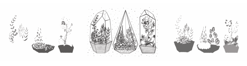
Once I had the line art drawn out (done on Procreate, which I’m slowly getting the hang of), I began to apply colour on separate layers underneath the line art. I chose to work with pink and blue inks, as these were two of the 4 colours available at the time. I’m not entirely sure about this colour scheme (it’s a bit out of my comfort zone), but I persevered nonetheless since nothing is set in stone colour-wise with the riso. Having said that, this project is all about experimentation so I’m consciously trying to work with colour schemes I haven’t used yet.
I’ll admit- I’m not used to working in this way, so the way in which I’d ‘blindly’ applied colour was painfully obvious on screen once I’d altered the layer opacities (see below for each separate layer). This will be something to remember in future if I re-do the colour (which I might actually end up doing, since we’ll be getting some more ink colours soon).
It’s also worth noting that no ink layer should be above 75% opacity, in order to avoid smudging and paper jams in the riso. My final layer opacities ranged from 20% (the ‘back’ of the terrarium frames) to 75% (the main black line art), with the coloured layers at 30-50% and 60% in between. By exporting each layer as a separate file, I was able to layer colours when printing (since the ink is semi-transparent), making a mid-purple tone where the inks crossed over.
I’ve gone into much further detail about the print process in my development file, but here’s a pic of the final prints:
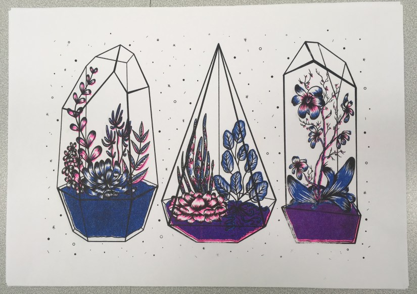
I was actually really pleasantly surprised at how nicely the image printed- although the registration isn’t perfect (which is a common trait of riso printing), the layers blended well and weren’t as messy looking as they appeared on screen.
At this point, I didn’t love my colour palette but I didn’t hate it, either- I’m most likely going to do another run next week, with neater colour layers and a more considered colour palette. Having green ink available will be really helpful!
…But at the same time, I don’t want this project to drag on for too long, since I want to really focus on the Animation Development brief I’m doing (this is especially important, as it will directly influence the Animation project in Semester 2… if the Semester 1 portion isn’t successful, I won’t have a solid foundation to work on!)
Also still to print is the mini A4 photography based geode flash sheet I’m doing as a side project ♥
References
Collingwood, C. (2018). Risograph Digital Ink Layers: Blue, Black, Pink [Digital].
Collingwood, C. (2018). Terrariums [Risograph print].
