evaluation

Year Evaluation

It’s that time!~

I’m so close to handing everything in, and before I do so I need to reflect upon the year as a whole- the good, the bad and everything in between!


Semester 1

I hit the ground running for Semester 1 after a disappointing year repeating the second year of my degree at CCAD (now the Northern School of Art). I had big plans for the year, outlining some pretty ambitious projects for the coming months, including a fully fledged animation project and a few familiar competition briefs from the past, e.g. the Cheltenham Illustration Awards, which has always had a very engaging theme year on year.

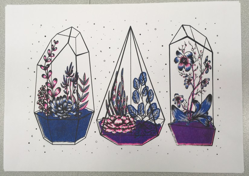
Risograph Printmaking: The first project I decided to work on was the Riso project- I’d heard about the new printing facilities and was eager to try them out as part of the initial Semester 1 term, which was highly focused on skills development and experimentation with new techniques.

This proved to be a very steep learning curve, but I did enough research to somewhat know what I was doing. At this stage, we only had 3 ink colours and a plain black ink drum, which made my options somewhat limited. However, these colours produced a very ‘traditional’ riso print with the strong pink and blue inks, which was outside my comfort zone yet felt very fitting for my first go with the medium.

I was pleased that I’d given it a try, despite being a bit iffy with my final image- it felt quite far away from the rest of my body of work. At the time I wanted to revisit the process, but my current plans didn’t leave much room for negotiation.

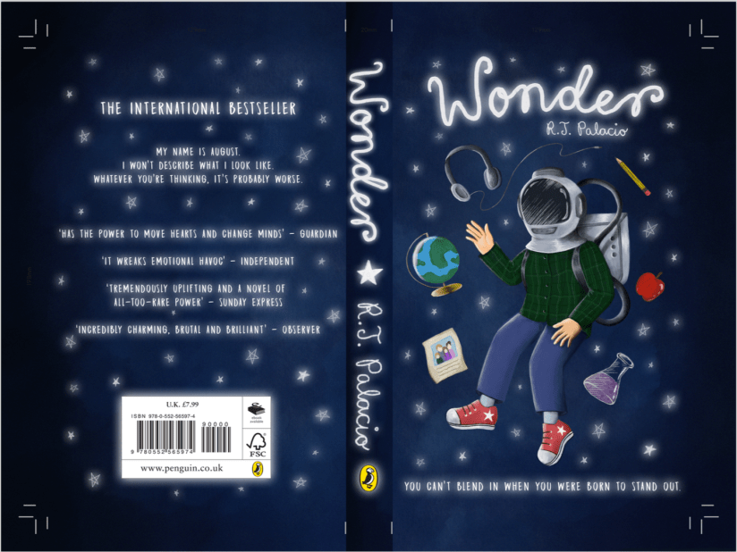
Penguin Student Award: The next two projects were worked on simultaneously- the Penguin Student Award and my personal project, Narrative Animation Development.

I chose Wonder by R.J. Palacio as the subject for the Penguin Award, as I was already familiar with the story and thought there’d be some really nice visuals to experiment with. I actually really enjoyed working on this, as it was a valuable experience that had clear industry links, which felt very worthwhile. I also loved getting back into typography and layout, as I hadn’t had a chance to work with these elements since my disastrous Pavilion Books brief while at CCAD (…maybe it wasn’t that bad, but it definitely felt that way). My final image was successful, even though I could have spent a little more time on the imagery rendering and overall finish.

This project was completed in the space of around 2 weeks, which was a feat for me since I tend to spend way too much time mulling things over in the research and development stages- which unfortunately impacted my work for the latter Narrative Animation project. :c

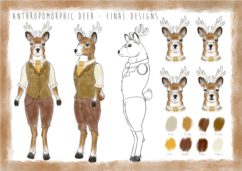
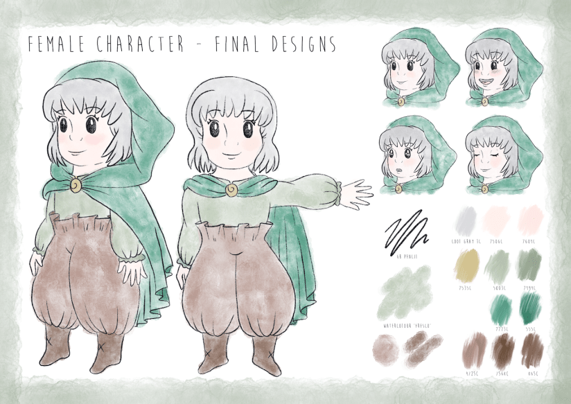
Narrative Animation Development: I was super excited to start work on this particular project as a finale for Semester 1, as it was based around an idea that had been mulling around in my head since the end of my FdA (summer 2017). I had planned for this to be my FMP at CCAD, which never happened since I moved back to Newcastle College after a tumultuous year. Therefore, I was determined to make it happen and started out with a concept project that would lead onto the animation realisation in Semester 2.

As I worked, I was easily able to map out my characters since they’d been fully formed for quite some time. There were negligible changes in appearance, but this was mostly practical so they were simplified enough to animate. However, time started to become very short and I ended up scrapping some of the more interesting elements of the project, including the background/environment designs which I was very eager to work on. My final project consisted of two character boards and accompanying development, some environment mood boards and a set of storyboards for the narrative.

At this point, I was well and truly knacked and vowed to never overstuff my proposal again.

Semester 2

Semester 2 was a bit of a disorganised monster, as I was so tired and stressed after the self-imposed heavy workload of Semester 1. I was very mindful when mapping out my proposal for this term- which led to the sad decision to remove the Animation Realisation project from my work plan. Ultimately, it felt too disconnected from the rest of my work planned for the year. Perhaps this is because the original inception of this project was quite a while ago, and I’ve grown as a person and an artist since then. Coupled with the immense amount of work it would take, I decided to postpone this project to be realised in my own time after my degree.

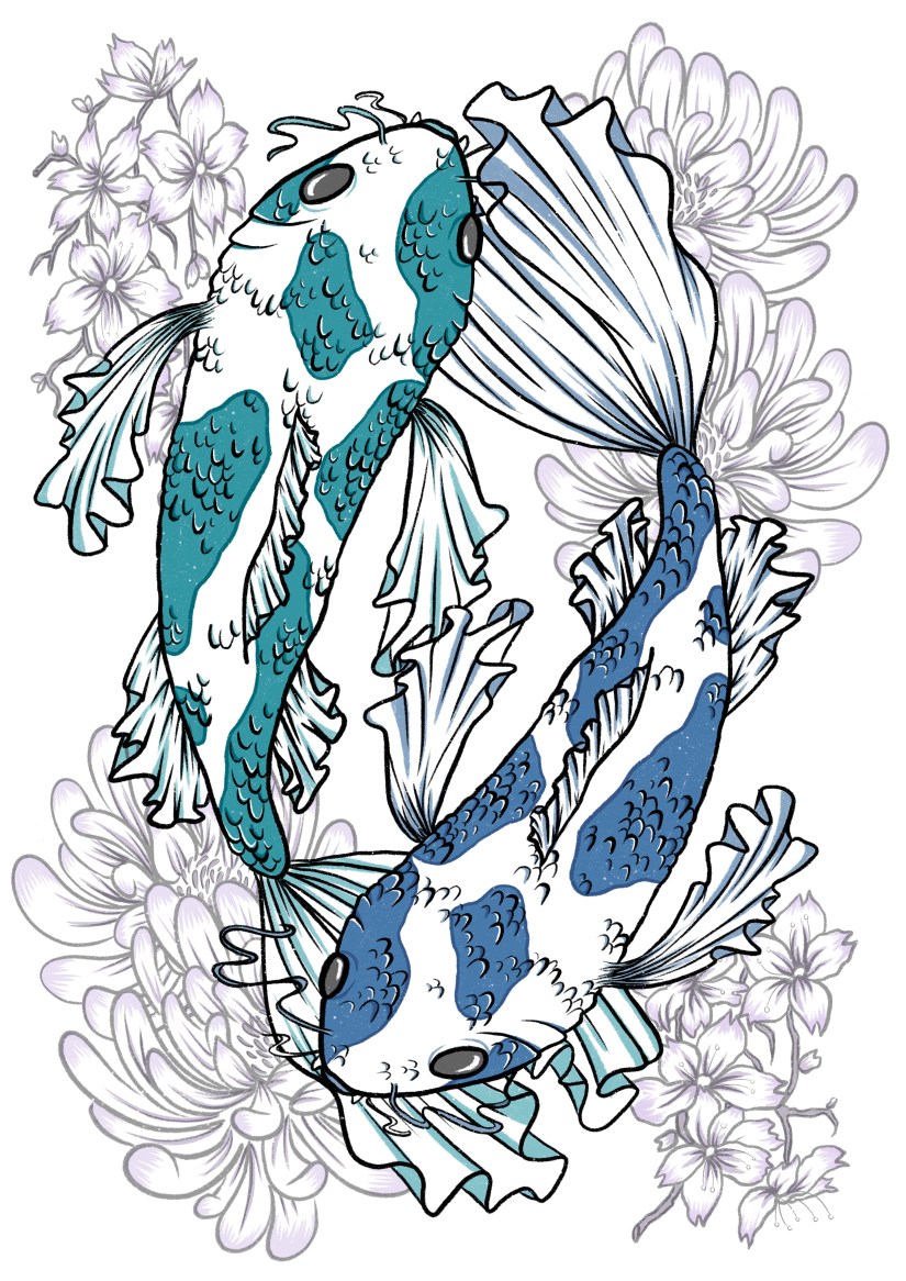
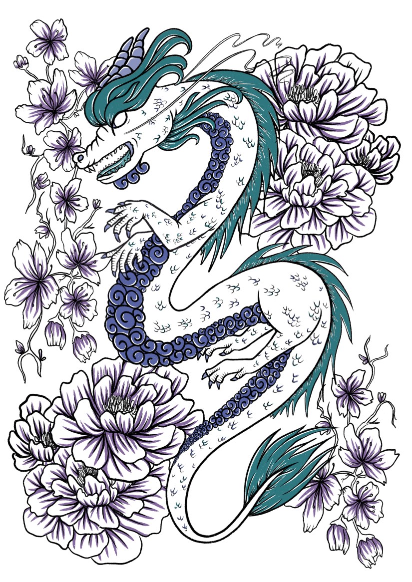
This left me with a bit of a gap in my schedule, so I decided to fill this in with a second Riso project after my pleasant experience in Semester 1. I had planned for the last commercial project to be the Cheltenham Illustration Awards, which felt was achievable, as well as being a good opportunity to create a stand out portfolio piece for the year. The final personal project was my Portfolio project my default.

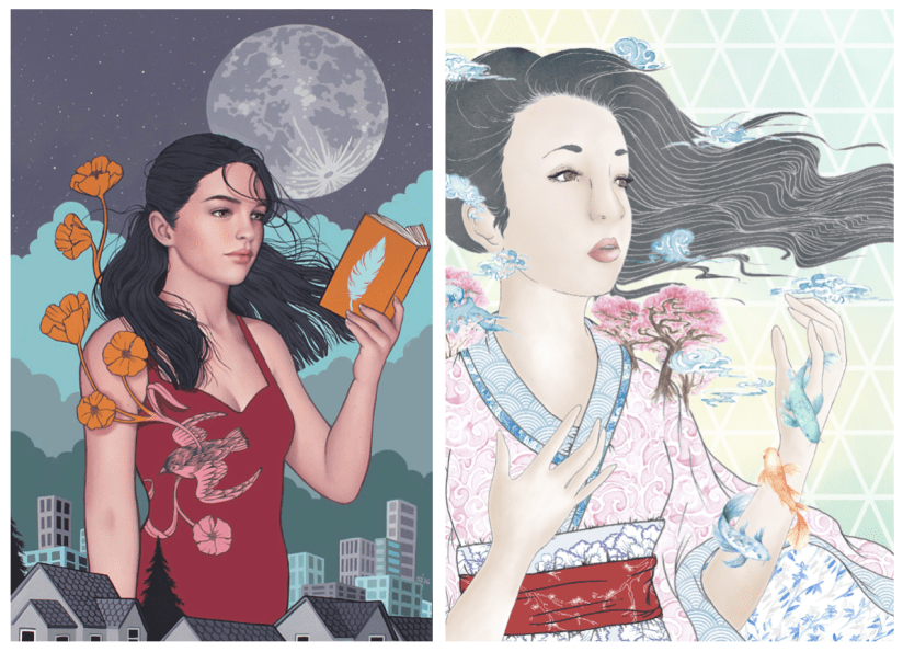
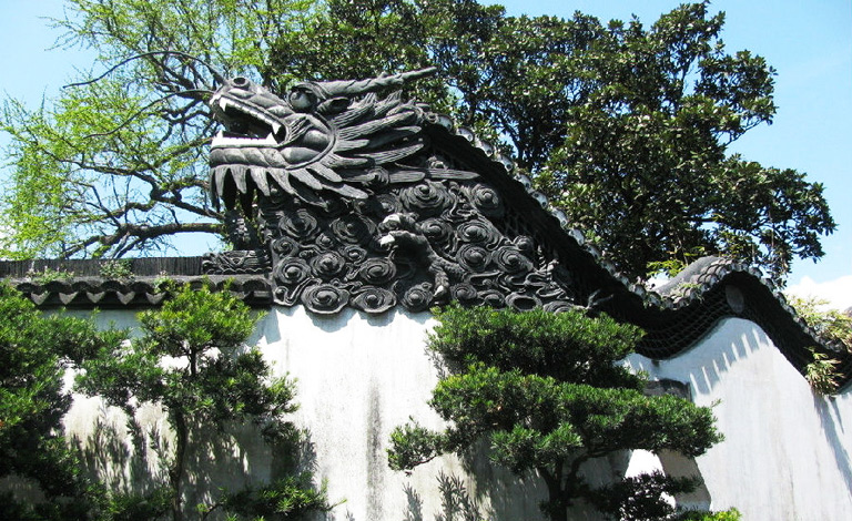
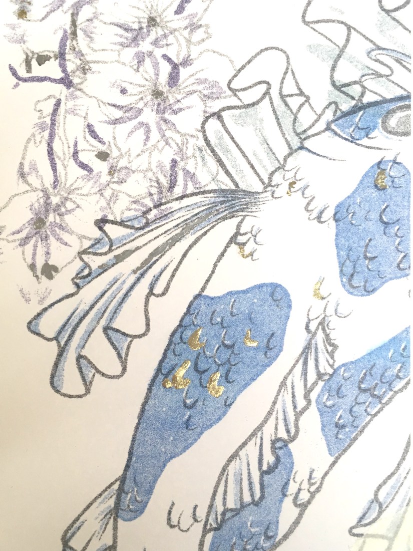
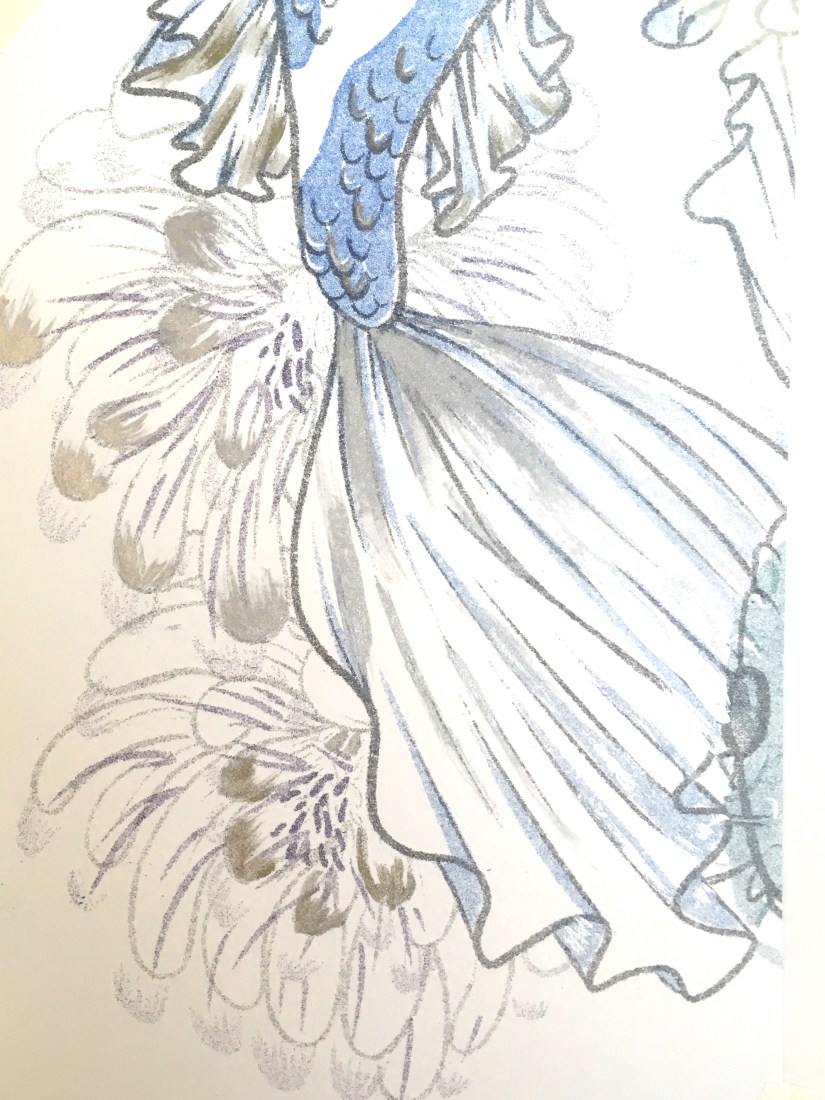
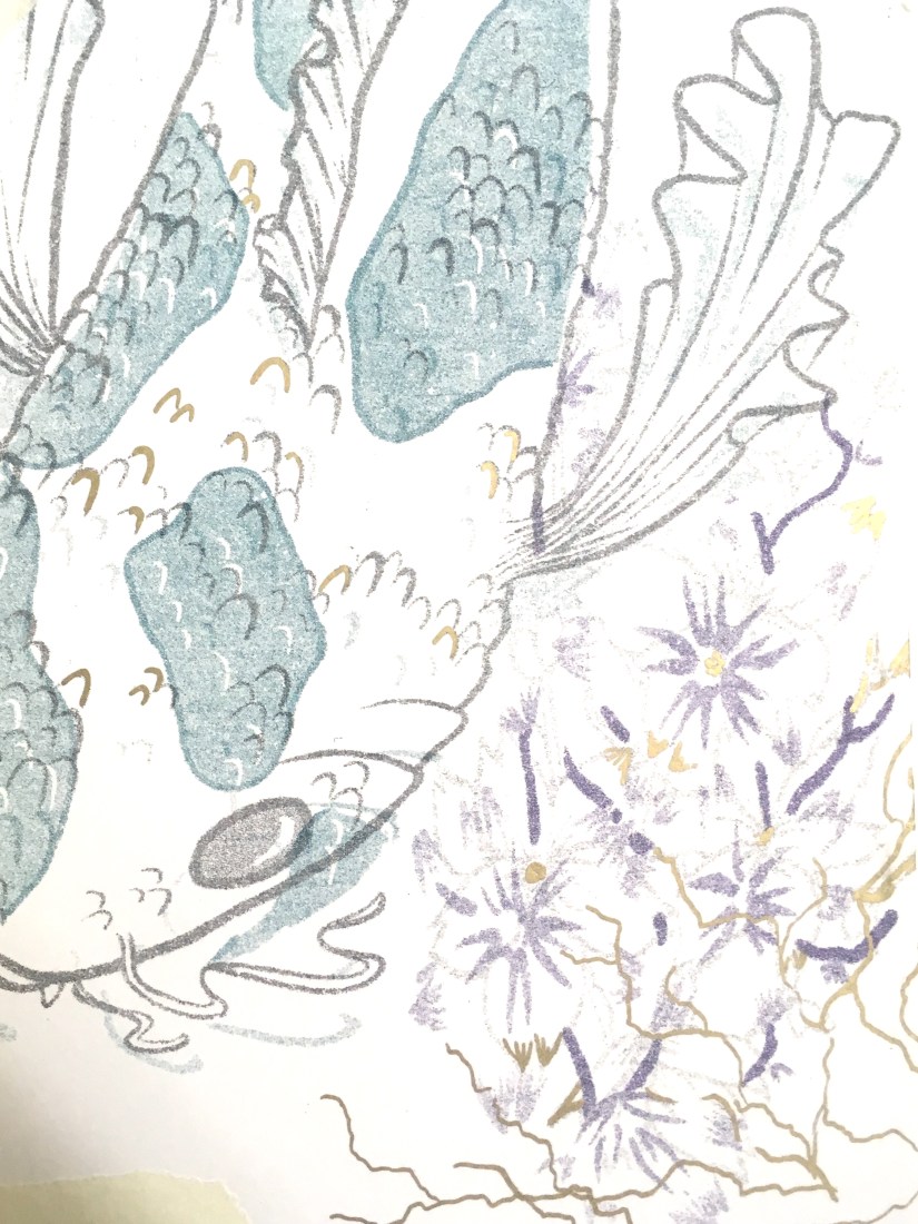
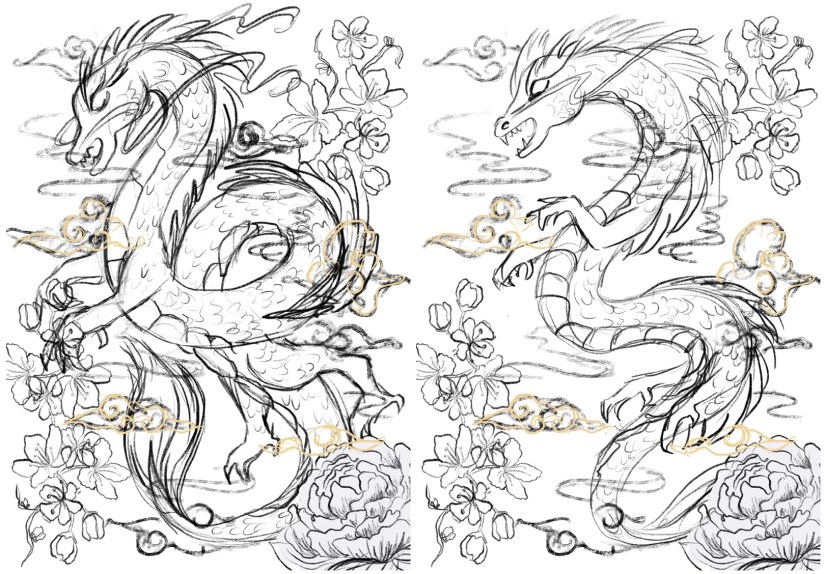
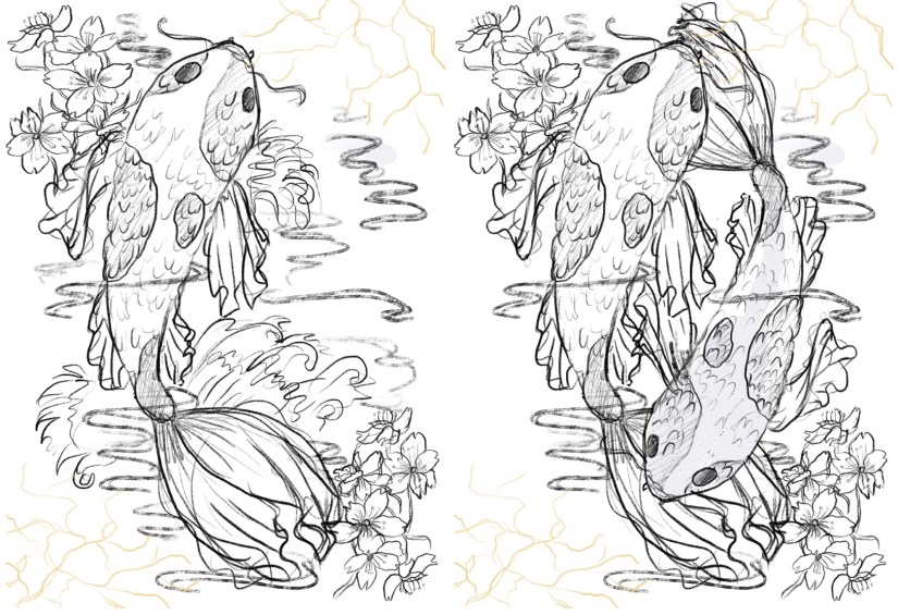
Risograph Realisation: This time around I felt much more comfortable with the process and its capabilities, so I was able to utilise the full potential of the risograph printer. We also had some new ink colours which was a very welcome addition- the teal and purple inks created some really nice effects on my final artwork, and I was happy to be able to create artwork with these specific colours in mind.

My final pair of prints was based on my travels last year, with an emphasis on the cross-cultural aesthetics of Chinese and Japanese design and symbolism. I was much happier with my outcomes compared to Semester 1, but I value both of the projects in my wider progression as an artist- I really want to continue to utilise this printing technique in my career and further work.

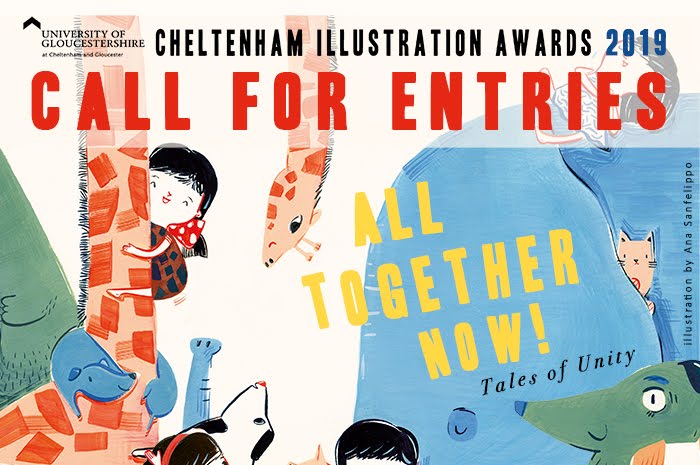
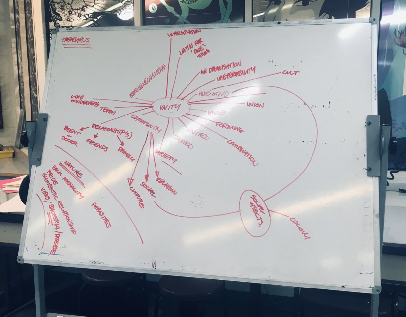
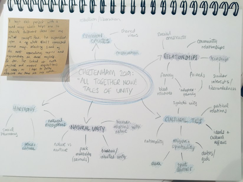
Cheltenham Illustration Awards: This project was nicely familiar to me, so there wasn’t really any struggle with the process or research elements. The theme this year was ‘Tales of Unity’, which was perhaps a little more niche and specific than in the past. Nevertheless, after a bit of initial struggle drafting out a suitable concept, I was able to use my new digital skills to effectively create a final piece that will serve as a centrepiece for the year (and final show).

Although I was used to the process, this project caused the most stress as it was completed in a short space of time right before the deadline (as the Risograph Realisation project overran by an alarming amount of time). I regret not leaving more time for the final realisation as this could have potentially made it even better- however, a deadline is a deadline and I’m not about to lose even more sleep over something out of my hands now~


Portfolio Project: This was a mandatory update on my existing portfolio- since lots of the work was still relevant, this made the workload much lighter than I’d anticipated. It also included making an updated portfolio book, which was good fun last year and was nice to revisit again. I also gave my creative CV and business cards a bit of a facelift, and also launched a new website! chalonjoy.com ~


Outcomes

…and here’s the final products! Most have been dotted around my blog already, but these are also on my ~new~ portfolio website… just a sly bit of self promotion there. c:

screen shot 2019-01-25 at 13.41.58
Anthropomorphic Deer Final Designs (Collingwood, 2018)


screen shot 2019-01-25 at 13.41.43
Young Female Character Final Designs (Collingwood, 2018)


screen shot 2019-01-25 at 12.31.31
Penguin Student Award: ‘Wonder’ Final Cover Art (Collingwood, 2018)


IMG_8014
Terrariums Risograph Print (Collingwood, 2018)


Koi_Final
Koi Fish Risograph Print (Collingwood, 2019)
Dragon_Final
Chinese Dragon Risograph Print (Collingwood, 2019)
FINAL_FILE_-3
Cheltenham Illustration Awards: Modernisation (Collingwood, 2019)


I’m now looking forward to final show, where I’ll hopefully be exhibiting my ‘best’ work from my degree, as well as selling some prints and other little bits of merchandise. I’ll blog about this afterwards too, even though my work will have (hopefully) been marked long before then!


Future Learning Plan/Progression

Targets and hopes for the future include:

  • Continuing to improve and enhance my skillset, particularly within commercial settings, and especially in pattern design and figural illustration- these are the two areas I enjoy working with most~
  • I also want to actively seek out opportunities for exposure, like open competitions and job openings that would suit my skillset. I’ll also look to improve my online presence, and look forward to fully launching my website and online store very soon!
  • Lastly, I want to endeavour to take life drawing classes, as I want to improve the figural elements in my work. They are my favourite thing to draw, but I still need to rely heavily on references to get something that looks remotely like a human. ^^” Hopefully having more free time will allow me to get stuck in at a weekly class, and I’m hoping to be able to draw more dynamic poses and better anatomy as a result. Especially hands. I hate hands.


As I jump over the last few hurdles before my deadline, I’ve found it to be quite cathartic to reflect upon the final year of my time as a student. I hope I manage to snag a First, but even if not I can safely say that I’ve tried my absolute best despite the drawbacks and issues I’ve faced in my life since returning to college.

I’m glad it’s all over after 4 years of deadlines and stress, but I’ll miss having a routine to stick to and a solid support network- I’ll have to build my own now ❀


References

Collingwood, C. (2019). Anthropomorphic Deer: Final Character Board [Digital].

Collingwood, C. (2019). Cheltenham Illustration Awards: Modernisation [Digital].

Collingwood, C. (2019). Chinese Dragon Risograph Print [risograph print].

Collingwood, C. (2019). Koi Fish Risograph Print [risograph print].

Collingwood, C. (2018). Penguin Student Award: ‘Wonder’ Final Cover Art [Digital].

Collingwood, C. (2018). Terrariums Risograph Print [risograph print].

Collingwood, C. (2019). Young Female Character: Final Character Board [Digital].

evaluation, portfolio, SWOT/Target Setting

Cheltenham Awards Final Piece Production

It’s been a busy week indeed!

In between running around like a headless chicken and trying to maintain a ‘healthy’ work/job/life balance, I’ve finally finished up my final project of the year ♥

It was quite an arduous process, but I think I actually really benefited from the super short time frame I’d been left with- not only was I working towards my deadline, I was also racing to get my art book submitted for publishing in time! I wanted this piece to be included, so that was another self imposed time limitation.

I created the piece on Procreate, using a variety of my own photos from my 2018 China trip to inform the architecture and layout. I clocked in just over 30 hours across 4 days according to the app, so here’s a wee time lapse video of my process to make a very long story short! (This is the 30 second quick cut- the longer time lapse video is about 12 mins long, and unfortunately I couldn’t quite get it to load up on Vimeo!)


So it was quite a linear, reassured workflow, but also had some new techniques being used since Procreate is a completely new tool to me since my last Cheltenham project in 2017. I’m really pleased with how far I’ve come, as my line art, layers and detailing/texture management has come leaps and bounds. While I still appreciate the flat, pastel-y appeal of my old Cheltenham piece, this newer one boasts a lot more depth, as well as a more experimental colour palette that really is quite ‘far out’ for me as an artist- up until now I really have been stuck in my ways with pastels and monotone, but the subject matter fully supported a warm, deep toned palette and I think it ties in quite well.

Here’s the finished piece- there’s loads wrong with it of course, but I’m content for now ♥

FINAL_FILE_-3
Modernisation (Collingwood, 2019)


Although I feel I’ve had a lot of success with this project, there were still some weak areas here and there- artwork wise, I think there’s still something amiss with the anatomy… but I have the time to fix this before final show, where I’ll hopefully be exhibiting this art as a centrepiece. If I’d have an ample amount of time prior to hand in this could have been fixed, but my workflow left me with a bit of a difficult situation- the way in which I’d blended the layers and applied tone and shading meant the line art and skin tones were across multiple layers, so it won’t be an easy task to correct this.

Working on this Cheltenham project has opened up lots more opportunities for me- I’m considering making a series of similar pieces based on my travels around the world. Also, when I submit this piece to the Awards I could potentially be featured in a catalogue showcasing selected entries from the year. Very exciting~


And with that, this wraps up my project work for Semester 2! Left to do is to finish off this blog, as well as some promo type stuff, like business cards, a creative CV and other artist-specific things like potential merchandise for final show. So, targets for the following week include tying up all the loose ends and making sure everything is ready and prepped for hand in, and also starting to think about final show- what I want to exhibit, sources for merchandise, and technicalities like layouts, exhibit space organisation, and marketing.


References

Collingwood, C. (2019). Modernisation [digital].

Collingwood, C. (2019). Modernisation Time Lapse .

portfolio, research, SWOT/Target Setting

Cheltenham Illustration Awards Progress

Its been a little while, but I’ve made some good progress since last checking in!

This week, I’ve been working constantly on concepts for my Cheltenham Awards piece- I want this to be culmination of my progression throughout my degree, so I want to make sure it’s suited to the brief, artistically and technically sound, and also something I’m proud of and can connect with.

When mapping out ideas for ‘Unity’ (the theme of the Awards this year), I thought back to my trip to China last year. The contrast between old and new Shanghai architecture, as well as the exceedingly blurred divide was reflected in the community around the city. It was a wild and dizzying blend of temples and traditional teahouses that were hundreds of years old, stood literally metres away from futuristic skyscrapers and the latest architectural marvels. It was so stunning, and unlike anything I’d ever seen! This really felt like the perfect thing to base my ideas on, so I set out making some concepts:

IMG_0168
‘Modernisation’ Concept 1 (Collingwood, 2019)
IMG_0167
‘Modernisation’ Concept 2 (Collingwood, 2019)
IMG_0163
‘Modernisation’ Concept 3 (Collingwood, 2019)


I’ve experimented with different background layouts, figural poses and blends of traditional and modern imagery. I chose the Pudong skyline as the background (very recognisable and iconic), with a selection of traditional architectural motifs based on the places I visited for the foreground surrounding the figure~

The idea fell into place quite quickly, as I was able to envision a rough layout after looking into my initial artist research, particularly the work of Sarah Joncas, as well as taking inspiration from my own past work:

Screen Shot 2019-05-19 at 21.37.16
Left: Night Life (Joncas, n.d.). Right Haru ‘Springtime’ (Collingwood, 2017)

The combination of figural elements and landscapes is something I’m already familiar with, and I was eager to work on something that is both beautiful and detailed, with architectural elements that were new territory to me.

I think I’ll be able to realise this piece fairly ‘easily’ compared to my other projects, where half of the battle was technique and workflow. I’m confident in my ability to produce this piece on Procreate, even thought that in itself will be a slight learning curve. However, that just means this is a good opportunity to fully immerse myself in the software- I plan to do final tidy up and processing on Photoshop, but Procreate boasts most of the same functions, so I want to make sure I’m widening my skills as much as possible.

I’ll have to keep a close eye on my time restraints and other projects (e.g. this blog!), as not keeping up with any one of these will negatively impact my progress. This has been a major weakness throughout my degree, and it’s never been so critically important to keep this in check!

Targets for the next few days include working on this piece (probably constantly), while also finding time to start collating my portfolio work and prepping for hand-in~


References

Collingwood, C. (2019). Haru ‘Springtime’ [mixed media].

Collingwood, C. (2019). Modernisation Concept 1 [digital].

Collingwood, C. (2019). Modernisation Concept 2 [digital].

Collingwood, C. (2019). Modernisation Concept 3 [digital].

Joncas, S. (n.d.) Night Life [oil, acrylic].

evaluation, research

Year Review Presentation

As a tie-in post to my upcoming Year Review (edit: link here!), here’s a sneak peek of the slides I’ve prepared for my presentation I need to deliver next week. So scary!

This is a review of the entire year, and while most of the following will be purely visual, a full explanation will be posted very soon~


This slideshow requires JavaScript.

Click through to see quick reviews on each Semester, Final Outcomes, Reflection and SWOT for each project, Action Plans and Future Progression Options, as well as my trusty Radial Thinking infographic and bibliography for all my references~

I’ll fully explain all of this in my Year Review– which will be a bit of a whopper haha~

As a quick side note, even though I was still stressed and terrified to deliver this presentation, I feel as if I’ve come a long way compared to my first Project Proposal Presentation just before the start of Semester 1. I hope my mark reflects that I (hopefully) won’t be nearly as nervous! I’m also starting to be more confident when speaking about my work, because I’ve started to realise things with a much more solidified view on my personal style and ethics as an artist.

Another update will come next week once I’ve got this presentation day out of the way and I can work on starting the final realisation of my Cheltenham Illustration Awards project ♥


portfolio

Risograph Realisation- Printing and Embellishment

First of all, sorry for the super long hiatus- between the Easter hols and life stuff in general, I’ve been busy sorting out various aspects of this project- it’s been a journey, but we made it!

In terms of finalising the imagery for print production, I had a few issues with the Dragon image- when I’d first decided on the central elements of each print, I was acutely aware that if I didn’t execute it properly the Dragon image would be a bit… cheesy looking. Maybe it’s just my spin on things, but dragons are inherently a bit lame so I really had to work to make sure my print wasn’t typical/lame. I feel like it’s halfway in-between haha- not quite cringey, but also not really what I envisioned, which is a bit of a shame. I based the imagery off a decorative wall within the traditional Yuyuan Garden in Shanghai:

yu-garden-768(2)
‘Dragon Crossing the Clouds’ (China Discovery, n.d.)


I thought this was a really unique part of the architecture within the garden, and this helped me immensely while I was designing this part of the imagery ❀

The koi, as previously noted in my Durham University visit posts (here and here), was influenced by reference imagery taken during my outing. This was the easier of the two prints to design, as the subject matter lends itself towards the type of aesthetic I was going for~


I won’t document the actual printing process here (more info in my research folder) as that’s already been covered on this blog here, but my final two designs turned out much nicer than expected! The new ink colours really helped too, as I was able to use a much cooler, less harsh palette of blue, teal and purple. I really knocked down the opacities on all four layers, which produced a lovely painterly effect…

…in fact, the resulting imagery was so nicely processed that I didn’t even want to embellish on top of these! I did some tests with metallic inks, pens and foil leaf on a failed print from my first printing attempt, and honestly the results were nice, but didn’t enhance the prints at all. The embellishment appeared very heavy compared to the plain prints, so I decided to ultimately leave this part of my proposed process out, since I felt it detracted from the final product too much. That’s not to say I regret researching into this so much- I can undoubtedly use these techniques in the near future, as I plan to work with printmaking often once I graduate.

IMG_9864
Risograph Embellishment: Gold Leaf Test (Collingwood, 2019)
IMG_9865
Risograph Embellishment: Metallic Ink Test (Collingwood, 2019)
IMG_9866
Risograph Embellishment: Metallic Pen Test (Collingwood, 2019)

Targets for the coming weeks include… doing the entire Cheltenham Awards project because I’ve left it so late! As well as continuing to build and collate my portfolio ready for hand in ♥

More in a few weeks once I’ve made a good start on the next project!


References 

China Discovery (n.d.). Yuyuan Garden: ‘Dragon Crossing the Clouds’ [photograph]. Available at: https://www.chinadiscovery.com/shanghai/yu-garden.html [Accessed 12 Apr 2019].

Collingwood, C. (2019). Chinese Dragon Risograph Print [risograph print].

Collingwood, C. (2019). Japanese Koi Risograph Print [risograph print].

Collingwood, C. (2019). Risograph Embellishment: Gold Leaf Test [risograph print, gold and silver leaf].

Collingwood, C. (2019). Risograph Embellishment: Metallic Ink Test [risograph print, metallic inks].

Collingwood, C. (2019). Risograph Embellishment: Metallic Pen Test [risograph print, metallic pen].

research

Wider Research: Illustration Agencies

As I move into the final few months of student life before trying to establish myself as a freelance illustrator, I’m researching into online illustration agencies that represent some of my favourite national and international artists.

I’ll be looking at each agency individually, evaluating their clientele, ‘house style’, and other areas of interest.


Big Active

Big Active are a UK based agency that specialise in Art Direction, Graphic Design, Content Production and the promotion of artists. Having a quick flick through their artist repertoire, I see some familiar names, particularly Katie Scott (who illustrated the popular children’s reference book Animalium as well as other editorial works):

Screen Shot 2019-03-25 at 11.59.07
Animalium (Scott, 2014), The Clerkenwell Post Issue 20 (Scott, 2014)


Big Active don’t appear to have a particular house style, which is nice to see. Sometimes agencies that have specific aesthetic requirements for their artists can make it difficult to stand out from the crowd or to break into the industry- or even to get taken on by an agency in the first place! However, I suppose it would help if there were certain ‘go-to’ agencies for a particular style of work, as this could help a client seek out a selection of potential artists.

On their website they currently list only a small selection of artists… while they are all fairly recognisable names, I was expecting them to have a bigger selection- I’m not sure if it’s typical to have a small amount of artists in an agency. I’ll compare this to the amount of artists promoted at other agencies I’ll look at.


Handsome Frank

Another agency based in the UK, Handsome Frank bill themselves as “representing some of the finest contemporary artists on the planet”, also stating that they now “represent 35 illustrators, spread across five continents and we’ve worked with some of the biggest brands and agencies in the world” (Handsome Frank, n.d.).

At a first glance, Handsome Frank definitely appear to have a more minimalistic, graphic house style compared to Big Active, which was more diverse style wise. Artists include Jonathan Burton, Quentin Monge and Tom Haugomat, a Paris based illustrator specialising in stylish, graphic landscapes:

archerfarms
Archer Farms Coffee (Haugomat, 2018)


Overall I think Handsome Frank tend to a younger, more stylish client than some of the other agencies which offer a wider variety of styles for different applications. Their website layout is also quite graphic based, which complements the artwork nicely.


Lemonade Illustration Agency

While the other agencies so far have had a very minimalistic approach, Lemonade Illustration Agency presents a wide range of artistic styles and disciplines, whereas the other agencies seem to have more of a focus on illustration for certain commercial applications. Lemonade sets out its artists under different categories according to their suited disciplines, e.g. editorial (with an emphasis on children’s books), storyboarding and concept art (which doesn’t appear to have much obvious representation in either Big Active or Handsome Frank).

Lots of the work is very commercial and represents popular tastes, compared to the artists represented by the former examples I’ve researched, who are arguably aiming towards a more sophisticated, niche market. The amount of artists represented exceeds Big Active and Handsome Frank tenfold, and appears to have around the same amount of creatives as Central Illustration Agency. Artists include Marine Gosselin and Rose Frith, both of whom boast a very colourful, childlike aesthetic in their artwork:

Screen Shot 2019-04-29 at 12.48.42
Witchy (Frith, 2014), Les Animaux (Presque) Disparus (Gosselin, 2018).

Lemonade Illustration Agency has offices in London, Yorkshire, Sydney and New York promoting artists in markets worldwide.


Central Illustration Agency

Last but not least, Central Illustration Agency (CIA) is another larger global agency that represents artists in three categories on their website: Illustration, Motion and Physical. This is an interesting way to set out these categories, as it allows clients to pinpoint artists that are especially proficient at their chosen discipline or application.

Also similarly to Lemonade Illustration Agency, they seem to have a much more diverse appeal within their body of represented illustrators and creatives, compared to the very select selection of Big Active and Handsome Frank. There doesn’t seem to be a house style, resulting in a wide array of art styles and aesthetics.

Artists include Whooli Chen and Brosmind, both of whom I’ve looked at in the past.

Screen Shot 2019-04-29 at 13.30.09
Hong Kong IFC Mall Brochure, Winter 2016: Beautiful – Celebrating Together (Chen, 2016), RS Concept Store: Christmas Display (Brosmind, 2017). 


Looking at agencies still feels a bit overwhelming, but I’ve definitely gained some insight into the specifics of choosing an agency, and working with a company that appreciates an individual’s specific artistic traits and aesthetic.


References

Big Active (2016). Big Active – art direction, graphic design, creative consultancy and representation [online]. Available at: https://www.bigactive.com  [Accessed 27 Mar 2019].

Brosmind (2017). RS Concept Store Barcelona: Christmas Display [mixed media].

Central Illustration Agency (n.d.). Central Illustration Agency – Home [online]. Available at: https://centralillustration.com  [Accessed 28 Mar 2019].

Chen, W. (2016). Hong Kong IFC Mall Brochure, Winter 2016: Beautiful – Celebrating Together. [mixed media].

Frith, R. (n.d.). Witchy [digital].

Gosselin, M. (2018). Les Animaux (Presque) Disparus (The (Almost) Extinct Animals) [digital].

Handsome Frank (n.d.). Handsome Frank Illustration Agency [online]. Available at:  https://www.handsomefrank.com [Accessed 27 Mar 2019].

Haugomat, T. (2018). Archer Farms Coffee [digital].

Lemonade Illustration Agency (2019). Home – Lemonade Illustration Agency [online]. Available at: https://www.lemonadeillustration.com/Default.aspx  [Accessed 28 Mar 2019].

Scott, K. (2014). ‘Animalium’ Front Cover art [mixed media].

Scott, K. (2014). ‘The Clerkenwell Post’ Issue 20 Cover art [mixed media].


portfolio, research, SWOT/Target Setting

Risograph Realisation – Idea Finalisation

It’s been a bit of a weird week- I haven’t made as much progress as I’d hoped with this riso project but any progress is better than none at all! ♥

I’ve been looking at finalising my riso ideas, and while these are still fairly rough drafts I find it much easier to visualise a final concept in a neater, tidier visual style (e.g. I’ll be really finishing up the layout in the actual final piece process, which is much easier thanks to the flexibility of Procreate).

So far, I’ve got 4 potential ‘final’ layouts, each with differences that affect the way in which the artwork fills out the frame of the piece- since these will be A3, the actual image will be slightly smaller on each side (~2.5cm) due to the riso printing limitation. I’ve also begun to visualise how I can embellish these pieces (see the light gold coloured overlay on each piece for ideas on which areas I might work into- this is all TBC!).

China Risograph Print Final Concepts (Collingwood, 2019)


Japan Risograph Print Final Concepts (Collingwood, 2019)


One technique I thought would work especially well on the Japanese/Koi Fish print was kintsugi inspired embellishment (which I’ve begun to visualise in the final concept sketches). I came across this art form during my visit to the Durham University Oriental Museum, where there were examples of ceramics displayed utilising this technique. The result was beautiful, and the idea behind the process even more so.

Kintsugi is based around the idea that the imperfect is beautiful- while some of us in the Western world prefer things to be new, Japanese people relish repairing broken items and seeing beauty in imperfection. This also links to the wabi-sabi philosophy, which centres around the idea that imperfection and the transience and fragility of perfection is accepted- far different to the obsession with perfection we have in the West.

I’d love to incorporate this into my work, as I too have a fascination with perfect things- I think it’d add some nice little imperfections into my pieces. The fact that I’ll be embellishing these by hand will mimic the original technique; the rest of the imagery will be digitally produced and collated, printing using the risograph which is very ‘perfect’ despite some natural variance in the process.

Hero
Kintsugi – Japanese Ceramic Gold Repair (Sydney Community College, n.d.)


I’ve also started to look at colour palettes and application for the final riso prints- since my palette is somewhat limited, I need to use my trusty Risotto colour swatch pack to look at alternative palettes that would work well. Since my artwork is mostly line-art based, I can use quite dark shades of the inks to intensify the line work while employing lighter, more subtle shades to add interest and shading.

This will be a target for the coming weeks after I’ve finished the base artwork- I’ll use Photoshop to manipulate the grayscale layers to view different colour palettes, which I’ll write about in my sketchbook.

I can’t wait to start properly visualising these finals… I’ll be using Procreate to render and layer my files ready for printmaking~

Blog post on this process coming soon! ❀


References

Carnazzi, S. (n.d.). Kintsugi: the art of precious scars [online]. Available at: https://www.lifegate.com/people/lifestyle/kintsugi  [Accessed 21 Mar 2019].

Collingwood, C. (2019). China Risograph Print Final Concepts [digital].

Collingwood, C. (2019). Japan Risograph Print Final Concepts [digital].

Richardson, J. (2016). WABI-SABI and UNDERSTANDING JAPAN | A PHILOSOPHY AND AESTHETIC AS WORLDVIEW [online]. Available at: https://www.tofugu.com/japan/wabi-sabi/ %5BAccessed 21 Mar 2019]. 

Sydney Community College. (n.d.). Kintsugi – Japanese Ceramic Gold Repair [photograph]. Available at: https://www.sydneycommunitycollege.edu.au/course/kintsugi.gold.repair  [Accessed 21 Mar 2019].

research, SWOT/Target Setting

Semester 2 – Cheltenham Illustration Awards 2019

While I’m still working on finalising my risograph prints for Commercial Project 2 (hoping to have these printed in the next week or so), I’m going to start looking into the brief for the Cheltenham Illustration Awards (CIA) which was recently announced at the beginning of the month.

CIa 2019 Poster v2 900 web banner 2
Cheltenham Illustration Awards: Call for Entries 2019 (University of Gloucestershire, Sanfellipo, 2019)


In previous years the theme has been ‘Tangled Tales’ and ‘Tales Through Other’s Eyes’, so this year’s theme of ‘All Together Now: Tales of Unity’ is quite different. My first thoughts are that this theme is a bit less varied and not open to interpretation as much as the previous themes of 2017 and 2018. I worked on a piece for the competition in 2017 and was admittedly able to shoehorn it into the theme (‘Tales Through Other’s Eyes’) without too much bother; my design was only loosely based on the given brief.

This year, I plan to work much more closely with the given theme to produce something that is tailored to this concept, rather than trying to twist an existing idea into meeting the needs of the brief. Based on a mind map by my entire class that I photographed (Collingwood, 2019), I’ve taken some of the most appealing ideas and made my own mind map that expands upon these concepts:

IMG_9154.jpg
Cheltenham Illustration Awards Mind Map: ‘Unity’ (BA Hons Illustration) (Collingwood, 2019)


IMG_9305-1
Cheltenham Illustration Awards Mind Map: ‘Unity’ (Collingwood, 2019)


My piece from 2017 was done digitally, and I daresay this is the best way of creating artwork intended for online entry/print- I will most likely adapt a similar workflow of digitally collaging both traditional and digital motifs/imagery to create a piece that successfully showcases my skillset.

The competition is open to student, emerging and established illustrators, with a deadline of 1st June 2019 (a bit over two months away at the time of writing this post), so I’ll have right up until our degree deadline of the 13th May to create something really special.


On another note, there’s been another recently announced competition that is new for this year and based in the North East. Northern School of Art (formerly CCAD) is running The Northern Illustration Prize in association with AOI, with this year’s theme being Monkey, based on the bizarre legend of the Hartlepool Monkey.

Screen Shot 2019-03-18 at 11.10.16
Northern Illustration Prize 2019 Banner (Northern School of Art, 2019)


I can’t say that theme has massively grabbed my attention, but with it being a new competition based in the North East it would be nice to enter. Since our degree course is brand new for this year, as a class we’re hoping to pull together some really good entries to put us on the map.

Like the Cheltenham Illustration Awards, it’s open to both emerging and established illustrators, with the prize being a fully funded studio in Hartlepool for one year. The prize is to mark the start of the Northern Festival of Illustration, a biennial event held in Hartlepool.


During these coming months I’ll have to be aware of my SWOT (strengths, weaknesses, opportunities and threats) more than ever, since I don’t want to let my grades slip at this crucial time. These are more of the same according to past projects- I’m good at realisation and research, but poor at timekeeping. This is both a weakness and a threat, but as this is the last project I’ll have to be acutely aware of how long is left before hand in- there’s no room for error here! Opportunity wise, I’m looking forward to be able to realise something and have full control over the outcome- most of my other projects have had a certain element of serendipity to them, where I’ve had to battle other elements in order to produce something I’m happy with.


My main target for the coming weeks will be to finish off the bulk of the work for the riso project- Once I get the images printed I can embellish the resulting prints at my leisure… or more likely, as an escape from what is most likely going to be hardcore planning and execution of this CIA 2019 project for the next few weeks!


References

Association of Illustrators (2019). The Northern Illustration Prize 2019 [online]. Available at: https://theaoi.com/northern-illustration-prize-2019/?fbclid=IwAR0SpwQXMjmh9nyb018JgubtDWu4bPB4FTi_RsSzLtgr2-e24vFmcGEoEz4   [Accessed 18 Mar 2019].

Collingwood, C. (2019). Cheltenham Illustration Awards Mind Map: ‘Unity’ [photograph].

Collingwood, C. (2019). Cheltenham Illustration Awards Mind Map: ‘Unity’ (BA Hons Illustration) [photograph].

Northern School of Art (2019). Northern Illustration Prize 2019 Terms [online]. Available at: https://theaoi.com/wp-content/uploads/2019/02/northern-illustration-prize-t-and-cs.pdf  [Accessed 18 Mar 2019].

Sanfellipo, A. (2019). Cheltenham Illustration Awards 2019 – Call For Entries: All Together Now! Tales of Unity [online]. Available at:  http://www.cheltenham-illustration-awards.com/p/about.html [Accessed 8 Mar 2019]

Smith, R. (2019). ‘The Northern School of Art launches major international art prize ‘The Northern Illustration Prize’ [online]. NorthernArt.ac.uk. Available at:  https://northernart.ac.uk/the-northern-school-of-art-launches-major-international-art-prize-the-northern-illustration-prize/ [Accessed 18 Mar 2019].


about, research

Radial Thinking and Reflective Cycle Infographic

As part of the ongoing effort to look deeper into my artistic practice, I’ve designed an infograph detailing some of the most important areas of my process- these include:

  • Concrete Experience (career-based areas I have experience with, e.g. personal and professional development and networking opportunities)
  • Active Experimentation (my current skillset and areas of artistic/illustrative technique experience)
  • Reflective Observation (strengths and weaknesses of my artistic workflow)
  • Abstract Conceptualisation (potential/hopeful future collaborations within the industry and global context)


Find the infographic here or by using the top menu bar: Info -> Radial Thinking.

inspiration, research

Magazine Review: Hi-Fructose Issue 50

This post has been a long time coming!

About a month ago we were set the impossible task of finding the latest issue of Hi-Fructose, a contemporary art quarterly magazine. I traipsed allllll over town trying to find one with no joy. Searches on eBay were also unfruitful, with only one seller listing the latest issue… and of course, they were sold out. :c

I resigned my search to maybe being able to find a back issue in the future. But last week I was browsing again on the off chance I might find a copy, and lo and behold- that seller had just restocked! Since the magazine was coming from Germany I wasn’t expecting it for at least 2 weeks, but it showed up on my doormat this morning~

IMG_9101
Hi-Fructose: Issue 50 (Collingwood, 2019)


Here we have Issue 50 of Hi-Fructose, RRP $8.95- my cost was just under €14 with postage, which is fairly reasonable considering these magazines seem to be akin to gold dust in Europe.

Not gonna lie, I was expecting it to be a wee bit bigger than ~A4/letter size, but the quality feels great and it’s printed on nice sturdy stock. Peep that lush gold foiling on the cover! ♥ My poor photo really doesn’t do it justice! [Disclaimer: please excuse my horrible sausage fingers invading the rest of these pics!]

We’d been advised that any recent issue would do for this review task, but I was set on finding Issue 50 because Audrey Kawasaki is one of the featured artists- I’ll touch on her section of the magazine later since her section is near the end of the issue.

Having a quick flick through, there’s also the added bonus of a snazzy 16-page insert on the work of Jason Lemon- love this, it makes it feel very deluxe.

IMG_9102
Hi-Fructose: Jason Limon Feature (Collingwood, 2019)


Going off on a tangent, this magazine also smells really good… woodsy and organic with only a very small smidge of plasticky print smell- hooray! I’m sure any fellow bibliophiles will attest to the fact that you can tell the quality of a printed publication by how good it smells~

The magazine is beautifully laid out, with very high quality photography and artwork alongside in-depth artist interviews that are genuinely interesting. Adverts are only found at the beginning and end of the publication, which is a welcome feature- I feel like adverts ruin the flow of a magazine and distract from the otherwise beautiful artwork.

img_9103.jpg
Hi-Fructose: Contents Page (Collingwood, 2019)


Featured artists for this issue include Annie Owens, DabsMyla, Shoichi Okumura, and of course Audrey Kawasaki, all of which have gorgeous artwork. Each section is from 6-12 pages long, with full page illustrations that are vivid and (mostly) of a good resolution. The interviews are set out beautifully and work well paired with both the illustrations and some candid shots of the artists as they work.

IMG_9105
Hi-Fructose: DABSMYLA Feature (Collingwood, 2019)


My favourite section is Audrey Kawasaki’s interview- no surprise there! Her work is hauntingly beautiful. I’m already pretty familiar with her work, but the interview alongside her illustrations is obviously very up to date, which reveals new information on her current practice and workflow as well as aspects her life that are inspiring her work. The featured artworks are from 2016 onwards and were impeccably photographed. I love the typography set against her art on the ‘cover’ page of the article- there was obviously lots of love and care put into the layout and editing of this issue.

IMG_9109

img_9106.jpg
Hi-Fructose: Audrey Kawasaki Feature (Collingwood, 2019)


Overall this is a really nice art quarterly- my top fave is still Beautiful Bizarre as that’s suited to my taste a wee bit more, but I love looking at new and upcoming examples of illustration and Hi-Fructose didn’t disappoint. I only wish it was easier to find in the UK!

Thanks for reading~


References

Beautiful Bizarre (2019). Beautiful Bizarre Magazine [online]. Available at: https://beautifulbizarre.net  [Accessed 12 Mar 2019].

Collingwood, C. (2019). Hi-Fructose: Audrey Kawasaki Feature [photograph].

Collingwood, C. (2019). Hi-Fructose: Contents Page [photograph].

Collingwood, C. (2019). Hi-Fructose: DABSMYLA Feature [photograph].

Collingwood, C. (2019). Hi-Fructose: Issue 50 [photograph]. Cover art: Fosik, AJ. Erratic Spell Release [polymer paint on wood].

Collingwood, C. (2019). Hi-Fructose: Jason Limon Feature [photograph].

Hi-Fructose (n.d.). Hi-Fructose|The New Contemporary Art Magazine [online]. Available at: https://hifructose.com  [Accessed 12 Mar 2019].

Kawasaki, A. (n.d.). Audrey Kawasaki [online]. Available at: https://www.audkawa.com  [Accessed 12 Mar 2019].

Rosa, E. (2019). Hi-Fructose. Issue 50. pp.13, 50-51, 76-77, 104-115.