evaluation, portfolio, SWOT/Target Setting

Cheltenham Awards Final Piece Production

It’s been a busy week indeed!

In between running around like a headless chicken and trying to maintain a ‘healthy’ work/job/life balance, I’ve finally finished up my final project of the year ♥

It was quite an arduous process, but I think I actually really benefited from the super short time frame I’d been left with- not only was I working towards my deadline, I was also racing to get my art book submitted for publishing in time! I wanted this piece to be included, so that was another self imposed time limitation.

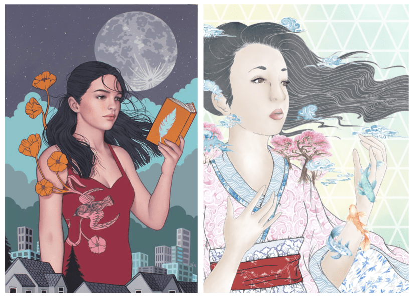
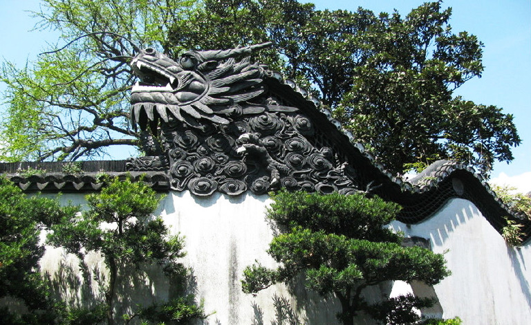
I created the piece on Procreate, using a variety of my own photos from my 2018 China trip to inform the architecture and layout. I clocked in just over 30 hours across 4 days according to the app, so here’s a wee time lapse video of my process to make a very long story short! (This is the 30 second quick cut- the longer time lapse video is about 12 mins long, and unfortunately I couldn’t quite get it to load up on Vimeo!)


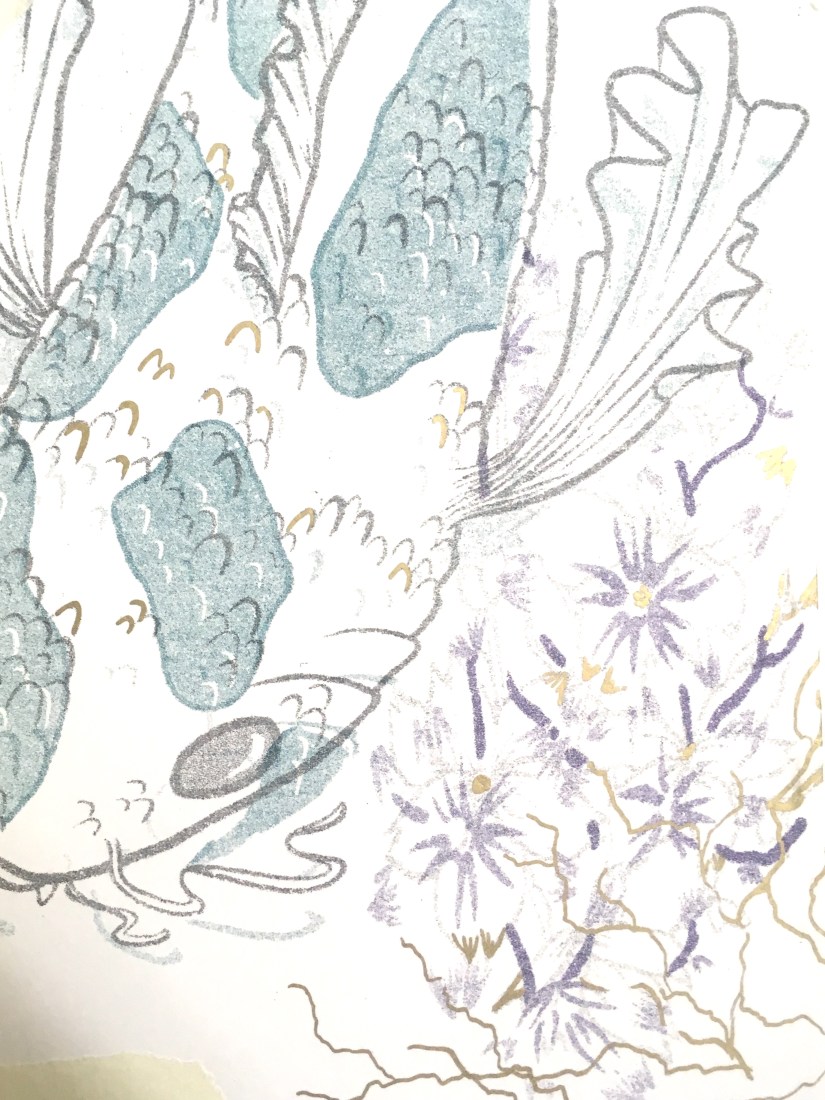
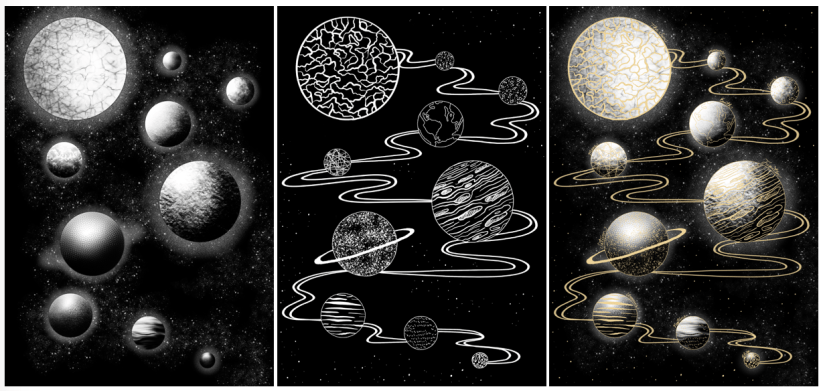
So it was quite a linear, reassured workflow, but also had some new techniques being used since Procreate is a completely new tool to me since my last Cheltenham project in 2017. I’m really pleased with how far I’ve come, as my line art, layers and detailing/texture management has come leaps and bounds. While I still appreciate the flat, pastel-y appeal of my old Cheltenham piece, this newer one boasts a lot more depth, as well as a more experimental colour palette that really is quite ‘far out’ for me as an artist- up until now I really have been stuck in my ways with pastels and monotone, but the subject matter fully supported a warm, deep toned palette and I think it ties in quite well.

Here’s the finished piece- there’s loads wrong with it of course, but I’m content for now ♥

FINAL_FILE_-3
Modernisation (Collingwood, 2019)


Although I feel I’ve had a lot of success with this project, there were still some weak areas here and there- artwork wise, I think there’s still something amiss with the anatomy… but I have the time to fix this before final show, where I’ll hopefully be exhibiting this art as a centrepiece. If I’d have an ample amount of time prior to hand in this could have been fixed, but my workflow left me with a bit of a difficult situation- the way in which I’d blended the layers and applied tone and shading meant the line art and skin tones were across multiple layers, so it won’t be an easy task to correct this.

Working on this Cheltenham project has opened up lots more opportunities for me- I’m considering making a series of similar pieces based on my travels around the world. Also, when I submit this piece to the Awards I could potentially be featured in a catalogue showcasing selected entries from the year. Very exciting~


And with that, this wraps up my project work for Semester 2! Left to do is to finish off this blog, as well as some promo type stuff, like business cards, a creative CV and other artist-specific things like potential merchandise for final show. So, targets for the following week include tying up all the loose ends and making sure everything is ready and prepped for hand in, and also starting to think about final show- what I want to exhibit, sources for merchandise, and technicalities like layouts, exhibit space organisation, and marketing.


References

Collingwood, C. (2019). Modernisation [digital].

Collingwood, C. (2019). Modernisation Time Lapse .

portfolio, research, SWOT/Target Setting

Cheltenham Illustration Awards Progress

Its been a little while, but I’ve made some good progress since last checking in!

This week, I’ve been working constantly on concepts for my Cheltenham Awards piece- I want this to be culmination of my progression throughout my degree, so I want to make sure it’s suited to the brief, artistically and technically sound, and also something I’m proud of and can connect with.

When mapping out ideas for ‘Unity’ (the theme of the Awards this year), I thought back to my trip to China last year. The contrast between old and new Shanghai architecture, as well as the exceedingly blurred divide was reflected in the community around the city. It was a wild and dizzying blend of temples and traditional teahouses that were hundreds of years old, stood literally metres away from futuristic skyscrapers and the latest architectural marvels. It was so stunning, and unlike anything I’d ever seen! This really felt like the perfect thing to base my ideas on, so I set out making some concepts:

IMG_0168
‘Modernisation’ Concept 1 (Collingwood, 2019)
IMG_0167
‘Modernisation’ Concept 2 (Collingwood, 2019)
IMG_0163
‘Modernisation’ Concept 3 (Collingwood, 2019)


I’ve experimented with different background layouts, figural poses and blends of traditional and modern imagery. I chose the Pudong skyline as the background (very recognisable and iconic), with a selection of traditional architectural motifs based on the places I visited for the foreground surrounding the figure~

The idea fell into place quite quickly, as I was able to envision a rough layout after looking into my initial artist research, particularly the work of Sarah Joncas, as well as taking inspiration from my own past work:

Screen Shot 2019-05-19 at 21.37.16
Left: Night Life (Joncas, n.d.). Right Haru ‘Springtime’ (Collingwood, 2017)

The combination of figural elements and landscapes is something I’m already familiar with, and I was eager to work on something that is both beautiful and detailed, with architectural elements that were new territory to me.

I think I’ll be able to realise this piece fairly ‘easily’ compared to my other projects, where half of the battle was technique and workflow. I’m confident in my ability to produce this piece on Procreate, even thought that in itself will be a slight learning curve. However, that just means this is a good opportunity to fully immerse myself in the software- I plan to do final tidy up and processing on Photoshop, but Procreate boasts most of the same functions, so I want to make sure I’m widening my skills as much as possible.

I’ll have to keep a close eye on my time restraints and other projects (e.g. this blog!), as not keeping up with any one of these will negatively impact my progress. This has been a major weakness throughout my degree, and it’s never been so critically important to keep this in check!

Targets for the next few days include working on this piece (probably constantly), while also finding time to start collating my portfolio work and prepping for hand-in~


References

Collingwood, C. (2019). Haru ‘Springtime’ [mixed media].

Collingwood, C. (2019). Modernisation Concept 1 [digital].

Collingwood, C. (2019). Modernisation Concept 2 [digital].

Collingwood, C. (2019). Modernisation Concept 3 [digital].

Joncas, S. (n.d.) Night Life [oil, acrylic].

portfolio

Risograph Realisation- Printing and Embellishment

First of all, sorry for the super long hiatus- between the Easter hols and life stuff in general, I’ve been busy sorting out various aspects of this project- it’s been a journey, but we made it!

In terms of finalising the imagery for print production, I had a few issues with the Dragon image- when I’d first decided on the central elements of each print, I was acutely aware that if I didn’t execute it properly the Dragon image would be a bit… cheesy looking. Maybe it’s just my spin on things, but dragons are inherently a bit lame so I really had to work to make sure my print wasn’t typical/lame. I feel like it’s halfway in-between haha- not quite cringey, but also not really what I envisioned, which is a bit of a shame. I based the imagery off a decorative wall within the traditional Yuyuan Garden in Shanghai:

yu-garden-768(2)
‘Dragon Crossing the Clouds’ (China Discovery, n.d.)


I thought this was a really unique part of the architecture within the garden, and this helped me immensely while I was designing this part of the imagery ❀

The koi, as previously noted in my Durham University visit posts (here and here), was influenced by reference imagery taken during my outing. This was the easier of the two prints to design, as the subject matter lends itself towards the type of aesthetic I was going for~


I won’t document the actual printing process here (more info in my research folder) as that’s already been covered on this blog here, but my final two designs turned out much nicer than expected! The new ink colours really helped too, as I was able to use a much cooler, less harsh palette of blue, teal and purple. I really knocked down the opacities on all four layers, which produced a lovely painterly effect…

…in fact, the resulting imagery was so nicely processed that I didn’t even want to embellish on top of these! I did some tests with metallic inks, pens and foil leaf on a failed print from my first printing attempt, and honestly the results were nice, but didn’t enhance the prints at all. The embellishment appeared very heavy compared to the plain prints, so I decided to ultimately leave this part of my proposed process out, since I felt it detracted from the final product too much. That’s not to say I regret researching into this so much- I can undoubtedly use these techniques in the near future, as I plan to work with printmaking often once I graduate.

IMG_9864
Risograph Embellishment: Gold Leaf Test (Collingwood, 2019)
IMG_9865
Risograph Embellishment: Metallic Ink Test (Collingwood, 2019)
IMG_9866
Risograph Embellishment: Metallic Pen Test (Collingwood, 2019)

Targets for the coming weeks include… doing the entire Cheltenham Awards project because I’ve left it so late! As well as continuing to build and collate my portfolio ready for hand in ♥

More in a few weeks once I’ve made a good start on the next project!


References 

China Discovery (n.d.). Yuyuan Garden: ‘Dragon Crossing the Clouds’ [photograph]. Available at: https://www.chinadiscovery.com/shanghai/yu-garden.html [Accessed 12 Apr 2019].

Collingwood, C. (2019). Chinese Dragon Risograph Print [risograph print].

Collingwood, C. (2019). Japanese Koi Risograph Print [risograph print].

Collingwood, C. (2019). Risograph Embellishment: Gold Leaf Test [risograph print, gold and silver leaf].

Collingwood, C. (2019). Risograph Embellishment: Metallic Ink Test [risograph print, metallic inks].

Collingwood, C. (2019). Risograph Embellishment: Metallic Pen Test [risograph print, metallic pen].

portfolio, research, SWOT/Target Setting

Risograph Realisation – Idea Finalisation

It’s been a bit of a weird week- I haven’t made as much progress as I’d hoped with this riso project but any progress is better than none at all! ♥

I’ve been looking at finalising my riso ideas, and while these are still fairly rough drafts I find it much easier to visualise a final concept in a neater, tidier visual style (e.g. I’ll be really finishing up the layout in the actual final piece process, which is much easier thanks to the flexibility of Procreate).

So far, I’ve got 4 potential ‘final’ layouts, each with differences that affect the way in which the artwork fills out the frame of the piece- since these will be A3, the actual image will be slightly smaller on each side (~2.5cm) due to the riso printing limitation. I’ve also begun to visualise how I can embellish these pieces (see the light gold coloured overlay on each piece for ideas on which areas I might work into- this is all TBC!).

China Risograph Print Final Concepts (Collingwood, 2019)


Japan Risograph Print Final Concepts (Collingwood, 2019)


One technique I thought would work especially well on the Japanese/Koi Fish print was kintsugi inspired embellishment (which I’ve begun to visualise in the final concept sketches). I came across this art form during my visit to the Durham University Oriental Museum, where there were examples of ceramics displayed utilising this technique. The result was beautiful, and the idea behind the process even more so.

Kintsugi is based around the idea that the imperfect is beautiful- while some of us in the Western world prefer things to be new, Japanese people relish repairing broken items and seeing beauty in imperfection. This also links to the wabi-sabi philosophy, which centres around the idea that imperfection and the transience and fragility of perfection is accepted- far different to the obsession with perfection we have in the West.

I’d love to incorporate this into my work, as I too have a fascination with perfect things- I think it’d add some nice little imperfections into my pieces. The fact that I’ll be embellishing these by hand will mimic the original technique; the rest of the imagery will be digitally produced and collated, printing using the risograph which is very ‘perfect’ despite some natural variance in the process.

Hero
Kintsugi – Japanese Ceramic Gold Repair (Sydney Community College, n.d.)


I’ve also started to look at colour palettes and application for the final riso prints- since my palette is somewhat limited, I need to use my trusty Risotto colour swatch pack to look at alternative palettes that would work well. Since my artwork is mostly line-art based, I can use quite dark shades of the inks to intensify the line work while employing lighter, more subtle shades to add interest and shading.

This will be a target for the coming weeks after I’ve finished the base artwork- I’ll use Photoshop to manipulate the grayscale layers to view different colour palettes, which I’ll write about in my sketchbook.

I can’t wait to start properly visualising these finals… I’ll be using Procreate to render and layer my files ready for printmaking~

Blog post on this process coming soon! ❀


References

Carnazzi, S. (n.d.). Kintsugi: the art of precious scars [online]. Available at: https://www.lifegate.com/people/lifestyle/kintsugi  [Accessed 21 Mar 2019].

Collingwood, C. (2019). China Risograph Print Final Concepts [digital].

Collingwood, C. (2019). Japan Risograph Print Final Concepts [digital].

Richardson, J. (2016). WABI-SABI and UNDERSTANDING JAPAN | A PHILOSOPHY AND AESTHETIC AS WORLDVIEW [online]. Available at: https://www.tofugu.com/japan/wabi-sabi/ %5BAccessed 21 Mar 2019]. 

Sydney Community College. (n.d.). Kintsugi – Japanese Ceramic Gold Repair [photograph]. Available at: https://www.sydneycommunitycollege.edu.au/course/kintsugi.gold.repair  [Accessed 21 Mar 2019].

evaluation, portfolio

Tailoring Your Career (Practice What You Love)

Getting into the real deal career stuff now, I thought I’d write a little post on my reflections on a fantastic talk presented by The Association of Illustrators (AOI) we had last Friday.

AOI visitor Lou Bones imparted lots of wisdom on us in the 2 hours we were spoken to, but one of the topics that stood out to me the most was about creating artwork that directs your interests (and your clients)- put simply, ‘create what you love to do and the work will follow’~

Now that doesn’t mean that freelancing is gonna be easy (that’s far from the truth!), but building a portfolio based upon work that you’d like to take on is key to getting jobs that promote self growth as an artist without straying too far from personal preference.

There’s loads of areas you can aim towards- to name a few, we have editorial, fashion/costume design, commercial advertising, fine art (art for its own sake), and concept design. There are areas that could use illustrative talent almost everywhere you look; the possibilities (and opportunities) are truly endless.

For example, I’ll personally be working on pattern design, character-led imagery, editorial style imagery and possibly printmaking (as well as a variety of other areas) that best describe my artistic style and interest. I also really want to get into typography some more, as this is a really prevalent application in the industry today and could come in useful for a variety of jobs.

Through doing this, I can display the kind of work on my website that will look attractive to clients looking for that type of artwork- in theory! ^^”

Obviously, it’s really beneficial to have a wide range of styles/applications of work to showcase as this opens up many more potential job opportunities compared to sticking to familiar ground. Not all jobs will be to my taste, but I hope by pointing my artistic style in the right direction will yield good results ♥


References

Association of Illustrators (2017). The AOI – Stand Stronger Together [online]. Available at: https://theaoi.com [Accessed 6 Feb 2019].

portfolio

Concept Development – Storyboarding

Now that my character designs have been finalised, I can begin to storyboard the narrative.

While I do want the story to be interesting, I’m planning to make the main focus ‘interaction’- between the characters and their environments. This means a more gesture based approach to the animation, where characters will bond with their environments and explore new ones. In this case, the young girl will journey through her own woodland environment to the Deer’s house, where she’ll discover a new environment.

I’m most inspired by the way in which Studio Ghibli animates even the most mundane of actions with a quiet, curious interest- this is present throughout all of their films. It really brings out the natural beauty in the scenery without drawing the focus towards anything in particular.

The story is short (clocking in at just over a minute), but at an anticipated 12fps this should be more than enough to keep me busy!

[Update 19.01.19] And here are my finished storyboards… I’m sure I’ll refine these more in future once I’m better informed with the limitations of the Semester 2 project, but for now these will do nicely. I had a few problems with drafting out proper perspective in such a simplified way, but these are not written in stone so I can definitely correct these little problems in future when I have more time to dedicate to properly exploring environment design~

screen shot 2019-01-25 at 13.42.43screen-shot-2019-01-25-at-13.42.50.png

screen-shot-2019-01-25-at-13.42.58.png
Narrative Storyboards, PP2. (Collingwood, 2018)


I’ve really tried to look at how I can animate even the ‘still’ scenes, with background elements that move continuously or small pieces of animation to liven up an otherwise stagnant frame (e.g. the steam from the teacups, or the breeze blowing branches and leaves). I’ve used a blue pen to describe the animated aspects or camera directions- hopefully this will help me to clarify what to animate in each scene.

I’m overall pleased with how these have turned out, and even though there’s room for improvement this is my first experience with visual storyboarding. Can’t wait to get this project tied up and finished so I can start on Semester 2 work~


References

Collingwood, C. (2019). Personal Project 2 Narrative Storyboard Panels [Digital].

portfolio, SWOT/Target Setting

Concept Development – Character Designs

I have some new character designs to share! c: I’ve been working constantly on these since my last update- I feel I’ve made good progress even though there’s still so much to do!

screen shot 2019-01-28 at 10.19.12
Young Female Character: Initial Concepts (Collingwood, 2019). 
screen shot 2019-01-28 at 10.19.32
Young Female Character: Face Revisals/Development (Collingwood, 2019). 
screen shot 2019-01-28 at 10.22.48
Young Female Character: Palette/Colour Application Experimentation (Collingwood, 2019). 


Meet our heroine of the story- she doesn’t have a name on purpose, because I want the audience to be able to relate to her and put themselves in her shoes. Since she’s youthful, naïve and curious, I wanted these traits to shine through in her character design. I went through loads of concepts (some of which were really awful, haha) but settled on a final design for her that best described her personality to the viewer. I’m sure it shows, but I was really inspired by the ‘chibi’ characters of Studio Ghibli, as well as the loose, simplistic art style of Heikala (info on both of these here from my artist research for this project).

I’m pleased with her design- she went through quite a few refinements as I progressed through my workflow! Final character board below:

screen shot 2019-01-25 at 13.41.43
Young Female Character: Final Character Board (Collingwood, 2019). 


To be honest my favourite aspect of her is her ‘paper bag’ trousers- I didn’t want to put her in a skirt lest that undermine her childish adventurous nature, so I decided to go with these oversized paper bag pantaloons (which also matched her boots and cape much better… too many ‘loose hems’ otherwise!)

I really love them ^^”


Next up, we have our anthropomorphic deer character:

screen shot 2019-01-28 at 10.20.51
Anthropomorphic Deer: Initial Head Concepts (Collingwood, 2019). 
screen shot 2019-01-28 at 10.21.32
Anthropomorphic Deer: Anatomy/Front View Development (Collingwood, 2019). 
screen shot 2019-01-28 at 10.16.14
Anthropomorphic Deer: Palette/Colour Application Experimentation (Collingwood, 2019). 


I designed him to both contrast and complement the young girl character, since the contrast of their environments and designs is central to the narrative journey. The palette is still natural while being different to the bright, fresh toned greens I used on the female character’s designs.

He’s very scholarly and loves a good cup of tea, I hope you can tell~

screen shot 2019-01-25 at 13.41.58
Anthropomorphic Deer: Final Character Board (Collingwood, 2019). 


It was a real challenge to simplify the characters enough so that there wouldn’t be any issues when drawing them repeatedly for the animation- I think I’ve nailed this down enough, but as always there’s always the chance I’ll refine these some more in the follow-up Semester 2 project.

I’m pleased with the outcomes- targets for the next few weeks include finalising and collating all of my projects for hand in, and starting to think about the beginning of Semester 2 and how I’m going to tackle the next few months. Using my previous SWOT analysis’ will help me circumvent any problems I anticipate I’ll have, while also playing towards my strengths to produce a strong semester of portfolio work.


References

Collingwood, C. (2019). Anthropomorphic Deer: Anatomy/Front View Development [Digital].

Collingwood, C. (2019). Anthropomorphic Deer: Final Character Board [Digital].

Collingwood, C. (2019). Anthropomorphic Deer: Initial Head Concepts [Digital].

Collingwood, C. (2019). Anthropomorphic Deer: Palette/Colour Application Experimentation [Digital].

Collingwood, C. (2019). Young Female Character: Face Revisals/Development [Digital].

Collingwood, C. (2019). Young Female Character: Final Character Board [Digital].

Collingwood, C. (2019). Young Female Character: Initial Concepts [Digital].

Collingwood, C. (2019). Young Female Character: Palette/Colour Application Experimentation [Digital].

Heikala (n.d.). Instagram – @heikala (online). Available at: https://www.instagram.com/heikala/?hl=en [Accessed 2 Jan 2019].


evaluation, portfolio

A Short Timeline of The ‘Wonder’ Project

Well I’ve been productive this week…~

(haha but no really, I essentially just finished the Wonder Penguin Project in 4 days). It was intense, but it worked!

I didn’t mean to take such a small amount of time for this (my initial timetable gave me 4 *weeks* from mind map to final cover), but having so much downtime in my life made me reevaluate how long I really had to complete this brief. I have so much in store for PP2 that I didn’t want to waste any more time than necessary on what was supposed to be my ‘shortest’ project- that thought took on a while new meaning…

I had already researched into some existing source material e.g. book covers and film posters before the Christmas break, so I’d be lying if I said I didn’t have a rough idea of what I wanted to do. With this research in hand, I started to draft out some concepts of the cover, evaluating each one and choosing the most successful to take forward to development. This was all pretty run of the mill development work that I completed over the course of a day, so I’ll move onto the more interesting stuff~

I worked in Procreate again to bring the final product to life- I feel that my workflow has really come into its own since I started using my iPad as a key tool in my process; it’s the perfect balance between familiar traditional technique and the ease and innovation of digital painting. I was able to scan in my final concept from my sketchbook and work directly on top of this in Procreate, where I could fine-tune the details, proportions, etc.

Procreate tells me I clocked in at just under 8 hours with over 7000 strokes to complete the cover- that’s quite an interesting stat! I’m pleased with the final image:

screen shot 2019-01-25 at 12.31.31
Wonder Final Cover Art (Collingwood, 2019).

I’ll be making a mock-up final product by laminating my printed cover onto an existing copy of the book before hand in too… it’ll be nice to see a ‘finished product’!

I’m expecting to have to make a few wee changes/additions to the project work (particularly the written work) once I have a pre-hand in tutorial, but for the most part I can put this project to rest. ♥


More next week as the deadline draws near!


References

Collingwood, C. (2019). Wonder Final Cover Art [Digital].

evaluation, portfolio, SWOT/Target Setting

Printing Session and Week Reflection 19.10.18

Over the past week, I’ve worked on a simple design that can translate into a screen print. Basing my concept on the idea of planets and digital fills (as inspired by the tutorial Dave showed us on Friday), I worked in Procreate to design both a gold layer, and a black and white screenprinted layer. Final designs below (left to right: Base/screenprinted layer, gold leaf layer, mock up of ‘final’ image with both layers):

Screen Shot 2018-10-22 at 10.44.51
Left to right: Figure 1, Figure 2, Figure 3

Using Procreate is a whole new learning curve for me, as up until now I’ve worked mostly in Photoshop. My previous digital work has been done using a Wacom Intuos tablet, which I often found a bit hard to use (e.g. not being able to rotate it to draw, having to reference back to the screen when drawing, small size and lagging software).

Overall I was happy with my workflow, but earlier this year I invested in an iPad Pro as an additional tool. Ultimately I’ll still finalise my work in Photoshop as Procreate isn’t as extensive, but it’s invaluable having a drawing device with a screen- it feels much more natural, and it’s easier to draft out artwork compared to using a conventional drawing tablet.

One of the most useful tools I discovered actually came from a calligraphy brush kit- a variable line brush that smooths jagged edges and creates nicely curved lines (almost in a similar style to Illustrator, but without all the fiddling). There’s a plethora of times that I could have used this brush in the past, so I’ll definitely keep this in mind for the future!

Come Friday morning, it became quite clear that I was a bit ambitious with the black layer- Dave suggested that I instead print the gold layer as a complete image, so I decided to go with this (possibly going back and editing the black layer to be more screen print friendly at a later date). I’m glad I discovered this early on in the year, as it’ll inform any future imagery that I produce for screen printing.

I experienced some issues with the screen machine- my design wasn’t burned to the screen properly; the black background border was fuzzy on one corner. I’m putting this down to a technical issue that will hopefully be fixed in the future, as I think having a border on a screen print sets it off nicely, especially for trimming and framing. I’ll probably mask the corner border off and correct this by painting on the acrylic in ‘post-production’.

In the afternoon we were shown a quick recap of how to gold foil using the heat press- this was really useful because although I’ve worked with this process before, it was quite a few years ago now and I definitely benefitted from the refresh. There’s a much wider variety of foils now (e.g. iridescent foil, clear foil, and an array of different coloured metallic foils), all of which will be nice to experiment with ♥

Friday was full of trial and error- in addition to the corner not being complete on any of my prints (which was expected), I had lots of issues with the amount of ink I was using (usually not enough ink). My 6th print (out of 8 total) was the most successful- I was surprised how well the fine lines came out, despite the pre-emptive warning that 12px was the finest line weight that would translate optimally. Below is my most successful print (I could have used slightly less ink):

Screen Shot 2018-10-22 at 11.14.30
Figure 4

I really love the process of screenprinting, so I’ll definitely be revisiting this in the future, hopefully with better results.

In the next week, I plan to finally start on my riso project- I’m a bit stressed out about this as I haven’t stuck to my timetable thus far (which is an awful start to the year). However, the past week hasn’t gone to waste as the development for this screen print can be linked into my Printmaking project as development and technique exploration, which is the purpose of the first Semester anyway~


References

Figure 1: Collingwood, C. (2018). Planets (Base Layer) [Digital].

Figure 2: Collingwood, C. (2018). Planets (Gold Layer) [Digital].

Figure 3: Collingwood, C. (2018). Planets [Digital].

Figure 4: Collingwood, C. (2018). Planets Test #6 [Ink].