Its been a little while, but I’ve made some good progress since last checking in!
This week, I’ve been working constantly on concepts for my Cheltenham Awards piece- I want this to be culmination of my progression throughout my degree, so I want to make sure it’s suited to the brief, artistically and technically sound, and also something I’m proud of and can connect with.
When mapping out ideas for ‘Unity’ (the theme of the Awards this year), I thought back to my trip to China last year. The contrast between old and new Shanghai architecture, as well as the exceedingly blurred divide was reflected in the community around the city. It was a wild and dizzying blend of temples and traditional teahouses that were hundreds of years old, stood literally metres away from futuristic skyscrapers and the latest architectural marvels. It was so stunning, and unlike anything I’d ever seen! This really felt like the perfect thing to base my ideas on, so I set out making some concepts:
I’ve experimented with different background layouts, figural poses and blends of traditional and modern imagery. I chose the Pudong skyline as the background (very recognisable and iconic), with a selection of traditional architectural motifs based on the places I visited for the foreground surrounding the figure~
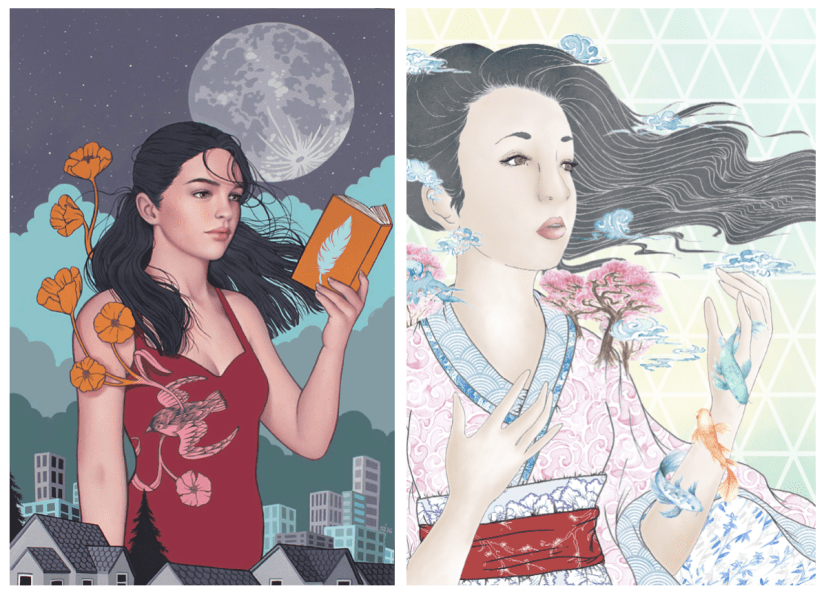
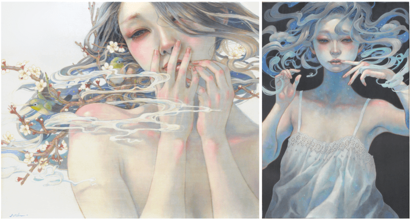
The idea fell into place quite quickly, as I was able to envision a rough layout after looking into my initial artist research, particularly the work of Sarah Joncas, as well as taking inspiration from my own past work:
Left: Night Life (Joncas, n.d.). Right Haru ‘Springtime’ (Collingwood, 2017)
The combination of figural elements and landscapes is something I’m already familiar with, and I was eager to work on something that is both beautiful and detailed, with architectural elements that were new territory to me.
I think I’ll be able to realise this piece fairly ‘easily’ compared to my other projects, where half of the battle was technique and workflow. I’m confident in my ability to produce this piece on Procreate, even thought that in itself will be a slight learning curve. However, that just means this is a good opportunity to fully immerse myself in the software- I plan to do final tidy up and processing on Photoshop, but Procreate boasts most of the same functions, so I want to make sure I’m widening my skills as much as possible.
I’ll have to keep a close eye on my time restraints and other projects (e.g. this blog!), as not keeping up with any one of these will negatively impact my progress. This has been a major weakness throughout my degree, and it’s never been so critically important to keep this in check!
Targets for the next few days include working on this piece (probably constantly), while also finding time to start collating my portfolio work and prepping for hand-in~
References
Collingwood, C. (2019). Haru ‘Springtime’ [mixed media].
Collingwood, C. (2019). Modernisation Concept 1 [digital].
Collingwood, C. (2019). Modernisation Concept 2 [digital].
Collingwood, C. (2019). Modernisation Concept 3 [digital].
As a tie-in post to my upcoming Year Review (edit: link here!), here’s a sneak peek of the slides I’ve prepared for my presentation I need to deliver next week. So scary!
This is a review of the entire year, and while most of the following will be purely visual, a full explanation will be posted very soon~
This slideshow requires JavaScript.
Click through to see quick reviews on each Semester, Final Outcomes, Reflection and SWOT for each project, Action Plans and Future Progression Options, as well as my trusty Radial Thinking infographic and bibliography for all my references~
I’ll fully explain all of this in my Year Review– which will be a bit of a whopper haha~
As a quick side note, even though I was still stressed and terrified to deliver this presentation, I feel as if I’ve come a long way compared to my first Project Proposal Presentation just before the start of Semester 1. I hope my mark reflects that I (hopefully) won’t be nearly as nervous! I’m also starting to be more confident when speaking about my work, because I’ve started to realise things with a much more solidified view on my personal style and ethics as an artist.
Another update will come next week once I’ve got this presentation day out of the way and I can work on starting the final realisation of my Cheltenham Illustration Awards project ♥
As I move into the final few months of student life before trying to establish myself as a freelance illustrator, I’m researching into online illustration agencies that represent some of my favourite national and international artists.
I’ll be looking at each agency individually, evaluating their clientele, ‘house style’, and other areas of interest.
Big Active
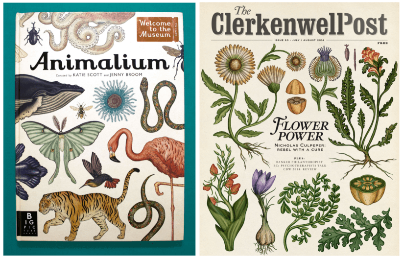
Big Active are a UK based agency that specialise in Art Direction, Graphic Design, Content Production and the promotion of artists. Having a quick flick through their artist repertoire, I see some familiar names, particularly Katie Scott (who illustrated the popular children’s reference book Animalium as well as other editorial works):
Animalium (Scott, 2014), The Clerkenwell Post Issue 20 (Scott, 2014)
Big Active don’t appear to have a particular house style, which is nice to see. Sometimes agencies that have specific aesthetic requirements for their artists can make it difficult to stand out from the crowd or to break into the industry- or even to get taken on by an agency in the first place! However, I suppose it would help if there were certain ‘go-to’ agencies for a particular style of work, as this could help a client seek out a selection of potential artists.
On their website they currently list only a small selection of artists… while they are all fairly recognisable names, I was expecting them to have a bigger selection- I’m not sure if it’s typical to have a small amount of artists in an agency. I’ll compare this to the amount of artists promoted at other agencies I’ll look at.
Handsome Frank
Another agency based in the UK, Handsome Frank bill themselves as “representing some of the finest contemporary artists on the planet”, also stating that they now “represent 35 illustrators, spread across five continents and we’ve worked with some of the biggest brands and agencies in the world” (Handsome Frank, n.d.).
At a first glance, Handsome Frank definitely appear to have a more minimalistic, graphic house style compared to Big Active, which was more diverse style wise. Artists include Jonathan Burton, Quentin Monge and Tom Haugomat, a Paris based illustrator specialising in stylish, graphic landscapes:
Archer Farms Coffee (Haugomat, 2018)
Overall I think Handsome Frank tend to a younger, more stylish client than some of the other agencies which offer a wider variety of styles for different applications. Their website layout is also quite graphic based, which complements the artwork nicely.
Lemonade Illustration Agency
While the other agencies so far have had a very minimalistic approach, Lemonade Illustration Agency presents a wide range of artistic styles and disciplines, whereas the other agencies seem to have more of a focus on illustration for certain commercial applications. Lemonade sets out its artists under different categories according to their suited disciplines, e.g. editorial (with an emphasis on children’s books), storyboarding and concept art (which doesn’t appear to have much obvious representation in either Big Active or Handsome Frank).
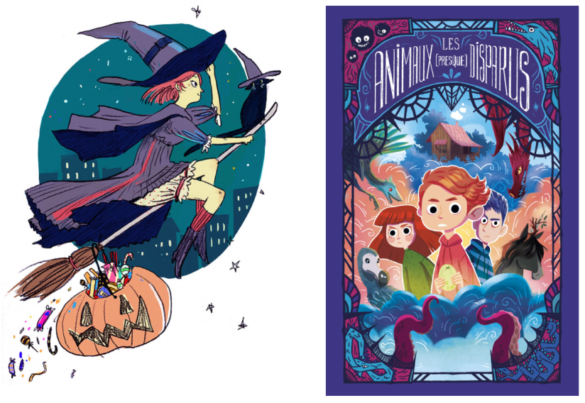
Lots of the work is very commercial and represents popular tastes, compared to the artists represented by the former examples I’ve researched, who are arguably aiming towards a more sophisticated, niche market. The amount of artists represented exceeds Big Active and Handsome Frank tenfold, and appears to have around the same amount of creatives as Central Illustration Agency. Artists include Marine Gosselin and Rose Frith, both of whom boast a very colourful, childlike aesthetic in their artwork:
Witchy (Frith, 2014), Les Animaux (Presque) Disparus (Gosselin, 2018).
Lemonade Illustration Agency has offices in London, Yorkshire, Sydney and New York promoting artists in markets worldwide.
Central Illustration Agency
Last but not least, Central Illustration Agency (CIA) is another larger global agency that represents artists in three categories on their website: Illustration, Motion and Physical. This is an interesting way to set out these categories, as it allows clients to pinpoint artists that are especially proficient at their chosen discipline or application.
Also similarly to Lemonade Illustration Agency, they seem to have a much more diverse appeal within their body of represented illustrators and creatives, compared to the very select selection of Big Active and Handsome Frank. There doesn’t seem to be a house style, resulting in a wide array of art styles and aesthetics.
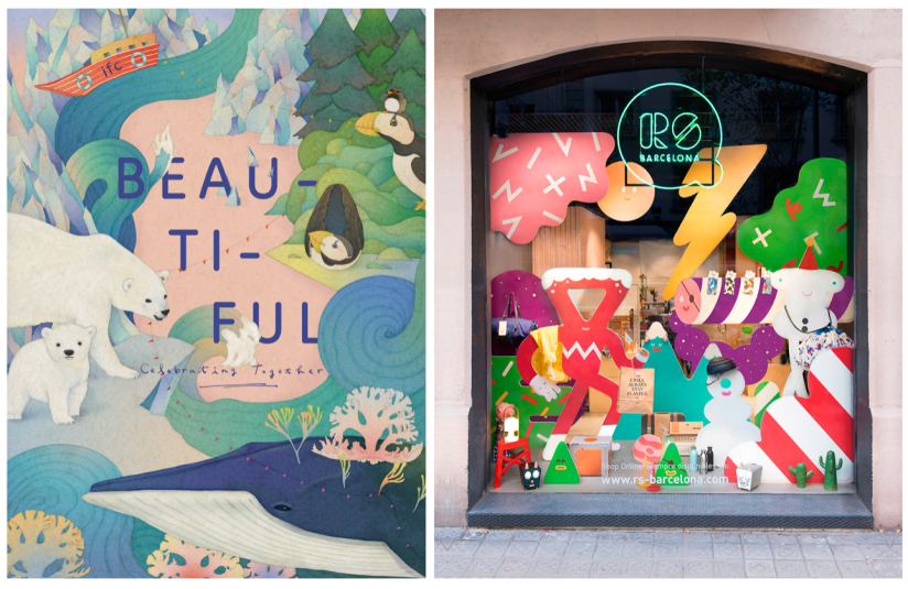
Artists include Whooli Chen and Brosmind, both of whom I’ve looked at in the past.
Hong Kong IFC Mall Brochure, Winter 2016: Beautiful – Celebrating Together (Chen, 2016), RS Concept Store: Christmas Display (Brosmind, 2017).
Looking at agencies still feels a bit overwhelming, but I’ve definitely gained some insight into the specifics of choosing an agency, and working with a company that appreciates an individual’s specific artistic traits and aesthetic.
References
Big Active (2016). Big Active – art direction, graphic design, creative consultancy and representation [online]. Available at: https://www.bigactive.com [Accessed 27 Mar 2019].
Brosmind (2017). RS Concept Store Barcelona: Christmas Display [mixed media].
Central Illustration Agency (n.d.). Central Illustration Agency – Home [online]. Available at: https://centralillustration.com [Accessed 28 Mar 2019].
Chen, W. (2016). Hong Kong IFC Mall Brochure, Winter 2016: Beautiful – Celebrating Together. [mixed media].
Frith, R. (n.d.). Witchy [digital].
Gosselin, M. (2018). Les Animaux (Presque) Disparus (The (Almost) Extinct Animals) [digital].
Handsome Frank (n.d.). Handsome Frank Illustration Agency [online]. Available at: https://www.handsomefrank.com [Accessed 27 Mar 2019].
Haugomat, T. (2018). Archer Farms Coffee [digital].
It’s been a bit of a weird week- I haven’t made as much progress as I’d hoped with this riso project but any progress is better than none at all! ♥
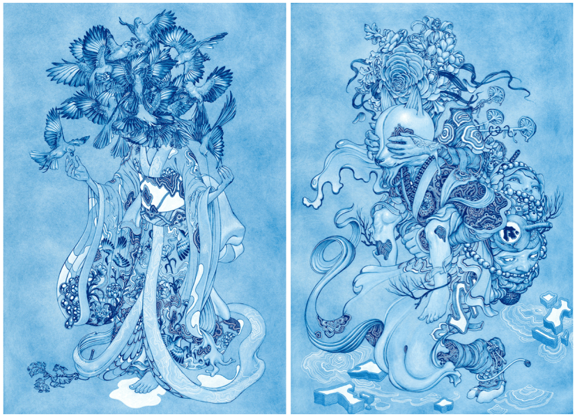
I’ve been looking at finalising my riso ideas, and while these are still fairly rough drafts I find it much easier to visualise a final concept in a neater, tidier visual style (e.g. I’ll be really finishing up the layout in the actual final piece process, which is much easier thanks to the flexibility of Procreate).
So far, I’ve got 4 potential ‘final’ layouts, each with differences that affect the way in which the artwork fills out the frame of the piece- since these will be A3, the actual image will be slightly smaller on each side (~2.5cm) due to the riso printing limitation. I’ve also begun to visualise how I can embellish these pieces (see the light gold coloured overlay on each piece for ideas on which areas I might work into- this is all TBC!).
China Risograph Print Final Concepts (Collingwood, 2019)
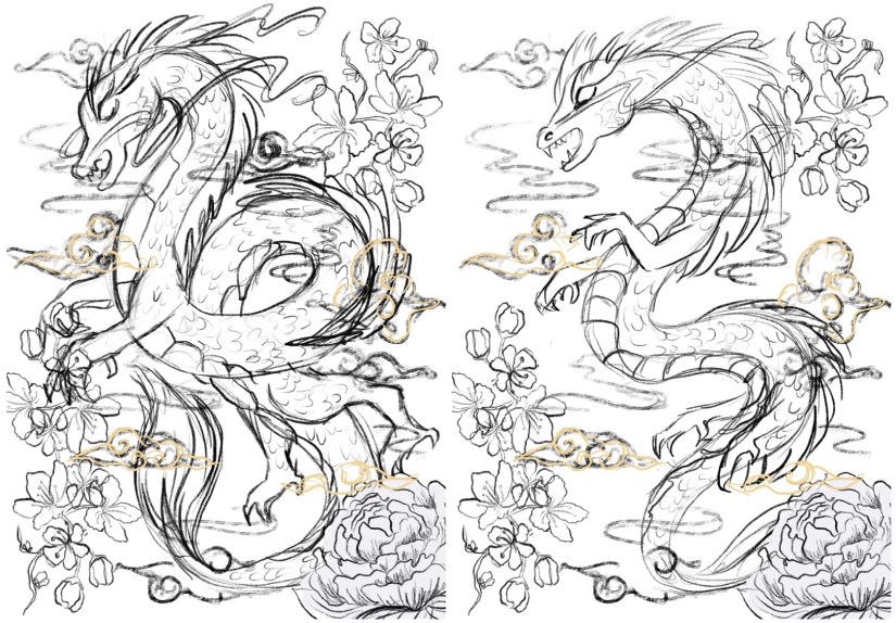
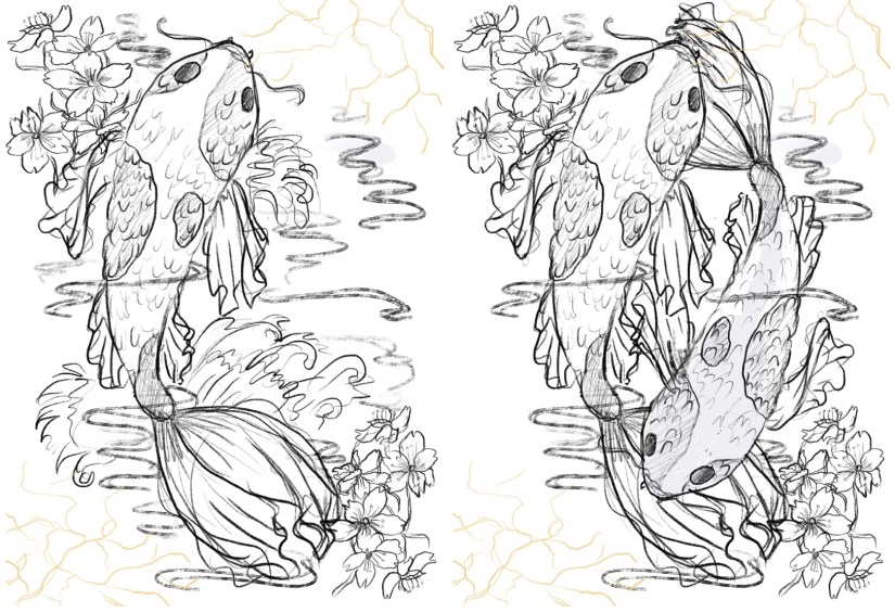
Japan Risograph Print Final Concepts (Collingwood, 2019)
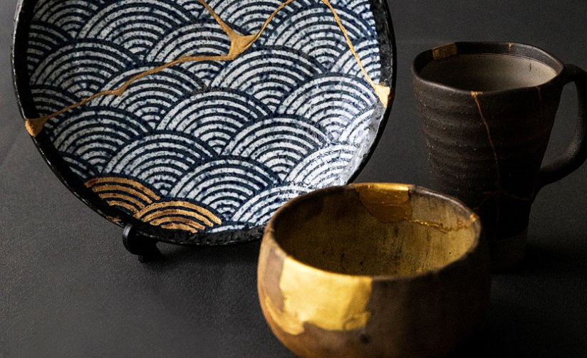
One technique I thought would work especially well on the Japanese/Koi Fish print was kintsugi inspired embellishment (which I’ve begun to visualise in the final concept sketches). I came across this art form during my visit to the Durham University Oriental Museum, where there were examples of ceramics displayed utilising this technique. The result was beautiful, and the idea behind the process even more so.
Kintsugi is based around the idea that the imperfect is beautiful- while some of us in the Western world prefer things to be new, Japanese people relish repairing broken items and seeing beauty in imperfection. This also links to the wabi-sabi philosophy, which centres around the idea that imperfection and the transience and fragility of perfection is accepted- far different to the obsession with perfection we have in the West.
I’d love to incorporate this into my work, as I too have a fascination with perfect things- I think it’d add some nice little imperfections into my pieces. The fact that I’ll be embellishing these by hand will mimic the original technique; the rest of the imagery will be digitally produced and collated, printing using the risograph which is very ‘perfect’ despite some natural variance in the process.
Kintsugi – Japanese Ceramic Gold Repair (Sydney Community College, n.d.)
I’ve also started to look at colour palettes and application for the final riso prints- since my palette is somewhat limited, I need to use my trusty Risotto colour swatch pack to look at alternative palettes that would work well. Since my artwork is mostly line-art based, I can use quite dark shades of the inks to intensify the line work while employing lighter, more subtle shades to add interest and shading.
This will be a target for the coming weeks after I’ve finished the base artwork- I’ll use Photoshop to manipulate the grayscale layers to view different colour palettes, which I’ll write about in my sketchbook.
I can’t wait to start properly visualising these finals… I’ll be using Procreate to render and layer my files ready for printmaking~
Blog post on this process coming soon! ❀
References
Carnazzi, S. (n.d.). Kintsugi: the art of precious scars[online]. Available at: https://www.lifegate.com/people/lifestyle/kintsugi [Accessed 21 Mar 2019].
Collingwood, C. (2019). China Risograph Print Final Concepts [digital].
Collingwood, C. (2019). Japan Risograph Print Final Concepts [digital].
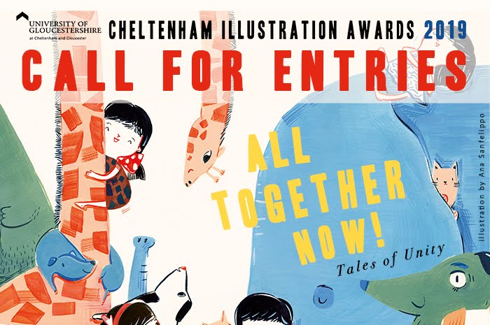
While I’m still working on finalising my risograph prints for Commercial Project 2 (hoping to have these printed in the next week or so), I’m going to start looking into the brief for the Cheltenham Illustration Awards (CIA) which was recently announced at the beginning of the month.
Cheltenham Illustration Awards: Call for Entries 2019 (University of Gloucestershire, Sanfellipo, 2019)
In previous years the theme has been ‘Tangled Tales’ and ‘Tales Through Other’s Eyes’, so this year’s theme of ‘All Together Now: Tales of Unity’ is quite different. My first thoughts are that this theme is a bit less varied and not open to interpretation as much as the previous themes of 2017 and 2018. I worked on a piece for the competition in 2017 and was admittedly able to shoehorn it into the theme (‘Tales Through Other’s Eyes’) without too much bother; my design was only loosely based on the given brief.
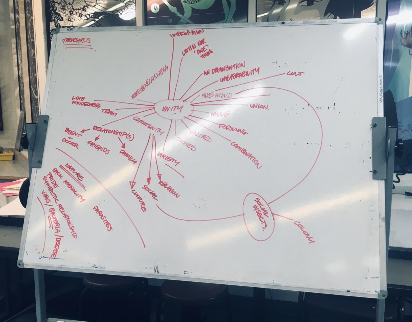
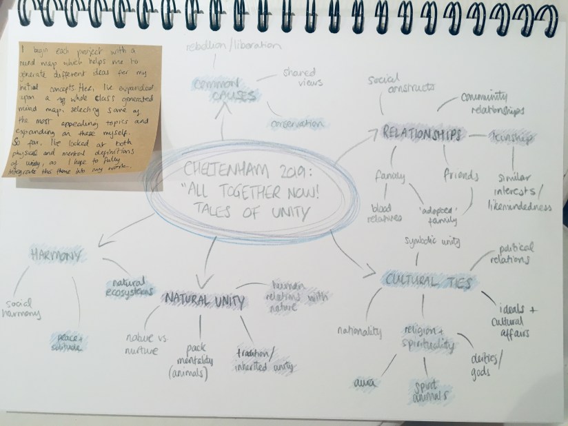
This year, I plan to work much more closely with the given theme to produce something that is tailored to this concept, rather than trying to twist an existing idea into meeting the needs of the brief. Based on a mind map by my entire class that I photographed (Collingwood, 2019), I’ve taken some of the most appealing ideas and made my own mind map that expands upon these concepts:
Cheltenham Illustration Awards Mind Map: ‘Unity’ (Collingwood, 2019)
My piece from 2017 was done digitally, and I daresay this is the best way of creating artwork intended for online entry/print- I will most likely adapt a similar workflow of digitally collaging both traditional and digital motifs/imagery to create a piece that successfully showcases my skillset.
The competition is open to student, emerging and established illustrators, with a deadline of 1st June 2019 (a bit over two months away at the time of writing this post), so I’ll have right up until our degree deadline of the 13th May to create something really special.
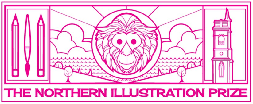
On another note, there’s been another recently announced competition that is new for this year and based in the North East. Northern School of Art (formerly CCAD) is running The Northern Illustration Prize in association with AOI, with this year’s theme being Monkey, based on the bizarre legend of the Hartlepool Monkey.
Northern Illustration Prize 2019 Banner (Northern School of Art, 2019)
I can’t say that theme has massively grabbed my attention, but with it being a new competition based in the North East it would be nice to enter. Since our degree course is brand new for this year, as a class we’re hoping to pull together some really good entries to put us on the map.
Like the Cheltenham Illustration Awards, it’s open to both emerging and established illustrators, with the prize being a fully funded studio in Hartlepool for one year. The prize is to mark the start of the Northern Festival of Illustration, a biennial event held in Hartlepool.
During these coming months I’ll have to be aware of my SWOT (strengths, weaknesses, opportunities and threats) more than ever, since I don’t want to let my grades slip at this crucial time. These are more of the same according to past projects- I’m good at realisation and research, but poor at timekeeping. This is both a weakness and a threat, but as this is the last project I’ll have to be acutely aware of how long is left before hand in- there’s no room for error here! Opportunity wise, I’m looking forward to be able to realise something and have full control over the outcome- most of my other projects have had a certain element of serendipity to them, where I’ve had to battle other elements in order to produce something I’m happy with.
My main target for the coming weeks will be to finish off the bulk of the work for the riso project- Once I get the images printed I can embellish the resulting prints at my leisure… or more likely, as an escape from what is most likely going to be hardcore planning and execution of this CIA 2019 project for the next few weeks!
Sanfellipo, A. (2019). Cheltenham Illustration Awards 2019 – Call For Entries: All Together Now! Tales of Unity [online]. Available at: http://www.cheltenham-illustration-awards.com/p/about.html [Accessed 8 Mar 2019]
Smith, R. (2019). ‘The Northern School of Art launches major international art prize ‘The Northern Illustration Prize’ [online]. NorthernArt.ac.uk. Available at: https://northernart.ac.uk/the-northern-school-of-art-launches-major-international-art-prize-the-northern-illustration-prize/ [Accessed 18 Mar 2019].
As part of the ongoing effort to look deeper into my artistic practice, I’ve designed an infograph detailing some of the most important areas of my process- these include:
Concrete Experience (career-based areas I have experience with, e.g. personal and professional development and networking opportunities)
Active Experimentation (my current skillset and areas of artistic/illustrative technique experience)
Reflective Observation (strengths and weaknesses of my artistic workflow)
Abstract Conceptualisation (potential/hopeful future collaborations within the industry and global context)
Find the infographic here or by using the top menu bar: Info -> Radial Thinking.
About a month ago we were set the impossible task of finding the latest issue of Hi-Fructose, a contemporary art quarterly magazine. I traipsed allllll over town trying to find one with no joy. Searches on eBay were also unfruitful, with only one seller listing the latest issue… and of course, they were sold out. :c
I resigned my search to maybe being able to find a back issue in the future. But last week I was browsing again on the off chance I might find a copy, and lo and behold- that seller had just restocked! Since the magazine was coming from Germany I wasn’t expecting it for at least 2 weeks, but it showed up on my doormat this morning~
Hi-Fructose: Issue 50 (Collingwood, 2019)
Here we have Issue 50 of Hi-Fructose, RRP $8.95- my cost was just under €14 with postage, which is fairly reasonable considering these magazines seem to be akin to gold dust in Europe.
Not gonna lie, I was expecting it to be a wee bit bigger than ~A4/letter size, but the quality feels great and it’s printed on nice sturdy stock. Peep that lush gold foiling on the cover! ♥ My poor photo really doesn’t do it justice! [Disclaimer: please excuse my horrible sausage fingers invading the rest of these pics!]
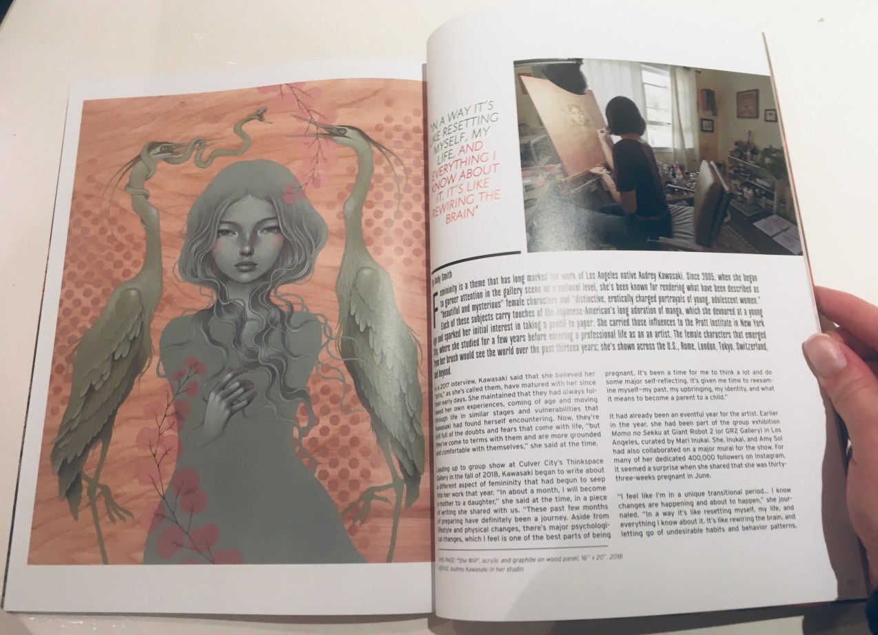
We’d been advised that any recent issue would do for this review task, but I was set on finding Issue 50 because Audrey Kawasaki is one of the featured artists- I’ll touch on her section of the magazine later since her section is near the end of the issue.
Having a quick flick through, there’s also the added bonus of a snazzy 16-page insert on the work of Jason Lemon- love this, it makes it feel very deluxe.
Hi-Fructose: Jason Limon Feature (Collingwood, 2019)
Going off on a tangent, this magazine also smells really good… woodsy and organic with only a very small smidge of plasticky print smell- hooray! I’m sure any fellow bibliophiles will attest to the fact that you can tell the quality of a printed publication by how good it smells~
The magazine is beautifully laid out, with very high quality photography and artwork alongside in-depth artist interviews that are genuinely interesting. Adverts are only found at the beginning and end of the publication, which is a welcome feature- I feel like adverts ruin the flow of a magazine and distract from the otherwise beautiful artwork.
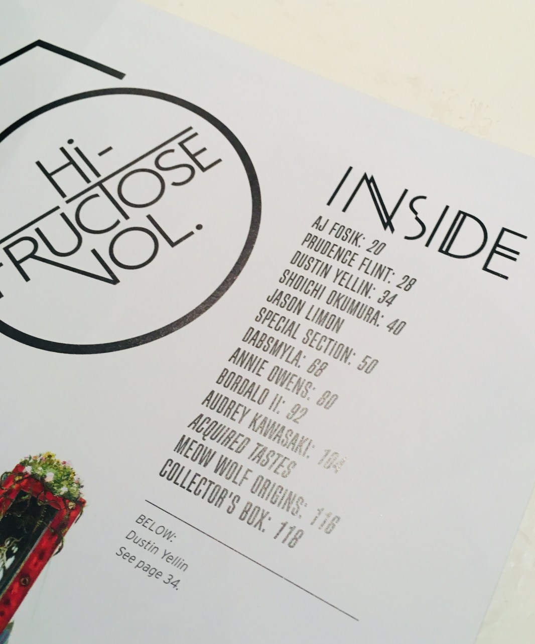
Hi-Fructose: Contents Page (Collingwood, 2019)
Featured artists for this issue include Annie Owens, DabsMyla, Shoichi Okumura, and of course Audrey Kawasaki, all of which have gorgeous artwork. Each section is from 6-12 pages long, with full page illustrations that are vivid and (mostly) of a good resolution. The interviews are set out beautifully and work well paired with both the illustrations and some candid shots of the artists as they work.
Hi-Fructose: DABSMYLA Feature (Collingwood, 2019)
My favourite section is Audrey Kawasaki’s interview- no surprise there! Her work is hauntingly beautiful. I’m already pretty familiar with her work, but the interview alongside her illustrations is obviously very up to date, which reveals new information on her current practice and workflow as well as aspects her life that are inspiring her work. The featured artworks are from 2016 onwards and were impeccably photographed. I love the typography set against her art on the ‘cover’ page of the article- there was obviously lots of love and care put into the layout and editing of this issue.
Overall this is a really nice art quarterly- my top fave is still Beautiful Bizarre as that’s suited to my taste a wee bit more, but I love looking at new and upcoming examples of illustration and Hi-Fructose didn’t disappoint. I only wish it was easier to find in the UK!
Thanks for reading~
References
Beautiful Bizarre (2019). Beautiful Bizarre Magazine [online]. Available at: https://beautifulbizarre.net [Accessed 12 Mar 2019].
Collingwood, C. (2019). Hi-Fructose: Audrey Kawasaki Feature [photograph].
Collingwood, C. (2019). Hi-Fructose: Contents Page [photograph].
Collingwood, C. (2019). Hi-Fructose: DABSMYLA Feature [photograph].
Collingwood, C. (2019). Hi-Fructose: Issue 50 [photograph]. Cover art: Fosik, AJ. Erratic Spell Release [polymer paint on wood].
Collingwood, C. (2019). Hi-Fructose: Jason Limon Feature [photograph].
Hi-Fructose (n.d.). Hi-Fructose|The New Contemporary Art Magazine [online]. Available at: https://hifructose.com [Accessed 12 Mar 2019].
Kawasaki, A. (n.d.). Audrey Kawasaki [online]. Available at: https://www.audkawa.com [Accessed 12 Mar 2019].
Rosa, E. (2019). Hi-Fructose. Issue 50. pp.13, 50-51, 76-77, 104-115.
Even though I’m looking at specific artists for each degree project in terms of suitability, application and style, there are a number of artists that inspire me in all of my artistic endeavours. By looking at the work of these creators, I’ve been able to hone my own style and artistic voice through looking at their work, finding my favourite aspects and fusing these elements together to create my own style. To reference one of my favourite quotes once again, Tony DiTerlizzi once said:
“…an artist’s “style” is simply an expression composed from a combination of the elements in other artist’s work that the artist finds appealing”. (DiTerlizzi, n.d.)
Here are just three of the best artists I follow that have influenced my own process and aesthetic~
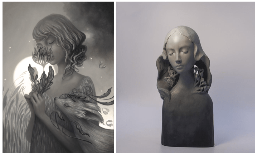
Amy Sol
I first came across Amy Sol’s work in an issue of Juxtapoz I was given to look at in the first year of my degree, and I instantly connected with the way in which she utilises fantasy setting and figural fauna and female elements to create an ethereal feel that is both haunting and endearing.
Embers (Sol, 2018), Rae (Sol, 2018).
A recent article from Juxtapoz Online tells of her inspiration and process:
“Exploring how nature and femininity intersect, Sol’s figures are elegant and serene with a stoic, introspective power. Both her sculptural work and oil paintings are frozen scenes taken from airy dreams and tales. Populated by bewitching figures and their mythic companions, each piece is a glimpse of a delicate ritual or parlance with nature. Incorporating traditional oil painting and sculpting techniques as well as virtual reality and 3D printing, Sol has masterfully blended mediums to explore light, atmosphere, dimensionality, and mood in this new body of work. Characters and figures are rendered both in graceful oil paintings and dynamic sculptural works utilizing digital- based and classic tools to create a visual language all her own.” (Juxtapoz, 2018)
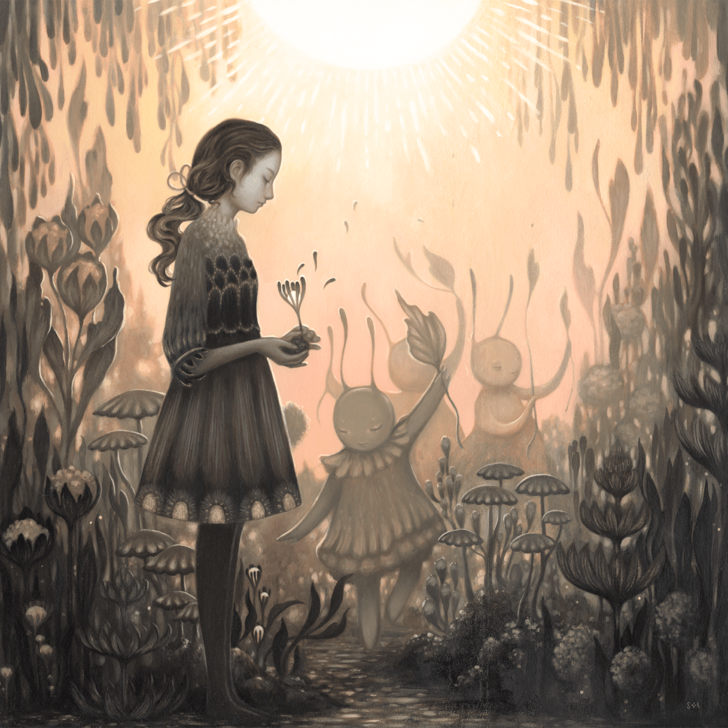
Diurnal Garden (Sol, 2018)
Since I first started following Sol, she has transitioned into a darker palette with more muted grey tones and less bright, pastel colours. I feel this is somewhat reflective in my own art, in the sense that I am starting to find it easier to refine my colour palette to suit a purpose, rather than combining colours from many different families. Nevertheless, I do still enjoy colour and like to embellish areas of my work with colour to draw a focal point or place of interest.
She also makes a wide use of flora and female characters in her work, something I also like to utilise wherever possible. Favouring female figures is a bit of a trend in the illustration world at the minute, but I find the female form so much more interesting and appealing… it seems a lot of artists agree! Combining form and nature is a quintessential match, and I love the diversity and endless possibility of working with this theme.
Overall I just find her work mesmerising ♥
Miho Hirano
Another one of my favourite artists, Miho Hirano’s work shares many of the same qualities with Amy Sol’s work- somber palettes embellished with slight touches of colour, and female focal figures that command the piece. She uses mostly oil paint in her work, which creates smooth fluid scenes and colours that blend seamlessly together which makes for a strong sense of surrealism.
The figures are often surrounded by flora and naturally curving patterns like foliage, smoke and hair- I often use these elements in my own work as I find they flow especially well together and I like to use as much naturally occurring imagery as possible. I especially love how she hides flowers within the hair of the figures, rather than just using them as a separate entity. Touching more upon this aspect of Hirano’s art, Tracy Eire of Beautiful Bizarre Magazine says:
“My first impulse was to connect the floral nature of Miho Hirano’s characters to reclaiming a confounded notion of womanhood, like women’s closeness to nature, their connection to the moon in myth and body, and painting them as entwined with untamed things.” (Eire, 2018)
In terms of feeling and emotion, the facial expressions of the figures play a big part in how the piece portrays these elements- the somber faces of the women in the paintings are a blank canvas for everything that surrounds them. I do find that a neutral expression cultivates a much more appealing aesthetic in my own work, leaving the possibility for the emotions of the viewer to be manipulated using other visual motifs; I find this creates a much more universally appealing piece. ♥
James Jean
I couldn’t write a favourite artists post without mentioning James Jean- I think he’s the artist that really inspired me to explore different varieties of illustration that were a bit more abstract, and has helped me grow out of my comfort zone- even though I still have a long way to go ^^”
I think my favourite aspect of Jean’s artwork is the engrossing, immersive atmospheres mixed with a distinctly Japanese aesthetic. Jean states that he was introduced to Hiroshige and Yoshitoshi during art college (Jean, 2016), which influenced him to start experimenting with sea-like waves and flowing forms in his art.
Adrift (Jean, 2016)
I adore these aspects, as once again this speaks to my personal love of curved and contoured form which flows across all areas, binding the artwork together. Referencing a 2016 article from It’s Nice That, James Jean and his interviewer Jamie Green expand on these themes:
“Creatures, critters and the tendrils of foliage wrap themselves around spectral figures, occupying worlds that seem to bleed out of the canvas. He casts his surreal and decaying fantasy worlds in technicolour blues, oranges and gold.” (Green, 2016)
“Despite my efforts to force my work to go in a certain direction, I keep going back to these dreamlike images. I suppose they are a selfish, self-indulgent escape from the anxiety-ridden age we live in.” (Jean, 2016)
Mockingbird (Jean, 2015), Piggyback (Jean, 2015)
The detail in these pieces is simply exquisite. Viewing Jean’s artwork is truly a joy, and evokes a very calming effect on the viewer. I’ve previously written about my attention to this particular aspect of emotion in my own work- see my Design Philosophies here ♥
There’s so many artists I’m inspired by, so this is only a small look at some of my favourites. I hope to write another post in the future about more artists that I love! Thanks for reading~
Back with another post on our day out at the Durham University Botanic Garden and Oriental Museum! Find my post on the Botanic Gardens here c:
Admittedly, I’m really not much of a museum-goer… I find them quite dry and stuffy at the best of times. However, I do have a deep appreciation of Asian culture and art, so I thought I’d give this museum a go since it sounds right up my street. The uni were also running a special admission deal for the Botanic Garden and the Oriental Museum on the same day~
Upon arriving the museum was nicely set out, organised in a tiered open space type layout- I know this has nothing to do with my research but it made it feel nice and airy in there (which made me much less anxious about spending hours getting lost in a blur of similar exhibits)!
Durham University Oriental Museum: Main Floor (Collingwood, 2019)
There were a plethora of cultures on show at the museum including Korean, Egyptian, Middle-Eastern and Indian exhibits which I thoroughly enjoyed; however, for the purpose of this post I’ll be looking specifically at Chinese and Japanese items, since that’s what I’m basing my project on.
We visited the Japanese exhibit first- although it was small, there were some gorgeous examples of early ceramics and pottery, as well as some ceremonial prayer set-ups and symbolic items. My favourite exhibit was the collection of traditional Hina Matsuri dolls. The attendant told me these are only displayed for a short time around Doll’s Day or Girl’s Day (celebrated on the 3rd March each year)- more on this holiday here if you’re curious!
Durham University Oriental Museum: Hina Matsuri Doll Display (Collingwood, 2019)
This is exactly what I was looking for to supplement the images of flora and fauna I’d taken in the gardens… I’m excited to work some of these visual styles into my concepts c:
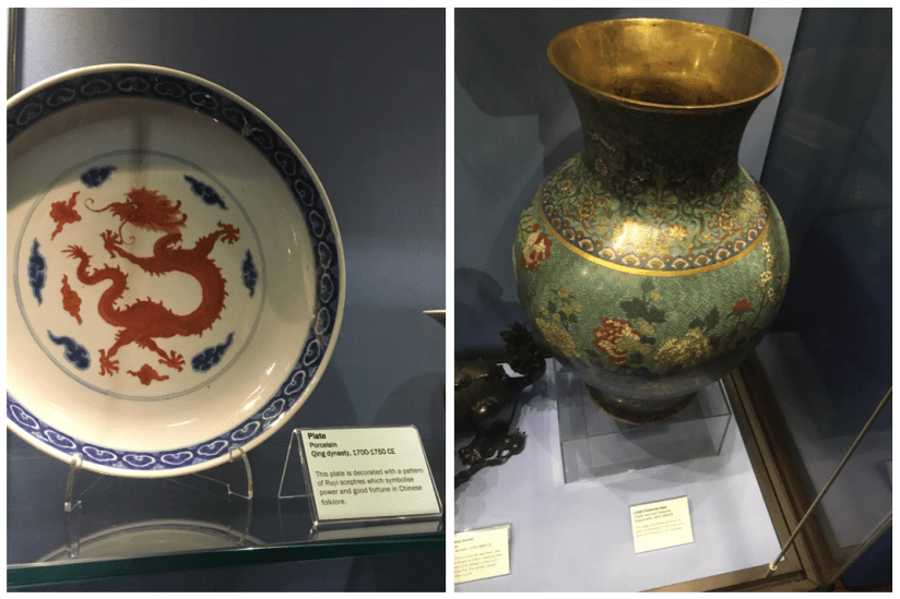
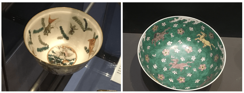
I then wandered across to the Chinese exhibit floors- there was a much larger space for Chinese items and artwork, so I was able to gather tons of really useful reference imagery. The ceramics and pottery were standouts for me; peek a few photos from the exhibit below. My favourite item was the huge Qing Dynasty cloisonné floral vase!
Durham University Oriental Museum: Qing Dynasty Red Dragon Plate/ Qing Dynasty Cloisonné Vase (Collingwood, 2019)Durham University Oriental Museum: Qing Dynasty Porcelain Bowl with Fish and Crane/Floral Horse Bowl (Collingwood, 2019)
At the far end of the Chinese floor was a huge paper replica of a traditional Chinese Dragon- with Chinese New Year being recently, it was nice to see an example of some more modern festive items. In particular I was happy to see this, since my current concepts for the Chinese risograph feature a traditional Chinese Dragon very prominently.
Durham University Oriental Museum: Upper Floor Chinese Dragon and Lanterns (Collingwood, 2019)
You may have noticed the quality of these photos is lacking in this post… truthfully I find museums to have horrendous lighting for photographing exhibits, so while most of my pics are useful and do the job, they’re not very nicely composed and a bit naff. There was also no flash photography, so I just had to make do with the conditions in there… and it was very dark >:c
Overall I thoroughly enjoyed my research visit to Durham. I’m so pleased I was able to source places to go for references for this project- I doubted I’d be able to find sufficient primary sources, so I was winning before I’d even begun~
I’m looking forward to working this new imagery into my concepts- I feel much more equipped to produce some lovely symbolic pieces of art that work well together and show my appreciation for the beauty of Asian culture ♥
References
Collingwood, C. (2019). Durham University Oriental Museum: Floral Horse Bowl[photograph].
Collingwood, C. (2019). Durham University Oriental Museum: Hina Matsuri Doll Display [photograph].
Collingwood, C. (2019). Durham University Oriental Museum: Main Floor[photograph].
Collingwood, C. (2019). Durham University Oriental Museum: Qing Dynasty Cloisonné Vase[photograph].
Collingwood, C. (2019). Durham University Oriental Museum: Qing Dynasty Porcelain Bowl with Fish and Crane[photograph].
Collingwood, C. (2019). Durham University Oriental Museum: Qing Dynasty Red Dragon Plate[photograph].
Collingwood, C. (2019). Durham University Oriental Museum: Upper Floor Chinese Dragon and Lanterns [photograph].
Wikipedia (n.d.). Wiki – Hina Matsuri [online]/ Available at: https://en.wikipedia.org/wiki/Hinamatsuri [Accessed 24 Feb 2019]
As part of my ongoing effort to source primary reference sources (this was a weakness in my workflow during Semester 1), I’ve been for a visit to the local Botanical Garden and the Oriental Museum, both of which are kept my Durham University. To prevent this from being overly wordy I’ll just talk about the Garden today, but I’ll be sure to make a post on the Oriental Museum in the future as both were fantastic!
In an attempt to catch some nice weather for the first part of the trip, we visited the Gardens first- of course, this was a failure because when do we ever have nice weather in the UK? It was really misty and since it’s still February, there wasn’t much to see in terms of flowers and blooms. I did spot a few British flowers planted at the front, but since my project is based on Asian flora, this wasn’t applicable to my area of research.
My favourite area of the garden is the collection of greenhouses, which contain ‘exotic’ plants that aren’t native to the UK. This is where I collected most of my references of succulents for my terrarium project, and at a slower pace I was able to discover some really nice plants that I could reference for this project.
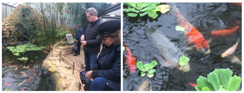
I also discovered another gem in the back conservatory of the greenhouse- koi fish! I hadn’t noticed these at all the first time I went in (I was in a pretty urgent hurry), so I took some time taking reference images of these fish. Here’s a pic of me employing my family to bait the fish with feed while I took photos haha:
Durham University Botanic Garden: Feeding the Koi/Koi Fish (Collingwood, 2019)
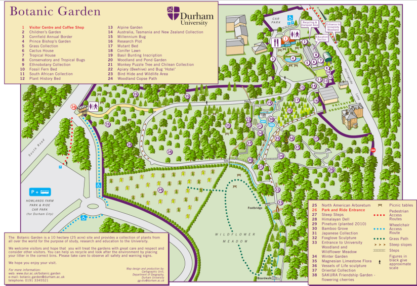
After having a good mooch through the tropical section, we ventured outside to the main garden. Looking at the map, there was a cluster of areas that interested me; the Bamboo Grove (30), the Japanese Collection (31), the Oriental Collection (37), and the Sakura Friendship Garden (38)- see these on the map below:
It was quite a trek, and when we arrived at the Oriental Collection there wasn’t too much to see- mostly trees and the odd leafy plant, but compared to the variety in the greenhouses it was a wee bit disappointing. Since it’s out of season, the Sakura Friendship Garden was also a bit underwhelming. Now obviously this garden doesn’t focus on flowering plants nor are they in season, so I sort of expected it to be limited- however, this is the best selection that’s accessible to me, so it’ll have to do for now~
Durham University Botanic Garden: SAKURA Friendship Garden (Collingwood, 2019)
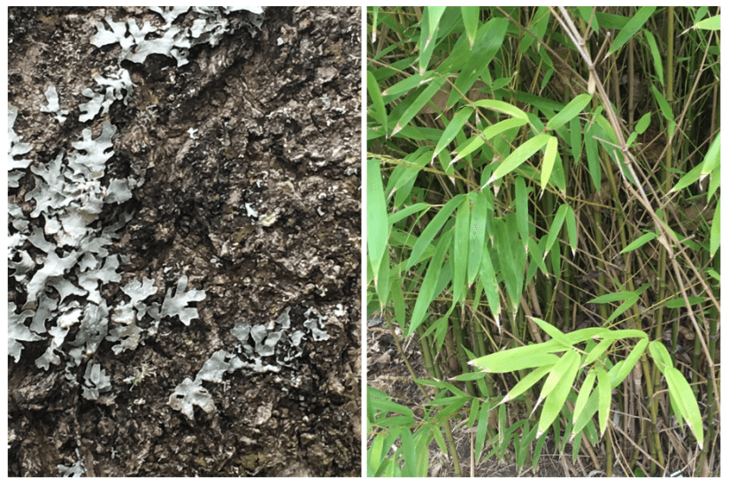
On the plus side, I really enjoyed the Bamboo Grove! Plenty of mossy textures and interesting leaves and branches to photograph- these will definitely come in handy.
Durham University Botanic Garden: Moss Specimen/Lostachys Aurea (Collingwood, 2019)
Despite the drawbacks, I really loved this garden- I’ve re-visited it quite often for inspiration and reference, the most recent being for my first experimental risograph project during Semester 1. That was a bit of a whirlwind visit since time was very short, but I was able to enjoy it much more this time around (despite there still being fairly little flora outside of the nice warm greenhouses!)
More in the next few days on the second leg of our trip- the Oriental Museum c:
[Edit 27th Feb: Oriental Museum trip report here!]
References
Collingwood, C. (2019). Durham University Botanic Garden: Feeding the Koi [photograph].
Collingwood, C. (2019). Durham University Botanic Garden: Koi Fish [photograph].
Collingwood, C. (2019). Durham University Botanic Garden: Lostachys Aurea [photograph].
Collingwood, C. (2019). Durham University Botanic Garden: SAKURA Friendship Garden [photograph].
Collingwood, C. (2019). Durham University Botanic Garden: Unidentified Moss Specimen [photograph].