research, SWOT/Target Setting

Risograph Realisation – Design Development

In my initial ideas, I’ve played with concepts such as traditional Asian-inspired pattern work (which I’m quite familiar with from past projects), basic floral motif work, and my favourite concept so far: prints based on national imagery associated with Japan and China.

I visited China last year and -for lack of a less cliché term- fell in love with how cultural significance is interwoven throughout every aspect of their design and aesthetic. The concept of a pair of prints representing China and Japan came from the idea of ‘where I’ve travelled to, and where I plan to go next’, combined with a deep appreciation of Asian culture and design. Since the two cultures influenced each other so much throughout history, a pair of prints encapsulating each country’s defining aesthetics works really well (both as an entity and as separate pieces of design).

After working on this idea, I was enjoying some down time in front of the telly and caught an episode of Monty Don’s Japanese Gardens (BBC Two, 2019)- obviously this appealed to me massively! The pair of episodes focused on the distinct seasons of spring and autumn in Japan, and how the foliage and flora changes accordingly. Of course, this inspired an alternative to my front-running design idea based on this aspect of Japanese culture and aesthetic design- nothing is by chance in Japanese design, not even nature!

Additionally, since the risograph printer is originally from Japan I thought it would be really interesting to combine traditional Japanese imagery with the newer technique of riso printing to create something that bridges the gap between traditional and modern technique.

I also really want to explore colour in this project, since we have some lovely new inks to use in this process (these being Purple, Teal and Green). I see lots of opportunity to incorporate these shades into my work to create something more refined and less blocky and loud compared to the terrarium project, which was printed in garish tones of blue and pink. I still like those prints, but I’m hoping to capture a totally different and more refined aesthetic with this project that’s also more visually in-line with other projects I’ve worked on.

To help me with colour matching, I’ve ordered a riso swatch pack from Risotto (a print studio based in Scotland that I’ve included in my research)- since it’s not very cost effective to make a test sheet of colour overlays and combinations myself, I thought I’d order a pack from a riso studio to use as a guide when fiddling with the opacities of my final image. I didn’t really make use of this design mechanic in Semester 1, so that’s a personal goal of mine for this project c:

IMG_8566
Risotto Studio Risograph ink swatches (Collingwood, 2019)


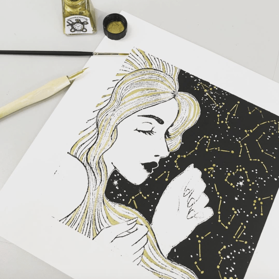
Here’s a pic of the contents of the pack- looking at these, I really wish we had a gold ink available at the college! It looks especially nice on black ♥ I’m still planning to embellish my final prints in ‘post-production’ using a variety of techniques- maybe even making some of them specific to a particular print. This will include metallic leaf work, so I can make a similar effect myself for now.

In terms of SWOT analysis for this week, I can work with my previous analysis from Semester 1’s PP1 (Printmaking), when I was also working on a riso project. Despite having more strengths with the riso medium than weaknesses due to valuable past experience, I still need to be aware of my biggest threat: timekeeping. However, the best opportunity for this semester will be to *actually* keep better time throughout, which is very doable since I’m still pretty early on in the term.

More next week when I nail down my final idea (I’m still a bit undecided!) and start refining this digitally~


References

Collingwood, C. (2019). Risotto Studio Swatch Pack. [Photograph].

Monty Don’s Japanese Gardens. (2019). BBC Two Television, 15 February.

Risotto Studio. (n.d.) Risotto Riso Room. [online]. RisottoStudio.com. Available at: https://www.risottostudio.com/print [Accessed 3 Feb 2019].


research

Commercial Project 2 – Risograph Realisation

There’s only 3-ish weeks until the release of the Cheltenham Illustration Awards theme and the start of the Call for Entries, so I’m coming back to the lovely process of risograph printing for a short and sweet 4 week project to fill my time until then~

This time around I already have a  good knowledge of the process and what it entails, as well as what types of artwork are best suited to the unique qualities of the risograph printer.

Since it’s quite an uncommon facility, I really want to make the most of my access to the riso this year while at college- there are other companies who print risographs to order (e.g. Risotto Studio, more on this later in my research) but these are few and far between and there’s nothing better than going through and learning the process yourself!

Armed with this prior experience, I’ll be able to produce much more refined prints that make better use of colour (including the new inks!!), as well as transparency/opacity levels and layout (e.g. line trapping, negative space, etc).

As always, I’ve begun the project with a mind map encompassing all of my ideas, areas for research and outcomes, as well as a rough workflow outline:

IMG_8962

Before mapping out my ideas, I also wrote a little synopsis of the project and what the aims are- might as well post below!~

Project Synopsis

  • For this project, I want to directly follow on from my initial risography experimentation in Semester 1, utilising my newfound skills, prior experience and increased colour availability to create a complementary pair of two prints. I will produce approx. 10 completed prints per image in a variety of finishes.
  • This pair of prints will be a continuation of the theme ‘Natural Pattern’, which I first explored in the experimental Printmaking project during Semester 1. I want to explore further natural subjects in these prints, merging together figure and flora/other naturally occurring elements, grouping these assets into themed outcomes that work well both individually and as a pair of complementary pieces.
  • I will be producing the imagery using Procreate, with additional hand applied processes such as metallic embellishment (e.g. hand-painted or screen printed, gold/silver leaf application) on select prints to add interest and unique elements. 
  • Ultimately, I’ll be aiming for the final prints to be of a good enough quality to be sold at my final show, in addition to being included in my portfolio as part of Personal Project 3 (PP3). 
  • I will also conduct thorough research before starting on my project as well as throughout the design process. This will include primary references, existing example research, risograph colour methods and printing applications, with additional visual development presented in an A4 sketchbook. 

As mentioned, I really want to make some nice prints to sell at final show- so this run of prints will be pretty commercial based rather than conceptual in order to meet the needs of the brief.

Targets for the coming week include starting to draw out some concepts (and finding/photographing references to go with these), as well as artist and existing imagery research. More next week! ♥


References

Risotto Studio (2019). Risotto Riso Room [online]. Available at: https://www.risottostudio.com/print  [Accessed 3 Feb 2019].

research

Semester 2 Overview

So I’ve had a lovely week off (a reward to myself for finishing Semester 1) and I’m so excited to start working on my Commercial Realisation project this term! ♥

We had a lecture about clarifying out intentions for this Semester, and we also discussed how our Portfolio projects are going to pan out- since our hand-in is mid-May but we need to spend a lot of time building our portfolios and exhibit materials, I really need to re-evaluate what I’ll be working on in order to produce the best products for final show. We’ve been told to finish most of our ‘formal’ degree work (with the accompanying vis dev and research) by mid-March, so this gives me a little over a month and a half to complete the Cheltenham Illustration Awards brief (which is revealed at the beginning of March), and the tentative Animation project (which was originally scheduled to be completed over a whopping 14 weeks)! These would be my two Commercial Projects, with the recurring Portfolio project being my Personal Project.

I’m certain that I still want to continue with the Cheltenham Illustration Awards, as the reasoning behind wanting to do that was to have a nice centrepiece for my end of year exhibit- I’d originally scheduled this project to be 5 weeks long, so this seems doable in the new timeframe.

The animation project (as a submission to the Adobe Awards) may have to sadly take a backseat as it’s most likely going to be too complex to complete to the best of my ability in the month that is available :c I fully intend to bring the existing work to fruition eventually- this might be a passion project of mine that I’ll take on in the summer after graduation… watch this space!

As an alternative, I want to further explore the riso and do some prints to submit to another competition- so far I’m thinking of basing them on the theme of the ‘Sun, Moon and Stars’ (this is extremely typical of me, haha)

I’m sad that I probably won’t be able to make my animation right now, but I really enjoyed working with the riso previously in Semester 1 and now that I have a lot more knowledge on the process and there are three new colours available, I’ll be able to make something really fancy~

My targets for next week include writing out a synopsis and briefs for my first project (Commercial Project 2), as well as starting initial concepts which I’ll work on while I wait for the CIA theme to be released.

research

Concept Development Progress

Now that I’ve signed off the Penguin Student Award and Printmaking projects, I can finally dedicate my focus to the Concept Development project- I’ve already conducted a bit of artist research late last year (my post about it is here), so this has already given me a good foundation on which to design my concepts~

For this project, I need to produce as much development/concept material as possible for the upcoming Animation Production project in Semester 2. This includes character/environment designs, storyboards, narrative info, and other supporting material that will be of use to me in the coming months.

I’m starting with the character designs, since I feel that this aspect is the most important, and therefore want to get this done first. I’ll be designing a human young female character (who’ll serve as the centric narrative device), as well as a more visually intricate anthropomorphic deer, who’ll act as an ‘opposite’ character, with contrasting design aesthetics, environment and colour palette. I’ve made two concept boards with palettes and existing artwork that mirror what I want to portray for each of these two characters… a few pics below from each board (all referenced at the end of this post):

screen shot 2019-01-25 at 12.28.04
Top left: Figure a. Top right: Figure b. Bottom left: Figure c. Bottom right: Figure d.
screen shot 2019-01-25 at 12.27.14
Top left: Figure e. Top right: Figure f. Bottom left: Figure g. Bottom right: Figure h.

Using these images and palettes as a loose style guide will help me to design characters that will complement these visual concepts, while also using my notes on personality and traits that I’ve written up in my sketchbook.

I always find it useful to map out key persona information before designing my character, as I often have a good idea of how I want them to act before I bring them to life on paper- this allows me to incorporate design elements into their aesthetic that support their individual personalities.

I’ll post next week with some character development sketches ♥


References

h. Heikkala, L. (n.d.). Pond [Ink].

e. Jansson, T. (n.d.). The Moomins concept art [Graphite, watercolour].

a. Ma Van As, Y. (2018). After School Violin Lessons [Digital].

c. Mountain Lumber. (n.d.). Reclaimed Antique Hickory [Photograph]. Available at: http://www.mountainlumber.com/portfolio_page/reclaimed-antique-hickory/ [Accessed 1 Dec 2018].

d. Rockefeller, M. (n.d.). Paul’s Cabin [Digital].

f. Studio Ghibli. (2010). Concept art from The Borrower Arrietty [Watercolour].

g. Studio Ghibli. (2010). Screen capture from The Borrower Arrietty [Animated feature].

b. Studio Ghibli. (2010). Concept art from Kiki’s Delivery Service [Watercolour].

research

January Update

It’s been a while, WordPress!

Sorry for the lack of updates, the reason being… there is very little to update on ^^”

I’ve taken some time to R&R during the holidays- burnout is real, and I’ve been feeling it for quite a while. Between my rubbish health and too many shifts at work I needed some ‘me time’ to recuperate and prepare to get down to business with my projects.

Having said all that, I feel more in tune with my artistic side again, so hopefully this will directly influence the quality of my work… here’s hoping~

The Wonder project was well underway prior to Christmas, so it’ll be nice to get back into that and finish off what I started before dedicating my time to the Animation Development project (saving the best for last… not sure that was the best idea!)

This week, I’m planning to cram in some good hours of degree work and finish off the remainder of the Penguin Award project- I’m excited to realise the final product. As soon as it’s all signed off (and I really do mean signed off- I’m not making any major last minute changes if I can help it as this stresses me out 10000%), I’ll dive right into the animation project…

Even though I’ve not been very productive on paper during the holidays, I’ve had many a thought swimming around in my head about exactly who my characters are, what their environments will be like down to the tiniest details and how they’ll interact with each other in the narrative, so I have a strong base to start with when I finally begin putting my ideas on paper.


More at the end of the week when I have something to show ♥

inspiration, research, SWOT/Target Setting

Concept Development – Project Beginnings

This new week means the start of a new project- quite the relief! As much as I enjoyed the riso project, it was very overwhelming learning literally an ENTIRELY new process, from the design basics to the niggly little details surrounding printing and technical issues. I’m not completely done with riso printing, however- I still hope to use it more actively in the new year, especially for print editions to sell at final show.

Onto the new project- Character and Narrative Development! As much as this represents its own set of experimental challenges, I’m hoping it’ll be a little more of a gradual learning curve, rather than the ‘throw myself in the deep end’ approach of the riso printing process ^^”

Thus far, I’m deep into the research portion of my workflow- since this project has been on my mind for a very long time (read: years), I already had quite a good vision of what the aesthetics of the environments and characters will look like. As such, my list of existing artist inspiration is long! To name a few, Nicole Gustafsson, Taryn Knight and Heikala are some of the most influential people I’ve looked at (examples of their work below.)

Screen Shot 2018-11-22 at 18.04.29.png
Left to right: Heikala, 2018. Gustafsson, 2018. Knight, 2018.

More on this in my artist research file, but I especially love Gustafsson’s work with anthropomorphic characters- this will be a big source of inspiration for my deer-man character. A similar simplified art style like Heikala’s work would work well for the animation, as I must always be mindful of the level of detail in the imagery- while I’ve timetabled quite a few weeks to realise the project, I don’t want to overwhelm myself with detail in the work.

I want the piece to have a warm, familiar feel with a woodsy colour palette for the most part- with warmer, organic tones for the deer-man and more youthful, fresh colours for the centric female character. More details on character, aesthetic and the more technical side of my project are documented in my initial mind map:

IMG_7944.jpg
My initial mood board for the project- gathers all my thinkings into one place! (Collingwood, 2018).

For the rest of the week, I’m aiming to make some mood boards that can portray my intentions for aesthetic, colour and character design in a very strong way- I often struggle to find faith in my initial ideas, especially when pitching them to other people, so I’m hoping a few mood boards that are well put together will aid me from the outset. (…did I also mention that mood boards are an excellent prop to hide behind during formal presentations…?)

In addition, I often like to fully flesh out my characters with MBTI personalities and trait lists… all part of my process to feel more connected to my characters. This will be the main focus of next week.

More soon ♥


References

Collingwood, C. (2018). Personal Project 2: Initial Mind Map.

Gustafsson, N. (2018). Shiba Spellcaster [Acrylic].

Heikkala, L. (2018). Astrochemist [Ink].

Knight, T. (2018). Untitled [Watercolour].

inspiration, research

November Update – Reflection and Target Setting

It’s been a wee while since I wrote the last post… it’s been a weird few weeks with only a little bit of progress unfortunately! I’ll hopefully be back into the swing of things now, with updates at least once weekly.

In terms of the riso project, I’ve finished everything bar the actual printing of the artwork… so yes, I’m slightly behind. I’ll correct this during this coming weeks while I work alongside the Character Design Development project so I don’t fall behind- I can’t afford to lose any project time this year.

Additionally, the list of book titles for the Penguin Student Award has been released- initially I was torn between Wonder by R.J. Palacio, and Norwegian Wood by Haruki Murakami. The current iterations of the cover art for both titles are very minimal and follow a specific theme throughout the rest of the author’s novels. Below are the two most recent covers released in the UK:

Screen Shot 2018-11-12 at 11.27.42.png
Left: Palacio, 2014. Right: Murakami, 1987.

Ultimately, I’m marginally more partial to Wonder, especially as I think some of the key imagery and thematic elements that are featured in the narrative lend themselves towards my style and interests slightly more than Norwegian Wood. More on this next month when I start production on the project~

I’m also due to start my Character Design/Animation Development project this month- I’ll do an update soon about my initial research and where I’m going with the characters and storyline. This is a project that I’ve had in mind for *years*, so it’ll be nice to finally bring it into realisation ♥

It’s been a rough few weeks but I’m excited for what lies ahead and for the upcoming projects I’ll be working on- but for now, I’ll be mostly focusing on finishing the riso project (e.g. doing some initial test prints while we wait for the new ink colours to arrive)- at present I’m in the dark as to what the test prints will yield. It could be that I’ll have to completely re-do my artwork, or alter some of the design, or a number of other things. I’m worried about it, but I’m also too excited to start the next project so my mind is all over the place! Hopefully I’ll be able to have some closure with the riso project soon.

Targets for the following month include finishing the riso project very soon (in order to leave ample time for the other two projects), as well as continuing to promote ‘radial thinking’ in my process, particularly as part of the experimental nature of Semester 1.


References

Palacio, R. (2014). Wonder. London: Corgi. p. Cover Artwork.

Murakami, H. (1987). Norwegian Wood. London: Vintage. p. Cover Artwork.

research

Risograph Research

It’s now the third week of my timetabled period in which I’m meant to be working on the Printmaking project; while the work I’ve produced in the past 2 weeks isn’t completely irrelevant, it’s high time I started getting deeper into the risograph side of things, e.g. how it works, the process and how to create artwork suitable for the riso.

Dare I say… from the research I’ve done so far, it actually sounds easier than I’d initially anticipated. An actual miracle.

From what I’ve gathered, risograph printing is essentially a cross between screen printing and photocopying, but more environmentally friendly and with a more limited colour range (MUCH more on this in my project research- I’m just doing a quick recap).

Having said that, it’s still quite technical and very different from the processes I’m used to working with. For example, you have to keep in mind the bleed areas around the design, the potential for accidental overlap, and the possibility of errors due to the machine, e.g. roller marks. However, through careful planning I’m certain a lot of these areas of concern can be sidestepped- respectively, this could be through careful border layout, trapping line and colour, and laying out heavily inked areas accordingly. (HatoPress.net, n.d.).

It’s quite a lot to keep in mind, but doing an ample amount of research prior to designing imagery has given me a really good basis of knowledge on which to build the project. My initial mind map helps me to plan out the work I need to do as the project progresses:

IMG_7945.jpg
Initial Mind Map- I find these useful at the start of every project. (Collingwood, 2018.)

Pending the success of this introductory project, I could utilise this technique to make zines, posters, business cards etc for final show- the colour palette might be more limited, but it’s infinitely less laborious than screen printing (and most of the other traditional printing processes, for that matter)~


References

Collingwood, C. (2018). Personal Project 1 – Initial Mind Map.

HatoPress.net. (n.d.). Printing – Risograph. [online] Available at: https://hatopress.net/printing/#guide-item-1 [Accessed 22 Oct. 2018].

inspiration, research

Printmaking – Screenprint Experimentation

To start the week, I’ll be working on concepts for the A4 screenprints we’ll be producing on Friday- as this is intended to be experimental, I’ll be straying away from my usual techniques, instead trying out digitally based fills for some of my initial ideas. For example, halftones, custom patterns, noise fills, and other fill techniques that produce results that will work well with a silk screen- since you can add lots of very fine detail with screenprinting, it’ll be a great opportunity to try these new styles out.

The last printmaking project I did involved monoprinting with a laser cut perspex plate- the results were mixed, but most importantly plate printing allowed for a lot less detail on the design (compared to screenprinting).

We were shown a mini tutorial on Photoshop and Cinema 4D, using shaded spheres as an example when applying each technique. They really looked like little planets… so I decided that using the solar system as a base would be a nice way to still include something from my own personal interest.

I may even make a second layer that details additional embellishment on the final design- this way, I can come back to my love of gold foil, using liquid glue to print the exact areas for foiling. I can then go in with the foil, brushing it on by hand. Going back to the monoprint project from Year 2, I used gold ink to work on top of my prints by hand after trying to print with glue… the pressure from the roller combined with the tackiness of the glue ended up a mess (lesson learned)

Screen Shot 2018-10-15 at 13.38.59.png
Collingwood, C. (2016)


Doing it by hand was tedious, but the results were good… yet not perfect. Look at the way the line art came out on the print- the details were too fine for the ink to stick to the printing plate when I rolled out the ink, especially with the white outline bordering the sky. It was a combination of the lines being too thin, and the ink being too thick. It was a lot more cost-effective compared to silk screen printing, but I feel plate printing is more suited to less detailed imagery.

With this new technique I’m trialling, I’ll be able to apply the foil with a lot more precision, yielding better results (as well as being able to have finer details on the base black layer). Also the gold foil is so much more vibrant and pretty compared to gold ink~

I’ll research this thoroughly before I go in and ruin all my prints, but I think if it works well this could be a really useful technique for the future.

There might even be the potential to create runs of hand-embellished prints (e.g. foils, inks, pattern collage, painted details), making each one unique. This could be a good way to market prints that I can sell, either at final show or on sites such as instagram, Etsy, etc.


Watch this space for a Friday update ♥

no pun intended


References

Collingwood, C. (2016). Cassiopia [Ink].

evaluation, research, SWOT/Target Setting

Reflection – 12.10.18

So, I ended up skipping an update last week- it would have been 500 words of me worrywarting over the presentation (glad that’s out the way!)

The presentation didn’t go amazingly, but I suppose it wasn’t exactly bad either. I’m grateful to have patient tutors that helped me through it! I ended up talking for a little over 10 minutes, which is leaning towards the longer side of things, especially since I tried my best to minimise talking by streamlining what I was going to say. In fact, I had a lot more to say that never actually came out of my mouth because of my anxiousness.

I just hope I’ve done enough to earn a First for this module… which is only worth 10 credits. Every little counts!

Friday AM was spent going through the new module (which includes all of the Semester 1 projects for this year). It’s nothing I haven’t done before- I’ll need to make sure I really keep on top of my Harvard Referencing throughout my research though, as this is imperative to passing this module.

We have the opportunity to do some A4 monochromatic screenprints a week today- quite short notice but I’m familiar with the process, preparing imagery etc., so this will be a nice introduction to my Printmaking project (which is mostly going to focus on riso prints).

I actually did quite a lot of screenprinting during my Textile design course, with (usually) successful results. I printed with single and multi colour designs (e.g. using more than one screen on a design), as well as printing with heat-sensitive glue in order to apply gold leaf to certain areas of wallpapers I was working on- that worked especially well.

I’ve learned a lot since then, so I’ll be applying newfound skills (as well as employing old skills that were successful) when I revisit this process next week. As I’ll personally own my printing frames, I’ll be able to continue making prints as often as I like throughout the year. Hopefully this leads to additional runs of prints, either ‘for fun’ or for final show.

Also, since the Proposal was handed in on Monday, I’ve finally been able to start some research into the risograph print process- I really need to educate myself well on the techniques that are available to me, since this is totally new territory for me and I’m determined to make something nice for the first project (to be honest, it’d be great if I could get the hang of the riso enough to be able to make prints to sell at final show… ^^)

Thus far, I’ve looked a little bit into the actual process and what it entails, as well as the process of preparing imagery for printing. I’ll go into more detail in my research file for this project.

Really I think most of my skill learning for the riso will be ‘on the job’, mainly in the form of trial and error/experimentation… that’s the entire point of Semester 1~

So, my targets for the next week include solidifying my workflow and researching deeper into the risograph process. One of my biggest ‘weaknesses’ of this project will be a lack of prior knowledge, but I’m confident I can turn this around into a strength in my skillset as I learn more about how risograph prints are processed and created.


More on this in the coming weeks!