inspiration, research

Artist Inspiration: 3 of My Favourite Artists

Even though I’m looking at specific artists for each degree project in terms of suitability, application and style, there are a number of artists that inspire me in all of my artistic endeavours. By looking at the work of these creators, I’ve been able to hone my own style and artistic voice through looking at their work, finding my favourite aspects and fusing these elements together to create my own style. To reference one of my favourite quotes once again, Tony DiTerlizzi once said:

“…an artist’s “style” is simply an expression composed from a combination of the elements in other artist’s work that the artist finds appealing”. (DiTerlizzi, n.d.)

Here are just three of the best artists I follow that have influenced my own process and aesthetic~

Amy Sol

I first came across Amy Sol’s work in an issue of Juxtapoz I was given to look at in the first year of my degree, and I instantly connected with the way in which she utilises fantasy setting and figural fauna and female elements to create an ethereal feel that is both haunting and endearing.

Screen Shot 2019-03-18 at 13.13.59.png
Embers (Sol, 2018), Rae (Sol, 2018).


A recent article from Juxtapoz Online tells of her inspiration and process:

“Exploring how nature and femininity intersect, Sol’s figures are elegant and serene with a stoic, introspective power. Both her sculptural work and oil paintings are frozen scenes taken from airy dreams and tales. Populated by bewitching figures and their mythic companions, each piece is a glimpse of a delicate ritual or parlance with nature. Incorporating traditional oil painting and sculpting techniques as well as virtual reality and 3D printing, Sol has masterfully blended mediums to explore light, atmosphere, dimensionality, and mood in this new body of work. Characters and figures are rendered both in graceful oil paintings and dynamic sculptural works utilizing digital- based and classic tools to create a visual language all her own.” (Juxtapoz, 2018)

7DiurnalGarden.png
Diurnal Garden (Sol, 2018)


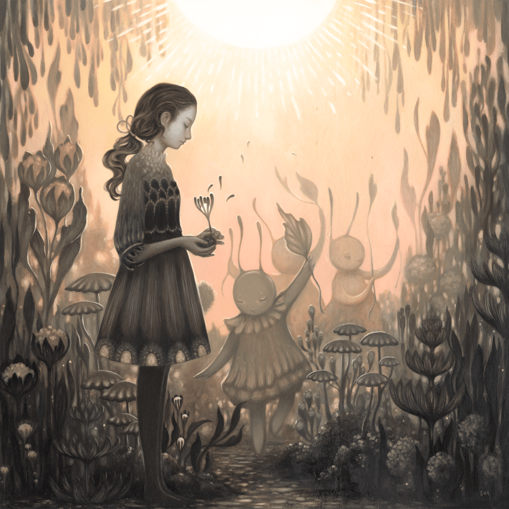
Since I first started following Sol, she has transitioned into a darker palette with more muted grey tones and less bright, pastel colours. I feel this is somewhat reflective in my own art, in the sense that I am starting to find it easier to refine my colour palette to suit a purpose, rather than combining colours from many different families. Nevertheless, I do still enjoy colour and like to embellish areas of my work with colour to draw a focal point or place of interest.

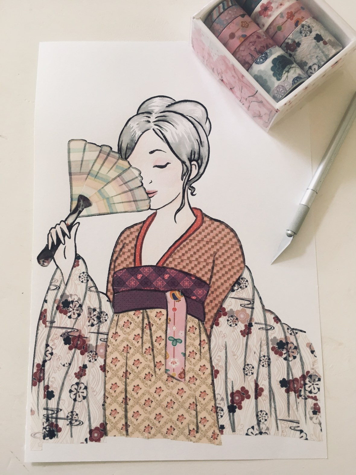
She also makes a wide use of flora and female characters in her work, something I also like to utilise wherever possible. Favouring female figures is a bit of a trend in the illustration world at the minute, but I find the female form so much more interesting and appealing… it seems a lot of artists agree! Combining form and nature is a quintessential match, and I love the diversity and endless possibility of working with this theme.

Overall I just find her work mesmerising ♥
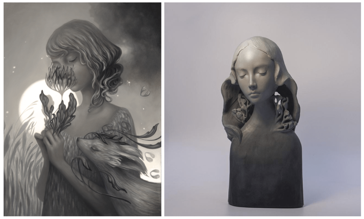
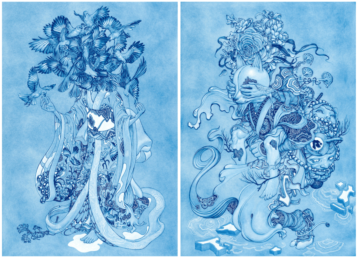
 

Miho Hirano

Another one of my favourite artists, Miho Hirano’s work shares many of the same qualities with Amy Sol’s work- somber palettes embellished with slight touches of colour, and female focal figures that command the piece. She uses mostly oil paint in her work, which creates smooth fluid scenes and colours that blend seamlessly together which makes for a strong sense of surrealism.

Screen Shot 2019-03-18 at 22.09.07
自慈 ‘Self Pity’ (Hirano, 2015),  夢占い ‘Dream Divination’ (Hirano, 2016)


The figures are often surrounded by flora and naturally curving patterns like foliage, smoke and hair- I often use these elements in my own work as I find they flow especially well together and I like to use as much naturally occurring imagery as possible. I especially love how she hides flowers within the hair of the figures, rather than just using them as a separate entity. Touching more upon this aspect of Hirano’s art, Tracy Eire of Beautiful Bizarre Magazine says:

“My first impulse was to connect the floral nature of Miho Hirano’s characters to reclaiming a confounded notion of womanhood, like women’s closeness to nature, their connection to the moon in myth and body, and painting them as entwined with untamed things.” (Eire, 2018)

In terms of feeling and emotion, the facial expressions of the figures play a big part in how the piece portrays these elements- the somber faces of the women in the paintings are a blank canvas for everything that surrounds them. I do find that a neutral expression cultivates a much more appealing aesthetic in my own work, leaving the possibility for the emotions of the viewer to be manipulated using other visual motifs; I find this creates a much more universally appealing piece. ♥


James Jean

I couldn’t write a favourite artists post without mentioning James Jean- I think he’s the artist that really inspired me to explore different varieties of illustration that were a bit more abstract, and has helped me grow out of my comfort zone- even though I still have a long way to go ^^”

I think my favourite aspect of Jean’s artwork is the engrossing, immersive atmospheres mixed with a distinctly Japanese aesthetic. Jean states that he was introduced to Hiroshige and Yoshitoshi during art college (Jean, 2016), which influenced him to start experimenting with sea-like waves and flowing forms in his art.

James_Jean__Adrift_adrift-final-webres
Adrift (Jean, 2016)


I adore these aspects, as once again this speaks to my personal love of curved and contoured form which flows across all areas, binding the artwork together. Referencing a 2016 article from It’s Nice That, James Jean and his interviewer Jamie Green expand on these themes:

“Creatures, critters and the tendrils of foliage wrap themselves around spectral figures, occupying worlds that seem to bleed out of the canvas. He casts his surreal and decaying fantasy worlds in technicolour blues, oranges and gold.” (Green, 2016)

 “Despite my efforts to force my work to go in a certain direction, I keep going back to these dreamlike images. I suppose they are a selfish, self-indulgent escape from the anxiety-ridden age we live in.” (Jean, 2016)

Screen Shot 2019-03-20 at 23.45.02
Mockingbird (Jean, 2015), Piggyback (Jean, 2015)


The detail in these pieces is simply exquisite. Viewing Jean’s artwork is truly a joy, and evokes a very calming effect on the viewer. I’ve previously written about my attention to this particular aspect of emotion in my own work- see my Design Philosophies here

There’s so many artists I’m inspired by, so this is only a small look at some of my favourites. I hope to write another post in the future about more artists that I love! Thanks for reading~


References

DiTerlizzi, T. (n.d.). Frequently Asked Questions: Art and Illustration – Tony DiTerlizzi.[Online] Diterlizzi.com. Available at: http://www.diterlizzi.com/faq-category/03-art-and-illustration  [Accessed 1st Oct 2018].

Eire, T. (2018). Hair and Hirano – Beautiful Bizarre Magazine [online]. Available at: https://beautifulbizarre.net/2018/02/15/hair-and-hirano/ [Accessed 8 Mar 2019].

Green, J., Jean, J. (2016). It’s Nice That|James Jean’s phantasmagorical world of technicolour fever dreams [online]. Available at: https://www.itsnicethat.com/articles/james-jean-zugzwang-phantasmagorical-paintings-180816  [Accessed 8 Mar 2019].

Hirano, M. (2016). 夢占い ‘Dream Divination’ [oil paint].

Hirano, M. (n.d.). Instagram – @mihohiranoart [online]. Available at: https://www.instagram.com/mihohiranoart [Accessed 8 Mar 2019].

Hirano, M. (2014). Miho Hirano|Powered by Strikingly [online]. Available at: http://mihohirano.strikingly.com [Accessed 8 Mar 2019].

Hirano, M. (2015). 自慈 ‘Self Pity’ [oil paint].

Jean, J. (2015) Adrift [mixed media].

Jean, J. (n.d.). Instagram – @jamesjeanart [online]. Available at: https://www.instagram.com/jamesjeanart/  [Accessed 8 Mar 2019].

Jean, J. (n.d.). James Jean [online]. Available at: http://www.jamesjean.com [Accessed 8 Mar 2019].

Jean, J. (2015) Mockingbird [mixed media].

Jean, J. (2015) Piggyback [mixed media].

Sol, A. (2019). amy sol. [online]. Available at: http://www.amysol.com [Accessed 8 Mar 2019].

Sol, A. (2018). AN INTERVIEW WITH AMY SOL ON HER NEW SHOW “LORE” AT SPOKE ART [online]. Available at:  https://www.juxtapoz.com/news/painting/an-interview-with-amy-sol-on-her-new-show-lore-at-spoke-art/  [Accessed 8 Mar 2019].

Sol, A (2018). Diurnal Garden [oil paint]. 

Sol, A (2018). Embers [oil paint]. 

Sol, A. (n.d.). Instagram – @amysol [online]. Available at: https://www.instagram.com/amysol [Accessed 8 Mar 2019].

Sol, A (2018). Rae [resin, enamel, oil paint]. Available at: https://spoke-art.com/collections/amy-sol-lore/products/amy-sol-rae  [Accessed 8th Mar 2019].

evaluation, SWOT/Target Setting

March 2019 – Progress and Reflection

It’s been a week or so since my visit to the museum, and I feel that despite always feeling that I’ve never done enough work (this is probably part *actual* truth and part self belief issues haha), I’m happy that I’ve managed to nail down my final concept after a series of initial and developed designs.

I think this riso project dragged a bit for the first couple of weeks- I suspect this is due to the fact that I spent a lot of time researching into the imagery that I wanted to use. I’m very aware of this subject matter potentially walking a fine line between appreciation and appropriation, so I wanted to take the extra steps to ensure I was representing each culture accurately. I also made use of my current knowledge as I do have a strong general interest in this topic, but I’ve learned so much more through thorough research. It’s always better to be safe than sorry, and I’m pleased that I was also able to expand my research file with this~

Drawing out the initials is really tedious for me- I much prefer sketching out the development, since this is building on an idea I really want to do (rather than drawing out ‘filler’ ideas). I fully admit I usually have a somewhat fully formed initial idea in my head when I start a project, so it can be hard to stray from this or try to show enthusiasm for the other initial ideas ^^”

Another thing I really wished I’d done was to do all of my initials and development digitally- as well as aiding in the general layout, working digitally is much neater and less messy than scribbly pencil drawings (which my sketchbooks are notorious for). I tried to remedy this by doing a few little ‘key icons’ research pages in watercolour in my sketchbook- the phrase “you can’t polish a turd” comes to mind, but I had fun doing them anyway!

japaniconsheet
Japan Icon Sheet (Collingwood, 2019)


chinaiconsheet
China Icon Sheet (Collingwood, 2019)


It was really strange drawing and colouring something refined traditionally- I never thought it would come to this but I actually really prefer digital now! Especially since I’ve started working on Procreate with my iPad, since the technicality and effects both mimic tradition workflows very well. Throwback to the iPad review I wrote- read it here

Targets for the coming weeks include finishing off my digitised concepts, taking these into the final design stages, and looking further into colour choices with the riso.

I’ll have to be mindful of any threats to my progress such as time restraints and poor planning, as these things have hindered me in the past- however, I’m determined to keep better time this semester, as one of my targets from a few weeks ago was to manage time better.

More to come soon!


References 

Collingwood, C. (2019). China Icon Sheet [ink, watercolour].

Collingwood, C. (2019). Japan Icon Sheet [ink, watercolour].

research

Durham University: Oriental Museum Visit

Back with another post on our day out at the Durham University Botanic Garden and Oriental Museum! Find my post on the Botanic Gardens here c:

Admittedly, I’m really not much of a museum-goer… I find them quite dry and stuffy at the best of times. However, I do have a deep appreciation of Asian culture and art, so I thought I’d give this museum a go since it sounds right up my street. The uni were also running a special admission deal for the Botanic Garden and the Oriental Museum on the same day~

Upon arriving the museum was nicely set out, organised in a tiered open space type layout- I know this has nothing to do with my research but it made it feel nice and airy in there (which made me much less anxious about spending hours getting lost in a blur of similar exhibits)!

Screen Shot 2019-03-01 at 14.40.53
Durham University Oriental Museum: Main Floor (Collingwood, 2019)

There were a plethora of cultures on show at the museum including Korean, Egyptian, Middle-Eastern and Indian exhibits which I thoroughly enjoyed; however, for the purpose of this post I’ll be looking specifically at Chinese and Japanese items, since that’s what I’m basing my project on.

We visited the Japanese exhibit first- although it was small, there were some gorgeous examples of early ceramics and pottery, as well as some ceremonial prayer set-ups and symbolic items. My favourite exhibit was the collection of traditional Hina Matsuri dolls. The attendant told me these are only displayed for a short time around Doll’s Day or Girl’s Day (celebrated on the 3rd March each year)- more on this holiday here if you’re curious!

IMG_8830
Durham University Oriental Museum: Hina Matsuri Doll Display (Collingwood, 2019)

This is exactly what I was looking for to supplement the images of flora and fauna I’d taken in the gardens… I’m excited to work some of these visual styles into my concepts c:

I then wandered across to the Chinese exhibit floors- there was a much larger space for Chinese items and artwork, so I was able to gather tons of really useful reference imagery. The ceramics and pottery were standouts for me; peek a few photos from the exhibit below. My favourite item was the huge Qing Dynasty cloisonné floral vase!

Screen Shot 2019-03-02 at 19.01.21
Durham University Oriental Museum: Qing Dynasty Red Dragon Plate/ Qing Dynasty Cloisonné Vase (Collingwood, 2019)
Screen Shot 2019-03-02 at 19.00.55
Durham University Oriental Museum: Qing Dynasty Porcelain Bowl with Fish and Crane/Floral Horse Bowl (Collingwood, 2019)

At the far end of the Chinese floor was a huge paper replica of a traditional Chinese Dragon- with Chinese New Year being recently, it was nice to see an example of some more modern festive items. In particular I was happy to see this, since my current concepts for the Chinese risograph feature a traditional Chinese Dragon very prominently.

IMG_8864
Durham University Oriental Museum: Upper Floor Chinese Dragon and Lanterns (Collingwood, 2019)

You may have noticed the quality of these photos is lacking in this post… truthfully I find museums to have horrendous lighting for photographing exhibits, so while most of my pics are useful and do the job, they’re not very nicely composed and a bit naff. There was also no flash photography, so I just had to make do with the conditions in there… and it was very dark >:c

Overall I thoroughly enjoyed my research visit to Durham. I’m so pleased I was able to source places to go for references for this project- I doubted I’d be able to find sufficient primary sources, so I was winning before I’d even begun~

I’m looking forward to working this new imagery into my concepts- I feel much more equipped to produce some lovely symbolic pieces of art that work well together and show my appreciation for the beauty of Asian culture ♥


References

Collingwood, C. (2019). Durham University Oriental Museum: Floral Horse Bowl [photograph].

Collingwood, C. (2019). Durham University Oriental Museum: Hina Matsuri Doll Display [photograph].

Collingwood, C. (2019). Durham University Oriental Museum: Main Floor [photograph].

Collingwood, C. (2019). Durham University Oriental Museum: Qing Dynasty Cloisonné Vase [photograph].

Collingwood, C. (2019). Durham University Oriental Museum: Qing Dynasty Porcelain Bowl with Fish and Crane [photograph].

Collingwood, C. (2019). Durham University Oriental Museum: Qing Dynasty Red Dragon Plate [photograph].

Collingwood, C. (2019). Durham University Oriental Museum: Upper Floor Chinese Dragon and Lanterns [photograph].

Wikipedia (n.d.). Wiki – Hina Matsuri [online]/ Available at:  https://en.wikipedia.org/wiki/Hinamatsuri [Accessed 24 Feb 2019]

research

Durham University: Botanic Garden Visit

As part of my ongoing effort to source primary reference sources (this was a weakness in my workflow during Semester 1), I’ve been for a visit to the local Botanical Garden and the Oriental Museum, both of which are kept my Durham University. To prevent this from being overly wordy I’ll just talk about the Garden today, but I’ll be sure to make a post on the Oriental Museum in the future as both were fantastic!

In an attempt to catch some nice weather for the first part of the trip, we visited the Gardens first- of course, this was a failure because when do we ever have nice weather in the UK? It was really misty and since it’s still February, there wasn’t much to see in terms of flowers and blooms. I did spot a few British flowers planted at the front, but since my project is based on Asian flora, this wasn’t applicable to my area of research.

My favourite area of the garden is the collection of greenhouses, which contain ‘exotic’ plants that aren’t native to the UK. This is where I collected most of my references of succulents for my terrarium project, and at a slower pace I was able to discover some really nice plants that I could reference for this project.

I also discovered another gem in the back conservatory of the greenhouse- koi fish! I hadn’t noticed these at all the first time I went in (I was in a pretty urgent hurry), so I took some time taking reference images of these fish. Here’s a pic of me employing my family to bait the fish with feed while I took photos haha:

Screen Shot 2019-03-01 at 13.03.07
Durham University Botanic Garden: Feeding the Koi/Koi Fish (Collingwood, 2019)

After having a good mooch through the tropical section, we ventured outside to the main garden. Looking at the map, there was a cluster of areas that interested me; the Bamboo Grove (30), the Japanese Collection (31), the Oriental Collection (37), and the Sakura Friendship Garden (38)- see these on the map below:

Screen Shot 2019-03-01 at 13.31.20
Botanic Garden Visitor Map (Durham University, n.d.)

It was quite a trek, and when we arrived at the Oriental Collection there wasn’t too much to see- mostly trees and the odd leafy plant, but compared to the variety in the greenhouses it was a wee bit disappointing. Since it’s out of season, the Sakura Friendship Garden was also a bit underwhelming. Now obviously this garden doesn’t focus on flowering plants nor are they in season, so I sort of expected it to be limited- however, this is the best selection that’s accessible to me, so it’ll have to do for now~

Screen Shot 2019-03-01 at 14.06.28
Durham University Botanic Garden: SAKURA Friendship Garden (Collingwood, 2019)

On the plus side, I really enjoyed the Bamboo Grove! Plenty of mossy textures and interesting leaves and branches to photograph- these will definitely come in handy.

Screen Shot 2019-03-01 at 13.47.46
Durham University Botanic Garden: Moss Specimen/Lostachys Aurea (Collingwood, 2019)

Despite the drawbacks, I really loved this garden- I’ve re-visited it quite often for inspiration and reference, the most recent being for my first experimental risograph project during Semester 1. That was a bit of a whirlwind visit since time was very short, but I was able to enjoy it much more this time around (despite there still being fairly little flora outside of the nice warm greenhouses!)

More in the next few days on the second leg of our trip- the Oriental Museum c:

[Edit 27th Feb: Oriental Museum trip report here!]


References

Collingwood, C. (2019). Durham University Botanic Garden: Feeding the Koi [photograph].

Collingwood, C. (2019). Durham University Botanic Garden: Koi Fish [photograph].

Collingwood, C. (2019). Durham University Botanic Garden: Lostachys Aurea [photograph].

Collingwood, C. (2019). Durham University Botanic Garden: SAKURA Friendship Garden [photograph].

Collingwood, C. (2019). Durham University Botanic Garden: Unidentified Moss Specimen [photograph].

Durham University (n.d.). Botanic Garden Visitor Map [map]. Available at: https://www.dur.ac.uk/resources/visitor-attractions/Botanic_Garden/Durham_University_Botanic_Garden_Map.pdf  [Accessed 20 Feb 2019].

research, SWOT/Target Setting

Risograph Realisation – Design Development

In my initial ideas, I’ve played with concepts such as traditional Asian-inspired pattern work (which I’m quite familiar with from past projects), basic floral motif work, and my favourite concept so far: prints based on national imagery associated with Japan and China.

I visited China last year and -for lack of a less cliché term- fell in love with how cultural significance is interwoven throughout every aspect of their design and aesthetic. The concept of a pair of prints representing China and Japan came from the idea of ‘where I’ve travelled to, and where I plan to go next’, combined with a deep appreciation of Asian culture and design. Since the two cultures influenced each other so much throughout history, a pair of prints encapsulating each country’s defining aesthetics works really well (both as an entity and as separate pieces of design).

After working on this idea, I was enjoying some down time in front of the telly and caught an episode of Monty Don’s Japanese Gardens (BBC Two, 2019)- obviously this appealed to me massively! The pair of episodes focused on the distinct seasons of spring and autumn in Japan, and how the foliage and flora changes accordingly. Of course, this inspired an alternative to my front-running design idea based on this aspect of Japanese culture and aesthetic design- nothing is by chance in Japanese design, not even nature!

Additionally, since the risograph printer is originally from Japan I thought it would be really interesting to combine traditional Japanese imagery with the newer technique of riso printing to create something that bridges the gap between traditional and modern technique.

I also really want to explore colour in this project, since we have some lovely new inks to use in this process (these being Purple, Teal and Green). I see lots of opportunity to incorporate these shades into my work to create something more refined and less blocky and loud compared to the terrarium project, which was printed in garish tones of blue and pink. I still like those prints, but I’m hoping to capture a totally different and more refined aesthetic with this project that’s also more visually in-line with other projects I’ve worked on.

To help me with colour matching, I’ve ordered a riso swatch pack from Risotto (a print studio based in Scotland that I’ve included in my research)- since it’s not very cost effective to make a test sheet of colour overlays and combinations myself, I thought I’d order a pack from a riso studio to use as a guide when fiddling with the opacities of my final image. I didn’t really make use of this design mechanic in Semester 1, so that’s a personal goal of mine for this project c:

IMG_8566
Risotto Studio Risograph ink swatches (Collingwood, 2019)


Here’s a pic of the contents of the pack- looking at these, I really wish we had a gold ink available at the college! It looks especially nice on black ♥ I’m still planning to embellish my final prints in ‘post-production’ using a variety of techniques- maybe even making some of them specific to a particular print. This will include metallic leaf work, so I can make a similar effect myself for now.

In terms of SWOT analysis for this week, I can work with my previous analysis from Semester 1’s PP1 (Printmaking), when I was also working on a riso project. Despite having more strengths with the riso medium than weaknesses due to valuable past experience, I still need to be aware of my biggest threat: timekeeping. However, the best opportunity for this semester will be to *actually* keep better time throughout, which is very doable since I’m still pretty early on in the term.

More next week when I nail down my final idea (I’m still a bit undecided!) and start refining this digitally~


References

Collingwood, C. (2019). Risotto Studio Swatch Pack. [Photograph].

Monty Don’s Japanese Gardens. (2019). BBC Two Television, 15 February.

Risotto Studio. (n.d.) Risotto Riso Room. [online]. RisottoStudio.com. Available at: https://www.risottostudio.com/print [Accessed 3 Feb 2019].


evaluation, portfolio

Tailoring Your Career (Practice What You Love)

Getting into the real deal career stuff now, I thought I’d write a little post on my reflections on a fantastic talk presented by The Association of Illustrators (AOI) we had last Friday.

AOI visitor Lou Bones imparted lots of wisdom on us in the 2 hours we were spoken to, but one of the topics that stood out to me the most was about creating artwork that directs your interests (and your clients)- put simply, ‘create what you love to do and the work will follow’~

Now that doesn’t mean that freelancing is gonna be easy (that’s far from the truth!), but building a portfolio based upon work that you’d like to take on is key to getting jobs that promote self growth as an artist without straying too far from personal preference.

There’s loads of areas you can aim towards- to name a few, we have editorial, fashion/costume design, commercial advertising, fine art (art for its own sake), and concept design. There are areas that could use illustrative talent almost everywhere you look; the possibilities (and opportunities) are truly endless.

For example, I’ll personally be working on pattern design, character-led imagery, editorial style imagery and possibly printmaking (as well as a variety of other areas) that best describe my artistic style and interest. I also really want to get into typography some more, as this is a really prevalent application in the industry today and could come in useful for a variety of jobs.

Through doing this, I can display the kind of work on my website that will look attractive to clients looking for that type of artwork- in theory! ^^”

Obviously, it’s really beneficial to have a wide range of styles/applications of work to showcase as this opens up many more potential job opportunities compared to sticking to familiar ground. Not all jobs will be to my taste, but I hope by pointing my artistic style in the right direction will yield good results ♥


References

Association of Illustrators (2017). The AOI – Stand Stronger Together [online]. Available at: https://theaoi.com [Accessed 6 Feb 2019].

research

Commercial Project 2 – Risograph Realisation

There’s only 3-ish weeks until the release of the Cheltenham Illustration Awards theme and the start of the Call for Entries, so I’m coming back to the lovely process of risograph printing for a short and sweet 4 week project to fill my time until then~

This time around I already have a  good knowledge of the process and what it entails, as well as what types of artwork are best suited to the unique qualities of the risograph printer.

Since it’s quite an uncommon facility, I really want to make the most of my access to the riso this year while at college- there are other companies who print risographs to order (e.g. Risotto Studio, more on this later in my research) but these are few and far between and there’s nothing better than going through and learning the process yourself!

Armed with this prior experience, I’ll be able to produce much more refined prints that make better use of colour (including the new inks!!), as well as transparency/opacity levels and layout (e.g. line trapping, negative space, etc).

As always, I’ve begun the project with a mind map encompassing all of my ideas, areas for research and outcomes, as well as a rough workflow outline:

IMG_8962

Before mapping out my ideas, I also wrote a little synopsis of the project and what the aims are- might as well post below!~

Project Synopsis

  • For this project, I want to directly follow on from my initial risography experimentation in Semester 1, utilising my newfound skills, prior experience and increased colour availability to create a complementary pair of two prints. I will produce approx. 10 completed prints per image in a variety of finishes.
  • This pair of prints will be a continuation of the theme ‘Natural Pattern’, which I first explored in the experimental Printmaking project during Semester 1. I want to explore further natural subjects in these prints, merging together figure and flora/other naturally occurring elements, grouping these assets into themed outcomes that work well both individually and as a pair of complementary pieces.
  • I will be producing the imagery using Procreate, with additional hand applied processes such as metallic embellishment (e.g. hand-painted or screen printed, gold/silver leaf application) on select prints to add interest and unique elements. 
  • Ultimately, I’ll be aiming for the final prints to be of a good enough quality to be sold at my final show, in addition to being included in my portfolio as part of Personal Project 3 (PP3). 
  • I will also conduct thorough research before starting on my project as well as throughout the design process. This will include primary references, existing example research, risograph colour methods and printing applications, with additional visual development presented in an A4 sketchbook. 

As mentioned, I really want to make some nice prints to sell at final show- so this run of prints will be pretty commercial based rather than conceptual in order to meet the needs of the brief.

Targets for the coming week include starting to draw out some concepts (and finding/photographing references to go with these), as well as artist and existing imagery research. More next week! ♥


References

Risotto Studio (2019). Risotto Riso Room [online]. Available at: https://www.risottostudio.com/print  [Accessed 3 Feb 2019].

research

Semester 2 Overview

So I’ve had a lovely week off (a reward to myself for finishing Semester 1) and I’m so excited to start working on my Commercial Realisation project this term! ♥

We had a lecture about clarifying out intentions for this Semester, and we also discussed how our Portfolio projects are going to pan out- since our hand-in is mid-May but we need to spend a lot of time building our portfolios and exhibit materials, I really need to re-evaluate what I’ll be working on in order to produce the best products for final show. We’ve been told to finish most of our ‘formal’ degree work (with the accompanying vis dev and research) by mid-March, so this gives me a little over a month and a half to complete the Cheltenham Illustration Awards brief (which is revealed at the beginning of March), and the tentative Animation project (which was originally scheduled to be completed over a whopping 14 weeks)! These would be my two Commercial Projects, with the recurring Portfolio project being my Personal Project.

I’m certain that I still want to continue with the Cheltenham Illustration Awards, as the reasoning behind wanting to do that was to have a nice centrepiece for my end of year exhibit- I’d originally scheduled this project to be 5 weeks long, so this seems doable in the new timeframe.

The animation project (as a submission to the Adobe Awards) may have to sadly take a backseat as it’s most likely going to be too complex to complete to the best of my ability in the month that is available :c I fully intend to bring the existing work to fruition eventually- this might be a passion project of mine that I’ll take on in the summer after graduation… watch this space!

As an alternative, I want to further explore the riso and do some prints to submit to another competition- so far I’m thinking of basing them on the theme of the ‘Sun, Moon and Stars’ (this is extremely typical of me, haha)

I’m sad that I probably won’t be able to make my animation right now, but I really enjoyed working with the riso previously in Semester 1 and now that I have a lot more knowledge on the process and there are three new colours available, I’ll be able to make something really fancy~

My targets for next week include writing out a synopsis and briefs for my first project (Commercial Project 2), as well as starting initial concepts which I’ll work on while I wait for the CIA theme to be released.

inspiration

How to… Collage with Washi Tape

The post I published a little while ago about alternate embellishment techniques really got me back into one of my favourite varieties… washi tape collage. It’s fast become one of the most relaxing ways to work on a piece, and I love doing washi collage when I’m feeling particularly stressed or anxious.

I first discovered this technique when I stumbled across the work of @shardula (real name May Ann Licudine) on instagram. Her art is so delicate and lovely!

Washi means ‘paper’ in Japanese, so washi tape literally means paper tape. To be honest it’s basically fancy masking tape, but the quality is mostly above and beyond what you’d usually find. It’s a joy to work with since it’s strong, versatile and comes in every pattern imaginable, allowing for a wide variety of uses.

In the style of my childhood hero Neil from Art Attack, “here’s one I made earlier”:


Screen Shot 2019-02-25 at 20.42.46
 Maiko Washi Tape Collage (Collingwood, 2018)

As you can see, the semi-opaque quality of washi tape makes it really easy to work with. As the line art can be seen through the tape, this helps to prevent the artwork from looking too loose, while also adding more detail and letting the accuracy of your actual collage be a little more lenient.

So, onto the ‘how to’! ❀

You’ll need:

  • An image to work with– try using a simple line art image for the best results. Use good card stock to minimise accidental cuts on the paper when collaging~
  • A selection of washi tapes (good quality so they adhere to the paper and don’t lift at the edges)
  • A sharp scalpel or craft knife– mine has a thin pointed blade for the best precision when cutting fiddly bits!
  • Watercolours or another medium to add final details to the image (optional)
IMG_9098
Washi Tape Collage Tutorial: Materials (Collingwood, 2019)


I’m starting off with a plain line art image- this can be anything but I’m sticking with a similar type of concept as my example, as it has lots of potential for patterned collage.

Select a tape that you’d like to use- I find solid repeat patterns are the best to use, with photographic themed tapes (e.g. characters, food, animals) being a bit less favourable for this application.

I usually work on the largest area first. Depending on how wide your tape is, you can cover a whole section with one piece, or you might need to lay strips side by side. If the pattern allows you can try to match up the pattern to create a seamless design, but honestly I think the organic nature of the workflow shines through if the tapes are slightly misaligned c:

Temporarily press the tape into place while it’s still attached to the roll, then use your scalpel to lightly cut around the edge of the area, leaving a clean cut where the pattern ends and preserving as much washi as possible (this stuff can be pricey!)

IMG_9125
Washi Tape Collage Tutorial: Cutting Washi (Collingwood, 2019)

Because good washi tape won’t damage the paper, you can reposition this as many times as you need to. A wee dab of glue will fix any curling edges when a piece has been repositioned one too many times ^^” I use the edge of my scalpel handle to firmly press the washi down when I’m happy with how it looks.

If the tape is light in colour and translucent enough, you should be able to see the line art through the tape when working, which is really useful as it makes it much easier to see what you’re doing. If the tape is dark or too opaque you can still use these techniques, it just takes a little bit more guesswork… try chipping away at an edge to maintain a precise cut rather than winging it on the first go~

IMG_9126
Washi Tape Collage Tutorial: Translucent Line Art Detail (Collingwood, 2019)

If you have a roll of tape that has lots of bold large scale pattern, you can also cut out individual elements to add to the image as stand alone embellishment. For example, this really wide roll I have features lots of leafy, flowery type things that can be easily cut out, due to their solid edges and distinct shapes. Even if the pattern runs off the edge of the tape, you can just fashion your own leaf or petal edge out of the existing imagery.

Use every pattern to your advantage- tapes can be applied sideways to follow the shape of the image, or used sparingly to embellish a tiny portion of the piece!

IMG_9127
Washi Tape Collage Tutorial: Small Detailing (Collingwood, 2019)

To finish off, you can hand embellish the remaining bits of the image with watercolour, ink pen or whatever you fancy using. I like to fill in areas that wouldn’t have worked well with washi, e.g. hair, skin, and other textures that weren’t represented within my tape collection.

IMG_9424
 ‘Gingko Fan’ Washi Tape Collage (Collingwood, 2019)

And there you have it- your own little washi collage. Not thrilled about the tapes I used for this image, but at the time of writing I was waiting on a new stash to arrive ^^”

Hope you enjoyed this tutorial! I’ve also compiled a list of tips and tricks, as well as some of the best sources for nice washi ❀


Tips and Tricks~

– Using a super sharp knife (as is needed) might result in you accidentally cutting through the paper… I do this literally all the time. Most cuts will be so crisp that you can simply push the paper back together, effectively ‘sealing’ the cut closed. Add a little bit of very strong tape (e.g. heavy duty masking tape or clear sellotape) to the reverse of the image if you want to stop the cut from lifting open again. c:

–  Always use this technique on a separate piece of paper, rather than in a sketchbook where there’ll be other imagery on the reverse of the sheet. You can always insert any finished washi collage into a sketchbook after you’ve finished~

–  Tapes come in loads of widths, from really thin to over 2 inches wide! Use this to your advantage to preserve tape and fill in tiny details ♥ You can also purchase special ‘writeable’ washi tape, where the surface is less waxy, allowing for detail to be added over the top of any collage work.

–  Don’t know which washi to use? Keep a swatch book with examples of all your tapes- that way, you’ll know how big/long the repeat is, what direction the repeat runs in and exactly which elements are on each roll. Here’s a page from my swatch book:

IMG_9095
Washi Tape Swatch Book (Collingwood, 2019)


Where to Buy~

Washi is available in an infinite amount of patterns and styles- I’ve collected washi for a long time! Some of the best sources are:

  • Paperchase– the seasonal tape collections often go on sale, so watch out for any upcoming discounts. A bit hit and miss at times, but every so often I find a real gem in here! Most of the tapes are a bit Basic though haha
  • Michaels (US-based craft store)- they sell huge bumper packs of washi in tons of themes and often run ‘50% off one item’ coupons.
  • Fox and Star– loooove this store, but they’re a bit on the Super Duper Expensive side. Single washi rolls are always priced at a premium compared to multipacks, but it’s UK based to save on postage, at least~
  • MiSoPaper– this online store has lots of tapes that fit my personal tastes. Slightly limited in certain categories, but can be quite affordable and there’s free delivery over £15 c:
  • If you’re feeling brave, try AliExpress– like all of the above, but a tenth of the price but takes 2+ months to arrive. You will find every single variation of ‘weird and wonderful’ on Ali! c:
  • Above all of these sources, nothing brings more joy than finding a one-off store that’s washi heaven. All of my favourite tapes are from a stationery store I stumbled upon during my trip to Shanghai- it really had it all. Rolls were 7 yuan (80p) a piece; the multipacks even better value! My fave find was a beautiful little box of Sakura washi:


Screen Shot 2019-03-16 at 17.35.08
‘Sakura Dream’ Washi Box (Collingwood, 2019)

And that’s a wrap! Sorry this was a long’un- thanks for reading! I hope this is helpful ♥♥♥


References

AliExpress (2019). AliExpress – Smarter Shopping, Better Living! [online]. Available at: https://www.aliexpress.com  [Accessed 28 Jan 2019].

Collingwood, C. (2019). ‘Gingko Fan’ Washi Tape Collage [digital, ink, watercolour, washi tape].

Collingwood, C. (2018). ‘Maiko’ Washi Tape Collage [ink, washi tape].

Collingwood, C. (2019). ‘Sakura Dream’ Washi Tape Box [photograph].

Collingwood, C. (2019). Washi Tape Collage Tutorial: Cutting Washi [photograph].

Collingwood, C. (2019). Washi Tape Collage Tutorial: Materials [photograph].

Collingwood, C. (2019). Washi Tape Collage Tutorial: Small Detailing [photograph].

Collingwood, C. (2019). Washi Tape Collage Tutorial: Translucent Line Art Detail [photograph].

Collingwood, C. (2019). Washi Tape Swatch Book [photograph].

Fox and Star UK. (n.d.). Fox and Star UK – Cute stationery suppliers [online]. Available at: https://www.thefoxandstar.co.uk  [Accessed 28 Jan 2019].

Fox and Star UK. (n.d.). Fox and Star UK – MT ex Bird Egg Washi Tape [online]. Available at: https://www.thefoxandstar.co.uk  [Accessed 28 Jan 2019].

Licudine, May Ann. (n.d.). Mall Licudine (@shardula) – Instagram photos and videos. [online] Available at: https://www.instagram.com/shardula/ [Accessed 28 Jan 2019].

Michaels. (n.d.). Michaels Stores – Art Supplies [online]. Available at: https://www.michaels.com  [Accessed 28 Jan 2019].

MiSoPaper. (n.d.). MiSoPaper – Home [online]. Available at: https://misopaper.co.uk  [Accessed 28 Jan 2019].

Paperchase. (n.d.). Paperchase GB [online]. Available at: https://www.paperchase.com/en_gb/  [Accessed 28 Jan 2019].

inspiration

An Ode to the iPad Pro – An Artist’s Review

Good morning! ❀

I previously made a post talking about my favourite art materials as an illustrator, but there’s one piece of equipment that has really transformed my practice and stood out amongst the others.


Screen Shot 2019-02-04 at 16.57.43
iPad Pro 10.5in, Rose Gold (Collingwood, 2019)


Digital art is on the rise and it’s still a subject of controversy about whether it’s replacing traditional technique too much, but this is my honest unbiased review of something that I want to use in conjunction with my traditional methods of working. I’m by no means a tech expert so this won’t get too far into the specifics- this is more of an overview of the iPad when used for creative purposes.

Making artwork on my iPad Pro has been a pretty big turning point in my illustrations so far- I used to loathe digital work because using my Wacom Intuos tablet was so fiddly and unnatural, but getting the iPad Pro has made it so much more intuitive and wholesome feeling~

First of all, some specs of my own iPad Pro and Apple Pencil:

iPad Pro

  • 2nd Gen WiFi, 64GB (2017)
  • 10.5-inch screen (measured diagonally)
  • LED Retina Display with TrueTone
  • Lightning Port/Headphone Jack
  • £619 via Apple

Apple Pencil

  • Bluetooth connectivity
  • Magnetic ‘cap’ with Lightning Charger (can charge using iPad)
  • Replaceable nib
  • 17.5cm length/21g weight
  • £89 via Apple


Put simply, the iPad Pro is brilliant for making artwork- I find the 10.5 inch more than large enough to support all of my ideas, with ample storage space for files that will grow in size as I continue to work on them. The display is stunning, with TrueTone technology that allows the colours on screen to adapt based on your surrounding lighting.

The iPad Pro is light enough to carry around on a daily basis, weighing in at only 469g for the 10.5in Wifi version. Add a nice case (mine also houses the Apple Pencil alongside the tablet), and you’re looking at around 600g… much lighter than most laptops and traditional art setups! I love taking mine travelling with me to record what I discover.

Now, there is one major sticking point with the iPad Pro, and that is that it does *not* support Photoshop, Illustrator or any of the other full Adobe CC software packages. I debated for a long while whether to purchase one because of this, but after some feedback about it from an illustrator friend, I found Procreate to be more than worthy enough to stand in for Photoshop- it even has .psd compatibility, which makes transferring files between programs a total breeze. And at a one-off payment of £12.99, it’s very budget friendly (which you might need to consider after dropping £700+ on this Pencil/iPad package!)

Working digitally has really allowed me to improve on my proportions and layouts (although there’s still a long way to go!), as well as making me less fearful to make bold strokes and quick mark making in the initial stages of a sketch- I was always a bit hesitant to do this traditionally as too many erased errors can really drag down the finished appearance of a piece. It’s also amazing to have loads of brush styles at your fingertips (literally)- this makes the iPad the best portable device for creating on the go c:


Screen Shot 2019-02-04 at 16.58.00
iPad Pro and Apple Pencil Stylus (Collingwood, 2019)


I also wholly recommend the Apple Pencil- it’s nice and sturdy feeling with a good weight to it, and also works seamlessly with programs such as ProCreate (Savage Interactive Ltd, 2019) and the Adobe collection of iPad software (Adobe, 2019). There’s tilt dynamics for brushes, as well as lots of different points of pressure that really enhance the natural feeling when using this stylus. The pencil tips last a long time (much longer than Wacom nibs!) and are cheap-ish to replace considering their longevity- a 4 pack of nibs are £19 from Apple (Apple, 2015).

Since I bought mine in Summer 2018 there is of course a new version out already, complete with a snazzier Apple Pencil companion that boasts gesture controls and wireless charging capabilities. I’m still really happy with my iPad Pro (2nd Gen, 10.5in) and Apple Pencil- technology is so ridiculous now it just makes you wonder what sort of upgrade will come next~

Thanks for reading my wee review! I’m so grateful to have my iPad and Pencil, and I hope more artists discover how great the combo can be for both quick sketches and fully realised detailed artwork ♥


References

Adobe (2019). Adobe Creative Cloud Mobile Apps. [Software]. Available at: https://www.adobe.com/uk/creativecloud/catalog/mobile.html  [Accessed 26 Jan 2019].

Apple. (2015). Apple Pencil 1st Generation [Product]. Available at: https://www.apple.com/uk/shop/product/MK0C2ZM/A/apple-pencil  [Accessed 26 Jan 2019].

Apple. (2015). Apple Pencil Tips- 4 Pack [Product]. Available at: https://www.apple.com/uk/shop/product/MLUN2ZM/A/apple-pencil-tips-4-pack  [Accessed 26 Jan 2019].

Apple. (2017). iPad Pro 10.5 inch/2nd Generation/64GB/Rose Gold [Product]. Available at: https://www.apple.com/uk/shop/buy-ipad/ipad-pro-10-5/rose-gold-64gb-wifi  [Accessed 26 Jan 2019].

Collingwood, C. (2019). Apple iPad Pro 10.5 Inch, Rose Gold and Folio Case [Photograph].

Collingwood C, (2019). iPad Pro and Apple Pencil Stylus [Photograph].

Savage Interactive Ltd. (2019). Procreate [Software]. Available at: https://procreate.art  [Accessed 26 Jan 2019].