inspiration

Tools of the Trade: My Favourite Artist Materials

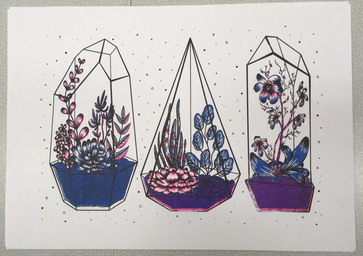
I thought I’d do a feature on some of my favourite artist materials that have been tried and tested by me throughout my illustration life! Obviously this is my personal (unsponsored) opinion and your mileage may vary, but these bits and bobs are what I use in my own practice ♥


Deleter Inks

I’ve tried quite a few inks since I first started working with traditional inks- I still prefer the first ones I ever used! These inks were first gifted to me by my Dad when I was 10- he bought me a Deleter Manga DX kit (available in the UK from Amazon intermittently)  for my birthday (come on… every artist went through some sort of manga/anime phase!)

Screen Shot 2019-02-04 at 16.32.10
Deleter Inks: Black 1 and White 1 (Collingwood, 2019)

Based in Japan, comic art supply company Deleter is a favourite amongst manga and comic artists, but these high quality inks are useful for many more applications. The inks are water resistant (not waterproof) after an hour or so of drying time, which makes them good for use with a variety of different mediums, especially art markers like Promarker, Copic and Deleter’s own brand, Neopiko.

I find these really good for fine detailing, and both the black and white come in a variety of opacities suitable for lots of different uses; Black 1 being the darkest, and Black 6 being a mid-opacity ‘black’. I have Black 1 which is super dark and dries with a nice satin finish, and White 1 which I mainly use for corrections and highlighting. Both are best used with a brush, because the ink dries quite quickly and can block nib tips if left too long!


Winsor and Newton Metallic Inks

You know me… I love a good metallic embellishment feature in my work! These are some of the nicest metallic finish inks I’ve used~ Shake to mix the pigments, which swirl round in the pot like a black hole (it’s seriously mesmerising)!

Screen Shot 2019-02-04 at 16.32.18
Winsor and Newton Inks: Gold and Silver (Collingwood, 2019)

They dry down really nicely and are perfect for dip pen and brush application.

Honorable mention to Liquitex Copper Ink- Winsor and Newton don’t make a copper yet! This is acrylic ink, so it’s a bit thicker but gets the job done with a paintbrush for what I like to use it for c:


Sakura Pigma Micron Pens

Fineliners are definitely personal preference since there’s so many different types, but for me the Sakura Pigma Microns are some of the best c:

Screen Shot 2019-02-04 at 16.32.32
Sakura Pigma Micron Pens (Collingwood, 2019)

They nice stay nice and sharp throughout their life to give the best quality of line, and in my experience these Pigma Micron pens are the best fineliners to use with wet media. They are also smudge proof after a short drying time, and don’t bleed through paper which makes them ideal for writing too! Since my knowledge only goes as far as usability, here’s some specifics courtesy of my favourite pen website, Cult Pens:

“The first disposable technical pen to use archival pigment ink, the Micron range is by favoured artists, writers and illustrators everywhere. […] Archival quality ink is acid-free, chemically stable, waterproof, and fade resistant. No smears, feathers, or bleed-through on most papers. Strong plastic tip is steel clad for strength and for use against rulers and drawing instruments” (Cult Pens, 2019).

Available in a whole rainbow of colours here! I really love using the sepia toned ones for a softer look line art, and the purple ones are also really nice to use as an underlayer to be inked over in the next stage of my workflow.


My iPad Pro/Apple Pencil has also been indispensable piece of equipment for me- I have lots to say about this so I’ll cover it in another post [Update 26th Jan 2019: new post here!] ♥


References

Amazon.com (n.d.). Deleter: Manga Took Kit DX [Product]. Available at: https://www.amazon.co.uk/Deleter-Manga-Tool-Kit-DX/dp/B000DZXB4O  [Accessed 24 Jan 2019].

Collingwood, C. (2019). Deleter Inks: Black 1 and White 1 [Photograph].

Collingwood, C. (2019). Sakura Pigma Micron Pens [Photograph].

Collingwood, C. (2019). Winsor and Newton Inks: Gold and Silver [Photograph].

Cult Pens. (2019). Sakura Pigma Micron Drawing Pen [Product]. Available at: https://www.cultpens.com/i/q/SK21084/sakura-pigma-micron-drawing-pen  [Accessed 24 Jan 2019].


evaluation, SWOT/Target Setting

Semester 1 – Evaluation and Reflection

I’m so pleased all of my Semester 1 work is done and dusted!!

Just to tie all the loose ends up, I’ll be summarising The Good, The Bad and The Ugly (read: strengths, weaknesses and threats), as well as upcoming goals and opportunities for the future c:


Strengths

For me, the most successful part of Semester 1 was my experience with Procreate, and the steep yet successful learning curve that went along with it- I found using the iPad Pro/Apple Pencil combo to draw directly onto the screen to be really refreshing and user friendly, rather than using a traditional ‘screenless’ tablet (e.g. Wacom Intuos) and Photoshop on a laptop, which wasn’t very intuitive at all.

Through creating art with this new workflow, I’ve been able to gain back some of my confidence when it comes to drafting and artwork in general- I’m not the most confident person by any means, but I’ve had lots of further difficulty in the past year or so that has really affected my ability to produce something I’m pleased with. I’m trying to become a more optimistic and outgoing person, so this is a small victory for me that I’m really proud of ♥


Weaknesses

While I feel the semester went well overall, there were definitely areas which I was really unhappy about and couldn’t wait to finish off and leave behind. Timekeeping has always been an issue for me, and I wish I’d spent a bit more time learning the ins and outs of the riso process before jumping in with my solid colour choices and largely single opacity layers.

My final grade will speak for itself, I just hope I can do enough in these subsequent modules to achieve a good class of degree. I’ve previously been able to scrape a First during my FdA, but I’ll be pleased (albeit it slightly less so) with a 2:1… anything else is a bit out of the question for me ^^”


Threats

Threats for the future include lack of time management and my own self-belief, as I know this can really hold me back if I let it get to me too much. I also don’t want to become too reliant on digital processes, as I feel I really need to retain my sound knowledge of traditional art. I’d love to include some nice originals in my portfolio, so this is something I’d like to work towards even if it doesn’t form the bulk of an actual personal or commercial project (I can work on this independently as part of my portfolio project, too).


Goals and Opportunities

My goals for Semester 2 include continuing to work with a variety of processes and techniques, while also coming back to my roots and creating some high quality portfolio centrepieces that I’ll be pleased to display during final show. Convincing myself is the biggest struggle of all, so I’ll also be actively working on favouring my work a little bit more to help me find peace with myself.

Onwards and upwards!

portfolio

Concept Development – Storyboarding

Now that my character designs have been finalised, I can begin to storyboard the narrative.

While I do want the story to be interesting, I’m planning to make the main focus ‘interaction’- between the characters and their environments. This means a more gesture based approach to the animation, where characters will bond with their environments and explore new ones. In this case, the young girl will journey through her own woodland environment to the Deer’s house, where she’ll discover a new environment.

I’m most inspired by the way in which Studio Ghibli animates even the most mundane of actions with a quiet, curious interest- this is present throughout all of their films. It really brings out the natural beauty in the scenery without drawing the focus towards anything in particular.

The story is short (clocking in at just over a minute), but at an anticipated 12fps this should be more than enough to keep me busy!

[Update 19.01.19] And here are my finished storyboards… I’m sure I’ll refine these more in future once I’m better informed with the limitations of the Semester 2 project, but for now these will do nicely. I had a few problems with drafting out proper perspective in such a simplified way, but these are not written in stone so I can definitely correct these little problems in future when I have more time to dedicate to properly exploring environment design~

screen shot 2019-01-25 at 13.42.43screen-shot-2019-01-25-at-13.42.50.png

screen-shot-2019-01-25-at-13.42.58.png
Narrative Storyboards, PP2. (Collingwood, 2018)


I’ve really tried to look at how I can animate even the ‘still’ scenes, with background elements that move continuously or small pieces of animation to liven up an otherwise stagnant frame (e.g. the steam from the teacups, or the breeze blowing branches and leaves). I’ve used a blue pen to describe the animated aspects or camera directions- hopefully this will help me to clarify what to animate in each scene.

I’m overall pleased with how these have turned out, and even though there’s room for improvement this is my first experience with visual storyboarding. Can’t wait to get this project tied up and finished so I can start on Semester 2 work~


References

Collingwood, C. (2019). Personal Project 2 Narrative Storyboard Panels [Digital].

portfolio, SWOT/Target Setting

Concept Development – Character Designs

I have some new character designs to share! c: I’ve been working constantly on these since my last update- I feel I’ve made good progress even though there’s still so much to do!

screen shot 2019-01-28 at 10.19.12
Young Female Character: Initial Concepts (Collingwood, 2019). 
screen shot 2019-01-28 at 10.19.32
Young Female Character: Face Revisals/Development (Collingwood, 2019). 
screen shot 2019-01-28 at 10.22.48
Young Female Character: Palette/Colour Application Experimentation (Collingwood, 2019). 


Meet our heroine of the story- she doesn’t have a name on purpose, because I want the audience to be able to relate to her and put themselves in her shoes. Since she’s youthful, naïve and curious, I wanted these traits to shine through in her character design. I went through loads of concepts (some of which were really awful, haha) but settled on a final design for her that best described her personality to the viewer. I’m sure it shows, but I was really inspired by the ‘chibi’ characters of Studio Ghibli, as well as the loose, simplistic art style of Heikala (info on both of these here from my artist research for this project).

I’m pleased with her design- she went through quite a few refinements as I progressed through my workflow! Final character board below:

screen shot 2019-01-25 at 13.41.43
Young Female Character: Final Character Board (Collingwood, 2019). 


To be honest my favourite aspect of her is her ‘paper bag’ trousers- I didn’t want to put her in a skirt lest that undermine her childish adventurous nature, so I decided to go with these oversized paper bag pantaloons (which also matched her boots and cape much better… too many ‘loose hems’ otherwise!)

I really love them ^^”


Next up, we have our anthropomorphic deer character:

screen shot 2019-01-28 at 10.20.51
Anthropomorphic Deer: Initial Head Concepts (Collingwood, 2019). 
screen shot 2019-01-28 at 10.21.32
Anthropomorphic Deer: Anatomy/Front View Development (Collingwood, 2019). 
screen shot 2019-01-28 at 10.16.14
Anthropomorphic Deer: Palette/Colour Application Experimentation (Collingwood, 2019). 


I designed him to both contrast and complement the young girl character, since the contrast of their environments and designs is central to the narrative journey. The palette is still natural while being different to the bright, fresh toned greens I used on the female character’s designs.

He’s very scholarly and loves a good cup of tea, I hope you can tell~

screen shot 2019-01-25 at 13.41.58
Anthropomorphic Deer: Final Character Board (Collingwood, 2019). 


It was a real challenge to simplify the characters enough so that there wouldn’t be any issues when drawing them repeatedly for the animation- I think I’ve nailed this down enough, but as always there’s always the chance I’ll refine these some more in the follow-up Semester 2 project.

I’m pleased with the outcomes- targets for the next few weeks include finalising and collating all of my projects for hand in, and starting to think about the beginning of Semester 2 and how I’m going to tackle the next few months. Using my previous SWOT analysis’ will help me circumvent any problems I anticipate I’ll have, while also playing towards my strengths to produce a strong semester of portfolio work.


References

Collingwood, C. (2019). Anthropomorphic Deer: Anatomy/Front View Development [Digital].

Collingwood, C. (2019). Anthropomorphic Deer: Final Character Board [Digital].

Collingwood, C. (2019). Anthropomorphic Deer: Initial Head Concepts [Digital].

Collingwood, C. (2019). Anthropomorphic Deer: Palette/Colour Application Experimentation [Digital].

Collingwood, C. (2019). Young Female Character: Face Revisals/Development [Digital].

Collingwood, C. (2019). Young Female Character: Final Character Board [Digital].

Collingwood, C. (2019). Young Female Character: Initial Concepts [Digital].

Collingwood, C. (2019). Young Female Character: Palette/Colour Application Experimentation [Digital].

Heikala (n.d.). Instagram – @heikala (online). Available at: https://www.instagram.com/heikala/?hl=en [Accessed 2 Jan 2019].


research

Concept Development Progress

Now that I’ve signed off the Penguin Student Award and Printmaking projects, I can finally dedicate my focus to the Concept Development project- I’ve already conducted a bit of artist research late last year (my post about it is here), so this has already given me a good foundation on which to design my concepts~

For this project, I need to produce as much development/concept material as possible for the upcoming Animation Production project in Semester 2. This includes character/environment designs, storyboards, narrative info, and other supporting material that will be of use to me in the coming months.

I’m starting with the character designs, since I feel that this aspect is the most important, and therefore want to get this done first. I’ll be designing a human young female character (who’ll serve as the centric narrative device), as well as a more visually intricate anthropomorphic deer, who’ll act as an ‘opposite’ character, with contrasting design aesthetics, environment and colour palette. I’ve made two concept boards with palettes and existing artwork that mirror what I want to portray for each of these two characters… a few pics below from each board (all referenced at the end of this post):

screen shot 2019-01-25 at 12.28.04
Top left: Figure a. Top right: Figure b. Bottom left: Figure c. Bottom right: Figure d.
screen shot 2019-01-25 at 12.27.14
Top left: Figure e. Top right: Figure f. Bottom left: Figure g. Bottom right: Figure h.

Using these images and palettes as a loose style guide will help me to design characters that will complement these visual concepts, while also using my notes on personality and traits that I’ve written up in my sketchbook.

I always find it useful to map out key persona information before designing my character, as I often have a good idea of how I want them to act before I bring them to life on paper- this allows me to incorporate design elements into their aesthetic that support their individual personalities.

I’ll post next week with some character development sketches ♥


References

h. Heikkala, L. (n.d.). Pond [Ink].

e. Jansson, T. (n.d.). The Moomins concept art [Graphite, watercolour].

a. Ma Van As, Y. (2018). After School Violin Lessons [Digital].

c. Mountain Lumber. (n.d.). Reclaimed Antique Hickory [Photograph]. Available at: http://www.mountainlumber.com/portfolio_page/reclaimed-antique-hickory/ [Accessed 1 Dec 2018].

d. Rockefeller, M. (n.d.). Paul’s Cabin [Digital].

f. Studio Ghibli. (2010). Concept art from The Borrower Arrietty [Watercolour].

g. Studio Ghibli. (2010). Screen capture from The Borrower Arrietty [Animated feature].

b. Studio Ghibli. (2010). Concept art from Kiki’s Delivery Service [Watercolour].

evaluation, portfolio

A Short Timeline of The ‘Wonder’ Project

Well I’ve been productive this week…~

(haha but no really, I essentially just finished the Wonder Penguin Project in 4 days). It was intense, but it worked!

I didn’t mean to take such a small amount of time for this (my initial timetable gave me 4 *weeks* from mind map to final cover), but having so much downtime in my life made me reevaluate how long I really had to complete this brief. I have so much in store for PP2 that I didn’t want to waste any more time than necessary on what was supposed to be my ‘shortest’ project- that thought took on a while new meaning…

I had already researched into some existing source material e.g. book covers and film posters before the Christmas break, so I’d be lying if I said I didn’t have a rough idea of what I wanted to do. With this research in hand, I started to draft out some concepts of the cover, evaluating each one and choosing the most successful to take forward to development. This was all pretty run of the mill development work that I completed over the course of a day, so I’ll move onto the more interesting stuff~

I worked in Procreate again to bring the final product to life- I feel that my workflow has really come into its own since I started using my iPad as a key tool in my process; it’s the perfect balance between familiar traditional technique and the ease and innovation of digital painting. I was able to scan in my final concept from my sketchbook and work directly on top of this in Procreate, where I could fine-tune the details, proportions, etc.

Procreate tells me I clocked in at just under 8 hours with over 7000 strokes to complete the cover- that’s quite an interesting stat! I’m pleased with the final image:

screen shot 2019-01-25 at 12.31.31
Wonder Final Cover Art (Collingwood, 2019).

I’ll be making a mock-up final product by laminating my printed cover onto an existing copy of the book before hand in too… it’ll be nice to see a ‘finished product’!

I’m expecting to have to make a few wee changes/additions to the project work (particularly the written work) once I have a pre-hand in tutorial, but for the most part I can put this project to rest. ♥


More next week as the deadline draws near!


References

Collingwood, C. (2019). Wonder Final Cover Art [Digital].

research

January Update

It’s been a while, WordPress!

Sorry for the lack of updates, the reason being… there is very little to update on ^^”

I’ve taken some time to R&R during the holidays- burnout is real, and I’ve been feeling it for quite a while. Between my rubbish health and too many shifts at work I needed some ‘me time’ to recuperate and prepare to get down to business with my projects.

Having said all that, I feel more in tune with my artistic side again, so hopefully this will directly influence the quality of my work… here’s hoping~

The Wonder project was well underway prior to Christmas, so it’ll be nice to get back into that and finish off what I started before dedicating my time to the Animation Development project (saving the best for last… not sure that was the best idea!)

This week, I’m planning to cram in some good hours of degree work and finish off the remainder of the Penguin Award project- I’m excited to realise the final product. As soon as it’s all signed off (and I really do mean signed off- I’m not making any major last minute changes if I can help it as this stresses me out 10000%), I’ll dive right into the animation project…

Even though I’ve not been very productive on paper during the holidays, I’ve had many a thought swimming around in my head about exactly who my characters are, what their environments will be like down to the tiniest details and how they’ll interact with each other in the narrative, so I have a strong base to start with when I finally begin putting my ideas on paper.


More at the end of the week when I have something to show ♥

evaluation

Mini Riso- ‘Minerals’ Photography Print / Project Evaluation

Alongside my work for the Penguin Award and the Animation Development projects, I’ve been making a smaller ‘mini’ A4 risograph image, this time making use of photographic elements instead of illustration, as this is something I didn’t get to experiment with when I made my terrarium prints.

I’d originally intended to use my own photography for this side-project, but Royal Mail had other plans since all the rock minerals I’d ordered to photograph haven’t arrived… :c So purely for the purpose of experimentation, I’ve collaged together some royalty-free images (which are all referenced in my project development file) to use as a experiment- I’ll most likely be able to take my own imagery in the future to use for photographic risograph work, as I don’t want to include something in my portfolio that isn’t entirely self-produced. I collaged the images together quickly in Photoshop- I used my notes from my development work as a set of ‘rules’ when laying out the photographs.

Once this was ready, I converted the image to black and white and duplicated the layer, one of which I edited using various Adjustment tools- I heightened the contrast and brightened up the second/upper layer, which meant only the darkest tones made it through into the final image- I’ll print this in the blue ink we have for the riso, with the base layer (with a wider range of light and mid-tones) printed in pink. Based on past experience with the riso during my terrarium printing run, I’ll be editing these on the riso prior to printing, bringing the ink coverage down to around 15-20%, as I don’t want bright colours on this print. The pink is extremely bright, and the blue extremely dark- hopefully reducing the coverage down to practically nothing will solve the problem. Below is my two final layers, ready for printing:

Screen Shot 2018-12-14 at 10.58.28.png
 Mini Minerals Riso – Printing Layers (Collingwood, 2018)


Obviously the printing process was much the same as the terrarium prints (again, all of this is documented much more in-depth in my development file), but this time I added halftones (via the riso)… and it worked well! Except that all of my prints were too light, haha. I initially thought that I’d need to make the masters super light to combat the really pigmented inks, but I think I went too far the other way, as lots of detail was lost in the final prints:

IMG_8117.jpg
My final prints- not quite to plan, but still a success experiment-wise! (Collingwood, 2018)

But, not to worry… this was a purely experimental exercise- when I’m able to take my own pics I’ll run some more prints off again, keeping in mind everything I learned throughout this test. I enjoyed the process anyway, and there’s no improvement to be gained unless you fail first!

Reflecting on the project as a whole… I’m glad I got to use the risograph printer, since it’s a process I’ve been interested in since hearing about it just over a year ago. It’s certainly been unconventional for me, since the colours are so restricted (and BRIGHT!), as well as the digital process involved in making artwork riso-ready. It was really nice to try out new techniques and styles of artwork all in the name of suitability, since prior to this I’ve been quite stuck in my ways. I’d love to revisit this in the future, but for now it’s definitely high time to start on the next Semester 1 projects…

Onwards and upwards c:


References

Collingwood, C. (2018). Mini Minerals Riso- Printing Layers 1 and 2 [Digital].

Collingwood, C. (2018). Mini Minerals Riso- Final Print [Risograph Print].

evaluation

Risograph Printing / Weekly Reflection 3.12.18

After a myriad of issues that got in the way of this project, I was finally able to print some risograph images today~

First, I’ll recap the prepping process for the imagery:

Once I had the line art drawn out (done on Procreate, which I’m slowly getting the hang of), I began to apply colour on separate layers underneath the line art. I chose to work with pink and blue inks, as these were two of the 4 colours available at the time. I’m not entirely sure about this colour scheme (it’s a bit out of my comfort zone), but I persevered nonetheless since nothing is set in stone colour-wise with the riso. Having said that, this project is all about experimentation so I’m consciously trying to work with colour schemes I haven’t used yet.

I’ll admit- I’m not used to working in this way, so the way in which I’d ‘blindly’ applied colour was painfully obvious on screen once I’d altered the layer opacities (see below for each separate layer). This will be something to remember in future if I re-do the colour (which I might actually end up doing, since we’ll be getting some more ink colours soon).

Screen Shot 2018-11-30 at 11.16.13
Left to right: Blue layer, Black layer, Pink layer for Risograph printing. (Collingwood, 2018).

It’s also worth noting that no ink layer should be above 75% opacity, in order to avoid smudging and paper jams in the riso. My final layer opacities ranged from 20% (the ‘back’ of the terrarium frames) to 75% (the main black line art), with the coloured layers at 30-50% and 60% in between. By exporting each layer as a separate file, I was able to layer colours when printing (since the ink is semi-transparent), making a mid-purple tone where the inks crossed over.

I’ve gone into much further detail about the print process in my development file, but here’s a pic of the final prints:

IMG_8014.jpg
Terrariums Final Print (Collingwood, 2018).

I was actually really pleasantly surprised at how nicely the image printed- although the registration isn’t perfect (which is a common trait of riso printing), the layers blended well and weren’t as messy looking as they appeared on screen.

At this point, I didn’t love my colour palette but I didn’t hate it, either- I’m most likely going to do another run next week, with neater colour layers and a more considered colour palette. Having green ink available will be really helpful!

…But at the same time, I don’t want this project to drag on for too long, since I want to really focus on the Animation Development brief I’m doing (this is especially important, as it will directly influence the Animation project in Semester 2… if the Semester 1 portion isn’t successful, I won’t have a solid foundation to work on!)

Also still to print is the mini A4 photography based geode flash sheet I’m doing as a side project ♥


References

Collingwood, C. (2018). Risograph Digital Ink Layers: Blue, Black, Pink [Digital].

Collingwood, C. (2018). Terrariums [Risograph print].

about, inspiration

Design Philosophies

Late last week I was tasked with creating a set of ‘philosophies’ that define my practice as an illustrator. These can be about design narrative/context, visual aesthetics, workflow or personal preferences during the entire process.

This was much more challenging than it seemed- honestly I think I’m still building up to having a very distinct design aesthetic, but I definitely have a strong idea of what I want my work to portray in my head. The two don’t always come together in the final image (yet), but my process has a few unique facets to it that help me create my work.

The final list can be found here, as well as via the top menu bar: Info -> Design Philosophies.

Hopefully these shed some more light on my practice and design criteria, as I don’t often talk about it personally. I suppose that’s the point of a blog though~