As part of my ongoing effort to summarise my illustrative style, process and voice, I’ve created a little infographic about what goes into my creative workflow, and what comes out as a result- put simply, the ‘input and output’ of my process.
We were challenged to develop an infographic with a central theme that mirrors the information- I see my workflow as a growth process, so I chose a very organic looking theme for my image~ I see my workflow as an ‘ebb and flow’ type of process, in the same way that water ebbs and flows with the current. Check it out here, or under the menu bar: Info > Input and Output c:
This new week means the start of a new project- quite the relief! As much as I enjoyed the riso project, it was very overwhelming learning literally an ENTIRELY new process, from the design basics to the niggly little details surrounding printing and technical issues. I’m not completely done with riso printing, however- I still hope to use it more actively in the new year, especially for print editions to sell at final show.
Onto the new project- Character and Narrative Development! As much as this represents its own set of experimental challenges, I’m hoping it’ll be a little more of a gradual learning curve, rather than the ‘throw myself in the deep end’ approach of the riso printing process ^^”
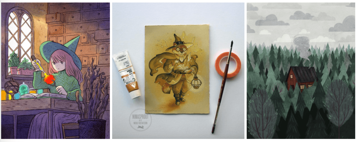
Thus far, I’m deep into the research portion of my workflow- since this project has been on my mind for a very long time (read: years), I already had quite a good vision of what the aesthetics of the environments and characters will look like. As such, my list of existing artist inspiration is long! To name a few, Nicole Gustafsson, Taryn Knight and Heikala are some of the most influential people I’ve looked at (examples of their work below.)
Left to right: Heikala, 2018. Gustafsson, 2018. Knight, 2018.
More on this in my artist research file, but I especially love Gustafsson’s work with anthropomorphic characters- this will be a big source of inspiration for my deer-man character. A similar simplified art style like Heikala’s work would work well for the animation, as I must always be mindful of the level of detail in the imagery- while I’ve timetabled quite a few weeks to realise the project, I don’t want to overwhelm myself with detail in the work.
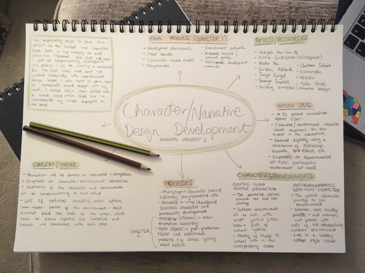
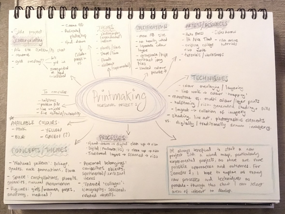
I want the piece to have a warm, familiar feel with a woodsy colour palette for the most part- with warmer, organic tones for the deer-man and more youthful, fresh colours for the centric female character. More details on character, aesthetic and the more technical side of my project are documented in my initial mind map:
My initial mood board for the project- gathers all my thinkings into one place! (Collingwood, 2018).
For the rest of the week, I’m aiming to make some mood boards that can portray my intentions for aesthetic, colour and character design in a very strong way- I often struggle to find faith in my initial ideas, especially when pitching them to other people, so I’m hoping a few mood boards that are well put together will aid me from the outset. (…did I also mention that mood boards are an excellent prop to hide behind during formal presentations…?)
In addition, I often like to fully flesh out my characters with MBTI personalities and trait lists… all part of my process to feel more connected to my characters. This will be the main focus of next week.
More soon ♥
References
Collingwood, C. (2018). Personal Project 2: Initial Mind Map.
Gustafsson, N. (2018). Shiba Spellcaster [Acrylic].
It’s been a wee while since I wrote the last post… it’s been a weird few weeks with only a little bit of progress unfortunately! I’ll hopefully be back into the swing of things now, with updates at least once weekly.
In terms of the riso project, I’ve finished everything bar the actual printing of the artwork… so yes, I’m slightly behind. I’ll correct this during this coming weeks while I work alongside the Character Design Development project so I don’t fall behind- I can’t afford to lose any project time this year.
Additionally, the list of book titles for the Penguin Student Award has been released- initially I was torn between Wonder by R.J. Palacio, and Norwegian Wood by Haruki Murakami. The current iterations of the cover art for both titles are very minimal and follow a specific theme throughout the rest of the author’s novels. Below are the two most recent covers released in the UK:
Left: Palacio, 2014. Right: Murakami, 1987.
Ultimately, I’m marginally more partial to Wonder, especially as I think some of the key imagery and thematic elements that are featured in the narrative lend themselves towards my style and interests slightly more than Norwegian Wood. More on this next month when I start production on the project~
I’m also due to start my Character Design/Animation Development project this month- I’ll do an update soon about my initial research and where I’m going with the characters and storyline. This is a project that I’ve had in mind for *years*, so it’ll be nice to finally bring it into realisation ♥
It’s been a rough few weeks but I’m excited for what lies ahead and for the upcoming projects I’ll be working on- but for now, I’ll be mostly focusing on finishing the riso project (e.g. doing some initial test prints while we wait for the new ink colours to arrive)- at present I’m in the dark as to what the test prints will yield. It could be that I’ll have to completely re-do my artwork, or alter some of the design, or a number of other things. I’m worried about it, but I’m also too excited to start the next project so my mind is all over the place! Hopefully I’ll be able to have some closure with the riso project soon.
Targets for the following month include finishing the riso project very soon (in order to leave ample time for the other two projects), as well as continuing to promote ‘radial thinking’ in my process, particularly as part of the experimental nature of Semester 1.
References
Palacio, R. (2014). Wonder. London: Corgi. p. Cover Artwork.
Murakami, H. (1987). Norwegian Wood. London: Vintage. p. Cover Artwork.
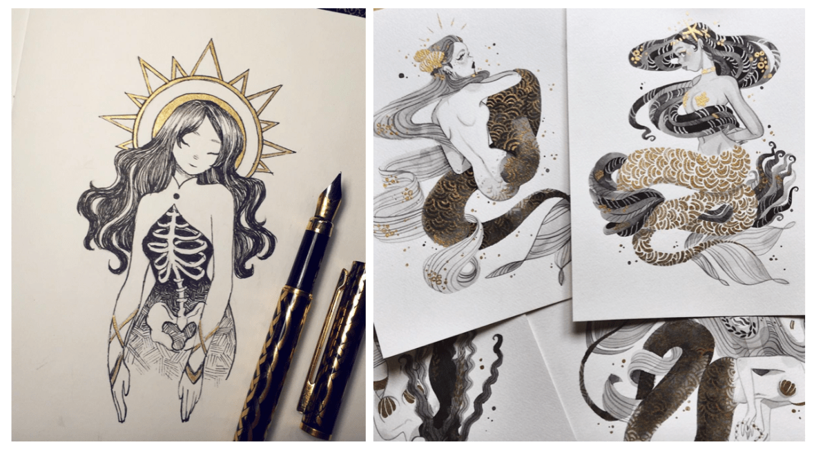
When exhibiting artwork (especially when the art is for sale), it’s important to consider new and interesting ways to add interest in order to capture the viewer’s attention, possibly increasing sales in an exceedingly competitive sector of the creative industry.
Of course, this isn’t from a purely business point of view, as the result must also compliment the artwork and be aesthetically pleasing. I love to add things on top of artwork, particularly runs of prints, as it adds a handmade touch that makes each piece unique.
Here are my 3 favourite ways to do this~
1- Surface Embellishment
I’m a big fan of glittery things- anything that sparkles or shifts in the light is sure to catch the eye of a bypasser, whether they like it or not! If the imagery is suited to it, adding a little bit of glitter or other embellishment can really make the difference between run of the mill art, and something people will buy.
I bought a piece from one of my favourite artists (@m_atelier on Instagram, more info in my references), and she jazzed up the art with tiny star shaped sequins before mailing it to me. As it fit well with the other imagery in the work, it looked lovely and created a sense of personalisation and preciousness.
Another example of surface embellishment is using patterned paper or washi tape- @shardula uses this technique quite often, with gorgeous results that add detail and intricacy to the artwork. I suppose I use this technique myself in some of my artwork- I like to digitally overlay patterns as a replacement for colour (see the Artwork tab for examples of this), which is a similar process.
Left: Lopez (2017). Right: Licudine (2018).
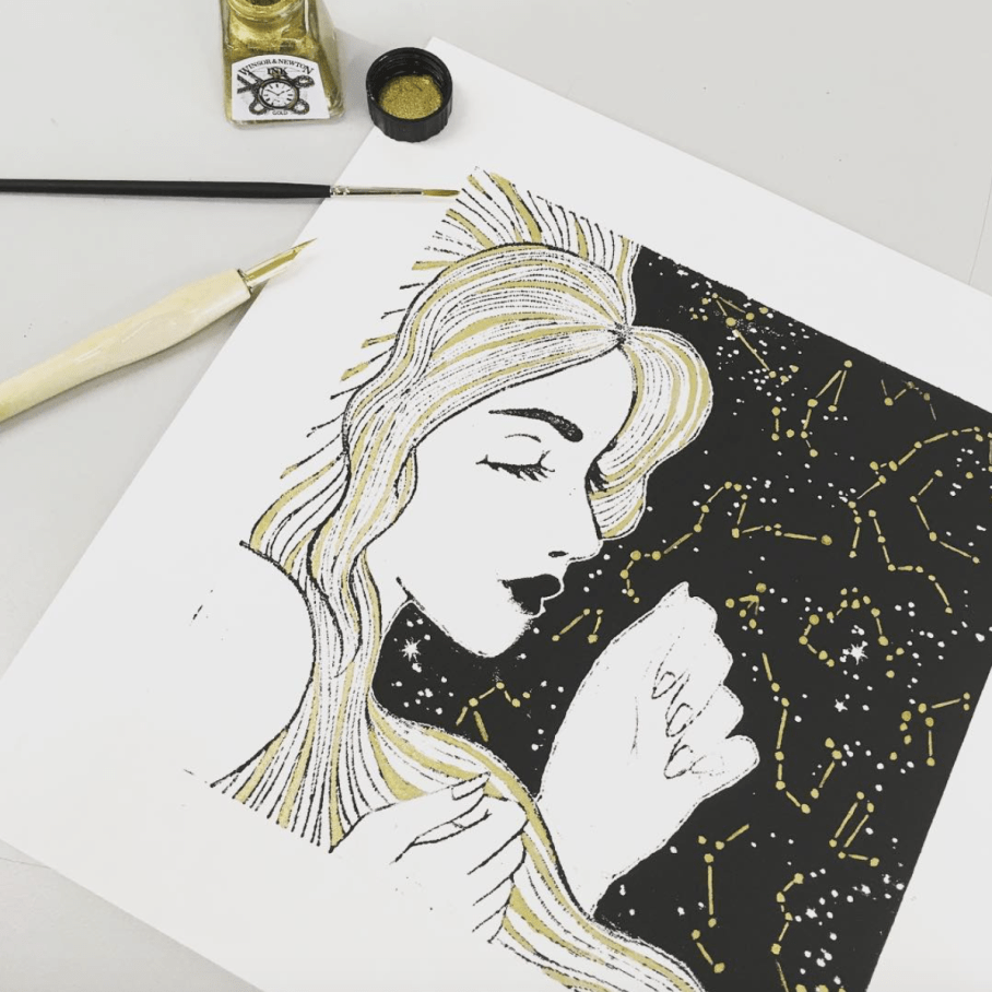
2- Metallic Overlays
This form of embellishment can come from specially made inks or pens, as well as gold leaf or gold foils- each of these methods is best suited to different applications, so it’s up to you to find out which is best for your artwork. Foils can be added to fabric, which can add ‘a little something extra’ to screen printed tote bags or t-shirts, or they can be applied on top of prints using heat or screen-printed glue.
In terms of physical printed or traditional artwork, I find it best to use either pre-filled ink pens (my favourite is the Sakura Touch-Pen Fine, available here in all sorts of finishes), or nib-pens/fine brushes with inks such as the Winsor and Newton metallic calligraphy inks (link here), which are slightly more opaque and concentrated (but are a little harder to get the hang of).
Use metallic embellishment to add highlights or extra detail to the art- again, some of my favourite examples are from artists such as Sibylline Meynet (@sibylline_m) and Feefal (@feefal), shown below:
Left: Feefal (2018). Right: Meynet (2016).
3- Proper Packaging
If the art is hand-pulled and won’t be produced again in the same format, you can market the pieces as a ‘limited run’ by numbering and signing them individually on the border of the art. Doing this adds value to the work, as numbered editions are considered the highest quality pieces from a run of prints (e.g. risograph, screen print, etc).
If art is being offered for sale, the general consensus is to sign numbered editions in the border of the art, and printed/mass produced prints inside the actual artwork (e.g. in the bottom corner of the piece, as long as it does not detract from the overall image). Always use pencil when numbering/signing artwork in the border, as this cannot be reproduced by printing!
By investing in some fitted cellophane bags, you can protect artwork from fingerprints or creases when selling, as well as add to the value. Mounting the artwork can also add to the overall appeal, as presentation of artwork is important when vying against competing illustrators. Additionally, including a business card with each print, or making a special branded stamp or sticker to seal the packet can add a sense of professionalism.
All of these techniques can help set your art apart from the rest aesthetically, as well as increasing value which in turn will allow you to make a little bit more profit on a piece.
I hope this was slightly helpful… of course the quality of the artwork is second to none when it comes to a successful illustrator, so consider this above all else ♥
It’s now the third week of my timetabled period in which I’m meant to be working on the Printmaking project; while the work I’ve produced in the past 2 weeks isn’t completely irrelevant, it’s high time I started getting deeper into the risograph side of things, e.g. how it works, the process and how to create artwork suitable for the riso.
Dare I say… from the research I’ve done so far, it actually sounds easier than I’d initially anticipated. An actual miracle.
From what I’ve gathered, risograph printing is essentially a cross between screen printing and photocopying, but more environmentally friendly and with a more limited colour range (MUCH more on this in my project research- I’m just doing a quick recap).
Having said that, it’s still quite technical and very different from the processes I’m used to working with. For example, you have to keep in mind the bleed areas around the design, the potential for accidental overlap, and the possibility of errors due to the machine, e.g. roller marks. However, through careful planning I’m certain a lot of these areas of concern can be sidestepped- respectively, this could be through careful border layout, trapping line and colour, and laying out heavily inked areas accordingly. (HatoPress.net, n.d.).
It’s quite a lot to keep in mind, but doing an ample amount of research prior to designing imagery has given me a really good basis of knowledge on which to build the project. My initial mind map helps me to plan out the work I need to do as the project progresses:
Initial Mind Map- I find these useful at the start of every project. (Collingwood, 2018.)
Pending the success of this introductory project, I could utilise this technique to make zines, posters, business cards etc for final show- the colour palette might be more limited, but it’s infinitely less laborious than screen printing (and most of the other traditional printing processes, for that matter)~
References
Collingwood, C. (2018). Personal Project 1 – Initial Mind Map.
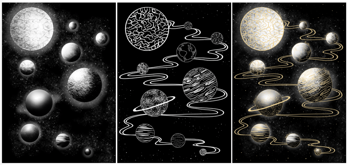
Over the past week, I’ve worked on a simple design that can translate into a screen print. Basing my concept on the idea of planets and digital fills (as inspired by the tutorial Dave showed us on Friday), I worked in Procreate to design both a gold layer, and a black and white screenprinted layer. Final designs below (left to right: Base/screenprinted layer, gold leaf layer, mock up of ‘final’ image with both layers):
Left to right: Figure 1, Figure 2, Figure 3
Using Procreate is a whole new learning curve for me, as up until now I’ve worked mostly in Photoshop. My previous digital work has been done using a Wacom Intuos tablet, which I often found a bit hard to use (e.g. not being able to rotate it to draw, having to reference back to the screen when drawing, small size and lagging software).
Overall I was happy with my workflow, but earlier this year I invested in an iPad Pro as an additional tool. Ultimately I’ll still finalise my work in Photoshop as Procreate isn’t as extensive, but it’s invaluable having a drawing device with a screen- it feels much more natural, and it’s easier to draft out artwork compared to using a conventional drawing tablet.
One of the most useful tools I discovered actually came from a calligraphy brush kit- a variable line brush that smooths jagged edges and creates nicely curved lines (almost in a similar style to Illustrator, but without all the fiddling). There’s a plethora of times that I could have used this brush in the past, so I’ll definitely keep this in mind for the future!
Come Friday morning, it became quite clear that I was a bit ambitious with the black layer- Dave suggested that I instead print the gold layer as a complete image, so I decided to go with this (possibly going back and editing the black layer to be more screen print friendly at a later date). I’m glad I discovered this early on in the year, as it’ll inform any future imagery that I produce for screen printing.
I experienced some issues with the screen machine- my design wasn’t burned to the screen properly; the black background border was fuzzy on one corner. I’m putting this down to a technical issue that will hopefully be fixed in the future, as I think having a border on a screen print sets it off nicely, especially for trimming and framing. I’ll probably mask the corner border off and correct this by painting on the acrylic in ‘post-production’.
In the afternoon we were shown a quick recap of how to gold foil using the heat press- this was really useful because although I’ve worked with this process before, it was quite a few years ago now and I definitely benefitted from the refresh. There’s a much wider variety of foils now (e.g. iridescent foil, clear foil, and an array of different coloured metallic foils), all of which will be nice to experiment with ♥
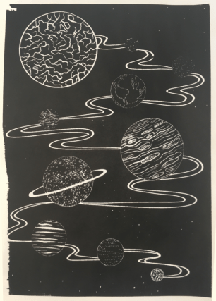
Friday was full of trial and error- in addition to the corner not being complete on any of my prints (which was expected), I had lots of issues with the amount of ink I was using (usually not enough ink). My 6th print (out of 8 total) was the most successful- I was surprised how well the fine lines came out, despite the pre-emptive warning that 12px was the finest line weight that would translate optimally. Below is my most successful print (I could have used slightly less ink):
Figure 4
I really love the process of screenprinting, so I’ll definitely be revisiting this in the future, hopefully with better results.
In the next week, I plan to finally start on my riso project- I’m a bit stressed out about this as I haven’t stuck to my timetable thus far (which is an awful start to the year). However, the past week hasn’t gone to waste as the development for this screen print can be linked into my Printmaking project as development and technique exploration, which is the purpose of the first Semester anyway~
References
Figure 1: Collingwood, C. (2018). Planets (Base Layer) [Digital].
Figure 2: Collingwood, C. (2018). Planets (Gold Layer) [Digital].
Figure 3: Collingwood, C. (2018). Planets [Digital].
Figure 4: Collingwood, C. (2018). Planets Test #6 [Ink].
To start the week, I’ll be working on concepts for the A4 screenprints we’ll be producing on Friday- as this is intended to be experimental, I’ll be straying away from my usual techniques, instead trying out digitally based fills for some of my initial ideas. For example, halftones, custom patterns, noise fills, and other fill techniques that produce results that will work well with a silk screen- since you can add lots of very fine detail with screenprinting, it’ll be a great opportunity to try these new styles out.
The last printmaking project I did involved monoprinting with a laser cut perspex plate- the results were mixed, but most importantly plate printing allowed for a lot less detail on the design (compared to screenprinting).
We were shown a mini tutorial on Photoshop and Cinema 4D, using shaded spheres as an example when applying each technique. They really looked like little planets… so I decided that using the solar system as a base would be a nice way to still include something from my own personal interest.
I may even make a second layer that details additional embellishment on the final design- this way, I can come back to my love of gold foil, using liquid glue to print the exact areas for foiling. I can then go in with the foil, brushing it on by hand. Going back to the monoprint project from Year 2, I used gold ink to work on top of my prints by hand after trying to print with glue… the pressure from the roller combined with the tackiness of the glue ended up a mess (lesson learned)
Collingwood, C. (2016)
Doing it by hand was tedious, but the results were good… yet not perfect. Look at the way the line art came out on the print- the details were too fine for the ink to stick to the printing plate when I rolled out the ink, especially with the white outline bordering the sky. It was a combination of the lines being too thin, and the ink being too thick. It was a lot more cost-effective compared to silk screen printing, but I feel plate printing is more suited to less detailed imagery.
With this new technique I’m trialling, I’ll be able to apply the foil with a lot more precision, yielding better results (as well as being able to have finer details on the base black layer). Also the gold foil is so much more vibrant and pretty compared to gold ink~
I’ll research this thoroughly before I go in and ruin all my prints, but I think if it works well this could be a really useful technique for the future.
There might even be the potential to create runs of hand-embellished prints (e.g. foils, inks, pattern collage, painted details), making each one unique. This could be a good way to market prints that I can sell, either at final show or on sites such as instagram, Etsy, etc.
So, I ended up skipping an update last week- it would have been 500 words of me worrywarting over the presentation (glad that’s out the way!)
The presentation didn’t go amazingly, but I suppose it wasn’t exactly bad either. I’m grateful to have patient tutors that helped me through it! I ended up talking for a little over 10 minutes, which is leaning towards the longer side of things, especially since I tried my best to minimise talking by streamlining what I was going to say. In fact, I had a lot more to say that never actually came out of my mouth because of my anxiousness.
I just hope I’ve done enough to earn a First for this module… which is only worth 10 credits. Every little counts!
Friday AM was spent going through the new module (which includes all of the Semester 1 projects for this year). It’s nothing I haven’t done before- I’ll need to make sure I really keep on top of my Harvard Referencing throughout my research though, as this is imperative to passing this module.
We have the opportunity to do some A4 monochromatic screenprints a week today- quite short notice but I’m familiar with the process, preparing imagery etc., so this will be a nice introduction to my Printmaking project (which is mostly going to focus on riso prints).
I actually did quite a lot of screenprinting during my Textile design course, with (usually) successful results. I printed with single and multi colour designs (e.g. using more than one screen on a design), as well as printing with heat-sensitive glue in order to apply gold leaf to certain areas of wallpapers I was working on- that worked especially well.
I’ve learned a lot since then, so I’ll be applying newfound skills (as well as employing old skills that were successful) when I revisit this process next week. As I’ll personally own my printing frames, I’ll be able to continue making prints as often as I like throughout the year. Hopefully this leads to additional runs of prints, either ‘for fun’ or for final show.
Also, since the Proposal was handed in on Monday, I’ve finally been able to start some research into the risograph print process- I really need to educate myself well on the techniques that are available to me, since this is totally new territory for me and I’m determined to make something nice for the first project (to be honest, it’d be great if I could get the hang of the riso enough to be able to make prints to sell at final show… ^^)
Thus far, I’ve looked a little bit into the actual process and what it entails, as well as the process of preparing imagery for printing. I’ll go into more detail in my research file for this project.
Really I think most of my skill learning for the riso will be ‘on the job’, mainly in the form of trial and error/experimentation… that’s the entire point of Semester 1~
So, my targets for the next week include solidifying my workflow and researching deeper into the risograph process. One of my biggest ‘weaknesses’ of this project will be a lack of prior knowledge, but I’m confident I can turn this around into a strength in my skillset as I learn more about how risograph prints are processed and created.
Friday’s presentation is still looming on my mind- decided to do a little Q+A about my work to help take my mind off things…
Tell us a bit about your style!
Above all, I think my style is quite girly- I use a lot of traditionally ‘female’ imagery, ideas and shapes; curves and soft edges. I think there’s other certain themes that keep coming back in my work, too (flora and fauna, Asia-inspired imagery, patterns…)
Aside from that, I really don’t think I have a distinct ‘style’ per se, which does bother me a little bit. That’s definitely something I want to work on this year!
I remember reading a Q+A with illustrator Tony DiTerlizzi, whom said:
“…an artist’s “style” is simply an expression composed from a combination of the elements in other artist’s work that the artist finds appealing”. (DiTerlizzi, n.d.)
What inspires you?
Inspiration is literally everywhere (what a horribly cliché answer…)
I think mostly, my personal inspiration comes from travel, women, nature and cinema (in that order)
Artist-wise: Amy Sol, Claire Keane, Heikala, and James Jean are some of my favourites (more info in my references below!)
I also really love Space ♥
How do you know when a work is finished?
I don’t think a piece is ever really finished- at least not for me. I can nitpick my work to death no matter what stage it’s at, which can be both detrimental and helpful. I’m able to self-evaluate for the most part.
It’s all too easy to overwork a piece, but I’m starting to be able to tell when it’s time to step away. Usually though, I only overwork personal art- the timescales of academic projects mean there’s no time to overwork anything!
What is your most important artist tool? Is there something you can’t live without within your process?
I think there’s often a bad stigma surrounding digital processes- I still have a great appreciation for traditional work (as we all should), but the power of digital allows an artist to have more textures, brushes and media at their disposal than any traditional art setup.
I only started working digitally after A-Level (it was frowned upon by my teachers back then), and I’m so grateful to have been able to learn digital in such a short space of time- it’s been immeasurably helpful.
Is there an element of art you enjoy working with most? Why?
I LOVE pattern- I’ve always loved repetition for some reason! I find it very calming because it’s so organised, but not too orderly or mapped out. There’s room for variation in pattern; there’s an infinite amount of ways to repeat something.
I also love to include figures in my art, although to be honest I need to sharpen up my anatomical skills quite a bit before I’ll be able to fully realise what I’m envisioning in my head when it comes to figural work. More than anything, people can instantly feel emotion through human form; the pose, the expression, the surrounding imagery. Maybe it’s too literal, but it’s one of the easiest ways to connect with an audience.
How did you start making art? Why do you makeart?
I can’t remember a time when I didn’t want to create. I’m not much good at anything else.
Is there a piece you are most proud of? Why?
I think it’d be my Cheltenham Illustration Awards entry from 2017 (thus far)- it was a bit of a mixed process that culminated in a ton of stress, but it was worth it. I threw everything I’d ever learned at that piece, which sort of shows because it’s a bit ‘all over the place’, but strangely I think it ultimately works- at first I hated it!
Of course, there’s still a plethora of things I don’t like about it- always room for improvement.
Haru – Springtime (Collingwood, 2017)
What food, drink, song inspires you?
Coffee is the root of all creativity (jk)
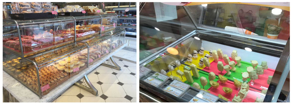
I’m not sure about being inspired by food? I think patisserie is really pretty though. I went to China in April of this year, and did a few little ‘Bake Off’-esque studies of the cute baked goodies they had there. There was lots of food shaped like other things… I even saw an ice cream shaped like Kim Jong-un ^^”
Baked goods and novelty ice cream in China~ (Collingwood, 2018)
Song-wise, I most like to listen to film soundtracks when working. Right now, my flavour of the month is the Call Me By Your Name (2017) score, which is lovely to work to. Because they are predominantly designed to be ‘background noise’ to accompany to what’s happening on screen, film scores are the perfect thing to passively listen to when creating.
Also, The Legend of Zelda soundtracks~
And songs with lyrics that I can’t quite make out (or even better, songs in foreign languages). I don’t know any of the words to most of my favourite music, but I like it that way. It’s nice to not have to know everything.
Is the artistic life lonely? What do you do to counteract it?
Honestly, I find solace in being alone. Not that I don’t like good company -I do-, it’s just that it’s often easier to organise my thoughts when I’m working by myself. I can’t even draw a straight line with someone looking over my shoulder!
In Western society, people seem to think of quietness as an undesirable trait- people favour extroverts. I feel quite strongly about this, maybe I’ll write a post in the future about it.
What do you dislike about the art world?
I think the current art climate is becoming all about politics; it’s OK to make things just for the sake of their beauty or design.
I admire people that can put a deeper meaning in their work, but there’s definitely room for artists who create for the sake of making something lovely. Art is a creative outlet that’s different for each person… it doesn’t always have to equate to something expected.
Lastly, when did you first develop a love for illustration?
As I said, I can’t remember a time when I wasn’t trying to draw or make something. I first gained a proper interest in art when I was doing fashion illustrations for my GCSE course- from there, I progressed onto Textile design (interiors, fabrics), and then finally illustration (which actually came from a last minute degree course change).
Also, once my art teacher told me my work was not fine art, as it was “too illustrative”.
Ha, this became a short essay! I know I won’t be able to help myself from expanding on some of these tangents in the future.
…And now we resume our scheduled program; worrying about the presentation!
References
Beckett, K. (n.d.). Kelsey Beckett Illustration – Gallery. [online] Kelseybeckett.com. Available at: http://kelseybeckett.com/# [Accessed 1 Oct. 2018].
Collingwood, C. (2018). Chinese Bakery [Photograph].
Collingwood, C. (2018). Chinese Novelty Ice Cream Shop [Photograph].
Collingwood, C. (2017). Haru- Springtime [Digital, various traditional techniques].
To say it was a busy week was an understatement- as well as finishing off my Proposal and Treatment (just a few small tweaks to complete over the weekend), I’ve been timetabling out the entire year, making action plans for the skills I want to improve.
A quick overview of my 6 chosen projects for the year:
-Personal Project 1- Printmaking (using the riso and developing specific riso-based and software skills)
-Personal Project 2- Narrative Animation Development (developing the characters, backgrounds, and storyboards/narrative for the animation project in Semester 2)
-Commercial Project 1- Penguin Student Design Award (creating a book cover for a given title- titles announced Oct 16th!)
-Commercial Project 2- Adobe Awards (using all my self-produced material from PP2 to create an animated short… probably looking forward to this one the most!)
-Commercial Project 3- Cheltenham Illustration Awards (I want a really nice ‘stand out’ piece for my portfolio and final show- this is the best opportunity I’ll have within my timetable)
-Personal Project 3- Portfolio, Brand and Merchandising (updating my portfolio with new/improved artwork, as well as making nicer promo materials and some merchandise for final show)
So now that all the writing is pretty much finished, I’ll have to adapt this into a presentation (which obviously I am dreading!!) I’ll need to really streamline my project proposal for this, including just the essentials so I can talk as little as possible while still getting the point across~
The presentation is due Friday 5th (a week from today), so I’ll be fiddling with my written work over the weekend, going through the corrections I’ve been given and making sure it’s all right before translating it into visuals and a presentation script.
In addition to these tasks, next week I’m aiming to start thinking a little bit more about what sort of imagery I want to bring into the printmaking project- so far on the shortlist there’s things like flora, fauna, and ‘natural patterns’, e.g. geodes and rock formations. I *love* to include pattern in my work (I’ve got quite a fascination with naturally formed repetition, especially) so this should be a fun one to look forward to after the trauma of having to present my proposal!!
I’ll update again next week once Friday is over and I can relax and think a bit more~