research

Concept Development Progress

Now that I’ve signed off the Penguin Student Award and Printmaking projects, I can finally dedicate my focus to the Concept Development project- I’ve already conducted a bit of artist research late last year (my post about it is here), so this has already given me a good foundation on which to design my concepts~

For this project, I need to produce as much development/concept material as possible for the upcoming Animation Production project in Semester 2. This includes character/environment designs, storyboards, narrative info, and other supporting material that will be of use to me in the coming months.

I’m starting with the character designs, since I feel that this aspect is the most important, and therefore want to get this done first. I’ll be designing a human young female character (who’ll serve as the centric narrative device), as well as a more visually intricate anthropomorphic deer, who’ll act as an ‘opposite’ character, with contrasting design aesthetics, environment and colour palette. I’ve made two concept boards with palettes and existing artwork that mirror what I want to portray for each of these two characters… a few pics below from each board (all referenced at the end of this post):

screen shot 2019-01-25 at 12.28.04
Top left: Figure a. Top right: Figure b. Bottom left: Figure c. Bottom right: Figure d.
screen shot 2019-01-25 at 12.27.14
Top left: Figure e. Top right: Figure f. Bottom left: Figure g. Bottom right: Figure h.

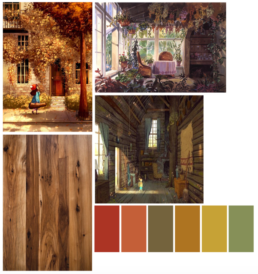
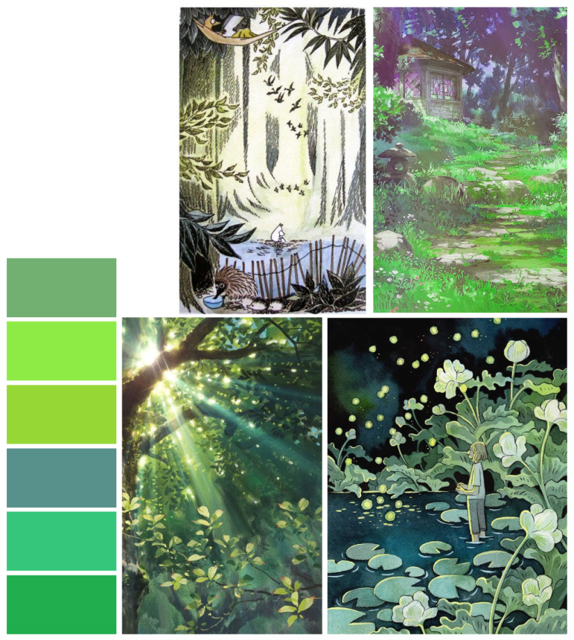
Using these images and palettes as a loose style guide will help me to design characters that will complement these visual concepts, while also using my notes on personality and traits that I’ve written up in my sketchbook.

I always find it useful to map out key persona information before designing my character, as I often have a good idea of how I want them to act before I bring them to life on paper- this allows me to incorporate design elements into their aesthetic that support their individual personalities.

I’ll post next week with some character development sketches ♥


References

h. Heikkala, L. (n.d.). Pond [Ink].

e. Jansson, T. (n.d.). The Moomins concept art [Graphite, watercolour].

a. Ma Van As, Y. (2018). After School Violin Lessons [Digital].

c. Mountain Lumber. (n.d.). Reclaimed Antique Hickory [Photograph]. Available at: http://www.mountainlumber.com/portfolio_page/reclaimed-antique-hickory/ [Accessed 1 Dec 2018].

d. Rockefeller, M. (n.d.). Paul’s Cabin [Digital].

f. Studio Ghibli. (2010). Concept art from The Borrower Arrietty [Watercolour].

g. Studio Ghibli. (2010). Screen capture from The Borrower Arrietty [Animated feature].

b. Studio Ghibli. (2010). Concept art from Kiki’s Delivery Service [Watercolour].

inspiration, research

Printmaking – Screenprint Experimentation

To start the week, I’ll be working on concepts for the A4 screenprints we’ll be producing on Friday- as this is intended to be experimental, I’ll be straying away from my usual techniques, instead trying out digitally based fills for some of my initial ideas. For example, halftones, custom patterns, noise fills, and other fill techniques that produce results that will work well with a silk screen- since you can add lots of very fine detail with screenprinting, it’ll be a great opportunity to try these new styles out.

The last printmaking project I did involved monoprinting with a laser cut perspex plate- the results were mixed, but most importantly plate printing allowed for a lot less detail on the design (compared to screenprinting).

We were shown a mini tutorial on Photoshop and Cinema 4D, using shaded spheres as an example when applying each technique. They really looked like little planets… so I decided that using the solar system as a base would be a nice way to still include something from my own personal interest.

I may even make a second layer that details additional embellishment on the final design- this way, I can come back to my love of gold foil, using liquid glue to print the exact areas for foiling. I can then go in with the foil, brushing it on by hand. Going back to the monoprint project from Year 2, I used gold ink to work on top of my prints by hand after trying to print with glue… the pressure from the roller combined with the tackiness of the glue ended up a mess (lesson learned)

Screen Shot 2018-10-15 at 13.38.59.png
Collingwood, C. (2016)


Doing it by hand was tedious, but the results were good… yet not perfect. Look at the way the line art came out on the print- the details were too fine for the ink to stick to the printing plate when I rolled out the ink, especially with the white outline bordering the sky. It was a combination of the lines being too thin, and the ink being too thick. It was a lot more cost-effective compared to silk screen printing, but I feel plate printing is more suited to less detailed imagery.

With this new technique I’m trialling, I’ll be able to apply the foil with a lot more precision, yielding better results (as well as being able to have finer details on the base black layer). Also the gold foil is so much more vibrant and pretty compared to gold ink~

I’ll research this thoroughly before I go in and ruin all my prints, but I think if it works well this could be a really useful technique for the future.

There might even be the potential to create runs of hand-embellished prints (e.g. foils, inks, pattern collage, painted details), making each one unique. This could be a good way to market prints that I can sell, either at final show or on sites such as instagram, Etsy, etc.


Watch this space for a Friday update ♥

no pun intended


References

Collingwood, C. (2016). Cassiopia [Ink].