portfolio, research, SWOT/Target Setting

Cheltenham Illustration Awards Progress

Its been a little while, but I’ve made some good progress since last checking in!

This week, I’ve been working constantly on concepts for my Cheltenham Awards piece- I want this to be culmination of my progression throughout my degree, so I want to make sure it’s suited to the brief, artistically and technically sound, and also something I’m proud of and can connect with.

When mapping out ideas for ‘Unity’ (the theme of the Awards this year), I thought back to my trip to China last year. The contrast between old and new Shanghai architecture, as well as the exceedingly blurred divide was reflected in the community around the city. It was a wild and dizzying blend of temples and traditional teahouses that were hundreds of years old, stood literally metres away from futuristic skyscrapers and the latest architectural marvels. It was so stunning, and unlike anything I’d ever seen! This really felt like the perfect thing to base my ideas on, so I set out making some concepts:

IMG_0168
‘Modernisation’ Concept 1 (Collingwood, 2019)
IMG_0167
‘Modernisation’ Concept 2 (Collingwood, 2019)
IMG_0163
‘Modernisation’ Concept 3 (Collingwood, 2019)


I’ve experimented with different background layouts, figural poses and blends of traditional and modern imagery. I chose the Pudong skyline as the background (very recognisable and iconic), with a selection of traditional architectural motifs based on the places I visited for the foreground surrounding the figure~

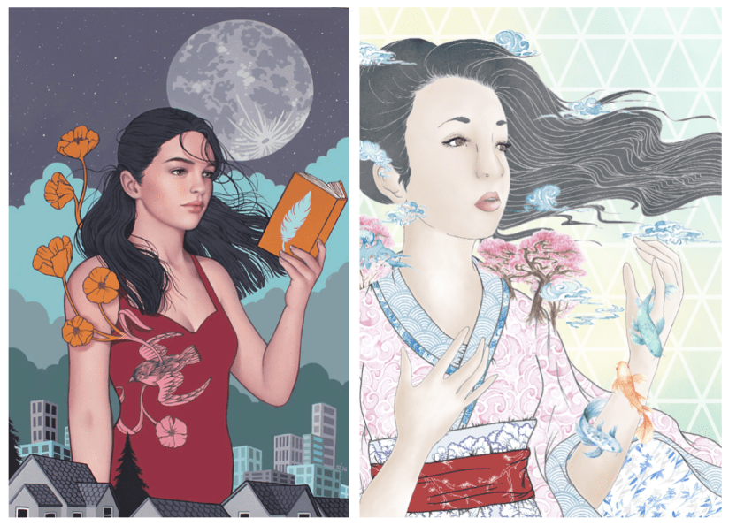
The idea fell into place quite quickly, as I was able to envision a rough layout after looking into my initial artist research, particularly the work of Sarah Joncas, as well as taking inspiration from my own past work:
Screen Shot 2019-05-19 at 21.37.16
Left: Night Life (Joncas, n.d.). Right Haru ‘Springtime’ (Collingwood, 2017)

The combination of figural elements and landscapes is something I’m already familiar with, and I was eager to work on something that is both beautiful and detailed, with architectural elements that were new territory to me.

I think I’ll be able to realise this piece fairly ‘easily’ compared to my other projects, where half of the battle was technique and workflow. I’m confident in my ability to produce this piece on Procreate, even thought that in itself will be a slight learning curve. However, that just means this is a good opportunity to fully immerse myself in the software- I plan to do final tidy up and processing on Photoshop, but Procreate boasts most of the same functions, so I want to make sure I’m widening my skills as much as possible.

I’ll have to keep a close eye on my time restraints and other projects (e.g. this blog!), as not keeping up with any one of these will negatively impact my progress. This has been a major weakness throughout my degree, and it’s never been so critically important to keep this in check!

Targets for the next few days include working on this piece (probably constantly), while also finding time to start collating my portfolio work and prepping for hand-in~


References

Collingwood, C. (2019). Haru ‘Springtime’ [mixed media].

Collingwood, C. (2019). Modernisation Concept 1 [digital].

Collingwood, C. (2019). Modernisation Concept 2 [digital].

Collingwood, C. (2019). Modernisation Concept 3 [digital].

Joncas, S. (n.d.) Night Life [oil, acrylic].
portfolio, research, SWOT/Target Setting

Risograph Realisation – Idea Finalisation

It’s been a bit of a weird week- I haven’t made as much progress as I’d hoped with this riso project but any progress is better than none at all! ♥

I’ve been looking at finalising my riso ideas, and while these are still fairly rough drafts I find it much easier to visualise a final concept in a neater, tidier visual style (e.g. I’ll be really finishing up the layout in the actual final piece process, which is much easier thanks to the flexibility of Procreate).

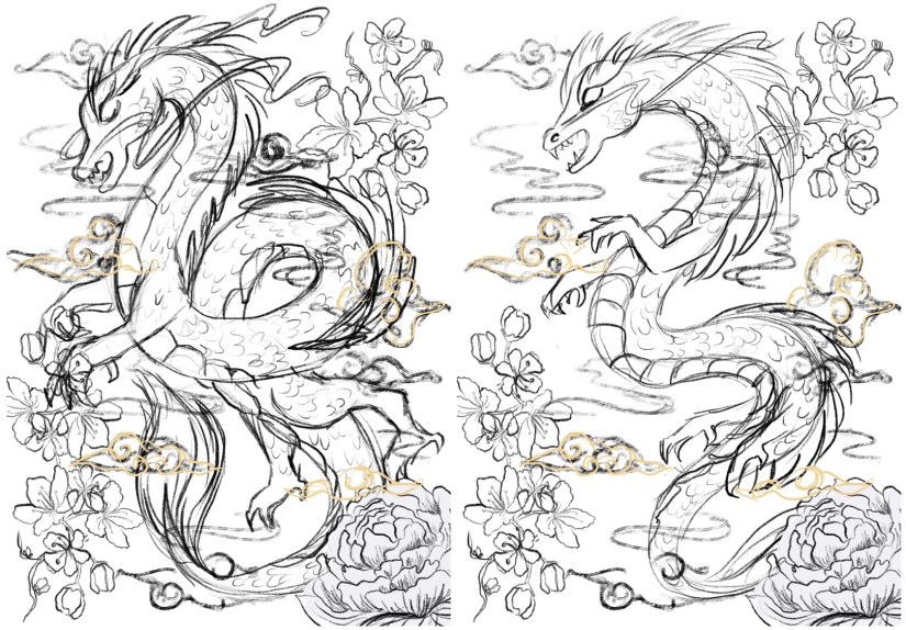
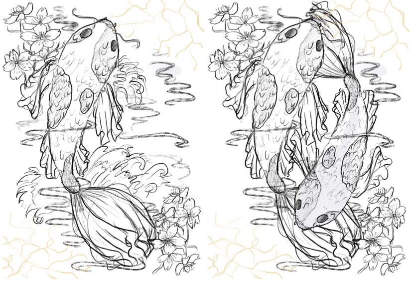
So far, I’ve got 4 potential ‘final’ layouts, each with differences that affect the way in which the artwork fills out the frame of the piece- since these will be A3, the actual image will be slightly smaller on each side (~2.5cm) due to the riso printing limitation. I’ve also begun to visualise how I can embellish these pieces (see the light gold coloured overlay on each piece for ideas on which areas I might work into- this is all TBC!).

China Risograph Print Final Concepts (Collingwood, 2019)


Japan Risograph Print Final Concepts (Collingwood, 2019)


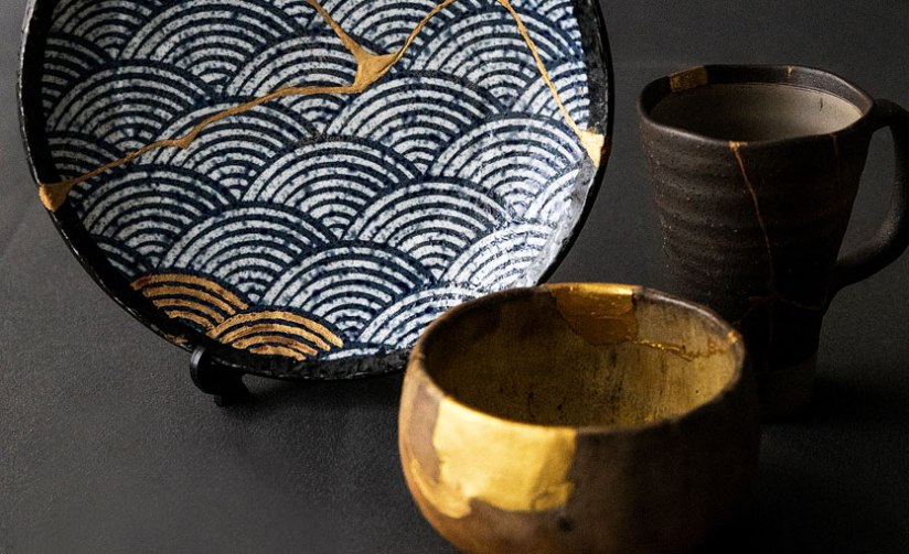
One technique I thought would work especially well on the Japanese/Koi Fish print was kintsugi inspired embellishment (which I’ve begun to visualise in the final concept sketches). I came across this art form during my visit to the Durham University Oriental Museum, where there were examples of ceramics displayed utilising this technique. The result was beautiful, and the idea behind the process even more so.

Kintsugi is based around the idea that the imperfect is beautiful- while some of us in the Western world prefer things to be new, Japanese people relish repairing broken items and seeing beauty in imperfection. This also links to the wabi-sabi philosophy, which centres around the idea that imperfection and the transience and fragility of perfection is accepted- far different to the obsession with perfection we have in the West.

I’d love to incorporate this into my work, as I too have a fascination with perfect things- I think it’d add some nice little imperfections into my pieces. The fact that I’ll be embellishing these by hand will mimic the original technique; the rest of the imagery will be digitally produced and collated, printing using the risograph which is very ‘perfect’ despite some natural variance in the process.

Hero
Kintsugi – Japanese Ceramic Gold Repair (Sydney Community College, n.d.)


I’ve also started to look at colour palettes and application for the final riso prints- since my palette is somewhat limited, I need to use my trusty Risotto colour swatch pack to look at alternative palettes that would work well. Since my artwork is mostly line-art based, I can use quite dark shades of the inks to intensify the line work while employing lighter, more subtle shades to add interest and shading.

This will be a target for the coming weeks after I’ve finished the base artwork- I’ll use Photoshop to manipulate the grayscale layers to view different colour palettes, which I’ll write about in my sketchbook.

I can’t wait to start properly visualising these finals… I’ll be using Procreate to render and layer my files ready for printmaking~

Blog post on this process coming soon! ❀


References

Carnazzi, S. (n.d.). Kintsugi: the art of precious scars [online]. Available at: https://www.lifegate.com/people/lifestyle/kintsugi  [Accessed 21 Mar 2019].

Collingwood, C. (2019). China Risograph Print Final Concepts [digital].

Collingwood, C. (2019). Japan Risograph Print Final Concepts [digital].

Richardson, J. (2016). WABI-SABI and UNDERSTANDING JAPAN | A PHILOSOPHY AND AESTHETIC AS WORLDVIEW [online]. Available at: https://www.tofugu.com/japan/wabi-sabi/ %5BAccessed 21 Mar 2019]. 

Sydney Community College. (n.d.). Kintsugi – Japanese Ceramic Gold Repair [photograph]. Available at: https://www.sydneycommunitycollege.edu.au/course/kintsugi.gold.repair  [Accessed 21 Mar 2019].

evaluation, SWOT/Target Setting

March 2019 – Progress and Reflection

It’s been a week or so since my visit to the museum, and I feel that despite always feeling that I’ve never done enough work (this is probably part *actual* truth and part self belief issues haha), I’m happy that I’ve managed to nail down my final concept after a series of initial and developed designs.

I think this riso project dragged a bit for the first couple of weeks- I suspect this is due to the fact that I spent a lot of time researching into the imagery that I wanted to use. I’m very aware of this subject matter potentially walking a fine line between appreciation and appropriation, so I wanted to take the extra steps to ensure I was representing each culture accurately. I also made use of my current knowledge as I do have a strong general interest in this topic, but I’ve learned so much more through thorough research. It’s always better to be safe than sorry, and I’m pleased that I was also able to expand my research file with this~

Drawing out the initials is really tedious for me- I much prefer sketching out the development, since this is building on an idea I really want to do (rather than drawing out ‘filler’ ideas). I fully admit I usually have a somewhat fully formed initial idea in my head when I start a project, so it can be hard to stray from this or try to show enthusiasm for the other initial ideas ^^”

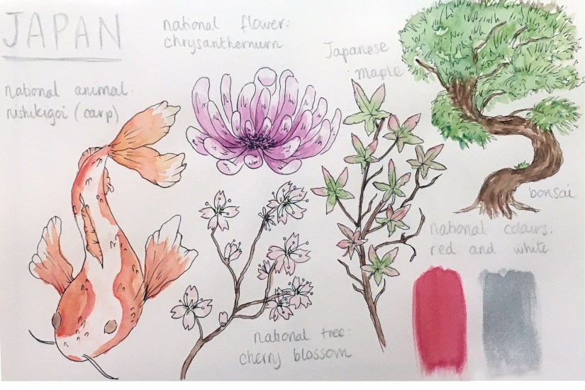
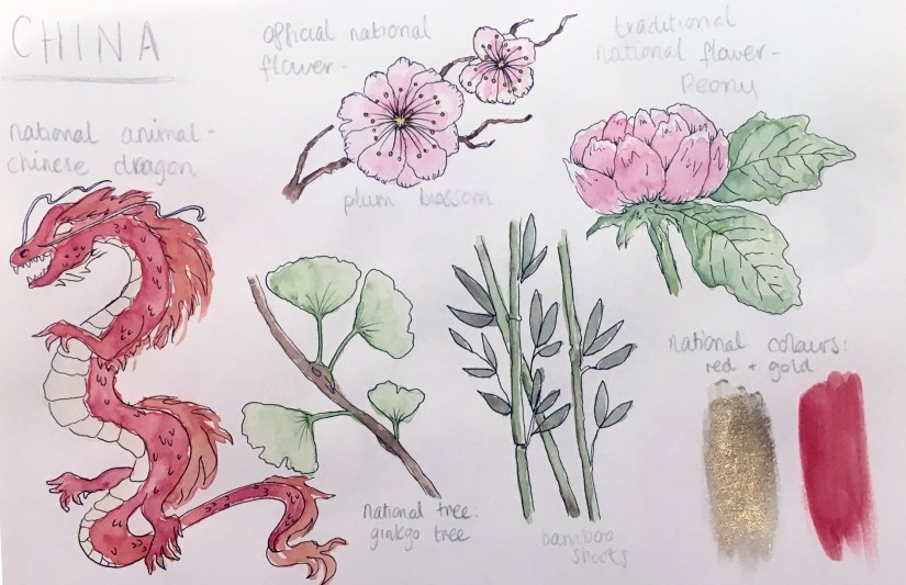
Another thing I really wished I’d done was to do all of my initials and development digitally- as well as aiding in the general layout, working digitally is much neater and less messy than scribbly pencil drawings (which my sketchbooks are notorious for). I tried to remedy this by doing a few little ‘key icons’ research pages in watercolour in my sketchbook- the phrase “you can’t polish a turd” comes to mind, but I had fun doing them anyway!

japaniconsheet
Japan Icon Sheet (Collingwood, 2019)


chinaiconsheet
China Icon Sheet (Collingwood, 2019)


It was really strange drawing and colouring something refined traditionally- I never thought it would come to this but I actually really prefer digital now! Especially since I’ve started working on Procreate with my iPad, since the technicality and effects both mimic tradition workflows very well. Throwback to the iPad review I wrote- read it here

Targets for the coming weeks include finishing off my digitised concepts, taking these into the final design stages, and looking further into colour choices with the riso.

I’ll have to be mindful of any threats to my progress such as time restraints and poor planning, as these things have hindered me in the past- however, I’m determined to keep better time this semester, as one of my targets from a few weeks ago was to manage time better.

More to come soon!


References 

Collingwood, C. (2019). China Icon Sheet [ink, watercolour].

Collingwood, C. (2019). Japan Icon Sheet [ink, watercolour].

research, SWOT/Target Setting

Risograph Realisation – Design Development

In my initial ideas, I’ve played with concepts such as traditional Asian-inspired pattern work (which I’m quite familiar with from past projects), basic floral motif work, and my favourite concept so far: prints based on national imagery associated with Japan and China.

I visited China last year and -for lack of a less cliché term- fell in love with how cultural significance is interwoven throughout every aspect of their design and aesthetic. The concept of a pair of prints representing China and Japan came from the idea of ‘where I’ve travelled to, and where I plan to go next’, combined with a deep appreciation of Asian culture and design. Since the two cultures influenced each other so much throughout history, a pair of prints encapsulating each country’s defining aesthetics works really well (both as an entity and as separate pieces of design).

After working on this idea, I was enjoying some down time in front of the telly and caught an episode of Monty Don’s Japanese Gardens (BBC Two, 2019)- obviously this appealed to me massively! The pair of episodes focused on the distinct seasons of spring and autumn in Japan, and how the foliage and flora changes accordingly. Of course, this inspired an alternative to my front-running design idea based on this aspect of Japanese culture and aesthetic design- nothing is by chance in Japanese design, not even nature!

Additionally, since the risograph printer is originally from Japan I thought it would be really interesting to combine traditional Japanese imagery with the newer technique of riso printing to create something that bridges the gap between traditional and modern technique.

I also really want to explore colour in this project, since we have some lovely new inks to use in this process (these being Purple, Teal and Green). I see lots of opportunity to incorporate these shades into my work to create something more refined and less blocky and loud compared to the terrarium project, which was printed in garish tones of blue and pink. I still like those prints, but I’m hoping to capture a totally different and more refined aesthetic with this project that’s also more visually in-line with other projects I’ve worked on.

To help me with colour matching, I’ve ordered a riso swatch pack from Risotto (a print studio based in Scotland that I’ve included in my research)- since it’s not very cost effective to make a test sheet of colour overlays and combinations myself, I thought I’d order a pack from a riso studio to use as a guide when fiddling with the opacities of my final image. I didn’t really make use of this design mechanic in Semester 1, so that’s a personal goal of mine for this project c:

IMG_8566
Risotto Studio Risograph ink swatches (Collingwood, 2019)


Here’s a pic of the contents of the pack- looking at these, I really wish we had a gold ink available at the college! It looks especially nice on black ♥ I’m still planning to embellish my final prints in ‘post-production’ using a variety of techniques- maybe even making some of them specific to a particular print. This will include metallic leaf work, so I can make a similar effect myself for now.

In terms of SWOT analysis for this week, I can work with my previous analysis from Semester 1’s PP1 (Printmaking), when I was also working on a riso project. Despite having more strengths with the riso medium than weaknesses due to valuable past experience, I still need to be aware of my biggest threat: timekeeping. However, the best opportunity for this semester will be to *actually* keep better time throughout, which is very doable since I’m still pretty early on in the term.

More next week when I nail down my final idea (I’m still a bit undecided!) and start refining this digitally~


References

Collingwood, C. (2019). Risotto Studio Swatch Pack. [Photograph].

Monty Don’s Japanese Gardens. (2019). BBC Two Television, 15 February.

Risotto Studio. (n.d.) Risotto Riso Room. [online]. RisottoStudio.com. Available at: https://www.risottostudio.com/print [Accessed 3 Feb 2019].


portfolio, SWOT/Target Setting

Concept Development – Character Designs

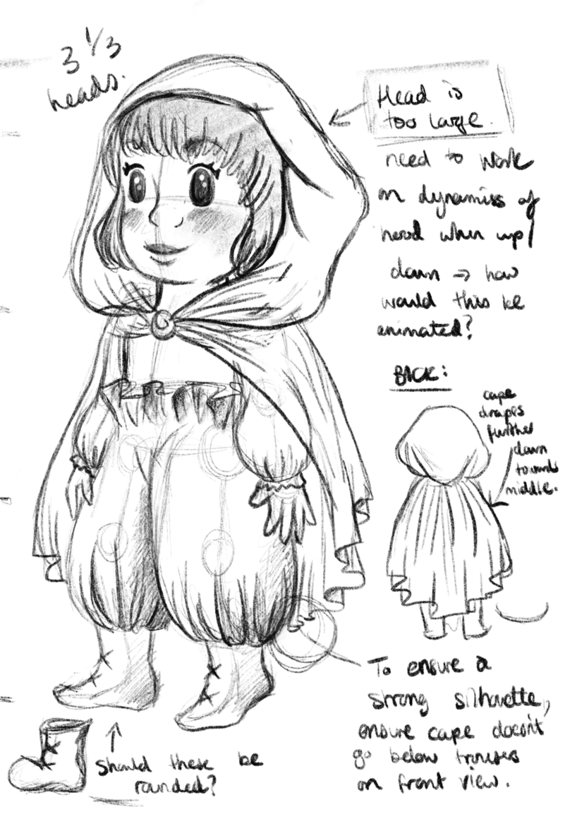
I have some new character designs to share! c: I’ve been working constantly on these since my last update- I feel I’ve made good progress even though there’s still so much to do!

screen shot 2019-01-28 at 10.19.12
Young Female Character: Initial Concepts (Collingwood, 2019). 
screen shot 2019-01-28 at 10.19.32
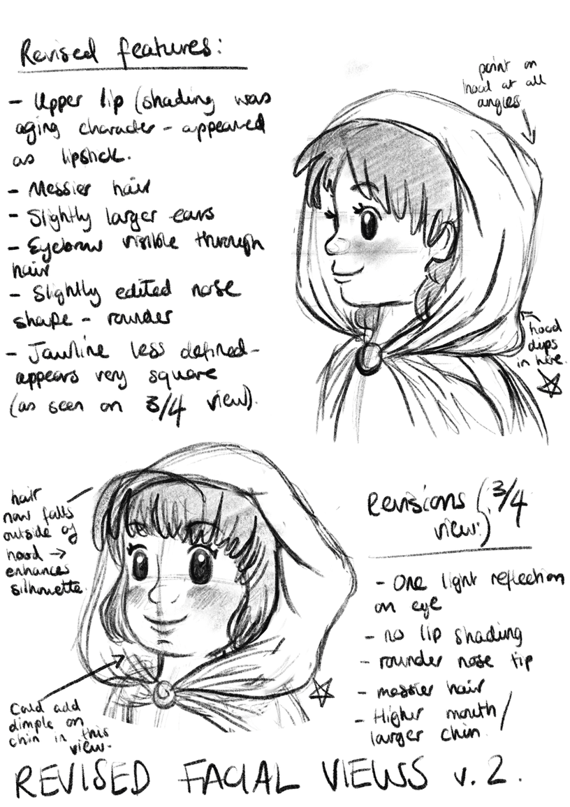
Young Female Character: Face Revisals/Development (Collingwood, 2019). 
screen shot 2019-01-28 at 10.22.48
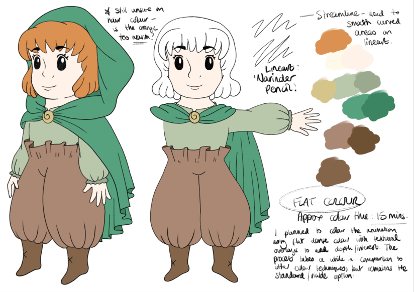
Young Female Character: Palette/Colour Application Experimentation (Collingwood, 2019). 


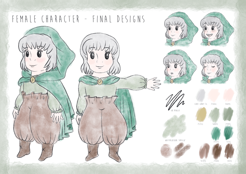
Meet our heroine of the story- she doesn’t have a name on purpose, because I want the audience to be able to relate to her and put themselves in her shoes. Since she’s youthful, naïve and curious, I wanted these traits to shine through in her character design. I went through loads of concepts (some of which were really awful, haha) but settled on a final design for her that best described her personality to the viewer. I’m sure it shows, but I was really inspired by the ‘chibi’ characters of Studio Ghibli, as well as the loose, simplistic art style of Heikala (info on both of these here from my artist research for this project).

I’m pleased with her design- she went through quite a few refinements as I progressed through my workflow! Final character board below:

screen shot 2019-01-25 at 13.41.43
Young Female Character: Final Character Board (Collingwood, 2019). 


To be honest my favourite aspect of her is her ‘paper bag’ trousers- I didn’t want to put her in a skirt lest that undermine her childish adventurous nature, so I decided to go with these oversized paper bag pantaloons (which also matched her boots and cape much better… too many ‘loose hems’ otherwise!)

I really love them ^^”


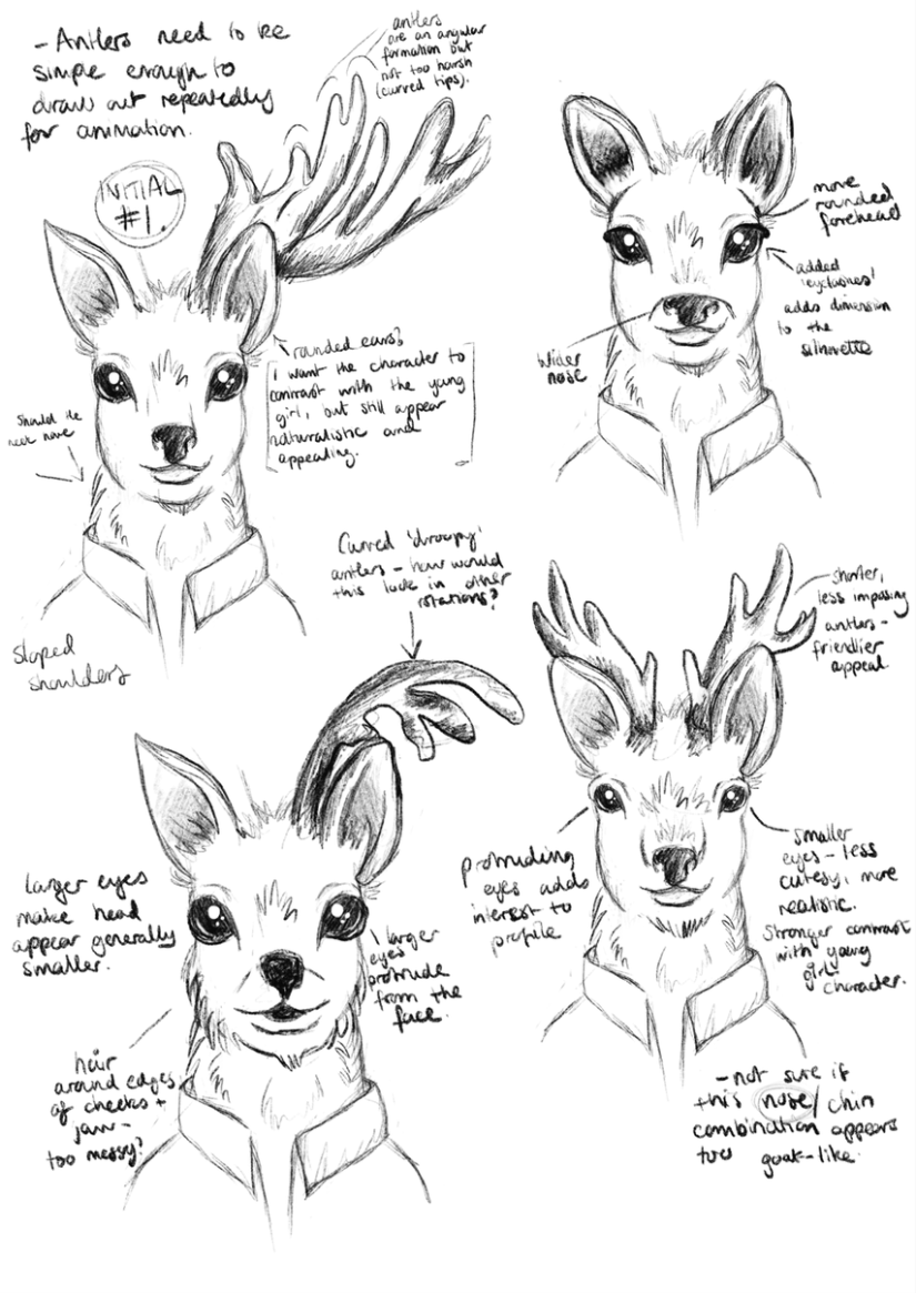
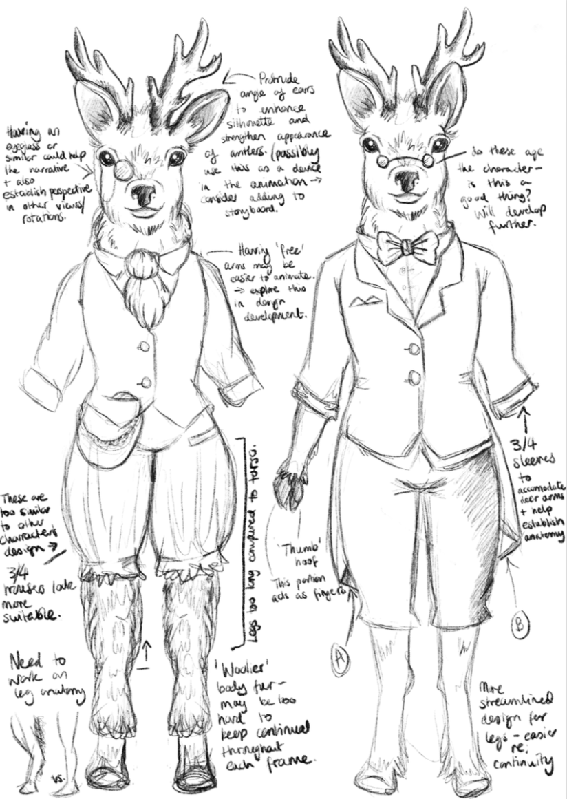
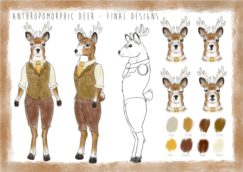
Next up, we have our anthropomorphic deer character:

screen shot 2019-01-28 at 10.20.51
Anthropomorphic Deer: Initial Head Concepts (Collingwood, 2019). 
screen shot 2019-01-28 at 10.21.32
Anthropomorphic Deer: Anatomy/Front View Development (Collingwood, 2019). 
screen shot 2019-01-28 at 10.16.14
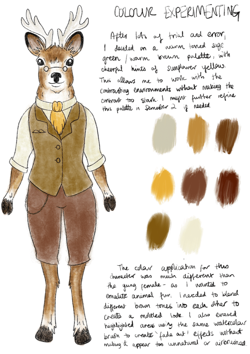
Anthropomorphic Deer: Palette/Colour Application Experimentation (Collingwood, 2019). 


I designed him to both contrast and complement the young girl character, since the contrast of their environments and designs is central to the narrative journey. The palette is still natural while being different to the bright, fresh toned greens I used on the female character’s designs.

He’s very scholarly and loves a good cup of tea, I hope you can tell~

screen shot 2019-01-25 at 13.41.58
Anthropomorphic Deer: Final Character Board (Collingwood, 2019). 


It was a real challenge to simplify the characters enough so that there wouldn’t be any issues when drawing them repeatedly for the animation- I think I’ve nailed this down enough, but as always there’s always the chance I’ll refine these some more in the follow-up Semester 2 project.

I’m pleased with the outcomes- targets for the next few weeks include finalising and collating all of my projects for hand in, and starting to think about the beginning of Semester 2 and how I’m going to tackle the next few months. Using my previous SWOT analysis’ will help me circumvent any problems I anticipate I’ll have, while also playing towards my strengths to produce a strong semester of portfolio work.


References

Collingwood, C. (2019). Anthropomorphic Deer: Anatomy/Front View Development [Digital].

Collingwood, C. (2019). Anthropomorphic Deer: Final Character Board [Digital].

Collingwood, C. (2019). Anthropomorphic Deer: Initial Head Concepts [Digital].

Collingwood, C. (2019). Anthropomorphic Deer: Palette/Colour Application Experimentation [Digital].

Collingwood, C. (2019). Young Female Character: Face Revisals/Development [Digital].

Collingwood, C. (2019). Young Female Character: Final Character Board [Digital].

Collingwood, C. (2019). Young Female Character: Initial Concepts [Digital].

Collingwood, C. (2019). Young Female Character: Palette/Colour Application Experimentation [Digital].

Heikala (n.d.). Instagram – @heikala (online). Available at: https://www.instagram.com/heikala/?hl=en [Accessed 2 Jan 2019].


research

Concept Development Progress

Now that I’ve signed off the Penguin Student Award and Printmaking projects, I can finally dedicate my focus to the Concept Development project- I’ve already conducted a bit of artist research late last year (my post about it is here), so this has already given me a good foundation on which to design my concepts~

For this project, I need to produce as much development/concept material as possible for the upcoming Animation Production project in Semester 2. This includes character/environment designs, storyboards, narrative info, and other supporting material that will be of use to me in the coming months.

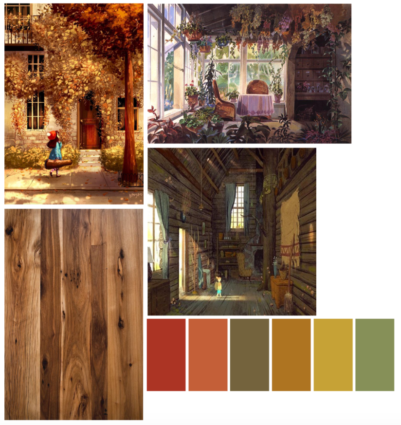
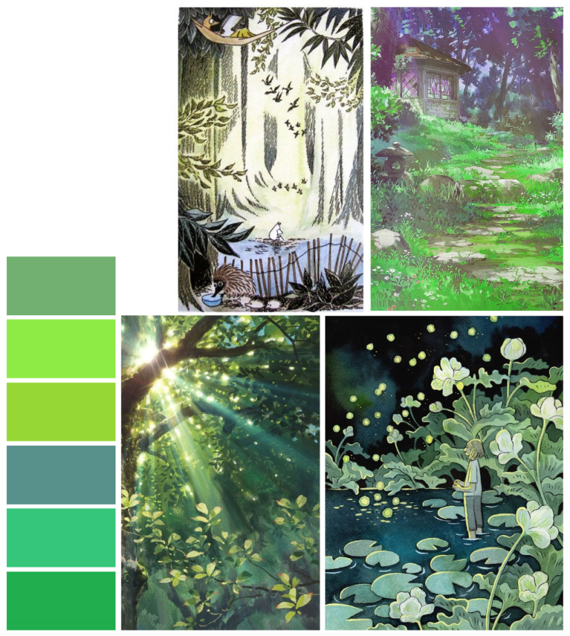
I’m starting with the character designs, since I feel that this aspect is the most important, and therefore want to get this done first. I’ll be designing a human young female character (who’ll serve as the centric narrative device), as well as a more visually intricate anthropomorphic deer, who’ll act as an ‘opposite’ character, with contrasting design aesthetics, environment and colour palette. I’ve made two concept boards with palettes and existing artwork that mirror what I want to portray for each of these two characters… a few pics below from each board (all referenced at the end of this post):

screen shot 2019-01-25 at 12.28.04
Top left: Figure a. Top right: Figure b. Bottom left: Figure c. Bottom right: Figure d.
screen shot 2019-01-25 at 12.27.14
Top left: Figure e. Top right: Figure f. Bottom left: Figure g. Bottom right: Figure h.

Using these images and palettes as a loose style guide will help me to design characters that will complement these visual concepts, while also using my notes on personality and traits that I’ve written up in my sketchbook.

I always find it useful to map out key persona information before designing my character, as I often have a good idea of how I want them to act before I bring them to life on paper- this allows me to incorporate design elements into their aesthetic that support their individual personalities.

I’ll post next week with some character development sketches ♥


References

h. Heikkala, L. (n.d.). Pond [Ink].

e. Jansson, T. (n.d.). The Moomins concept art [Graphite, watercolour].

a. Ma Van As, Y. (2018). After School Violin Lessons [Digital].

c. Mountain Lumber. (n.d.). Reclaimed Antique Hickory [Photograph]. Available at: http://www.mountainlumber.com/portfolio_page/reclaimed-antique-hickory/ [Accessed 1 Dec 2018].

d. Rockefeller, M. (n.d.). Paul’s Cabin [Digital].

f. Studio Ghibli. (2010). Concept art from The Borrower Arrietty [Watercolour].

g. Studio Ghibli. (2010). Screen capture from The Borrower Arrietty [Animated feature].

b. Studio Ghibli. (2010). Concept art from Kiki’s Delivery Service [Watercolour].

evaluation, portfolio

A Short Timeline of The ‘Wonder’ Project

Well I’ve been productive this week…~

(haha but no really, I essentially just finished the Wonder Penguin Project in 4 days). It was intense, but it worked!

I didn’t mean to take such a small amount of time for this (my initial timetable gave me 4 *weeks* from mind map to final cover), but having so much downtime in my life made me reevaluate how long I really had to complete this brief. I have so much in store for PP2 that I didn’t want to waste any more time than necessary on what was supposed to be my ‘shortest’ project- that thought took on a while new meaning…

I had already researched into some existing source material e.g. book covers and film posters before the Christmas break, so I’d be lying if I said I didn’t have a rough idea of what I wanted to do. With this research in hand, I started to draft out some concepts of the cover, evaluating each one and choosing the most successful to take forward to development. This was all pretty run of the mill development work that I completed over the course of a day, so I’ll move onto the more interesting stuff~

I worked in Procreate again to bring the final product to life- I feel that my workflow has really come into its own since I started using my iPad as a key tool in my process; it’s the perfect balance between familiar traditional technique and the ease and innovation of digital painting. I was able to scan in my final concept from my sketchbook and work directly on top of this in Procreate, where I could fine-tune the details, proportions, etc.

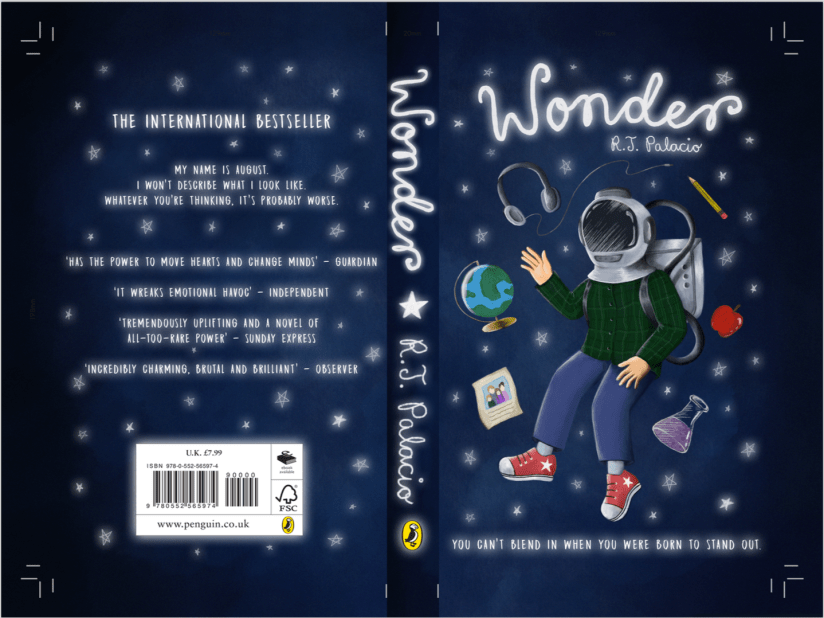
Procreate tells me I clocked in at just under 8 hours with over 7000 strokes to complete the cover- that’s quite an interesting stat! I’m pleased with the final image:

screen shot 2019-01-25 at 12.31.31
Wonder Final Cover Art (Collingwood, 2019).

I’ll be making a mock-up final product by laminating my printed cover onto an existing copy of the book before hand in too… it’ll be nice to see a ‘finished product’!

I’m expecting to have to make a few wee changes/additions to the project work (particularly the written work) once I have a pre-hand in tutorial, but for the most part I can put this project to rest. ♥


More next week as the deadline draws near!


References

Collingwood, C. (2019). Wonder Final Cover Art [Digital].

inspiration, research, SWOT/Target Setting

Concept Development – Project Beginnings

This new week means the start of a new project- quite the relief! As much as I enjoyed the riso project, it was very overwhelming learning literally an ENTIRELY new process, from the design basics to the niggly little details surrounding printing and technical issues. I’m not completely done with riso printing, however- I still hope to use it more actively in the new year, especially for print editions to sell at final show.

Onto the new project- Character and Narrative Development! As much as this represents its own set of experimental challenges, I’m hoping it’ll be a little more of a gradual learning curve, rather than the ‘throw myself in the deep end’ approach of the riso printing process ^^”

Thus far, I’m deep into the research portion of my workflow- since this project has been on my mind for a very long time (read: years), I already had quite a good vision of what the aesthetics of the environments and characters will look like. As such, my list of existing artist inspiration is long! To name a few, Nicole Gustafsson, Taryn Knight and Heikala are some of the most influential people I’ve looked at (examples of their work below.)

Screen Shot 2018-11-22 at 18.04.29.png
Left to right: Heikala, 2018. Gustafsson, 2018. Knight, 2018.

More on this in my artist research file, but I especially love Gustafsson’s work with anthropomorphic characters- this will be a big source of inspiration for my deer-man character. A similar simplified art style like Heikala’s work would work well for the animation, as I must always be mindful of the level of detail in the imagery- while I’ve timetabled quite a few weeks to realise the project, I don’t want to overwhelm myself with detail in the work.

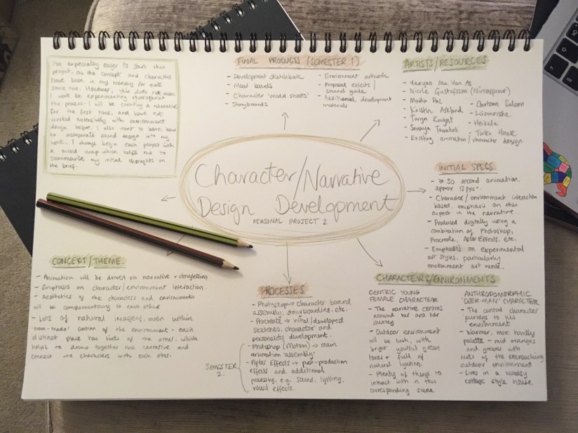
I want the piece to have a warm, familiar feel with a woodsy colour palette for the most part- with warmer, organic tones for the deer-man and more youthful, fresh colours for the centric female character. More details on character, aesthetic and the more technical side of my project are documented in my initial mind map:

IMG_7944.jpg
My initial mood board for the project- gathers all my thinkings into one place! (Collingwood, 2018).

For the rest of the week, I’m aiming to make some mood boards that can portray my intentions for aesthetic, colour and character design in a very strong way- I often struggle to find faith in my initial ideas, especially when pitching them to other people, so I’m hoping a few mood boards that are well put together will aid me from the outset. (…did I also mention that mood boards are an excellent prop to hide behind during formal presentations…?)

In addition, I often like to fully flesh out my characters with MBTI personalities and trait lists… all part of my process to feel more connected to my characters. This will be the main focus of next week.

More soon ♥


References

Collingwood, C. (2018). Personal Project 2: Initial Mind Map.

Gustafsson, N. (2018). Shiba Spellcaster [Acrylic].

Heikkala, L. (2018). Astrochemist [Ink].

Knight, T. (2018). Untitled [Watercolour].