It’s that time!~
I’m so close to handing everything in, and before I do so I need to reflect upon the year as a whole- the good, the bad and everything in between!
Semester 1
I hit the ground running for Semester 1 after a disappointing year repeating the second year of my degree at CCAD (now the Northern School of Art). I had big plans for the year, outlining some pretty ambitious projects for the coming months, including a fully fledged animation project and a few familiar competition briefs from the past, e.g. the Cheltenham Illustration Awards, which has always had a very engaging theme year on year.
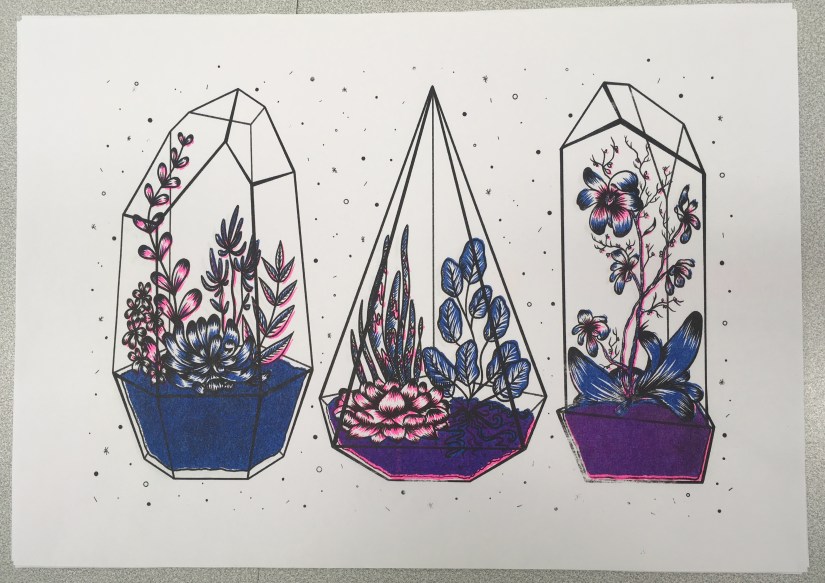
Risograph Printmaking: The first project I decided to work on was the Riso project- I’d heard about the new printing facilities and was eager to try them out as part of the initial Semester 1 term, which was highly focused on skills development and experimentation with new techniques.
This proved to be a very steep learning curve, but I did enough research to somewhat know what I was doing. At this stage, we only had 3 ink colours and a plain black ink drum, which made my options somewhat limited. However, these colours produced a very ‘traditional’ riso print with the strong pink and blue inks, which was outside my comfort zone yet felt very fitting for my first go with the medium.
I was pleased that I’d given it a try, despite being a bit iffy with my final image- it felt quite far away from the rest of my body of work. At the time I wanted to revisit the process, but my current plans didn’t leave much room for negotiation.
Penguin Student Award: The next two projects were worked on simultaneously- the Penguin Student Award and my personal project, Narrative Animation Development.
I chose Wonder by R.J. Palacio as the subject for the Penguin Award, as I was already familiar with the story and thought there’d be some really nice visuals to experiment with. I actually really enjoyed working on this, as it was a valuable experience that had clear industry links, which felt very worthwhile. I also loved getting back into typography and layout, as I hadn’t had a chance to work with these elements since my disastrous Pavilion Books brief while at CCAD (…maybe it wasn’t that bad, but it definitely felt that way). My final image was successful, even though I could have spent a little more time on the imagery rendering and overall finish.
This project was completed in the space of around 2 weeks, which was a feat for me since I tend to spend way too much time mulling things over in the research and development stages- which unfortunately impacted my work for the latter Narrative Animation project. :c
Narrative Animation Development: I was super excited to start work on this particular project as a finale for Semester 1, as it was based around an idea that had been mulling around in my head since the end of my FdA (summer 2017). I had planned for this to be my FMP at CCAD, which never happened since I moved back to Newcastle College after a tumultuous year. Therefore, I was determined to make it happen and started out with a concept project that would lead onto the animation realisation in Semester 2.
As I worked, I was easily able to map out my characters since they’d been fully formed for quite some time. There were negligible changes in appearance, but this was mostly practical so they were simplified enough to animate. However, time started to become very short and I ended up scrapping some of the more interesting elements of the project, including the background/environment designs which I was very eager to work on. My final project consisted of two character boards and accompanying development, some environment mood boards and a set of storyboards for the narrative.
At this point, I was well and truly knacked and vowed to never overstuff my proposal again.
Semester 2
Semester 2 was a bit of a disorganised monster, as I was so tired and stressed after the self-imposed heavy workload of Semester 1. I was very mindful when mapping out my proposal for this term- which led to the sad decision to remove the Animation Realisation project from my work plan. Ultimately, it felt too disconnected from the rest of my work planned for the year. Perhaps this is because the original inception of this project was quite a while ago, and I’ve grown as a person and an artist since then. Coupled with the immense amount of work it would take, I decided to postpone this project to be realised in my own time after my degree.
This left me with a bit of a gap in my schedule, so I decided to fill this in with a second Riso project after my pleasant experience in Semester 1. I had planned for the last commercial project to be the Cheltenham Illustration Awards, which felt was achievable, as well as being a good opportunity to create a stand out portfolio piece for the year. The final personal project was my Portfolio project my default.
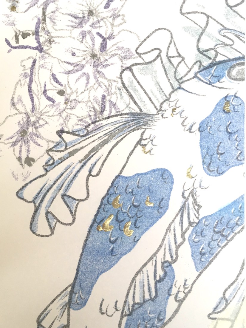
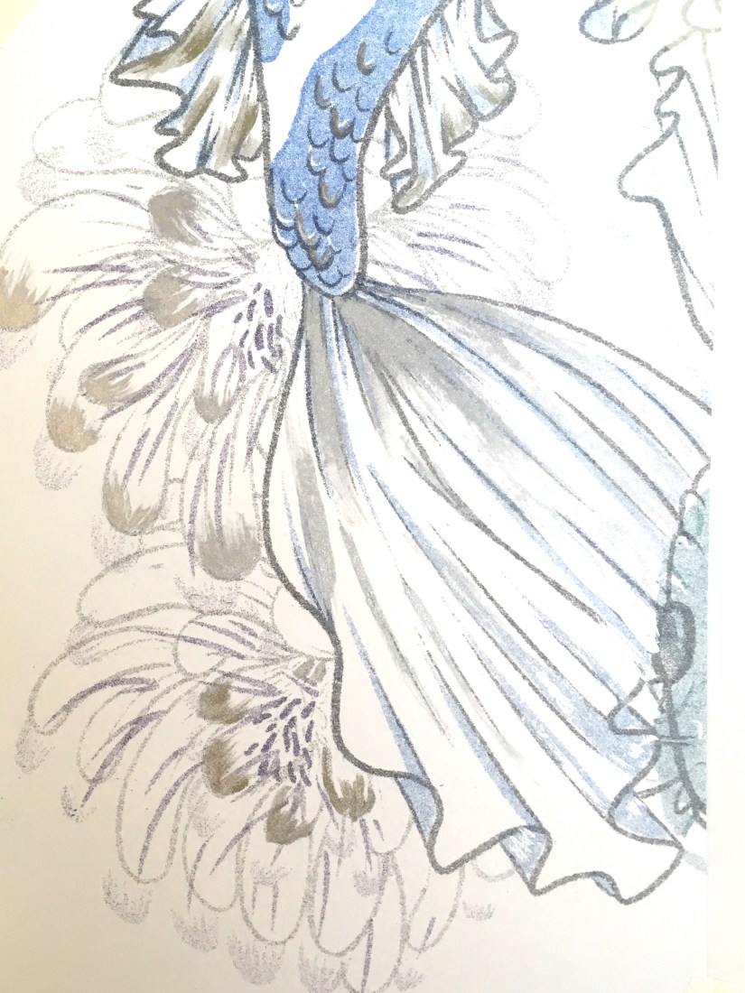
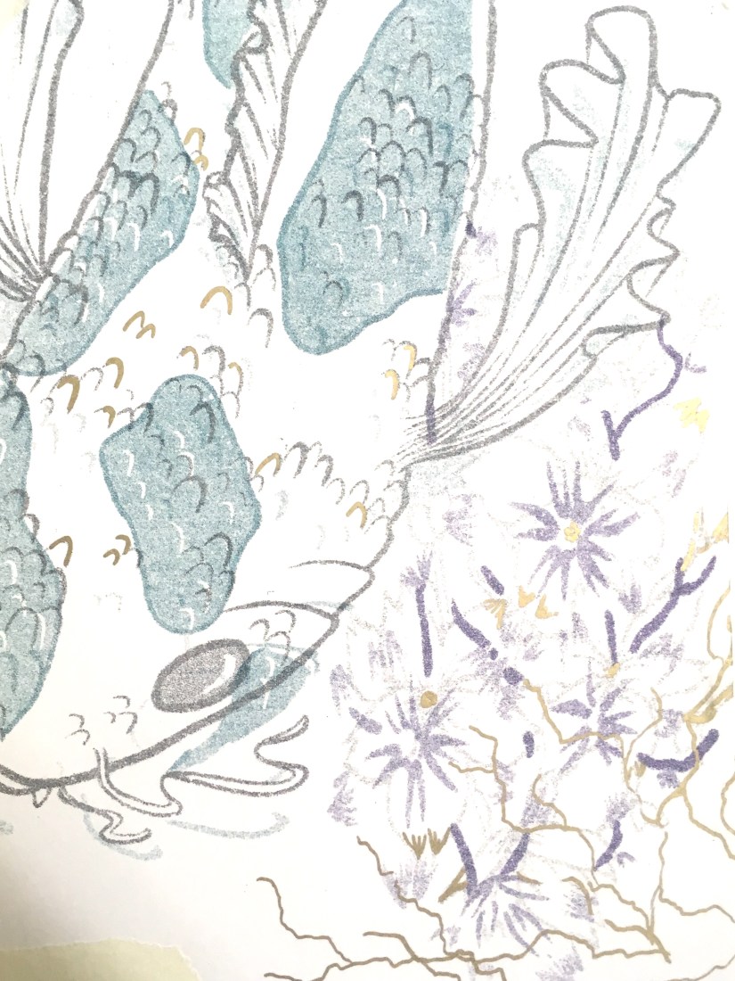
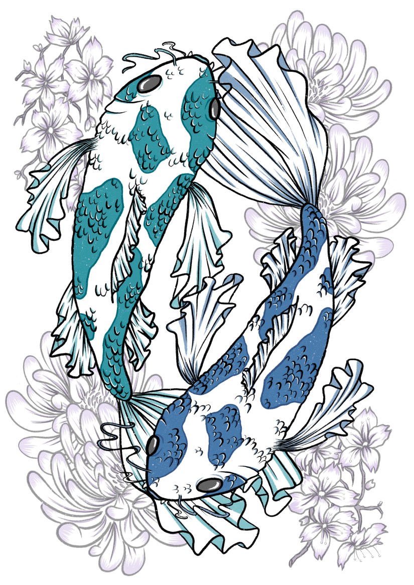
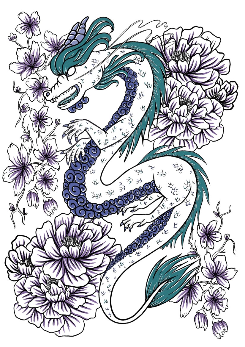
Risograph Realisation: This time around I felt much more comfortable with the process and its capabilities, so I was able to utilise the full potential of the risograph printer. We also had some new ink colours which was a very welcome addition- the teal and purple inks created some really nice effects on my final artwork, and I was happy to be able to create artwork with these specific colours in mind.
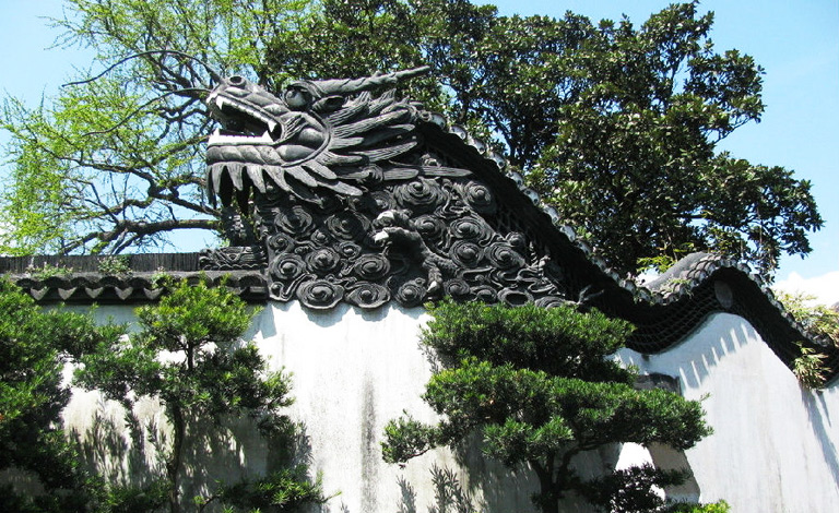
My final pair of prints was based on my travels last year, with an emphasis on the cross-cultural aesthetics of Chinese and Japanese design and symbolism. I was much happier with my outcomes compared to Semester 1, but I value both of the projects in my wider progression as an artist- I really want to continue to utilise this printing technique in my career and further work.
Cheltenham Illustration Awards: This project was nicely familiar to me, so there wasn’t really any struggle with the process or research elements. The theme this year was ‘Tales of Unity’, which was perhaps a little more niche and specific than in the past. Nevertheless, after a bit of initial struggle drafting out a suitable concept, I was able to use my new digital skills to effectively create a final piece that will serve as a centrepiece for the year (and final show).
Although I was used to the process, this project caused the most stress as it was completed in a short space of time right before the deadline (as the Risograph Realisation project overran by an alarming amount of time). I regret not leaving more time for the final realisation as this could have potentially made it even better- however, a deadline is a deadline and I’m not about to lose even more sleep over something out of my hands now~
Portfolio Project: This was a mandatory update on my existing portfolio- since lots of the work was still relevant, this made the workload much lighter than I’d anticipated. It also included making an updated portfolio book, which was good fun last year and was nice to revisit again. I also gave my creative CV and business cards a bit of a facelift, and also launched a new website! chalonjoy.com ~
Outcomes
…and here’s the final products! Most have been dotted around my blog already, but these are also on my ~new~ portfolio website… just a sly bit of self promotion there. c:
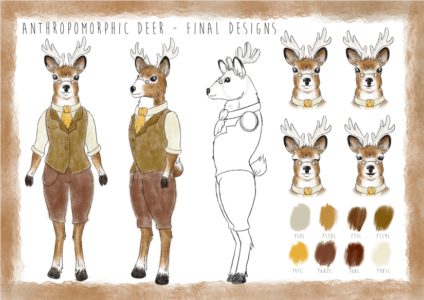
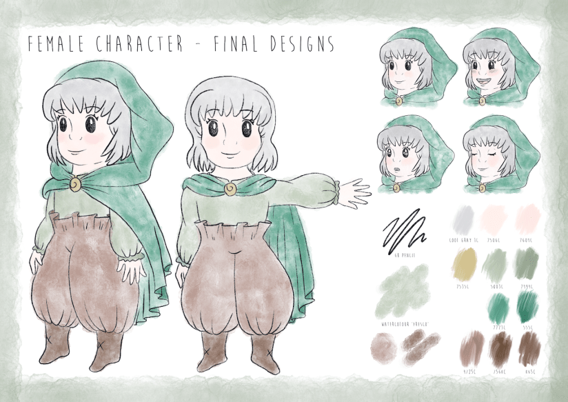
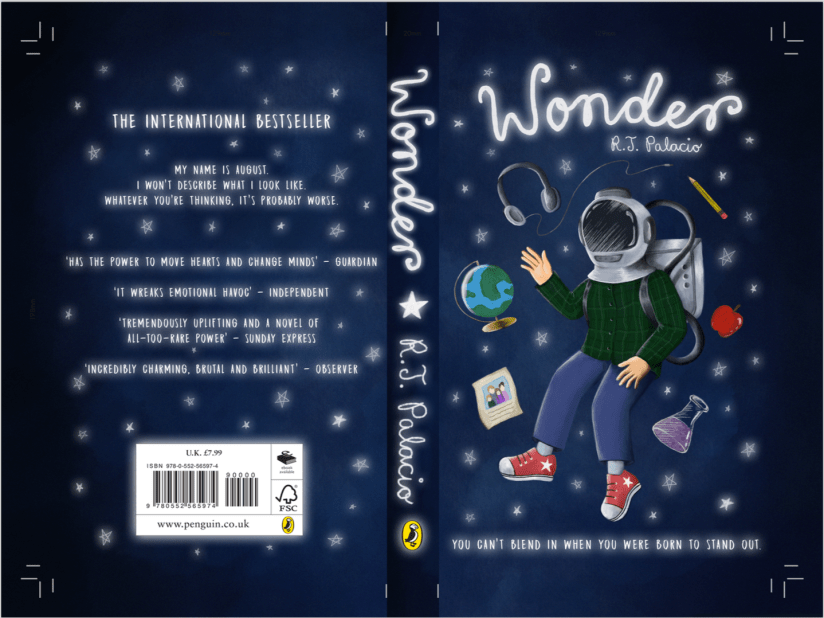

I’m now looking forward to final show, where I’ll hopefully be exhibiting my ‘best’ work from my degree, as well as selling some prints and other little bits of merchandise. I’ll blog about this afterwards too, even though my work will have (hopefully) been marked long before then!
Future Learning Plan/Progression
Targets and hopes for the future include:
- Continuing to improve and enhance my skillset, particularly within commercial settings, and especially in pattern design and figural illustration- these are the two areas I enjoy working with most~
- I also want to actively seek out opportunities for exposure, like open competitions and job openings that would suit my skillset. I’ll also look to improve my online presence, and look forward to fully launching my website and online store very soon!
- Lastly, I want to endeavour to take life drawing classes, as I want to improve the figural elements in my work. They are my favourite thing to draw, but I still need to rely heavily on references to get something that looks remotely like a human. ^^” Hopefully having more free time will allow me to get stuck in at a weekly class, and I’m hoping to be able to draw more dynamic poses and better anatomy as a result. Especially hands. I hate hands.
As I jump over the last few hurdles before my deadline, I’ve found it to be quite cathartic to reflect upon the final year of my time as a student. I hope I manage to snag a First, but even if not I can safely say that I’ve tried my absolute best despite the drawbacks and issues I’ve faced in my life since returning to college.
I’m glad it’s all over after 4 years of deadlines and stress, but I’ll miss having a routine to stick to and a solid support network- I’ll have to build my own now ❀
References
Collingwood, C. (2019). Anthropomorphic Deer: Final Character Board [Digital].
Collingwood, C. (2019). Cheltenham Illustration Awards: Modernisation [Digital].
Collingwood, C. (2019). Chinese Dragon Risograph Print [risograph print].
Collingwood, C. (2019). Koi Fish Risograph Print [risograph print].
Collingwood, C. (2018). Penguin Student Award: ‘Wonder’ Final Cover Art [Digital].
Collingwood, C. (2018). Terrariums Risograph Print [risograph print].
Collingwood, C. (2019). Young Female Character: Final Character Board [Digital].
