research

Commercial Project 2 – Risograph Realisation

There’s only 3-ish weeks until the release of the Cheltenham Illustration Awards theme and the start of the Call for Entries, so I’m coming back to the lovely process of risograph printing for a short and sweet 4 week project to fill my time until then~

This time around I already have a  good knowledge of the process and what it entails, as well as what types of artwork are best suited to the unique qualities of the risograph printer.

Since it’s quite an uncommon facility, I really want to make the most of my access to the riso this year while at college- there are other companies who print risographs to order (e.g. Risotto Studio, more on this later in my research) but these are few and far between and there’s nothing better than going through and learning the process yourself!

Armed with this prior experience, I’ll be able to produce much more refined prints that make better use of colour (including the new inks!!), as well as transparency/opacity levels and layout (e.g. line trapping, negative space, etc).

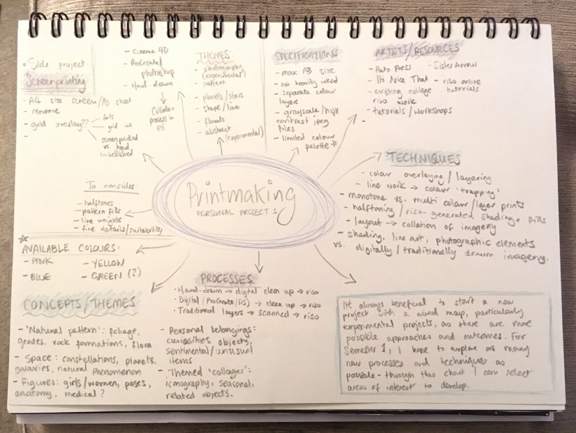
As always, I’ve begun the project with a mind map encompassing all of my ideas, areas for research and outcomes, as well as a rough workflow outline:

IMG_8962

Before mapping out my ideas, I also wrote a little synopsis of the project and what the aims are- might as well post below!~

Project Synopsis

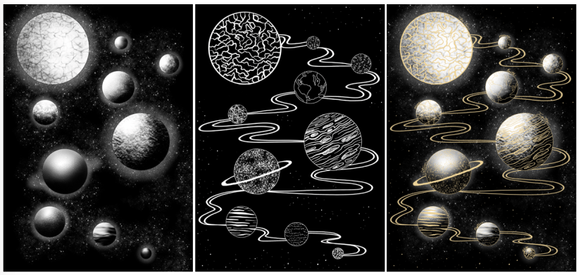
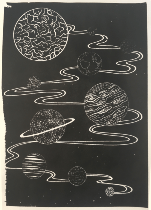
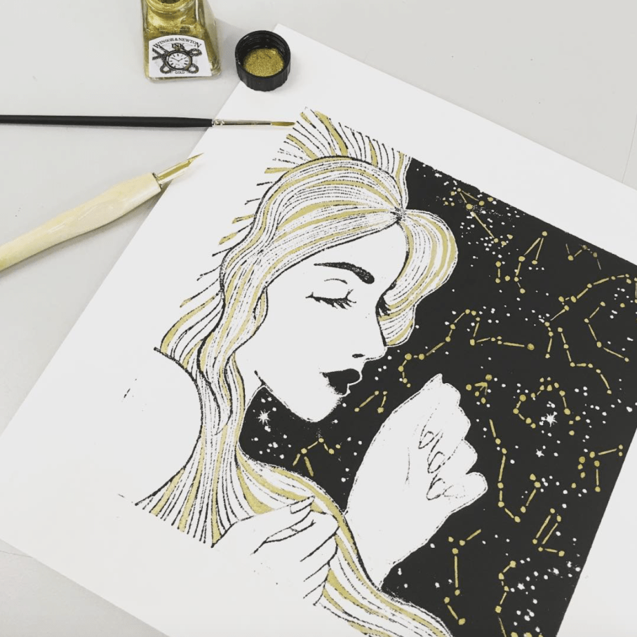
  • For this project, I want to directly follow on from my initial risography experimentation in Semester 1, utilising my newfound skills, prior experience and increased colour availability to create a complementary pair of two prints. I will produce approx. 10 completed prints per image in a variety of finishes.
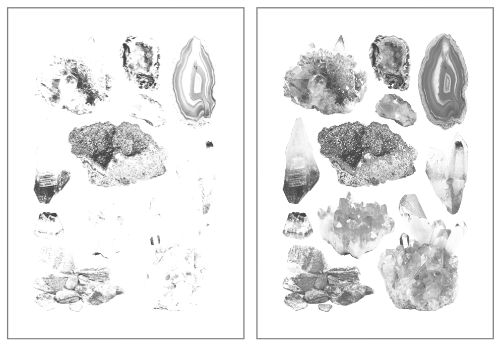
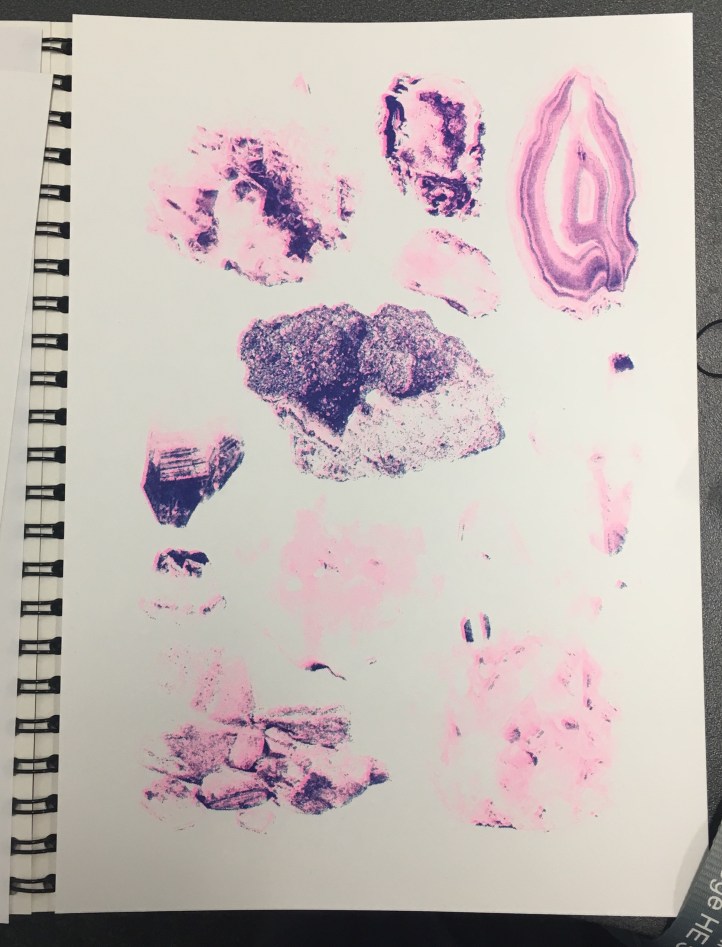
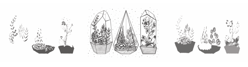
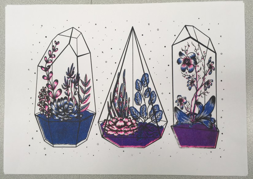
  • This pair of prints will be a continuation of the theme ‘Natural Pattern’, which I first explored in the experimental Printmaking project during Semester 1. I want to explore further natural subjects in these prints, merging together figure and flora/other naturally occurring elements, grouping these assets into themed outcomes that work well both individually and as a pair of complementary pieces.
  • I will be producing the imagery using Procreate, with additional hand applied processes such as metallic embellishment (e.g. hand-painted or screen printed, gold/silver leaf application) on select prints to add interest and unique elements. 
  • Ultimately, I’ll be aiming for the final prints to be of a good enough quality to be sold at my final show, in addition to being included in my portfolio as part of Personal Project 3 (PP3). 
  • I will also conduct thorough research before starting on my project as well as throughout the design process. This will include primary references, existing example research, risograph colour methods and printing applications, with additional visual development presented in an A4 sketchbook. 

As mentioned, I really want to make some nice prints to sell at final show- so this run of prints will be pretty commercial based rather than conceptual in order to meet the needs of the brief.

Targets for the coming week include starting to draw out some concepts (and finding/photographing references to go with these), as well as artist and existing imagery research. More next week! ♥


References

Risotto Studio (2019). Risotto Riso Room [online]. Available at: https://www.risottostudio.com/print  [Accessed 3 Feb 2019].

evaluation

Mini Riso- ‘Minerals’ Photography Print / Project Evaluation

Alongside my work for the Penguin Award and the Animation Development projects, I’ve been making a smaller ‘mini’ A4 risograph image, this time making use of photographic elements instead of illustration, as this is something I didn’t get to experiment with when I made my terrarium prints.

I’d originally intended to use my own photography for this side-project, but Royal Mail had other plans since all the rock minerals I’d ordered to photograph haven’t arrived… :c So purely for the purpose of experimentation, I’ve collaged together some royalty-free images (which are all referenced in my project development file) to use as a experiment- I’ll most likely be able to take my own imagery in the future to use for photographic risograph work, as I don’t want to include something in my portfolio that isn’t entirely self-produced. I collaged the images together quickly in Photoshop- I used my notes from my development work as a set of ‘rules’ when laying out the photographs.

Once this was ready, I converted the image to black and white and duplicated the layer, one of which I edited using various Adjustment tools- I heightened the contrast and brightened up the second/upper layer, which meant only the darkest tones made it through into the final image- I’ll print this in the blue ink we have for the riso, with the base layer (with a wider range of light and mid-tones) printed in pink. Based on past experience with the riso during my terrarium printing run, I’ll be editing these on the riso prior to printing, bringing the ink coverage down to around 15-20%, as I don’t want bright colours on this print. The pink is extremely bright, and the blue extremely dark- hopefully reducing the coverage down to practically nothing will solve the problem. Below is my two final layers, ready for printing:

Screen Shot 2018-12-14 at 10.58.28.png
 Mini Minerals Riso – Printing Layers (Collingwood, 2018)


Obviously the printing process was much the same as the terrarium prints (again, all of this is documented much more in-depth in my development file), but this time I added halftones (via the riso)… and it worked well! Except that all of my prints were too light, haha. I initially thought that I’d need to make the masters super light to combat the really pigmented inks, but I think I went too far the other way, as lots of detail was lost in the final prints:

IMG_8117.jpg
My final prints- not quite to plan, but still a success experiment-wise! (Collingwood, 2018)

But, not to worry… this was a purely experimental exercise- when I’m able to take my own pics I’ll run some more prints off again, keeping in mind everything I learned throughout this test. I enjoyed the process anyway, and there’s no improvement to be gained unless you fail first!

Reflecting on the project as a whole… I’m glad I got to use the risograph printer, since it’s a process I’ve been interested in since hearing about it just over a year ago. It’s certainly been unconventional for me, since the colours are so restricted (and BRIGHT!), as well as the digital process involved in making artwork riso-ready. It was really nice to try out new techniques and styles of artwork all in the name of suitability, since prior to this I’ve been quite stuck in my ways. I’d love to revisit this in the future, but for now it’s definitely high time to start on the next Semester 1 projects…

Onwards and upwards c:


References

Collingwood, C. (2018). Mini Minerals Riso- Printing Layers 1 and 2 [Digital].

Collingwood, C. (2018). Mini Minerals Riso- Final Print [Risograph Print].

evaluation

Risograph Printing / Weekly Reflection 3.12.18

After a myriad of issues that got in the way of this project, I was finally able to print some risograph images today~

First, I’ll recap the prepping process for the imagery:

Once I had the line art drawn out (done on Procreate, which I’m slowly getting the hang of), I began to apply colour on separate layers underneath the line art. I chose to work with pink and blue inks, as these were two of the 4 colours available at the time. I’m not entirely sure about this colour scheme (it’s a bit out of my comfort zone), but I persevered nonetheless since nothing is set in stone colour-wise with the riso. Having said that, this project is all about experimentation so I’m consciously trying to work with colour schemes I haven’t used yet.

I’ll admit- I’m not used to working in this way, so the way in which I’d ‘blindly’ applied colour was painfully obvious on screen once I’d altered the layer opacities (see below for each separate layer). This will be something to remember in future if I re-do the colour (which I might actually end up doing, since we’ll be getting some more ink colours soon).

Screen Shot 2018-11-30 at 11.16.13
Left to right: Blue layer, Black layer, Pink layer for Risograph printing. (Collingwood, 2018).

It’s also worth noting that no ink layer should be above 75% opacity, in order to avoid smudging and paper jams in the riso. My final layer opacities ranged from 20% (the ‘back’ of the terrarium frames) to 75% (the main black line art), with the coloured layers at 30-50% and 60% in between. By exporting each layer as a separate file, I was able to layer colours when printing (since the ink is semi-transparent), making a mid-purple tone where the inks crossed over.

I’ve gone into much further detail about the print process in my development file, but here’s a pic of the final prints:

IMG_8014.jpg
Terrariums Final Print (Collingwood, 2018).

I was actually really pleasantly surprised at how nicely the image printed- although the registration isn’t perfect (which is a common trait of riso printing), the layers blended well and weren’t as messy looking as they appeared on screen.

At this point, I didn’t love my colour palette but I didn’t hate it, either- I’m most likely going to do another run next week, with neater colour layers and a more considered colour palette. Having green ink available will be really helpful!

…But at the same time, I don’t want this project to drag on for too long, since I want to really focus on the Animation Development brief I’m doing (this is especially important, as it will directly influence the Animation project in Semester 2… if the Semester 1 portion isn’t successful, I won’t have a solid foundation to work on!)

Also still to print is the mini A4 photography based geode flash sheet I’m doing as a side project ♥


References

Collingwood, C. (2018). Risograph Digital Ink Layers: Blue, Black, Pink [Digital].

Collingwood, C. (2018). Terrariums [Risograph print].

research

Risograph Research

It’s now the third week of my timetabled period in which I’m meant to be working on the Printmaking project; while the work I’ve produced in the past 2 weeks isn’t completely irrelevant, it’s high time I started getting deeper into the risograph side of things, e.g. how it works, the process and how to create artwork suitable for the riso.

Dare I say… from the research I’ve done so far, it actually sounds easier than I’d initially anticipated. An actual miracle.

From what I’ve gathered, risograph printing is essentially a cross between screen printing and photocopying, but more environmentally friendly and with a more limited colour range (MUCH more on this in my project research- I’m just doing a quick recap).

Having said that, it’s still quite technical and very different from the processes I’m used to working with. For example, you have to keep in mind the bleed areas around the design, the potential for accidental overlap, and the possibility of errors due to the machine, e.g. roller marks. However, through careful planning I’m certain a lot of these areas of concern can be sidestepped- respectively, this could be through careful border layout, trapping line and colour, and laying out heavily inked areas accordingly. (HatoPress.net, n.d.).

It’s quite a lot to keep in mind, but doing an ample amount of research prior to designing imagery has given me a really good basis of knowledge on which to build the project. My initial mind map helps me to plan out the work I need to do as the project progresses:

IMG_7945.jpg
Initial Mind Map- I find these useful at the start of every project. (Collingwood, 2018.)

Pending the success of this introductory project, I could utilise this technique to make zines, posters, business cards etc for final show- the colour palette might be more limited, but it’s infinitely less laborious than screen printing (and most of the other traditional printing processes, for that matter)~


References

Collingwood, C. (2018). Personal Project 1 – Initial Mind Map.

HatoPress.net. (n.d.). Printing – Risograph. [online] Available at: https://hatopress.net/printing/#guide-item-1 [Accessed 22 Oct. 2018].

evaluation, portfolio, SWOT/Target Setting

Printing Session and Week Reflection 19.10.18

Over the past week, I’ve worked on a simple design that can translate into a screen print. Basing my concept on the idea of planets and digital fills (as inspired by the tutorial Dave showed us on Friday), I worked in Procreate to design both a gold layer, and a black and white screenprinted layer. Final designs below (left to right: Base/screenprinted layer, gold leaf layer, mock up of ‘final’ image with both layers):

Screen Shot 2018-10-22 at 10.44.51
Left to right: Figure 1, Figure 2, Figure 3

Using Procreate is a whole new learning curve for me, as up until now I’ve worked mostly in Photoshop. My previous digital work has been done using a Wacom Intuos tablet, which I often found a bit hard to use (e.g. not being able to rotate it to draw, having to reference back to the screen when drawing, small size and lagging software).

Overall I was happy with my workflow, but earlier this year I invested in an iPad Pro as an additional tool. Ultimately I’ll still finalise my work in Photoshop as Procreate isn’t as extensive, but it’s invaluable having a drawing device with a screen- it feels much more natural, and it’s easier to draft out artwork compared to using a conventional drawing tablet.

One of the most useful tools I discovered actually came from a calligraphy brush kit- a variable line brush that smooths jagged edges and creates nicely curved lines (almost in a similar style to Illustrator, but without all the fiddling). There’s a plethora of times that I could have used this brush in the past, so I’ll definitely keep this in mind for the future!

Come Friday morning, it became quite clear that I was a bit ambitious with the black layer- Dave suggested that I instead print the gold layer as a complete image, so I decided to go with this (possibly going back and editing the black layer to be more screen print friendly at a later date). I’m glad I discovered this early on in the year, as it’ll inform any future imagery that I produce for screen printing.

I experienced some issues with the screen machine- my design wasn’t burned to the screen properly; the black background border was fuzzy on one corner. I’m putting this down to a technical issue that will hopefully be fixed in the future, as I think having a border on a screen print sets it off nicely, especially for trimming and framing. I’ll probably mask the corner border off and correct this by painting on the acrylic in ‘post-production’.

In the afternoon we were shown a quick recap of how to gold foil using the heat press- this was really useful because although I’ve worked with this process before, it was quite a few years ago now and I definitely benefitted from the refresh. There’s a much wider variety of foils now (e.g. iridescent foil, clear foil, and an array of different coloured metallic foils), all of which will be nice to experiment with ♥

Friday was full of trial and error- in addition to the corner not being complete on any of my prints (which was expected), I had lots of issues with the amount of ink I was using (usually not enough ink). My 6th print (out of 8 total) was the most successful- I was surprised how well the fine lines came out, despite the pre-emptive warning that 12px was the finest line weight that would translate optimally. Below is my most successful print (I could have used slightly less ink):

Screen Shot 2018-10-22 at 11.14.30
Figure 4

I really love the process of screenprinting, so I’ll definitely be revisiting this in the future, hopefully with better results.

In the next week, I plan to finally start on my riso project- I’m a bit stressed out about this as I haven’t stuck to my timetable thus far (which is an awful start to the year). However, the past week hasn’t gone to waste as the development for this screen print can be linked into my Printmaking project as development and technique exploration, which is the purpose of the first Semester anyway~


References

Figure 1: Collingwood, C. (2018). Planets (Base Layer) [Digital].

Figure 2: Collingwood, C. (2018). Planets (Gold Layer) [Digital].

Figure 3: Collingwood, C. (2018). Planets [Digital].

Figure 4: Collingwood, C. (2018). Planets Test #6 [Ink].

inspiration, research

Printmaking – Screenprint Experimentation

To start the week, I’ll be working on concepts for the A4 screenprints we’ll be producing on Friday- as this is intended to be experimental, I’ll be straying away from my usual techniques, instead trying out digitally based fills for some of my initial ideas. For example, halftones, custom patterns, noise fills, and other fill techniques that produce results that will work well with a silk screen- since you can add lots of very fine detail with screenprinting, it’ll be a great opportunity to try these new styles out.

The last printmaking project I did involved monoprinting with a laser cut perspex plate- the results were mixed, but most importantly plate printing allowed for a lot less detail on the design (compared to screenprinting).

We were shown a mini tutorial on Photoshop and Cinema 4D, using shaded spheres as an example when applying each technique. They really looked like little planets… so I decided that using the solar system as a base would be a nice way to still include something from my own personal interest.

I may even make a second layer that details additional embellishment on the final design- this way, I can come back to my love of gold foil, using liquid glue to print the exact areas for foiling. I can then go in with the foil, brushing it on by hand. Going back to the monoprint project from Year 2, I used gold ink to work on top of my prints by hand after trying to print with glue… the pressure from the roller combined with the tackiness of the glue ended up a mess (lesson learned)

Screen Shot 2018-10-15 at 13.38.59.png
Collingwood, C. (2016)


Doing it by hand was tedious, but the results were good… yet not perfect. Look at the way the line art came out on the print- the details were too fine for the ink to stick to the printing plate when I rolled out the ink, especially with the white outline bordering the sky. It was a combination of the lines being too thin, and the ink being too thick. It was a lot more cost-effective compared to silk screen printing, but I feel plate printing is more suited to less detailed imagery.

With this new technique I’m trialling, I’ll be able to apply the foil with a lot more precision, yielding better results (as well as being able to have finer details on the base black layer). Also the gold foil is so much more vibrant and pretty compared to gold ink~

I’ll research this thoroughly before I go in and ruin all my prints, but I think if it works well this could be a really useful technique for the future.

There might even be the potential to create runs of hand-embellished prints (e.g. foils, inks, pattern collage, painted details), making each one unique. This could be a good way to market prints that I can sell, either at final show or on sites such as instagram, Etsy, etc.


Watch this space for a Friday update ♥

no pun intended


References

Collingwood, C. (2016). Cassiopia [Ink].

evaluation, research, SWOT/Target Setting

Reflection – 12.10.18

So, I ended up skipping an update last week- it would have been 500 words of me worrywarting over the presentation (glad that’s out the way!)

The presentation didn’t go amazingly, but I suppose it wasn’t exactly bad either. I’m grateful to have patient tutors that helped me through it! I ended up talking for a little over 10 minutes, which is leaning towards the longer side of things, especially since I tried my best to minimise talking by streamlining what I was going to say. In fact, I had a lot more to say that never actually came out of my mouth because of my anxiousness.

I just hope I’ve done enough to earn a First for this module… which is only worth 10 credits. Every little counts!

Friday AM was spent going through the new module (which includes all of the Semester 1 projects for this year). It’s nothing I haven’t done before- I’ll need to make sure I really keep on top of my Harvard Referencing throughout my research though, as this is imperative to passing this module.

We have the opportunity to do some A4 monochromatic screenprints a week today- quite short notice but I’m familiar with the process, preparing imagery etc., so this will be a nice introduction to my Printmaking project (which is mostly going to focus on riso prints).

I actually did quite a lot of screenprinting during my Textile design course, with (usually) successful results. I printed with single and multi colour designs (e.g. using more than one screen on a design), as well as printing with heat-sensitive glue in order to apply gold leaf to certain areas of wallpapers I was working on- that worked especially well.

I’ve learned a lot since then, so I’ll be applying newfound skills (as well as employing old skills that were successful) when I revisit this process next week. As I’ll personally own my printing frames, I’ll be able to continue making prints as often as I like throughout the year. Hopefully this leads to additional runs of prints, either ‘for fun’ or for final show.

Also, since the Proposal was handed in on Monday, I’ve finally been able to start some research into the risograph print process- I really need to educate myself well on the techniques that are available to me, since this is totally new territory for me and I’m determined to make something nice for the first project (to be honest, it’d be great if I could get the hang of the riso enough to be able to make prints to sell at final show… ^^)

Thus far, I’ve looked a little bit into the actual process and what it entails, as well as the process of preparing imagery for printing. I’ll go into more detail in my research file for this project.

Really I think most of my skill learning for the riso will be ‘on the job’, mainly in the form of trial and error/experimentation… that’s the entire point of Semester 1~

So, my targets for the next week include solidifying my workflow and researching deeper into the risograph process. One of my biggest ‘weaknesses’ of this project will be a lack of prior knowledge, but I’m confident I can turn this around into a strength in my skillset as I learn more about how risograph prints are processed and created.


More on this in the coming weeks!