evaluation, portfolio, SWOT/Target Setting

Cheltenham Awards Final Piece Production

It’s been a busy week indeed!

In between running around like a headless chicken and trying to maintain a ‘healthy’ work/job/life balance, I’ve finally finished up my final project of the year ♥

It was quite an arduous process, but I think I actually really benefited from the super short time frame I’d been left with- not only was I working towards my deadline, I was also racing to get my art book submitted for publishing in time! I wanted this piece to be included, so that was another self imposed time limitation.

I created the piece on Procreate, using a variety of my own photos from my 2018 China trip to inform the architecture and layout. I clocked in just over 30 hours across 4 days according to the app, so here’s a wee time lapse video of my process to make a very long story short! (This is the 30 second quick cut- the longer time lapse video is about 12 mins long, and unfortunately I couldn’t quite get it to load up on Vimeo!)


So it was quite a linear, reassured workflow, but also had some new techniques being used since Procreate is a completely new tool to me since my last Cheltenham project in 2017. I’m really pleased with how far I’ve come, as my line art, layers and detailing/texture management has come leaps and bounds. While I still appreciate the flat, pastel-y appeal of my old Cheltenham piece, this newer one boasts a lot more depth, as well as a more experimental colour palette that really is quite ‘far out’ for me as an artist- up until now I really have been stuck in my ways with pastels and monotone, but the subject matter fully supported a warm, deep toned palette and I think it ties in quite well.

Here’s the finished piece- there’s loads wrong with it of course, but I’m content for now ♥

FINAL_FILE_-3
Modernisation (Collingwood, 2019)


Although I feel I’ve had a lot of success with this project, there were still some weak areas here and there- artwork wise, I think there’s still something amiss with the anatomy… but I have the time to fix this before final show, where I’ll hopefully be exhibiting this art as a centrepiece. If I’d have an ample amount of time prior to hand in this could have been fixed, but my workflow left me with a bit of a difficult situation- the way in which I’d blended the layers and applied tone and shading meant the line art and skin tones were across multiple layers, so it won’t be an easy task to correct this.

Working on this Cheltenham project has opened up lots more opportunities for me- I’m considering making a series of similar pieces based on my travels around the world. Also, when I submit this piece to the Awards I could potentially be featured in a catalogue showcasing selected entries from the year. Very exciting~


And with that, this wraps up my project work for Semester 2! Left to do is to finish off this blog, as well as some promo type stuff, like business cards, a creative CV and other artist-specific things like potential merchandise for final show. So, targets for the following week include tying up all the loose ends and making sure everything is ready and prepped for hand in, and also starting to think about final show- what I want to exhibit, sources for merchandise, and technicalities like layouts, exhibit space organisation, and marketing.


References

Collingwood, C. (2019). Modernisation [digital].

Collingwood, C. (2019). Modernisation Time Lapse .

portfolio, research, SWOT/Target Setting

Risograph Realisation – Idea Finalisation

It’s been a bit of a weird week- I haven’t made as much progress as I’d hoped with this riso project but any progress is better than none at all! ♥

I’ve been looking at finalising my riso ideas, and while these are still fairly rough drafts I find it much easier to visualise a final concept in a neater, tidier visual style (e.g. I’ll be really finishing up the layout in the actual final piece process, which is much easier thanks to the flexibility of Procreate).

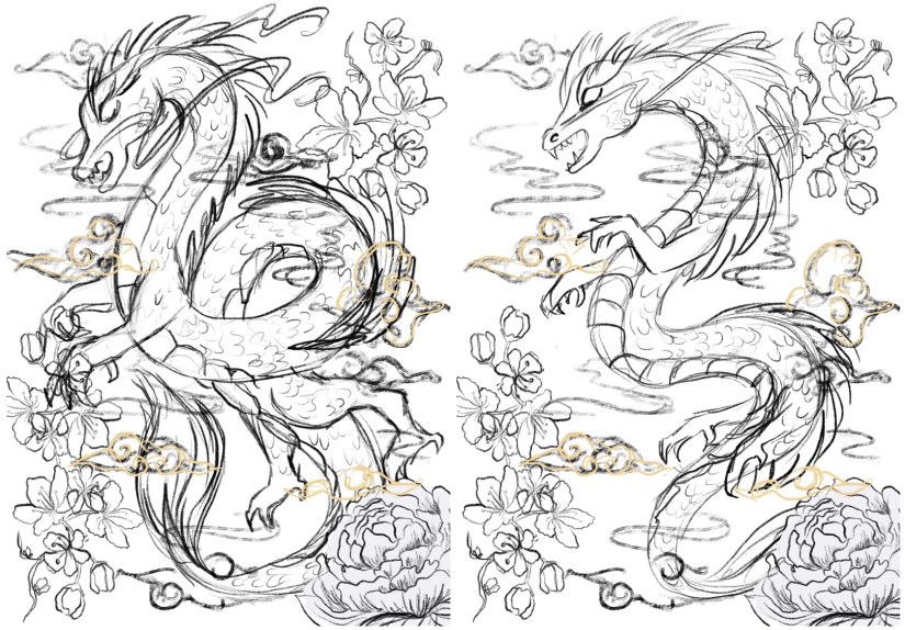
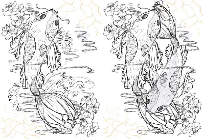
So far, I’ve got 4 potential ‘final’ layouts, each with differences that affect the way in which the artwork fills out the frame of the piece- since these will be A3, the actual image will be slightly smaller on each side (~2.5cm) due to the riso printing limitation. I’ve also begun to visualise how I can embellish these pieces (see the light gold coloured overlay on each piece for ideas on which areas I might work into- this is all TBC!).

China Risograph Print Final Concepts (Collingwood, 2019)


Japan Risograph Print Final Concepts (Collingwood, 2019)


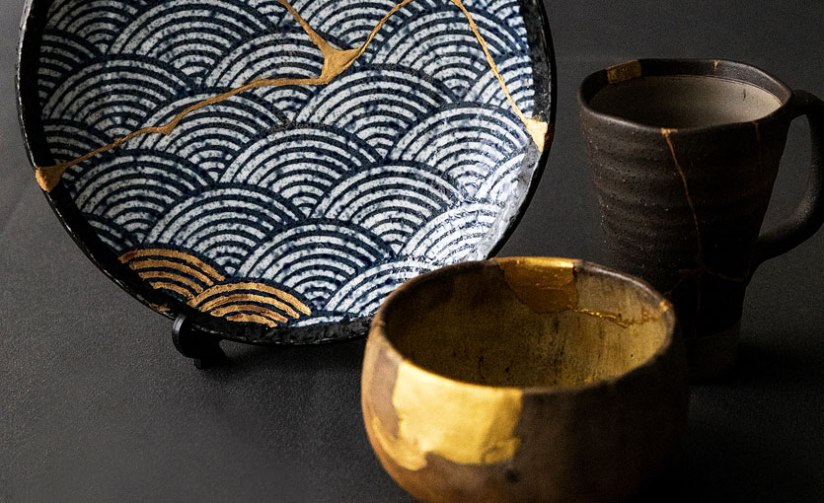
One technique I thought would work especially well on the Japanese/Koi Fish print was kintsugi inspired embellishment (which I’ve begun to visualise in the final concept sketches). I came across this art form during my visit to the Durham University Oriental Museum, where there were examples of ceramics displayed utilising this technique. The result was beautiful, and the idea behind the process even more so.

Kintsugi is based around the idea that the imperfect is beautiful- while some of us in the Western world prefer things to be new, Japanese people relish repairing broken items and seeing beauty in imperfection. This also links to the wabi-sabi philosophy, which centres around the idea that imperfection and the transience and fragility of perfection is accepted- far different to the obsession with perfection we have in the West.

I’d love to incorporate this into my work, as I too have a fascination with perfect things- I think it’d add some nice little imperfections into my pieces. The fact that I’ll be embellishing these by hand will mimic the original technique; the rest of the imagery will be digitally produced and collated, printing using the risograph which is very ‘perfect’ despite some natural variance in the process.

Hero
Kintsugi – Japanese Ceramic Gold Repair (Sydney Community College, n.d.)


I’ve also started to look at colour palettes and application for the final riso prints- since my palette is somewhat limited, I need to use my trusty Risotto colour swatch pack to look at alternative palettes that would work well. Since my artwork is mostly line-art based, I can use quite dark shades of the inks to intensify the line work while employing lighter, more subtle shades to add interest and shading.

This will be a target for the coming weeks after I’ve finished the base artwork- I’ll use Photoshop to manipulate the grayscale layers to view different colour palettes, which I’ll write about in my sketchbook.

I can’t wait to start properly visualising these finals… I’ll be using Procreate to render and layer my files ready for printmaking~

Blog post on this process coming soon! ❀


References

Carnazzi, S. (n.d.). Kintsugi: the art of precious scars [online]. Available at: https://www.lifegate.com/people/lifestyle/kintsugi  [Accessed 21 Mar 2019].

Collingwood, C. (2019). China Risograph Print Final Concepts [digital].

Collingwood, C. (2019). Japan Risograph Print Final Concepts [digital].

Richardson, J. (2016). WABI-SABI and UNDERSTANDING JAPAN | A PHILOSOPHY AND AESTHETIC AS WORLDVIEW [online]. Available at: https://www.tofugu.com/japan/wabi-sabi/ %5BAccessed 21 Mar 2019]. 

Sydney Community College. (n.d.). Kintsugi – Japanese Ceramic Gold Repair [photograph]. Available at: https://www.sydneycommunitycollege.edu.au/course/kintsugi.gold.repair  [Accessed 21 Mar 2019].

inspiration

An Ode to the iPad Pro – An Artist’s Review

Good morning! ❀

I previously made a post talking about my favourite art materials as an illustrator, but there’s one piece of equipment that has really transformed my practice and stood out amongst the others.


Screen Shot 2019-02-04 at 16.57.43
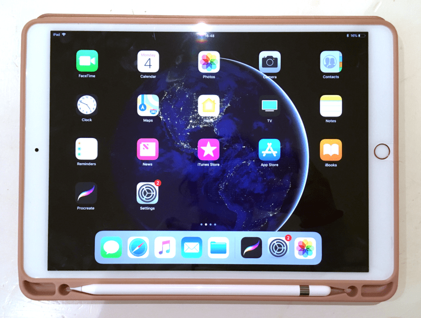
iPad Pro 10.5in, Rose Gold (Collingwood, 2019)


Digital art is on the rise and it’s still a subject of controversy about whether it’s replacing traditional technique too much, but this is my honest unbiased review of something that I want to use in conjunction with my traditional methods of working. I’m by no means a tech expert so this won’t get too far into the specifics- this is more of an overview of the iPad when used for creative purposes.

Making artwork on my iPad Pro has been a pretty big turning point in my illustrations so far- I used to loathe digital work because using my Wacom Intuos tablet was so fiddly and unnatural, but getting the iPad Pro has made it so much more intuitive and wholesome feeling~

First of all, some specs of my own iPad Pro and Apple Pencil:

iPad Pro

  • 2nd Gen WiFi, 64GB (2017)
  • 10.5-inch screen (measured diagonally)
  • LED Retina Display with TrueTone
  • Lightning Port/Headphone Jack
  • £619 via Apple

Apple Pencil

  • Bluetooth connectivity
  • Magnetic ‘cap’ with Lightning Charger (can charge using iPad)
  • Replaceable nib
  • 17.5cm length/21g weight
  • £89 via Apple


Put simply, the iPad Pro is brilliant for making artwork- I find the 10.5 inch more than large enough to support all of my ideas, with ample storage space for files that will grow in size as I continue to work on them. The display is stunning, with TrueTone technology that allows the colours on screen to adapt based on your surrounding lighting.

The iPad Pro is light enough to carry around on a daily basis, weighing in at only 469g for the 10.5in Wifi version. Add a nice case (mine also houses the Apple Pencil alongside the tablet), and you’re looking at around 600g… much lighter than most laptops and traditional art setups! I love taking mine travelling with me to record what I discover.

Now, there is one major sticking point with the iPad Pro, and that is that it does *not* support Photoshop, Illustrator or any of the other full Adobe CC software packages. I debated for a long while whether to purchase one because of this, but after some feedback about it from an illustrator friend, I found Procreate to be more than worthy enough to stand in for Photoshop- it even has .psd compatibility, which makes transferring files between programs a total breeze. And at a one-off payment of £12.99, it’s very budget friendly (which you might need to consider after dropping £700+ on this Pencil/iPad package!)

Working digitally has really allowed me to improve on my proportions and layouts (although there’s still a long way to go!), as well as making me less fearful to make bold strokes and quick mark making in the initial stages of a sketch- I was always a bit hesitant to do this traditionally as too many erased errors can really drag down the finished appearance of a piece. It’s also amazing to have loads of brush styles at your fingertips (literally)- this makes the iPad the best portable device for creating on the go c:


Screen Shot 2019-02-04 at 16.58.00
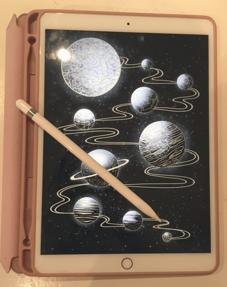
iPad Pro and Apple Pencil Stylus (Collingwood, 2019)


I also wholly recommend the Apple Pencil- it’s nice and sturdy feeling with a good weight to it, and also works seamlessly with programs such as ProCreate (Savage Interactive Ltd, 2019) and the Adobe collection of iPad software (Adobe, 2019). There’s tilt dynamics for brushes, as well as lots of different points of pressure that really enhance the natural feeling when using this stylus. The pencil tips last a long time (much longer than Wacom nibs!) and are cheap-ish to replace considering their longevity- a 4 pack of nibs are £19 from Apple (Apple, 2015).

Since I bought mine in Summer 2018 there is of course a new version out already, complete with a snazzier Apple Pencil companion that boasts gesture controls and wireless charging capabilities. I’m still really happy with my iPad Pro (2nd Gen, 10.5in) and Apple Pencil- technology is so ridiculous now it just makes you wonder what sort of upgrade will come next~

Thanks for reading my wee review! I’m so grateful to have my iPad and Pencil, and I hope more artists discover how great the combo can be for both quick sketches and fully realised detailed artwork ♥


References

Adobe (2019). Adobe Creative Cloud Mobile Apps. [Software]. Available at: https://www.adobe.com/uk/creativecloud/catalog/mobile.html  [Accessed 26 Jan 2019].

Apple. (2015). Apple Pencil 1st Generation [Product]. Available at: https://www.apple.com/uk/shop/product/MK0C2ZM/A/apple-pencil  [Accessed 26 Jan 2019].

Apple. (2015). Apple Pencil Tips- 4 Pack [Product]. Available at: https://www.apple.com/uk/shop/product/MLUN2ZM/A/apple-pencil-tips-4-pack  [Accessed 26 Jan 2019].

Apple. (2017). iPad Pro 10.5 inch/2nd Generation/64GB/Rose Gold [Product]. Available at: https://www.apple.com/uk/shop/buy-ipad/ipad-pro-10-5/rose-gold-64gb-wifi  [Accessed 26 Jan 2019].

Collingwood, C. (2019). Apple iPad Pro 10.5 Inch, Rose Gold and Folio Case [Photograph].

Collingwood C, (2019). iPad Pro and Apple Pencil Stylus [Photograph].

Savage Interactive Ltd. (2019). Procreate [Software]. Available at: https://procreate.art  [Accessed 26 Jan 2019].