portfolio, research, SWOT/Target Setting

Cheltenham Illustration Awards Progress

Its been a little while, but I’ve made some good progress since last checking in!

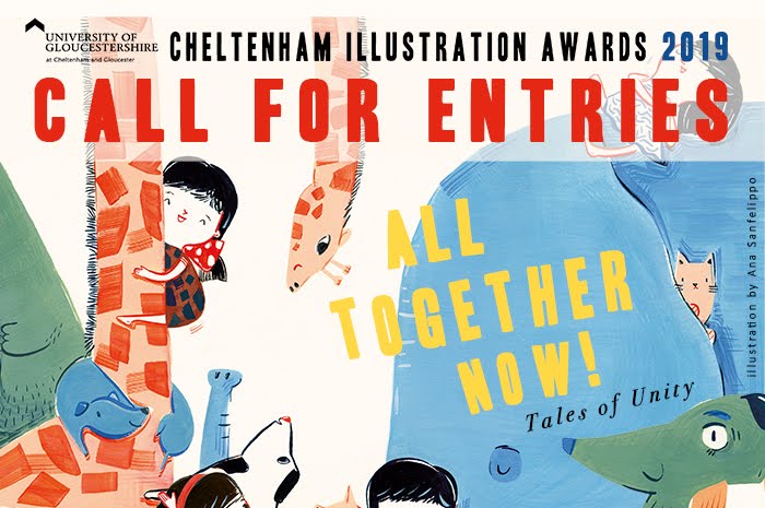
This week, I’ve been working constantly on concepts for my Cheltenham Awards piece- I want this to be culmination of my progression throughout my degree, so I want to make sure it’s suited to the brief, artistically and technically sound, and also something I’m proud of and can connect with.

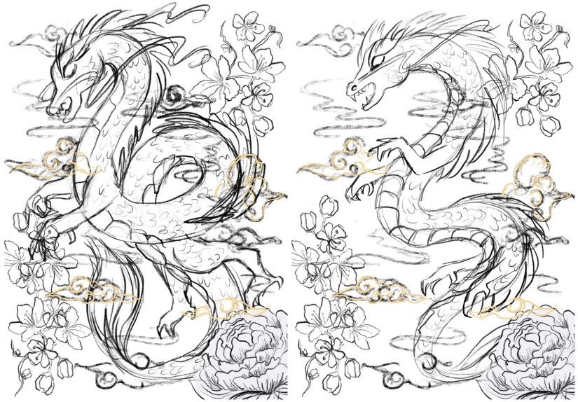
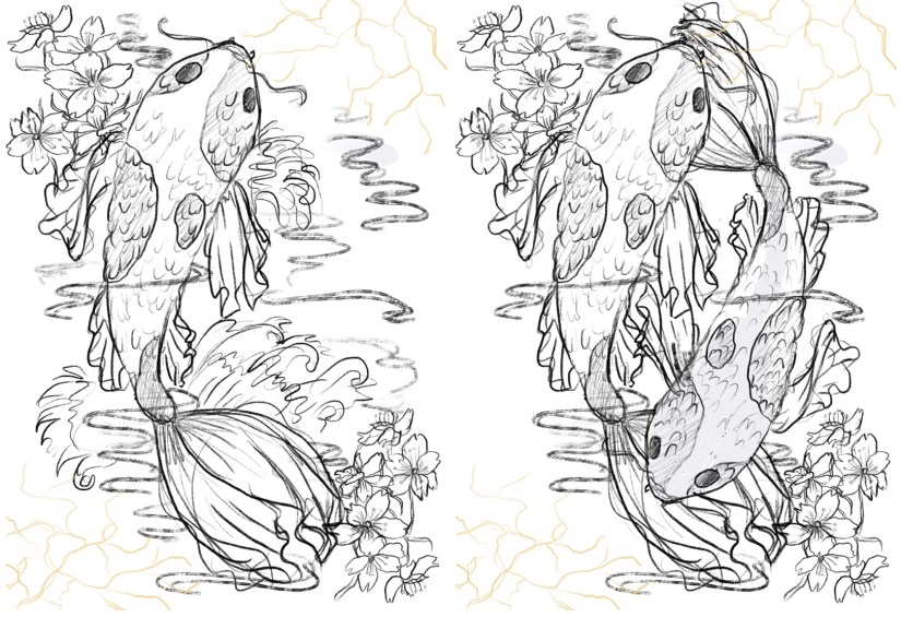
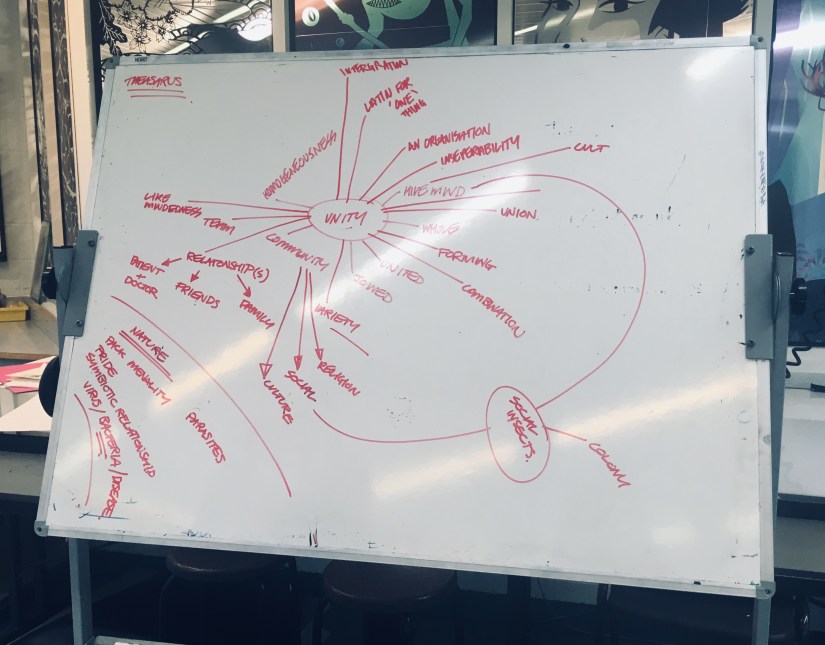
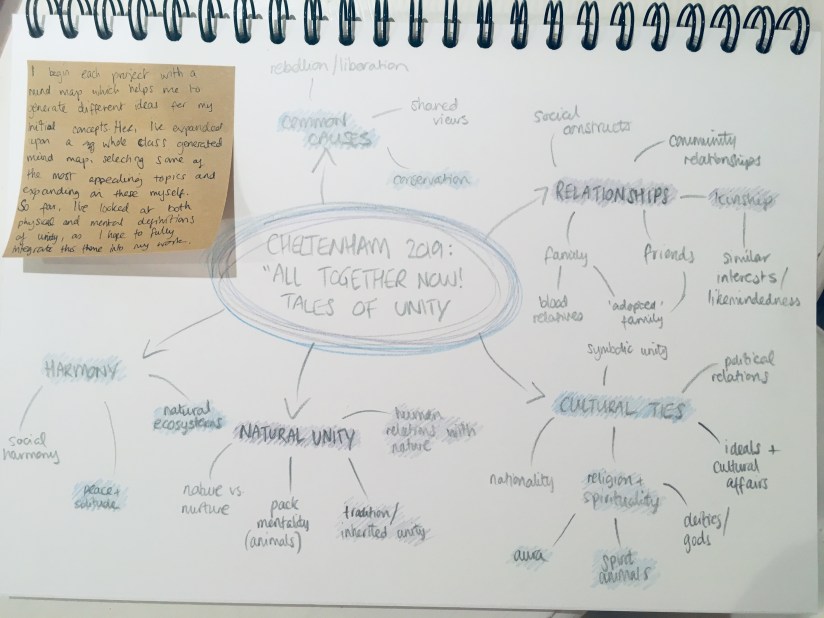
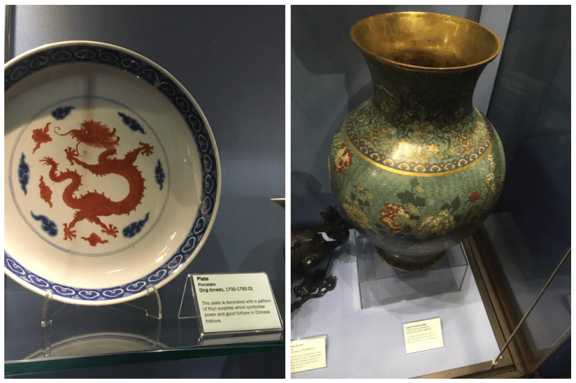
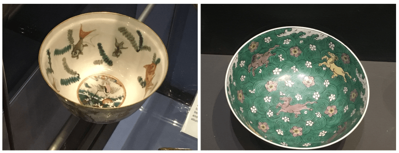
When mapping out ideas for ‘Unity’ (the theme of the Awards this year), I thought back to my trip to China last year. The contrast between old and new Shanghai architecture, as well as the exceedingly blurred divide was reflected in the community around the city. It was a wild and dizzying blend of temples and traditional teahouses that were hundreds of years old, stood literally metres away from futuristic skyscrapers and the latest architectural marvels. It was so stunning, and unlike anything I’d ever seen! This really felt like the perfect thing to base my ideas on, so I set out making some concepts:

IMG_0168
‘Modernisation’ Concept 1 (Collingwood, 2019)
IMG_0167
‘Modernisation’ Concept 2 (Collingwood, 2019)
IMG_0163
‘Modernisation’ Concept 3 (Collingwood, 2019)


I’ve experimented with different background layouts, figural poses and blends of traditional and modern imagery. I chose the Pudong skyline as the background (very recognisable and iconic), with a selection of traditional architectural motifs based on the places I visited for the foreground surrounding the figure~

The idea fell into place quite quickly, as I was able to envision a rough layout after looking into my initial artist research, particularly the work of Sarah Joncas, as well as taking inspiration from my own past work:

Screen Shot 2019-05-19 at 21.37.16
Left: Night Life (Joncas, n.d.). Right Haru ‘Springtime’ (Collingwood, 2017)

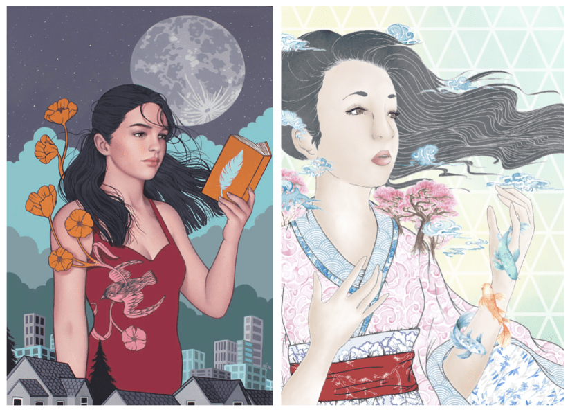
The combination of figural elements and landscapes is something I’m already familiar with, and I was eager to work on something that is both beautiful and detailed, with architectural elements that were new territory to me.

I think I’ll be able to realise this piece fairly ‘easily’ compared to my other projects, where half of the battle was technique and workflow. I’m confident in my ability to produce this piece on Procreate, even thought that in itself will be a slight learning curve. However, that just means this is a good opportunity to fully immerse myself in the software- I plan to do final tidy up and processing on Photoshop, but Procreate boasts most of the same functions, so I want to make sure I’m widening my skills as much as possible.

I’ll have to keep a close eye on my time restraints and other projects (e.g. this blog!), as not keeping up with any one of these will negatively impact my progress. This has been a major weakness throughout my degree, and it’s never been so critically important to keep this in check!

Targets for the next few days include working on this piece (probably constantly), while also finding time to start collating my portfolio work and prepping for hand-in~


References

Collingwood, C. (2019). Haru ‘Springtime’ [mixed media].

Collingwood, C. (2019). Modernisation Concept 1 [digital].

Collingwood, C. (2019). Modernisation Concept 2 [digital].

Collingwood, C. (2019). Modernisation Concept 3 [digital].

Joncas, S. (n.d.) Night Life [oil, acrylic].

portfolio, research, SWOT/Target Setting

Risograph Realisation – Idea Finalisation

It’s been a bit of a weird week- I haven’t made as much progress as I’d hoped with this riso project but any progress is better than none at all! ♥

I’ve been looking at finalising my riso ideas, and while these are still fairly rough drafts I find it much easier to visualise a final concept in a neater, tidier visual style (e.g. I’ll be really finishing up the layout in the actual final piece process, which is much easier thanks to the flexibility of Procreate).

So far, I’ve got 4 potential ‘final’ layouts, each with differences that affect the way in which the artwork fills out the frame of the piece- since these will be A3, the actual image will be slightly smaller on each side (~2.5cm) due to the riso printing limitation. I’ve also begun to visualise how I can embellish these pieces (see the light gold coloured overlay on each piece for ideas on which areas I might work into- this is all TBC!).

China Risograph Print Final Concepts (Collingwood, 2019)


Japan Risograph Print Final Concepts (Collingwood, 2019)


One technique I thought would work especially well on the Japanese/Koi Fish print was kintsugi inspired embellishment (which I’ve begun to visualise in the final concept sketches). I came across this art form during my visit to the Durham University Oriental Museum, where there were examples of ceramics displayed utilising this technique. The result was beautiful, and the idea behind the process even more so.

Kintsugi is based around the idea that the imperfect is beautiful- while some of us in the Western world prefer things to be new, Japanese people relish repairing broken items and seeing beauty in imperfection. This also links to the wabi-sabi philosophy, which centres around the idea that imperfection and the transience and fragility of perfection is accepted- far different to the obsession with perfection we have in the West.

I’d love to incorporate this into my work, as I too have a fascination with perfect things- I think it’d add some nice little imperfections into my pieces. The fact that I’ll be embellishing these by hand will mimic the original technique; the rest of the imagery will be digitally produced and collated, printing using the risograph which is very ‘perfect’ despite some natural variance in the process.

Hero
Kintsugi – Japanese Ceramic Gold Repair (Sydney Community College, n.d.)


I’ve also started to look at colour palettes and application for the final riso prints- since my palette is somewhat limited, I need to use my trusty Risotto colour swatch pack to look at alternative palettes that would work well. Since my artwork is mostly line-art based, I can use quite dark shades of the inks to intensify the line work while employing lighter, more subtle shades to add interest and shading.

This will be a target for the coming weeks after I’ve finished the base artwork- I’ll use Photoshop to manipulate the grayscale layers to view different colour palettes, which I’ll write about in my sketchbook.

I can’t wait to start properly visualising these finals… I’ll be using Procreate to render and layer my files ready for printmaking~

Blog post on this process coming soon! ❀


References

Carnazzi, S. (n.d.). Kintsugi: the art of precious scars [online]. Available at: https://www.lifegate.com/people/lifestyle/kintsugi  [Accessed 21 Mar 2019].

Collingwood, C. (2019). China Risograph Print Final Concepts [digital].

Collingwood, C. (2019). Japan Risograph Print Final Concepts [digital].

Richardson, J. (2016). WABI-SABI and UNDERSTANDING JAPAN | A PHILOSOPHY AND AESTHETIC AS WORLDVIEW [online]. Available at: https://www.tofugu.com/japan/wabi-sabi/ %5BAccessed 21 Mar 2019]. 

Sydney Community College. (n.d.). Kintsugi – Japanese Ceramic Gold Repair [photograph]. Available at: https://www.sydneycommunitycollege.edu.au/course/kintsugi.gold.repair  [Accessed 21 Mar 2019].

research, SWOT/Target Setting

Semester 2 – Cheltenham Illustration Awards 2019

While I’m still working on finalising my risograph prints for Commercial Project 2 (hoping to have these printed in the next week or so), I’m going to start looking into the brief for the Cheltenham Illustration Awards (CIA) which was recently announced at the beginning of the month.

CIa 2019 Poster v2 900 web banner 2
Cheltenham Illustration Awards: Call for Entries 2019 (University of Gloucestershire, Sanfellipo, 2019)


In previous years the theme has been ‘Tangled Tales’ and ‘Tales Through Other’s Eyes’, so this year’s theme of ‘All Together Now: Tales of Unity’ is quite different. My first thoughts are that this theme is a bit less varied and not open to interpretation as much as the previous themes of 2017 and 2018. I worked on a piece for the competition in 2017 and was admittedly able to shoehorn it into the theme (‘Tales Through Other’s Eyes’) without too much bother; my design was only loosely based on the given brief.

This year, I plan to work much more closely with the given theme to produce something that is tailored to this concept, rather than trying to twist an existing idea into meeting the needs of the brief. Based on a mind map by my entire class that I photographed (Collingwood, 2019), I’ve taken some of the most appealing ideas and made my own mind map that expands upon these concepts:

IMG_9154.jpg
Cheltenham Illustration Awards Mind Map: ‘Unity’ (BA Hons Illustration) (Collingwood, 2019)


IMG_9305-1
Cheltenham Illustration Awards Mind Map: ‘Unity’ (Collingwood, 2019)


My piece from 2017 was done digitally, and I daresay this is the best way of creating artwork intended for online entry/print- I will most likely adapt a similar workflow of digitally collaging both traditional and digital motifs/imagery to create a piece that successfully showcases my skillset.

The competition is open to student, emerging and established illustrators, with a deadline of 1st June 2019 (a bit over two months away at the time of writing this post), so I’ll have right up until our degree deadline of the 13th May to create something really special.


On another note, there’s been another recently announced competition that is new for this year and based in the North East. Northern School of Art (formerly CCAD) is running The Northern Illustration Prize in association with AOI, with this year’s theme being Monkey, based on the bizarre legend of the Hartlepool Monkey.

Screen Shot 2019-03-18 at 11.10.16
Northern Illustration Prize 2019 Banner (Northern School of Art, 2019)


I can’t say that theme has massively grabbed my attention, but with it being a new competition based in the North East it would be nice to enter. Since our degree course is brand new for this year, as a class we’re hoping to pull together some really good entries to put us on the map.

Like the Cheltenham Illustration Awards, it’s open to both emerging and established illustrators, with the prize being a fully funded studio in Hartlepool for one year. The prize is to mark the start of the Northern Festival of Illustration, a biennial event held in Hartlepool.


During these coming months I’ll have to be aware of my SWOT (strengths, weaknesses, opportunities and threats) more than ever, since I don’t want to let my grades slip at this crucial time. These are more of the same according to past projects- I’m good at realisation and research, but poor at timekeeping. This is both a weakness and a threat, but as this is the last project I’ll have to be acutely aware of how long is left before hand in- there’s no room for error here! Opportunity wise, I’m looking forward to be able to realise something and have full control over the outcome- most of my other projects have had a certain element of serendipity to them, where I’ve had to battle other elements in order to produce something I’m happy with.


My main target for the coming weeks will be to finish off the bulk of the work for the riso project- Once I get the images printed I can embellish the resulting prints at my leisure… or more likely, as an escape from what is most likely going to be hardcore planning and execution of this CIA 2019 project for the next few weeks!


References

Association of Illustrators (2019). The Northern Illustration Prize 2019 [online]. Available at: https://theaoi.com/northern-illustration-prize-2019/?fbclid=IwAR0SpwQXMjmh9nyb018JgubtDWu4bPB4FTi_RsSzLtgr2-e24vFmcGEoEz4   [Accessed 18 Mar 2019].

Collingwood, C. (2019). Cheltenham Illustration Awards Mind Map: ‘Unity’ [photograph].

Collingwood, C. (2019). Cheltenham Illustration Awards Mind Map: ‘Unity’ (BA Hons Illustration) [photograph].

Northern School of Art (2019). Northern Illustration Prize 2019 Terms [online]. Available at: https://theaoi.com/wp-content/uploads/2019/02/northern-illustration-prize-t-and-cs.pdf  [Accessed 18 Mar 2019].

Sanfellipo, A. (2019). Cheltenham Illustration Awards 2019 – Call For Entries: All Together Now! Tales of Unity [online]. Available at:  http://www.cheltenham-illustration-awards.com/p/about.html [Accessed 8 Mar 2019]

Smith, R. (2019). ‘The Northern School of Art launches major international art prize ‘The Northern Illustration Prize’ [online]. NorthernArt.ac.uk. Available at:  https://northernart.ac.uk/the-northern-school-of-art-launches-major-international-art-prize-the-northern-illustration-prize/ [Accessed 18 Mar 2019].


research

Durham University: Oriental Museum Visit

Back with another post on our day out at the Durham University Botanic Garden and Oriental Museum! Find my post on the Botanic Gardens here c:

Admittedly, I’m really not much of a museum-goer… I find them quite dry and stuffy at the best of times. However, I do have a deep appreciation of Asian culture and art, so I thought I’d give this museum a go since it sounds right up my street. The uni were also running a special admission deal for the Botanic Garden and the Oriental Museum on the same day~

Upon arriving the museum was nicely set out, organised in a tiered open space type layout- I know this has nothing to do with my research but it made it feel nice and airy in there (which made me much less anxious about spending hours getting lost in a blur of similar exhibits)!

Screen Shot 2019-03-01 at 14.40.53
Durham University Oriental Museum: Main Floor (Collingwood, 2019)

There were a plethora of cultures on show at the museum including Korean, Egyptian, Middle-Eastern and Indian exhibits which I thoroughly enjoyed; however, for the purpose of this post I’ll be looking specifically at Chinese and Japanese items, since that’s what I’m basing my project on.

We visited the Japanese exhibit first- although it was small, there were some gorgeous examples of early ceramics and pottery, as well as some ceremonial prayer set-ups and symbolic items. My favourite exhibit was the collection of traditional Hina Matsuri dolls. The attendant told me these are only displayed for a short time around Doll’s Day or Girl’s Day (celebrated on the 3rd March each year)- more on this holiday here if you’re curious!

IMG_8830
Durham University Oriental Museum: Hina Matsuri Doll Display (Collingwood, 2019)

This is exactly what I was looking for to supplement the images of flora and fauna I’d taken in the gardens… I’m excited to work some of these visual styles into my concepts c:

I then wandered across to the Chinese exhibit floors- there was a much larger space for Chinese items and artwork, so I was able to gather tons of really useful reference imagery. The ceramics and pottery were standouts for me; peek a few photos from the exhibit below. My favourite item was the huge Qing Dynasty cloisonné floral vase!

Screen Shot 2019-03-02 at 19.01.21
Durham University Oriental Museum: Qing Dynasty Red Dragon Plate/ Qing Dynasty Cloisonné Vase (Collingwood, 2019)
Screen Shot 2019-03-02 at 19.00.55
Durham University Oriental Museum: Qing Dynasty Porcelain Bowl with Fish and Crane/Floral Horse Bowl (Collingwood, 2019)

At the far end of the Chinese floor was a huge paper replica of a traditional Chinese Dragon- with Chinese New Year being recently, it was nice to see an example of some more modern festive items. In particular I was happy to see this, since my current concepts for the Chinese risograph feature a traditional Chinese Dragon very prominently.

IMG_8864
Durham University Oriental Museum: Upper Floor Chinese Dragon and Lanterns (Collingwood, 2019)

You may have noticed the quality of these photos is lacking in this post… truthfully I find museums to have horrendous lighting for photographing exhibits, so while most of my pics are useful and do the job, they’re not very nicely composed and a bit naff. There was also no flash photography, so I just had to make do with the conditions in there… and it was very dark >:c

Overall I thoroughly enjoyed my research visit to Durham. I’m so pleased I was able to source places to go for references for this project- I doubted I’d be able to find sufficient primary sources, so I was winning before I’d even begun~

I’m looking forward to working this new imagery into my concepts- I feel much more equipped to produce some lovely symbolic pieces of art that work well together and show my appreciation for the beauty of Asian culture ♥


References

Collingwood, C. (2019). Durham University Oriental Museum: Floral Horse Bowl [photograph].

Collingwood, C. (2019). Durham University Oriental Museum: Hina Matsuri Doll Display [photograph].

Collingwood, C. (2019). Durham University Oriental Museum: Main Floor [photograph].

Collingwood, C. (2019). Durham University Oriental Museum: Qing Dynasty Cloisonné Vase [photograph].

Collingwood, C. (2019). Durham University Oriental Museum: Qing Dynasty Porcelain Bowl with Fish and Crane [photograph].

Collingwood, C. (2019). Durham University Oriental Museum: Qing Dynasty Red Dragon Plate [photograph].

Collingwood, C. (2019). Durham University Oriental Museum: Upper Floor Chinese Dragon and Lanterns [photograph].

Wikipedia (n.d.). Wiki – Hina Matsuri [online]/ Available at:  https://en.wikipedia.org/wiki/Hinamatsuri [Accessed 24 Feb 2019]

research

Durham University: Botanic Garden Visit

As part of my ongoing effort to source primary reference sources (this was a weakness in my workflow during Semester 1), I’ve been for a visit to the local Botanical Garden and the Oriental Museum, both of which are kept my Durham University. To prevent this from being overly wordy I’ll just talk about the Garden today, but I’ll be sure to make a post on the Oriental Museum in the future as both were fantastic!

In an attempt to catch some nice weather for the first part of the trip, we visited the Gardens first- of course, this was a failure because when do we ever have nice weather in the UK? It was really misty and since it’s still February, there wasn’t much to see in terms of flowers and blooms. I did spot a few British flowers planted at the front, but since my project is based on Asian flora, this wasn’t applicable to my area of research.

My favourite area of the garden is the collection of greenhouses, which contain ‘exotic’ plants that aren’t native to the UK. This is where I collected most of my references of succulents for my terrarium project, and at a slower pace I was able to discover some really nice plants that I could reference for this project.

I also discovered another gem in the back conservatory of the greenhouse- koi fish! I hadn’t noticed these at all the first time I went in (I was in a pretty urgent hurry), so I took some time taking reference images of these fish. Here’s a pic of me employing my family to bait the fish with feed while I took photos haha:

Screen Shot 2019-03-01 at 13.03.07
Durham University Botanic Garden: Feeding the Koi/Koi Fish (Collingwood, 2019)

After having a good mooch through the tropical section, we ventured outside to the main garden. Looking at the map, there was a cluster of areas that interested me; the Bamboo Grove (30), the Japanese Collection (31), the Oriental Collection (37), and the Sakura Friendship Garden (38)- see these on the map below:

Screen Shot 2019-03-01 at 13.31.20
Botanic Garden Visitor Map (Durham University, n.d.)

It was quite a trek, and when we arrived at the Oriental Collection there wasn’t too much to see- mostly trees and the odd leafy plant, but compared to the variety in the greenhouses it was a wee bit disappointing. Since it’s out of season, the Sakura Friendship Garden was also a bit underwhelming. Now obviously this garden doesn’t focus on flowering plants nor are they in season, so I sort of expected it to be limited- however, this is the best selection that’s accessible to me, so it’ll have to do for now~

Screen Shot 2019-03-01 at 14.06.28
Durham University Botanic Garden: SAKURA Friendship Garden (Collingwood, 2019)

On the plus side, I really enjoyed the Bamboo Grove! Plenty of mossy textures and interesting leaves and branches to photograph- these will definitely come in handy.

Screen Shot 2019-03-01 at 13.47.46
Durham University Botanic Garden: Moss Specimen/Lostachys Aurea (Collingwood, 2019)

Despite the drawbacks, I really loved this garden- I’ve re-visited it quite often for inspiration and reference, the most recent being for my first experimental risograph project during Semester 1. That was a bit of a whirlwind visit since time was very short, but I was able to enjoy it much more this time around (despite there still being fairly little flora outside of the nice warm greenhouses!)

More in the next few days on the second leg of our trip- the Oriental Museum c:

[Edit 27th Feb: Oriental Museum trip report here!]


References

Collingwood, C. (2019). Durham University Botanic Garden: Feeding the Koi [photograph].

Collingwood, C. (2019). Durham University Botanic Garden: Koi Fish [photograph].

Collingwood, C. (2019). Durham University Botanic Garden: Lostachys Aurea [photograph].

Collingwood, C. (2019). Durham University Botanic Garden: SAKURA Friendship Garden [photograph].

Collingwood, C. (2019). Durham University Botanic Garden: Unidentified Moss Specimen [photograph].

Durham University (n.d.). Botanic Garden Visitor Map [map]. Available at: https://www.dur.ac.uk/resources/visitor-attractions/Botanic_Garden/Durham_University_Botanic_Garden_Map.pdf  [Accessed 20 Feb 2019].

research, SWOT/Target Setting

Risograph Realisation – Design Development

In my initial ideas, I’ve played with concepts such as traditional Asian-inspired pattern work (which I’m quite familiar with from past projects), basic floral motif work, and my favourite concept so far: prints based on national imagery associated with Japan and China.

I visited China last year and -for lack of a less cliché term- fell in love with how cultural significance is interwoven throughout every aspect of their design and aesthetic. The concept of a pair of prints representing China and Japan came from the idea of ‘where I’ve travelled to, and where I plan to go next’, combined with a deep appreciation of Asian culture and design. Since the two cultures influenced each other so much throughout history, a pair of prints encapsulating each country’s defining aesthetics works really well (both as an entity and as separate pieces of design).

After working on this idea, I was enjoying some down time in front of the telly and caught an episode of Monty Don’s Japanese Gardens (BBC Two, 2019)- obviously this appealed to me massively! The pair of episodes focused on the distinct seasons of spring and autumn in Japan, and how the foliage and flora changes accordingly. Of course, this inspired an alternative to my front-running design idea based on this aspect of Japanese culture and aesthetic design- nothing is by chance in Japanese design, not even nature!

Additionally, since the risograph printer is originally from Japan I thought it would be really interesting to combine traditional Japanese imagery with the newer technique of riso printing to create something that bridges the gap between traditional and modern technique.

I also really want to explore colour in this project, since we have some lovely new inks to use in this process (these being Purple, Teal and Green). I see lots of opportunity to incorporate these shades into my work to create something more refined and less blocky and loud compared to the terrarium project, which was printed in garish tones of blue and pink. I still like those prints, but I’m hoping to capture a totally different and more refined aesthetic with this project that’s also more visually in-line with other projects I’ve worked on.

To help me with colour matching, I’ve ordered a riso swatch pack from Risotto (a print studio based in Scotland that I’ve included in my research)- since it’s not very cost effective to make a test sheet of colour overlays and combinations myself, I thought I’d order a pack from a riso studio to use as a guide when fiddling with the opacities of my final image. I didn’t really make use of this design mechanic in Semester 1, so that’s a personal goal of mine for this project c:

IMG_8566
Risotto Studio Risograph ink swatches (Collingwood, 2019)


Here’s a pic of the contents of the pack- looking at these, I really wish we had a gold ink available at the college! It looks especially nice on black ♥ I’m still planning to embellish my final prints in ‘post-production’ using a variety of techniques- maybe even making some of them specific to a particular print. This will include metallic leaf work, so I can make a similar effect myself for now.

In terms of SWOT analysis for this week, I can work with my previous analysis from Semester 1’s PP1 (Printmaking), when I was also working on a riso project. Despite having more strengths with the riso medium than weaknesses due to valuable past experience, I still need to be aware of my biggest threat: timekeeping. However, the best opportunity for this semester will be to *actually* keep better time throughout, which is very doable since I’m still pretty early on in the term.

More next week when I nail down my final idea (I’m still a bit undecided!) and start refining this digitally~


References

Collingwood, C. (2019). Risotto Studio Swatch Pack. [Photograph].

Monty Don’s Japanese Gardens. (2019). BBC Two Television, 15 February.

Risotto Studio. (n.d.) Risotto Riso Room. [online]. RisottoStudio.com. Available at: https://www.risottostudio.com/print [Accessed 3 Feb 2019].


research

Semester 2 Overview

So I’ve had a lovely week off (a reward to myself for finishing Semester 1) and I’m so excited to start working on my Commercial Realisation project this term! ♥

We had a lecture about clarifying out intentions for this Semester, and we also discussed how our Portfolio projects are going to pan out- since our hand-in is mid-May but we need to spend a lot of time building our portfolios and exhibit materials, I really need to re-evaluate what I’ll be working on in order to produce the best products for final show. We’ve been told to finish most of our ‘formal’ degree work (with the accompanying vis dev and research) by mid-March, so this gives me a little over a month and a half to complete the Cheltenham Illustration Awards brief (which is revealed at the beginning of March), and the tentative Animation project (which was originally scheduled to be completed over a whopping 14 weeks)! These would be my two Commercial Projects, with the recurring Portfolio project being my Personal Project.

I’m certain that I still want to continue with the Cheltenham Illustration Awards, as the reasoning behind wanting to do that was to have a nice centrepiece for my end of year exhibit- I’d originally scheduled this project to be 5 weeks long, so this seems doable in the new timeframe.

The animation project (as a submission to the Adobe Awards) may have to sadly take a backseat as it’s most likely going to be too complex to complete to the best of my ability in the month that is available :c I fully intend to bring the existing work to fruition eventually- this might be a passion project of mine that I’ll take on in the summer after graduation… watch this space!

As an alternative, I want to further explore the riso and do some prints to submit to another competition- so far I’m thinking of basing them on the theme of the ‘Sun, Moon and Stars’ (this is extremely typical of me, haha)

I’m sad that I probably won’t be able to make my animation right now, but I really enjoyed working with the riso previously in Semester 1 and now that I have a lot more knowledge on the process and there are three new colours available, I’ll be able to make something really fancy~

My targets for next week include writing out a synopsis and briefs for my first project (Commercial Project 2), as well as starting initial concepts which I’ll work on while I wait for the CIA theme to be released.

evaluation, SWOT/Target Setting

Semester 1 – Evaluation and Reflection

I’m so pleased all of my Semester 1 work is done and dusted!!

Just to tie all the loose ends up, I’ll be summarising The Good, The Bad and The Ugly (read: strengths, weaknesses and threats), as well as upcoming goals and opportunities for the future c:


Strengths

For me, the most successful part of Semester 1 was my experience with Procreate, and the steep yet successful learning curve that went along with it- I found using the iPad Pro/Apple Pencil combo to draw directly onto the screen to be really refreshing and user friendly, rather than using a traditional ‘screenless’ tablet (e.g. Wacom Intuos) and Photoshop on a laptop, which wasn’t very intuitive at all.

Through creating art with this new workflow, I’ve been able to gain back some of my confidence when it comes to drafting and artwork in general- I’m not the most confident person by any means, but I’ve had lots of further difficulty in the past year or so that has really affected my ability to produce something I’m pleased with. I’m trying to become a more optimistic and outgoing person, so this is a small victory for me that I’m really proud of ♥


Weaknesses

While I feel the semester went well overall, there were definitely areas which I was really unhappy about and couldn’t wait to finish off and leave behind. Timekeeping has always been an issue for me, and I wish I’d spent a bit more time learning the ins and outs of the riso process before jumping in with my solid colour choices and largely single opacity layers.

My final grade will speak for itself, I just hope I can do enough in these subsequent modules to achieve a good class of degree. I’ve previously been able to scrape a First during my FdA, but I’ll be pleased (albeit it slightly less so) with a 2:1… anything else is a bit out of the question for me ^^”


Threats

Threats for the future include lack of time management and my own self-belief, as I know this can really hold me back if I let it get to me too much. I also don’t want to become too reliant on digital processes, as I feel I really need to retain my sound knowledge of traditional art. I’d love to include some nice originals in my portfolio, so this is something I’d like to work towards even if it doesn’t form the bulk of an actual personal or commercial project (I can work on this independently as part of my portfolio project, too).


Goals and Opportunities

My goals for Semester 2 include continuing to work with a variety of processes and techniques, while also coming back to my roots and creating some high quality portfolio centrepieces that I’ll be pleased to display during final show. Convincing myself is the biggest struggle of all, so I’ll also be actively working on favouring my work a little bit more to help me find peace with myself.

Onwards and upwards!

portfolio

Concept Development – Storyboarding

Now that my character designs have been finalised, I can begin to storyboard the narrative.

While I do want the story to be interesting, I’m planning to make the main focus ‘interaction’- between the characters and their environments. This means a more gesture based approach to the animation, where characters will bond with their environments and explore new ones. In this case, the young girl will journey through her own woodland environment to the Deer’s house, where she’ll discover a new environment.

I’m most inspired by the way in which Studio Ghibli animates even the most mundane of actions with a quiet, curious interest- this is present throughout all of their films. It really brings out the natural beauty in the scenery without drawing the focus towards anything in particular.

The story is short (clocking in at just over a minute), but at an anticipated 12fps this should be more than enough to keep me busy!

[Update 19.01.19] And here are my finished storyboards… I’m sure I’ll refine these more in future once I’m better informed with the limitations of the Semester 2 project, but for now these will do nicely. I had a few problems with drafting out proper perspective in such a simplified way, but these are not written in stone so I can definitely correct these little problems in future when I have more time to dedicate to properly exploring environment design~

screen shot 2019-01-25 at 13.42.43screen-shot-2019-01-25-at-13.42.50.png

screen-shot-2019-01-25-at-13.42.58.png
Narrative Storyboards, PP2. (Collingwood, 2018)


I’ve really tried to look at how I can animate even the ‘still’ scenes, with background elements that move continuously or small pieces of animation to liven up an otherwise stagnant frame (e.g. the steam from the teacups, or the breeze blowing branches and leaves). I’ve used a blue pen to describe the animated aspects or camera directions- hopefully this will help me to clarify what to animate in each scene.

I’m overall pleased with how these have turned out, and even though there’s room for improvement this is my first experience with visual storyboarding. Can’t wait to get this project tied up and finished so I can start on Semester 2 work~


References

Collingwood, C. (2019). Personal Project 2 Narrative Storyboard Panels [Digital].

portfolio, SWOT/Target Setting

Concept Development – Character Designs

I have some new character designs to share! c: I’ve been working constantly on these since my last update- I feel I’ve made good progress even though there’s still so much to do!

screen shot 2019-01-28 at 10.19.12
Young Female Character: Initial Concepts (Collingwood, 2019). 
screen shot 2019-01-28 at 10.19.32
Young Female Character: Face Revisals/Development (Collingwood, 2019). 
screen shot 2019-01-28 at 10.22.48
Young Female Character: Palette/Colour Application Experimentation (Collingwood, 2019). 


Meet our heroine of the story- she doesn’t have a name on purpose, because I want the audience to be able to relate to her and put themselves in her shoes. Since she’s youthful, naïve and curious, I wanted these traits to shine through in her character design. I went through loads of concepts (some of which were really awful, haha) but settled on a final design for her that best described her personality to the viewer. I’m sure it shows, but I was really inspired by the ‘chibi’ characters of Studio Ghibli, as well as the loose, simplistic art style of Heikala (info on both of these here from my artist research for this project).

I’m pleased with her design- she went through quite a few refinements as I progressed through my workflow! Final character board below:

screen shot 2019-01-25 at 13.41.43
Young Female Character: Final Character Board (Collingwood, 2019). 


To be honest my favourite aspect of her is her ‘paper bag’ trousers- I didn’t want to put her in a skirt lest that undermine her childish adventurous nature, so I decided to go with these oversized paper bag pantaloons (which also matched her boots and cape much better… too many ‘loose hems’ otherwise!)

I really love them ^^”


Next up, we have our anthropomorphic deer character:

screen shot 2019-01-28 at 10.20.51
Anthropomorphic Deer: Initial Head Concepts (Collingwood, 2019). 
screen shot 2019-01-28 at 10.21.32
Anthropomorphic Deer: Anatomy/Front View Development (Collingwood, 2019). 
screen shot 2019-01-28 at 10.16.14
Anthropomorphic Deer: Palette/Colour Application Experimentation (Collingwood, 2019). 


I designed him to both contrast and complement the young girl character, since the contrast of their environments and designs is central to the narrative journey. The palette is still natural while being different to the bright, fresh toned greens I used on the female character’s designs.

He’s very scholarly and loves a good cup of tea, I hope you can tell~

screen shot 2019-01-25 at 13.41.58
Anthropomorphic Deer: Final Character Board (Collingwood, 2019). 


It was a real challenge to simplify the characters enough so that there wouldn’t be any issues when drawing them repeatedly for the animation- I think I’ve nailed this down enough, but as always there’s always the chance I’ll refine these some more in the follow-up Semester 2 project.

I’m pleased with the outcomes- targets for the next few weeks include finalising and collating all of my projects for hand in, and starting to think about the beginning of Semester 2 and how I’m going to tackle the next few months. Using my previous SWOT analysis’ will help me circumvent any problems I anticipate I’ll have, while also playing towards my strengths to produce a strong semester of portfolio work.


References

Collingwood, C. (2019). Anthropomorphic Deer: Anatomy/Front View Development [Digital].

Collingwood, C. (2019). Anthropomorphic Deer: Final Character Board [Digital].

Collingwood, C. (2019). Anthropomorphic Deer: Initial Head Concepts [Digital].

Collingwood, C. (2019). Anthropomorphic Deer: Palette/Colour Application Experimentation [Digital].

Collingwood, C. (2019). Young Female Character: Face Revisals/Development [Digital].

Collingwood, C. (2019). Young Female Character: Final Character Board [Digital].

Collingwood, C. (2019). Young Female Character: Initial Concepts [Digital].

Collingwood, C. (2019). Young Female Character: Palette/Colour Application Experimentation [Digital].

Heikala (n.d.). Instagram – @heikala (online). Available at: https://www.instagram.com/heikala/?hl=en [Accessed 2 Jan 2019].