First of all, sorry for the super long hiatus- between the Easter hols and life stuff in general, I’ve been busy sorting out various aspects of this project- it’s been a journey, but we made it!
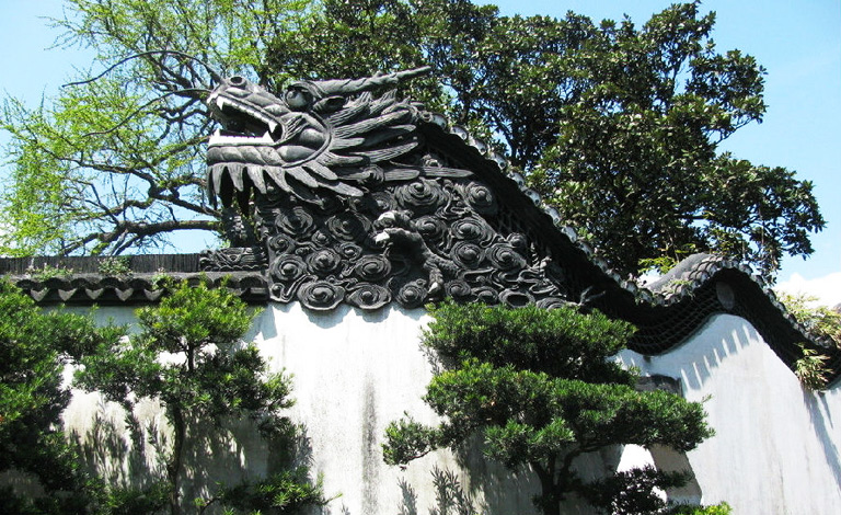
In terms of finalising the imagery for print production, I had a few issues with the Dragon image- when I’d first decided on the central elements of each print, I was acutely aware that if I didn’t execute it properly the Dragon image would be a bit… cheesy looking. Maybe it’s just my spin on things, but dragons are inherently a bit lame so I really had to work to make sure my print wasn’t typical/lame. I feel like it’s halfway in-between haha- not quite cringey, but also not really what I envisioned, which is a bit of a shame. I based the imagery off a decorative wall within the traditional Yuyuan Garden in Shanghai:
‘Dragon Crossing the Clouds’ (China Discovery, n.d.)
I thought this was a really unique part of the architecture within the garden, and this helped me immensely while I was designing this part of the imagery ❀
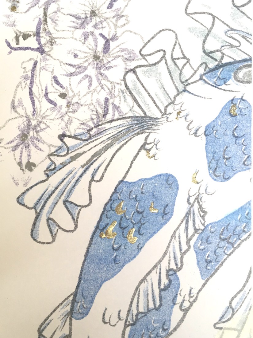
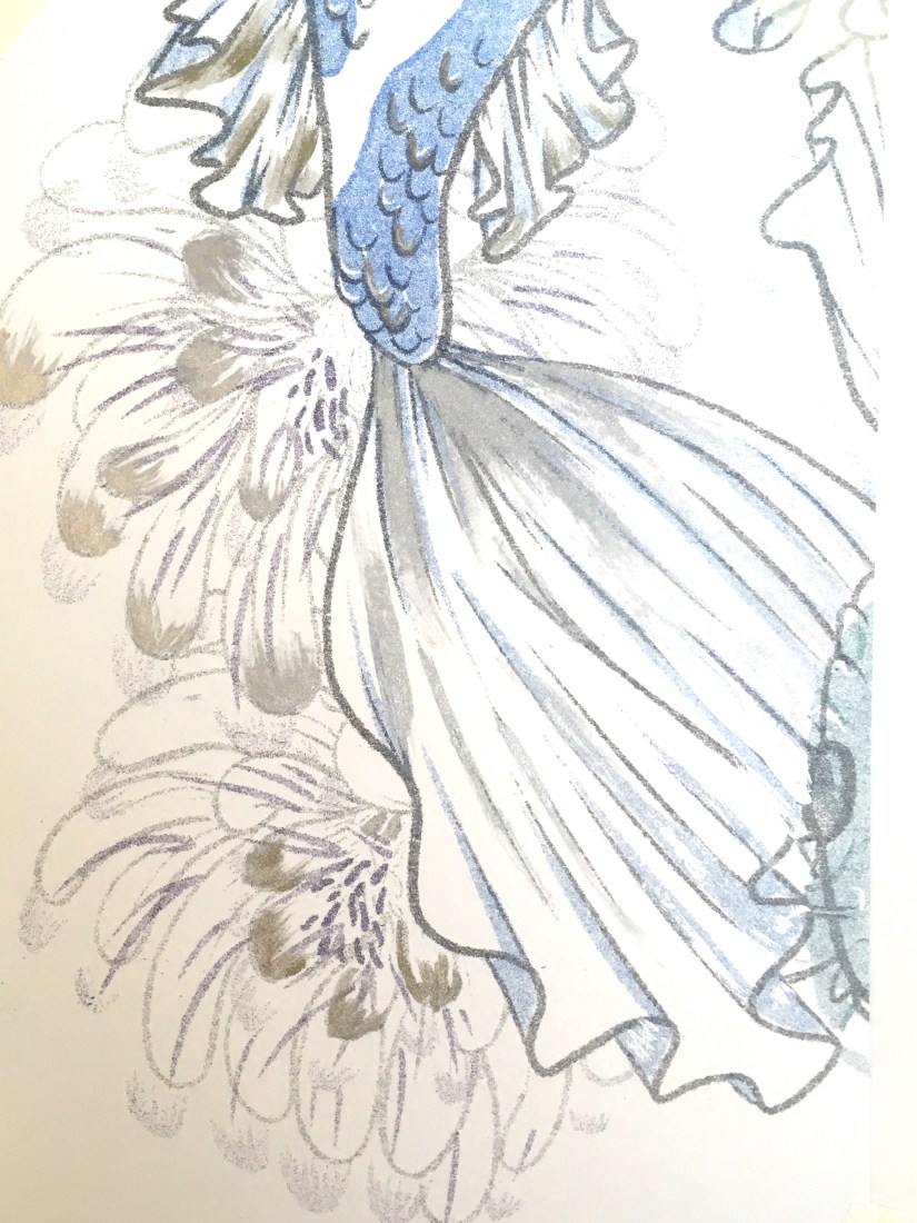
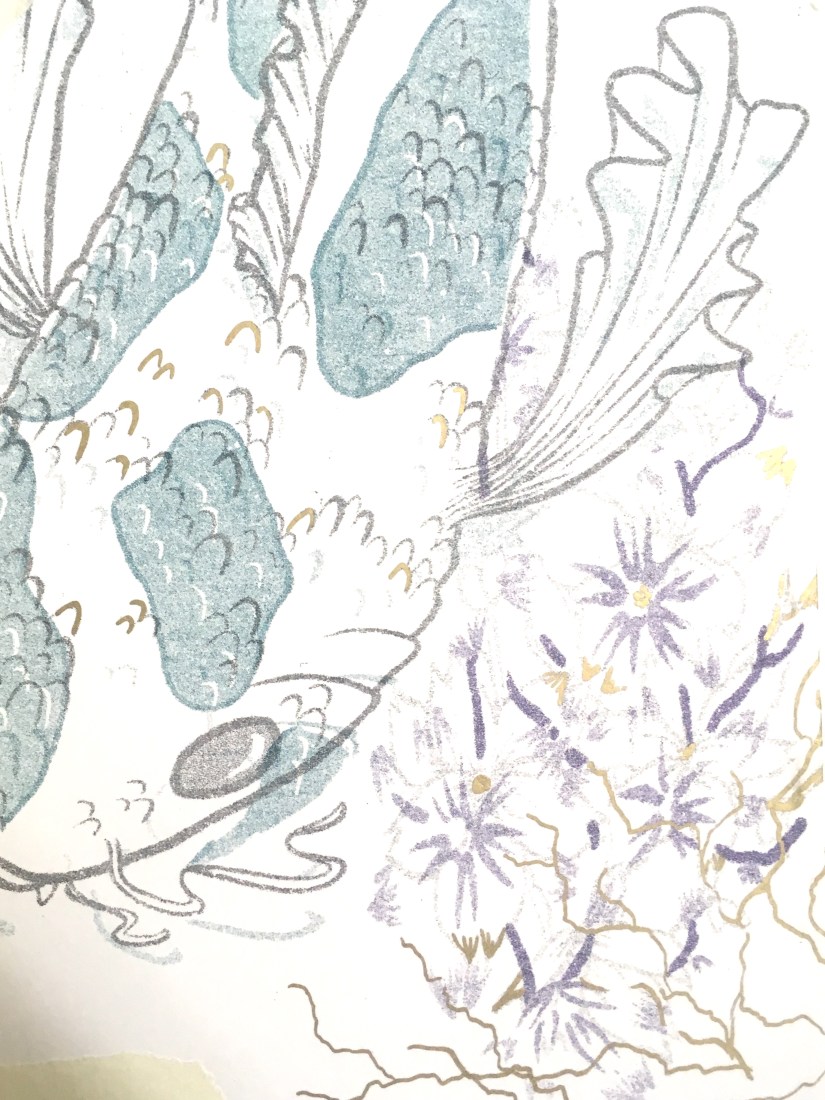
The koi, as previously noted in my Durham University visit posts (here and here), was influenced by reference imagery taken during my outing. This was the easier of the two prints to design, as the subject matter lends itself towards the type of aesthetic I was going for~
I won’t document the actual printing process here (more info in my research folder) as that’s already been covered on this blog here, but my final two designs turned out much nicer than expected! The new ink colours really helped too, as I was able to use a much cooler, less harsh palette of blue, teal and purple. I really knocked down the opacities on all four layers, which produced a lovely painterly effect…
…in fact, the resulting imagery was so nicely processed that I didn’t even want to embellish on top of these! I did some tests with metallic inks, pens and foil leaf on a failed print from my first printing attempt, and honestly the results were nice, but didn’t enhance the prints at all. The embellishment appeared very heavy compared to the plain prints, so I decided to ultimately leave this part of my proposed process out, since I felt it detracted from the final product too much. That’s not to say I regret researching into this so much- I can undoubtedly use these techniques in the near future, as I plan to work with printmaking often once I graduate.
Risograph Embellishment: Gold Leaf Test (Collingwood, 2019)Risograph Embellishment: Metallic Ink Test (Collingwood, 2019)Risograph Embellishment: Metallic Pen Test (Collingwood, 2019)
Targets for the coming weeks include… doing the entire Cheltenham Awards project because I’ve left it so late! As well as continuing to build and collate my portfolio ready for hand in ♥
More in a few weeks once I’ve made a good start on the next project!
In my initial ideas, I’ve played with concepts such as traditional Asian-inspired pattern work (which I’m quite familiar with from past projects), basic floral motif work, and my favourite concept so far: prints based on national imagery associated with Japan and China.
I visited China last year and -for lack of a less cliché term- fell in love with how cultural significance is interwoven throughout every aspect of their design and aesthetic. The concept of a pair of prints representing China and Japan came from the idea of ‘where I’ve travelled to, and where I plan to go next’, combined with a deep appreciation of Asian culture and design. Since the two cultures influenced each other so much throughout history, a pair of prints encapsulating each country’s defining aesthetics works really well (both as an entity and as separate pieces of design).
After working on this idea, I was enjoying some down time in front of the telly and caught an episode of Monty Don’s Japanese Gardens (BBC Two, 2019)- obviously this appealed to me massively! The pair of episodes focused on the distinct seasons of spring and autumn in Japan, and how the foliage and flora changes accordingly. Of course, this inspired an alternative to my front-running design idea based on this aspect of Japanese culture and aesthetic design- nothing is by chance in Japanese design, not even nature!
Additionally, since the risograph printer is originally from Japan I thought it would be really interesting to combine traditional Japanese imagery with the newer technique of riso printing to create something that bridges the gap between traditional and modern technique.
I also really want to explore colour in this project, since we have some lovely new inks to use in this process (these being Purple, Teal and Green). I see lots of opportunity to incorporate these shades into my work to create something more refined and less blocky and loud compared to the terrarium project, which was printed in garish tones of blue and pink. I still like those prints, but I’m hoping to capture a totally different and more refined aesthetic with this project that’s also more visually in-line with other projects I’ve worked on.
To help me with colour matching, I’ve ordered a riso swatch pack from Risotto (a print studio based in Scotland that I’ve included in my research)- since it’s not very cost effective to make a test sheet of colour overlays and combinations myself, I thought I’d order a pack from a riso studio to use as a guide when fiddling with the opacities of my final image. I didn’t really make use of this design mechanic in Semester 1, so that’s a personal goal of mine for this project c:
Risotto Studio Risograph ink swatches (Collingwood, 2019)
Here’s a pic of the contents of the pack- looking at these, I really wish we had a gold ink available at the college! It looks especially nice on black ♥ I’m still planning to embellish my final prints in ‘post-production’ using a variety of techniques- maybe even making some of them specific to a particular print. This will include metallic leaf work, so I can make a similar effect myself for now.
In terms of SWOT analysis for this week, I can work with my previous analysis from Semester 1’s PP1 (Printmaking), when I was also working on a riso project. Despite having more strengths with the riso medium than weaknesses due to valuable past experience, I still need to be aware of my biggest threat: timekeeping. However, the best opportunity for this semester will be to *actually* keep better time throughout, which is very doable since I’m still pretty early on in the term.
More next week when I nail down my final idea (I’m still a bit undecided!) and start refining this digitally~
References
Collingwood, C. (2019). Risotto Studio Swatch Pack. [Photograph].
Monty Don’s Japanese Gardens. (2019). BBC Two Television, 15 February.
Risotto Studio. (n.d.) Risotto Riso Room. [online]. RisottoStudio.com. Available at: https://www.risottostudio.com/print [Accessed 3 Feb 2019].
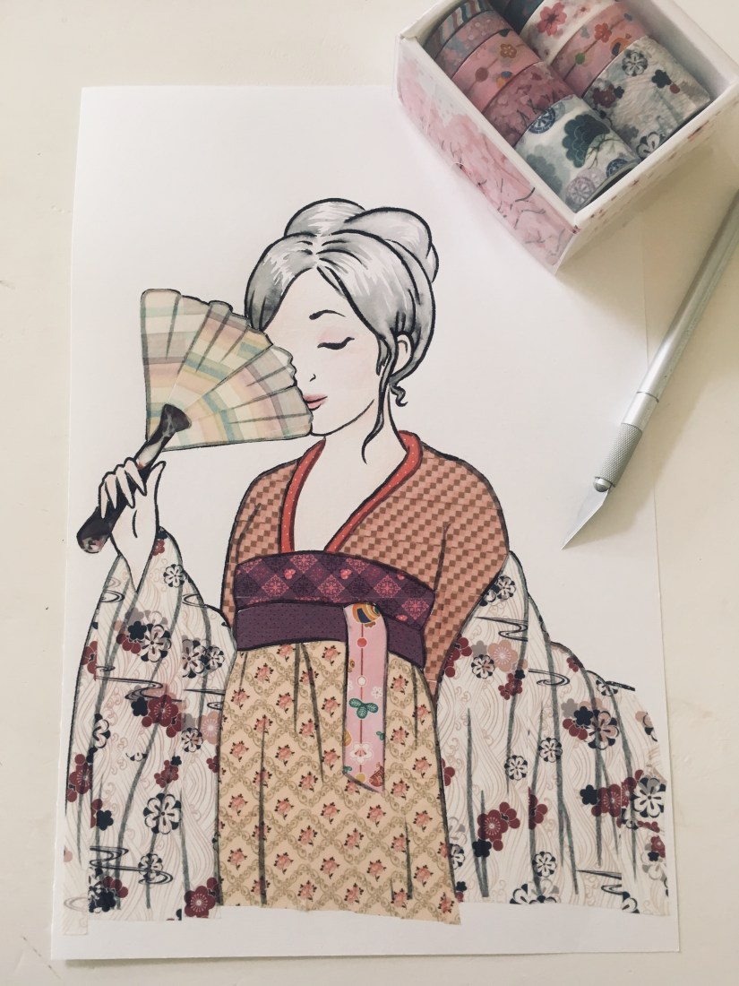
The post I published a little while ago about alternate embellishment techniques really got me back into one of my favourite varieties… washi tape collage. It’s fast become one of the most relaxing ways to work on a piece, and I love doing washi collage when I’m feeling particularly stressed or anxious.
I first discovered this technique when I stumbled across the work of @shardula (real name May Ann Licudine) on instagram. Her art is so delicate and lovely!
Washi means ‘paper’ in Japanese, so washi tape literally means paper tape. To be honest it’s basically fancy masking tape, but the quality is mostly above and beyond what you’d usually find. It’s a joy to work with since it’s strong, versatile and comes in every pattern imaginable, allowing for a wide variety of uses.
In the style of my childhood hero Neil from Art Attack, “here’s one I made earlier”:
Maiko Washi Tape Collage (Collingwood, 2018)
As you can see, the semi-opaque quality of washi tape makes it really easy to work with. As the line art can be seen through the tape, this helps to prevent the artwork from looking too loose, while also adding more detail and letting the accuracy of your actual collage be a little more lenient.
So, onto the ‘how to’! ❀
You’ll need:
An image to work with– try using a simple line art image for the best results. Use good card stock to minimise accidental cuts on the paper when collaging~
A selection of washi tapes (good quality so they adhere to the paper and don’t lift at the edges)
A sharp scalpel or craft knife– mine has a thin pointed blade for the best precision when cutting fiddly bits!
Watercolours or another medium to add final details to the image (optional)
I’m starting off with a plain line art image- this can be anything but I’m sticking with a similar type of concept as my example, as it has lots of potential for patterned collage.
Select a tape that you’d like to use- I find solid repeat patterns are the best to use, with photographic themed tapes (e.g. characters, food, animals) being a bit less favourable for this application.
I usually work on the largest area first. Depending on how wide your tape is, you can cover a whole section with one piece, or you might need to lay strips side by side. If the pattern allows you can try to match up the pattern to create a seamless design, but honestly I think the organic nature of the workflow shines through if the tapes are slightly misaligned c:
Temporarily press the tape into place while it’s still attached to the roll, then use your scalpel to lightly cut around the edge of the area, leaving a clean cut where the pattern ends and preserving as much washi as possible (this stuff can be pricey!)
Because good washi tape won’t damage the paper, you can reposition this as many times as you need to. A wee dab of glue will fix any curling edges when a piece has been repositioned one too many times ^^” I use the edge of my scalpel handle to firmly press the washi down when I’m happy with how it looks.
If the tape is light in colour and translucent enough, you should be able to see the line art through the tape when working, which is really useful as it makes it much easier to see what you’re doing. If the tape is dark or too opaque you can still use these techniques, it just takes a little bit more guesswork… try chipping away at an edge to maintain a precise cut rather than winging it on the first go~
Washi Tape Collage Tutorial: Translucent Line Art Detail (Collingwood, 2019)
If you have a roll of tape that has lots of bold large scale pattern, you can also cut out individual elements to add to the image as stand alone embellishment. For example, this really wide roll I have features lots of leafy, flowery type things that can be easily cut out, due to their solid edges and distinct shapes. Even if the pattern runs off the edge of the tape, you can just fashion your own leaf or petal edge out of the existing imagery.
Use every pattern to your advantage- tapes can be applied sideways to follow the shape of the image, or used sparingly to embellish a tiny portion of the piece!
Washi Tape Collage Tutorial: Small Detailing (Collingwood, 2019)
To finish off, you can hand embellish the remaining bits of the image with watercolour, ink pen or whatever you fancy using. I like to fill in areas that wouldn’t have worked well with washi, e.g. hair, skin, and other textures that weren’t represented within my tape collection.
And there you have it- your own little washi collage. Not thrilled about the tapes I used for this image, but at the time of writing I was waiting on a new stash to arrive ^^”
Hope you enjoyed this tutorial! I’ve also compiled a list of tips and tricks, as well as some of the best sources for nice washi ❀
Tips and Tricks~
– Using a super sharp knife (as is needed) might result in you accidentally cutting through the paper… I do this literally all the time. Most cuts will be so crisp that you can simply push the paper back together, effectively ‘sealing’ the cut closed. Add a little bit of very strong tape (e.g. heavy duty masking tape or clear sellotape) to the reverse of the image if you want to stop the cut from lifting open again. c:
– Always use this technique on a separate piece of paper, rather than in a sketchbook where there’ll be other imagery on the reverse of the sheet. You can always insert any finished washi collage into a sketchbook after you’ve finished~
– Tapes come in loads of widths, from really thin to over 2 inches wide! Use this to your advantage to preserve tape and fill in tiny details ♥ You can also purchase special ‘writeable’ washi tape, where the surface is less waxy, allowing for detail to be added over the top of any collage work.
– Don’t know which washi to use? Keep a swatch book with examples of all your tapes- that way, you’ll know how big/long the repeat is, what direction the repeat runs in and exactly which elements are on each roll. Here’s a page from my swatch book:
Washi Tape Swatch Book (Collingwood, 2019)
Where to Buy~
Washi is available in an infinite amount of patterns and styles- I’ve collected washi for a long time! Some of the best sources are:
Paperchase– the seasonal tape collections often go on sale, so watch out for any upcoming discounts. A bit hit and miss at times, but every so often I find a real gem in here! Most of the tapes are a bit Basic though haha
Michaels (US-based craft store)- they sell huge bumper packs of washi in tons of themes and often run ‘50% off one item’ coupons.
Fox and Star– loooove this store, but they’re a bit on the Super Duper Expensive side. Single washi rolls are always priced at a premium compared to multipacks, but it’s UK based to save on postage, at least~
MiSoPaper– this online store has lots of tapes that fit my personal tastes. Slightly limited in certain categories, but can be quite affordable and there’s free delivery over £15 c:
If you’re feeling brave, try AliExpress– like all of the above, but a tenth of the price but takes 2+ months to arrive. You will find every single variation of ‘weird and wonderful’ on Ali! c:
Above all of these sources, nothing brings more joy than finding a one-off store that’s washi heaven. All of my favourite tapes are from a stationery store I stumbled upon during my trip to Shanghai- it really had it all. Rolls were 7 yuan (80p) a piece; the multipacks even better value! My fave find was a beautiful little box of Sakura washi:
‘Sakura Dream’ Washi Box (Collingwood, 2019)
And that’s a wrap! Sorry this was a long’un- thanks for reading! I hope this is helpful ♥♥♥
References
AliExpress (2019). AliExpress – Smarter Shopping, Better Living! [online]. Available at: https://www.aliexpress.com [Accessed 28 Jan 2019].
Collingwood, C. (2018). ‘Maiko’ Washi Tape Collage [ink, washi tape].
Collingwood, C. (2019). ‘Sakura Dream’ Washi Tape Box [photograph].
Collingwood, C. (2019). Washi Tape Collage Tutorial: Cutting Washi [photograph].
Collingwood, C. (2019). Washi Tape Collage Tutorial: Materials [photograph].
Collingwood, C. (2019). Washi Tape Collage Tutorial: Small Detailing [photograph].
Collingwood, C. (2019). Washi Tape Collage Tutorial: Translucent Line Art Detail [photograph].
Collingwood, C. (2019). Washi Tape Swatch Book [photograph].
Fox and Star UK. (n.d.). Fox and Star UK – Cute stationery suppliers [online]. Available at: https://www.thefoxandstar.co.uk [Accessed 28 Jan 2019].
Fox and Star UK. (n.d.). Fox and Star UK – MT ex Bird Egg Washi Tape [online]. Available at: https://www.thefoxandstar.co.uk [Accessed 28 Jan 2019].
Licudine, May Ann. (n.d.). Mall Licudine (@shardula) – Instagram photos and videos. [online] Available at: https://www.instagram.com/shardula/ [Accessed 28 Jan 2019].
Michaels. (n.d.). Michaels Stores – Art Supplies [online]. Available at: https://www.michaels.com [Accessed 28 Jan 2019].
MiSoPaper. (n.d.). MiSoPaper – Home [online]. Available at: https://misopaper.co.uk [Accessed 28 Jan 2019].
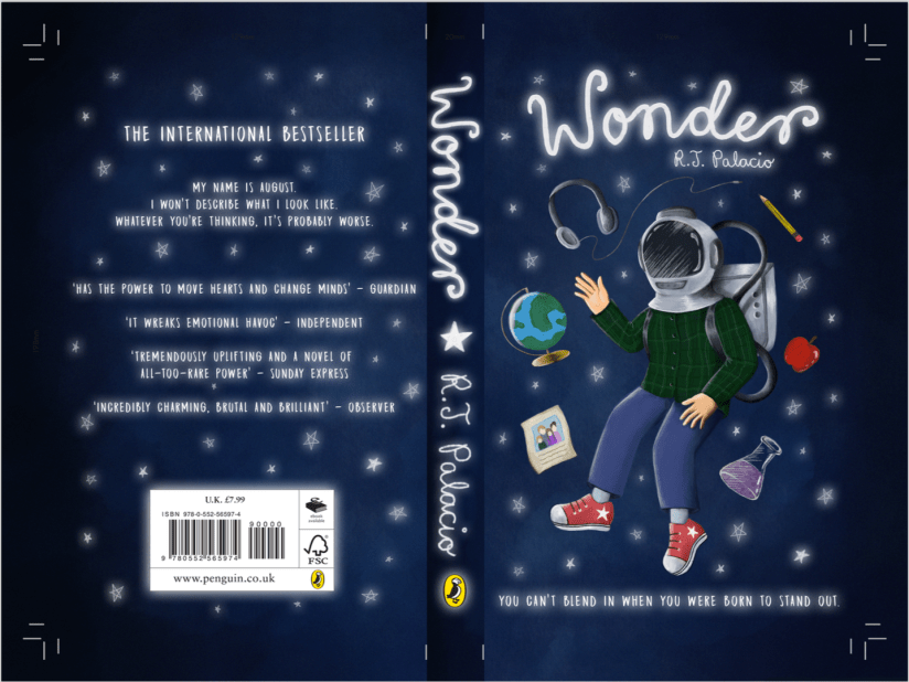
(haha but no really, I essentially just finished the Wonder Penguin Project in 4 days). It was intense, but it worked!
I didn’t mean to take such a small amount of time for this (my initial timetable gave me 4 *weeks* from mind map to final cover), but having so much downtime in my life made me reevaluate how long I really had to complete this brief. I have so much in store for PP2 that I didn’t want to waste any more time than necessary on what was supposed to be my ‘shortest’ project- that thought took on a while new meaning…
I had already researched into some existing source material e.g. book covers and film posters before the Christmas break, so I’d be lying if I said I didn’t have a rough idea of what I wanted to do. With this research in hand, I started to draft out some concepts of the cover, evaluating each one and choosing the most successful to take forward to development. This was all pretty run of the mill development work that I completed over the course of a day, so I’ll move onto the more interesting stuff~
I worked in Procreate again to bring the final product to life- I feel that my workflow has really come into its own since I started using my iPad as a key tool in my process; it’s the perfect balance between familiar traditional technique and the ease and innovation of digital painting. I was able to scan in my final concept from my sketchbook and work directly on top of this in Procreate, where I could fine-tune the details, proportions, etc.
Procreate tells me I clocked in at just under 8 hours with over 7000 strokes to complete the cover- that’s quite an interesting stat! I’m pleased with the final image:
Wonder Final Cover Art (Collingwood, 2019).
I’ll be making a mock-up final product by laminating my printed cover onto an existing copy of the book before hand in too… it’ll be nice to see a ‘finished product’!
I’m expecting to have to make a few wee changes/additions to the project work (particularly the written work) once I have a pre-hand in tutorial, but for the most part I can put this project to rest. ♥
More next week as the deadline draws near!
References
Collingwood, C. (2019). Wonder Final Cover Art [Digital].